 The Dieter Kienast project. I believe that a sound site strategy is responsible for ninety percent of the success of any architectural project. Of course, beyond the initial principle of settlement, keeping an eye on how the project unfolds through multiple design phases —urban, architectural and human scales— and making constant adjustments to the site strategy is an important barometer of the health of the project.
When teaching architecture at the Eidgenössische Technische Hochschule (ETH) in Zürich, Switzerland, I encountered the work of Professor Dieter Kienast, head of the landscape program. Having been educated at Zürich’s sister institution in Lausanne, the Ecole Polytechnique Féderale de Lausanne (EPFL), where I found an equally deep commitment to cross-disciplinary design thinking, I was eager to learn about Kienast’s particular response to his art-form, and more importantly, his distinct approach to composing the landscape through architectural tectonics.
This approach was evident in many of his completed projects, all of which responded beautifully to the site’s context by heightening all human senses in a world that was real and tangible. However, the other appeal of Kienast’s work was his sense of poetry in the way he communicated his ideas, concepts and processes by diverting and interpreting a 20thcentury artistic compositional strategy called collage.

At that time (over two decades ago), I had never been exposed to landscape projects rendered in such a sensitive way, where the visual abstraction of the drawings —in particular Kienast’s desire to represent nature— had such power of suggestion. His projects (see above images) seemed to me to be those of a pioneer who advocated a contemporary narrative through landscape drawing; something the utopic architects such as Boullée, Ledoux and Piranesi had explored in architectural terms during the 18th century.
Although he is a landscape architect, the appeal of Kienast’s work was architectural and often extended to the urban and territorial scales. His rigor and original aesthetic applied to deciphering and highlighting landscape structures rendered visible the unseen with an incredible suggestive power, which became important to acknowledge in my métier as an architect.

I came to also admire other European landscape architects (paysagistes in French) such as Patrick Berger, Michel Corajoud and Michel Desvigne (see above images in alphabetical order), who were also pushing the boundaries of a new contemporary landscape architecture, giving a renewed sense to the notion of urban context.

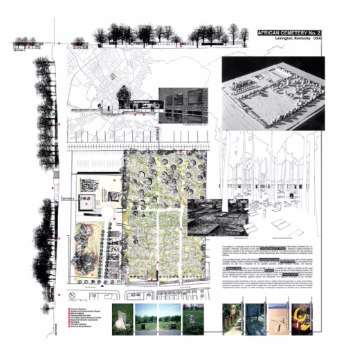
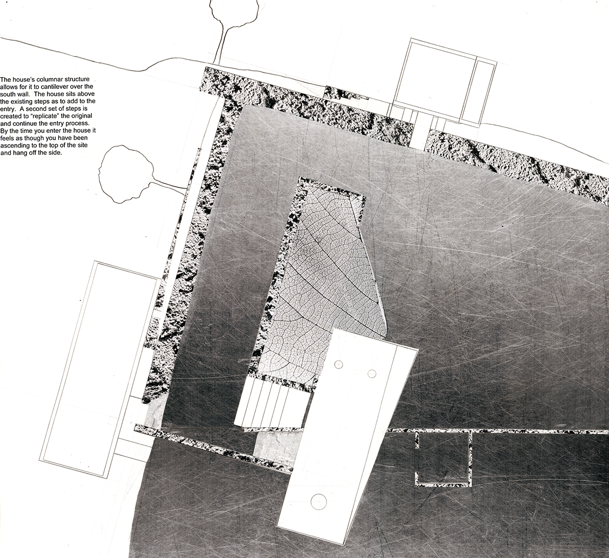
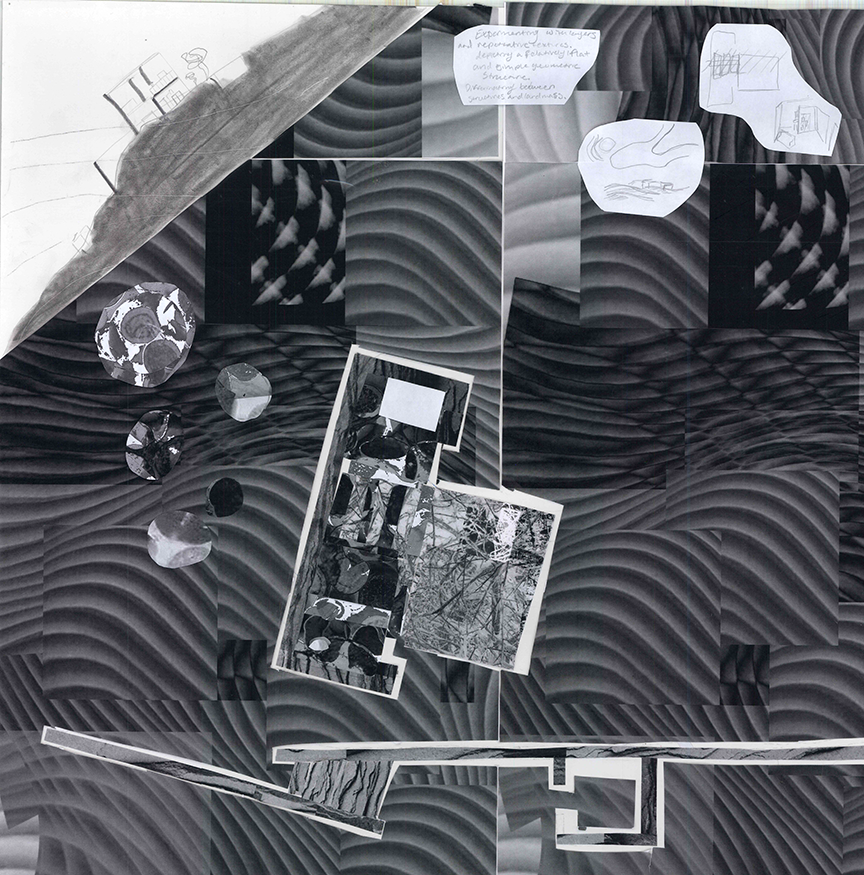
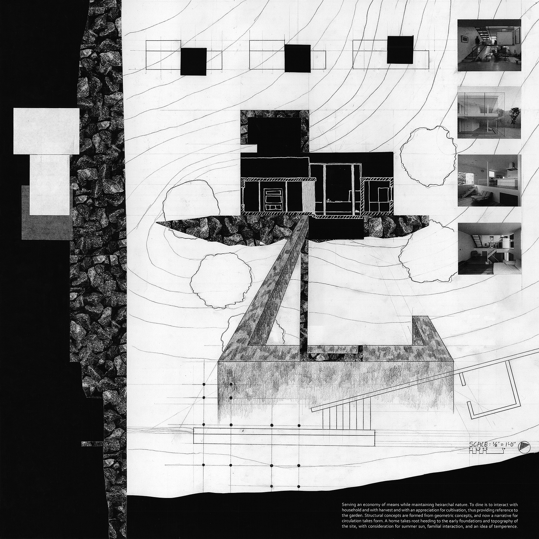
In some ways, the pertinence and originality of those paysagistes was similar to the Impressionist paintings of Henri Matisse who applied a Fauvist style on his work by emphasizing “painterly qualities and strong color over the representation or realistic values…” Grass was painted blue, thus gaining power of suggestion while the viewer knew it to still be grass. While most of Kienast’s renderings that I studied while in Zürich were in black and white, their collage technique remains powerful and graceful, rendering a visual forcefulness, and bringing a metaphorical and atmospheric delicacy to the designed landscape. I became enamored with Kienast’s way of thinking to the extent that I borrowed some of his principles for the rendering of a competition panel for the project African Cemetery No. 2, Lexington, KY (see images below).Within this context, I asked my second-year students to represent their first foray into the site plan for their studio project in the manner of Dieter Kienast.
- First, for the obvious reason of expanding the horizon of their curiosity. This assignment required them to familiarize themselves with other disciplines (i.e., Landscape Architecture and art collage) and understand modes of design thinking that might differ or parallel those found in architecture.
- Second, while each student can exhibit their own talent, I like to establish tightly aimed charette projects (compared to more open-ended design projects) where it is possible to compare and contrast deliverables. This allows for a more robust discussion at an important pedagogical moment. It is rewarding to see that with a focused brief one can achieve variety and interpretive excellence.
- Third, the notion of copying, borrowing and being influenced by other ideas does not lessen the students’ design authorship; in fact, it anchors their research within a larger body of work.
Student work
The following examples showcase a selection of students’ work both as interpretative of Dieter Kienast’s approach as well as unconsciously elucidating the German word Landschaftsgestaltung (Landscaping), with the all embracive meaning of the word Gestaltung that ranges from shaping, layout, formation, arrangement, structuring, composition and forming.


 To view additional student site plans