“Architecture does not exist without drawing, in the same way that architecture does not exist without text.”
Bernard Tschumi
Students of architecture have countless ways to express ideas about their projects. From concept to final presentation, they may choose carefully from many mediums to represent their ideas: diagrams, sketches, orthographic representations, perspectives, analog models, computer generated fly-through animations, details, and construction documents.
These tools for in-process and final project deliverables are no different than those used in a professional office; with the exception of the need to provide legal documents that are cross checked by experts prior to serving as a roadmap for construction. These construction drawings are another essential step in translating the architect’s ambition into a built artifact.
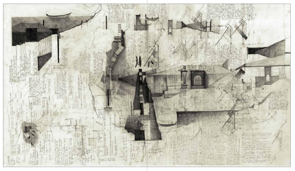
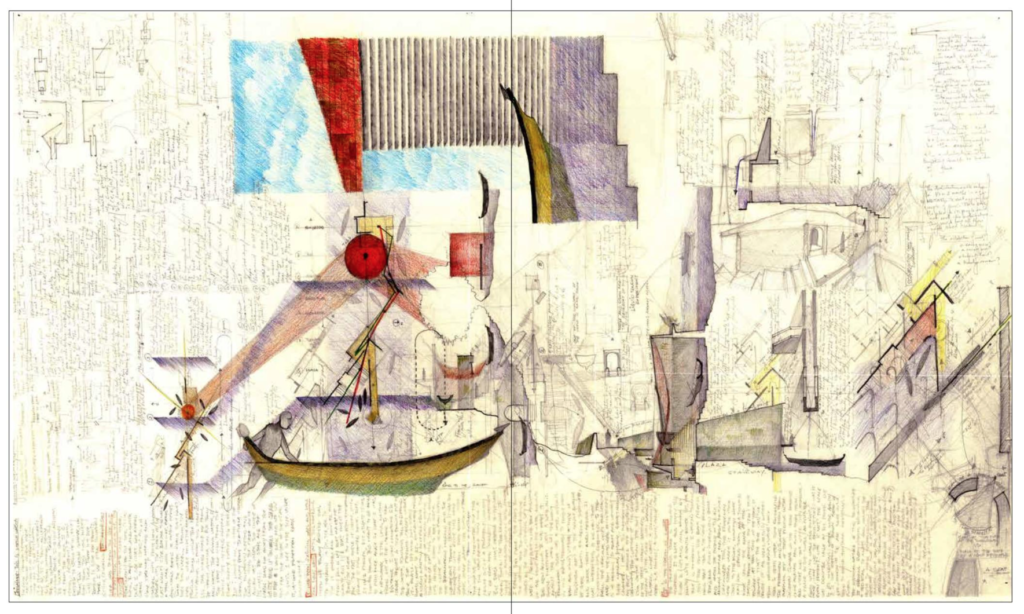
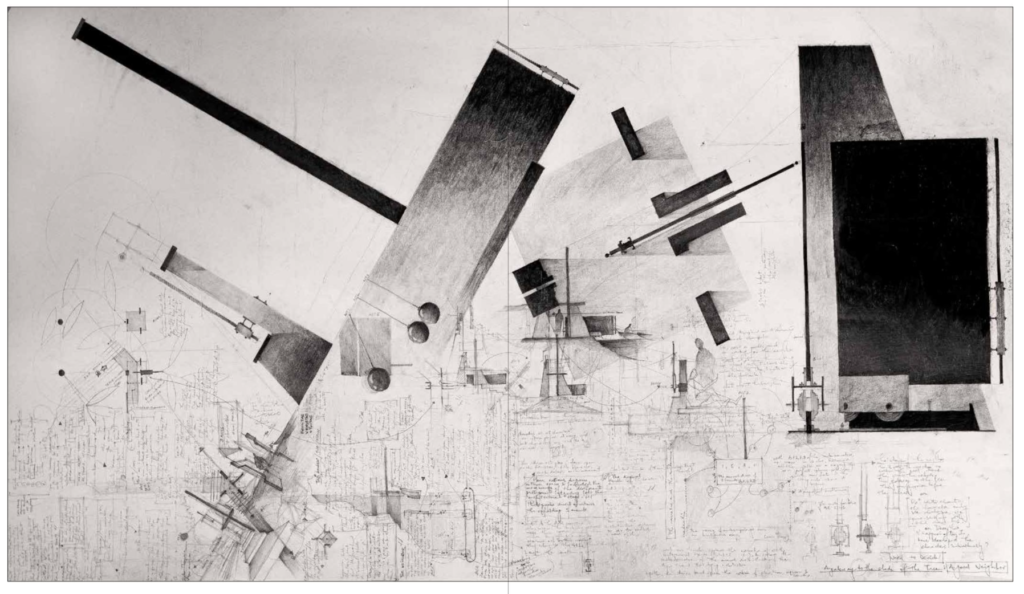
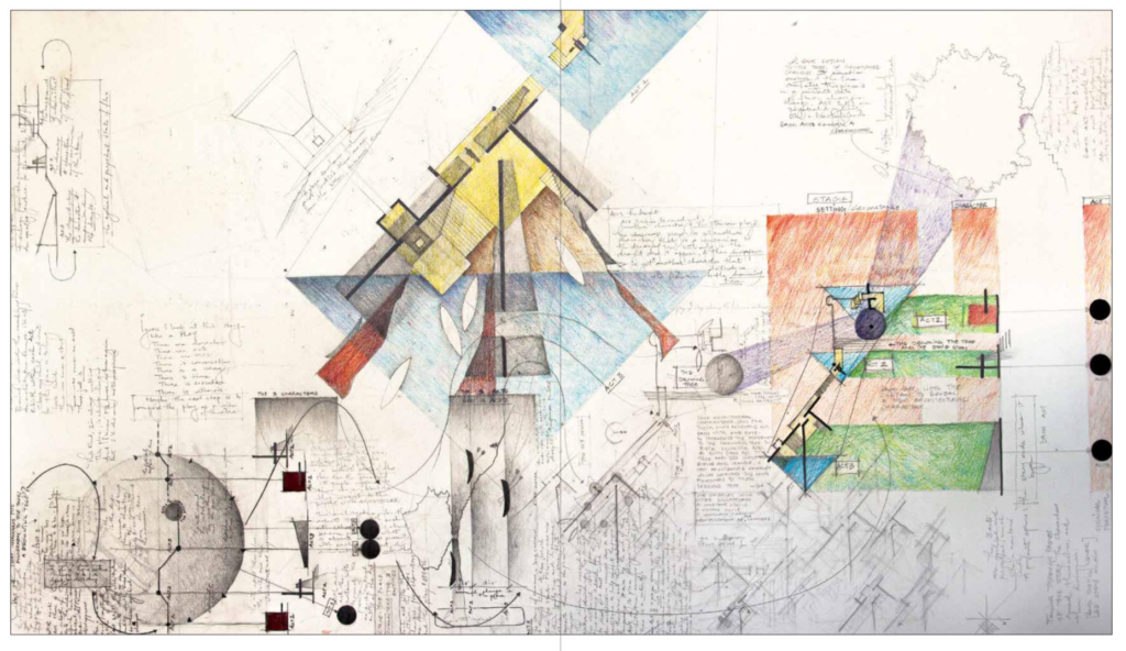
While many of these visual documents have been integral over the centuries in representing architecture, during the 18th century visionary utopic architects such as Boullée, Ledoux, Lequeu, and Piranesi promoted these modes of representation as architecture in their own right rather than instruments of codification leading toward architecture as a building (image 1 above). Since this paradigmatic shift, architecture drawings have become in certain circles art in their own right. Case in point, during the 1980s in New York City, the art world embraced contemporary architecture drawings and sold them through famed galleried including Max Protech and at MoMA’s Architecture and Design Department where they were well curated but nevertheless mummified (Image 2, below).
For me, the sale of architectural drawings has always created tension. If the drawings in their various idealized depictions become substitutes for built artifacts (pointing more toward the IDEA of a building), should contemporary tools of codification be created to inform the CONSTRUCTION of a building? This question has been debated endlessly by scholars defending each position. Additionally, if architecture retreats and becomes only pure art, or worse, an expression of a non-referential position that favors elitist and provocative slogans, what role is it playing in light of the myriad challenges of the 21st century?
Architecture as writing
The written word is another important method to express architectural ideas. Common to our daily lives, writing offers a powerful way to convey meaning. For example, since Vitruvius wrote the first treatise On Architecture (known as The Ten Books on Architecture), architects, historians, theoreticians, critics, and, closer to us, well-curated socialite bloggers, have used writing to offer insight into the world of architecture. In academia, I see two main reasons to have students write about their architectural projects.
First, from a didactic perspective such an exercise offers the pretext to focus on developing a correct use of written English. Second, expressing their ideas in writing offers the students the possibility of alternative descriptive narratives about the spatiality of their work. In other words, it is a way to clarify their work through another art form. It is to this aim that faculty invite students to add a brief description to their project during mid-term and final reviews. To my regret, these written components are often done at the last moment, are poorly written, and are rarely read by faculty or leveraged by their authors during critiques.
Building on these thoughts, with my second-year design students I launched three moments called writing interludes. Similar to the incremental skill building practiced through architectural sketching, refining written ideas relies on an iterative process. In our case, rather than asking students to repeatedly wordsmith for a single essay, I specified three different ways to describe their project using shorter essays, emphasizing that the writing needed to be concise and clear in its descriptive nature.
Three writing interludes
The first essay allowed the students to explain their overarching architectural move using their own natural writing style. Since the essay was requested early-on during the project, it was also a moment to help them define what they were seeking in the visual manifestations of their design. Typically, this first essay conveyed the functional disposition of the assigned spaces, and with only a few students transcribed a vision, the BIG idea, or the calling of the project.
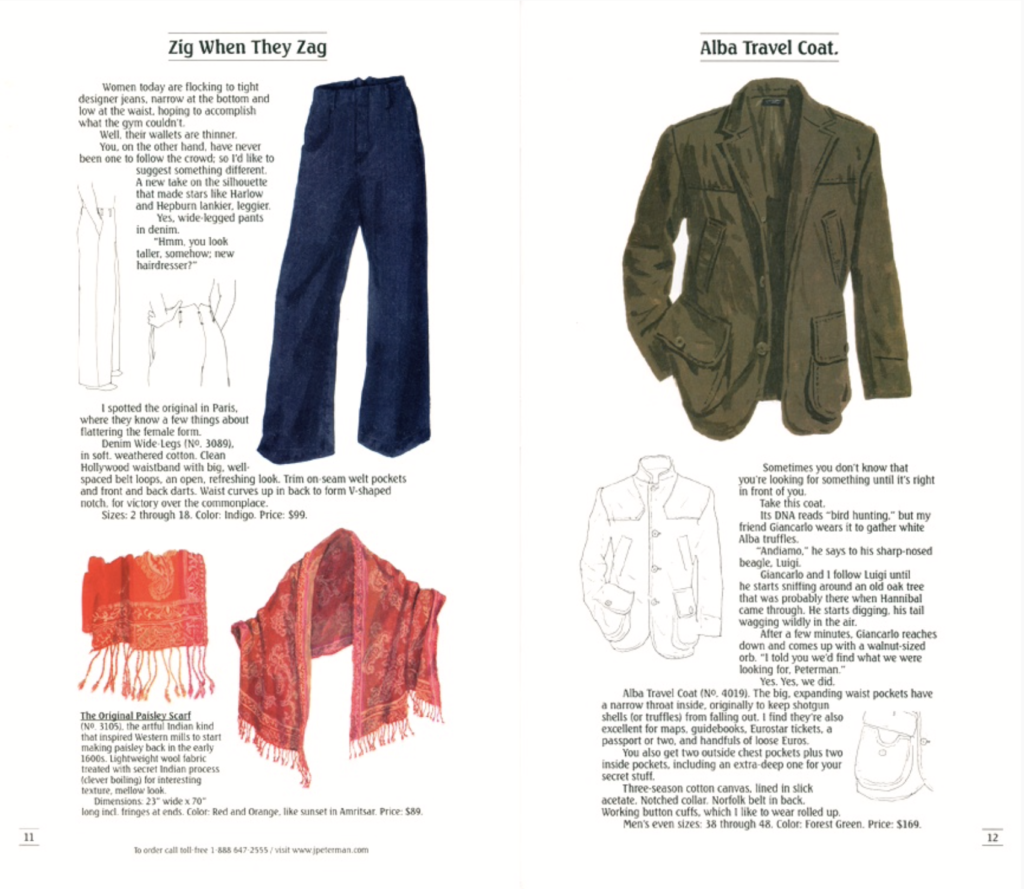
In the second iteration of the essay, the students had to promote the unique atmosphere of the loft they have envisioned, with the caveat that it be written in the playful manner found in the descriptions included in the famous J. Peterman Company Catalogue. The essays must focus on “hyper-creative product descriptions;” a sensuous feeling of comfort and luxury without “…really talk[ing] to you about the features of the product. They talk to you about the story of what it might be to live in that product. They focus on one idea: How would you want to feel wearing this thing.” In short, how do you make someone believe that it feels good and wonderful to live in the loft you are designing?
The third and final essay assignment asked the students to describe the loft in a poetic style akin to author Hisham Matar as he recounts his personal experience (which is highly interpretative) after viewing the Sienese painting by Ambrogio Lorenzetti: Madonna del latte, 1324-25, located in the Museo Diceosano in Siena, Italy. Matar’s writing is both poetic and precise, descriptive and evasive, yet always underscores the humanity art expresses so beautifully.
During this exercise in writing styles, I have discovered that many students enjoyed this interlude and showed great writing skill, often exhibiting more precision than with some of their conceptual sketches. Playfulness and precision of thought was carried through with careful choice of words, often lending a poetic elegance to their essay, notably when stuck in their design process.
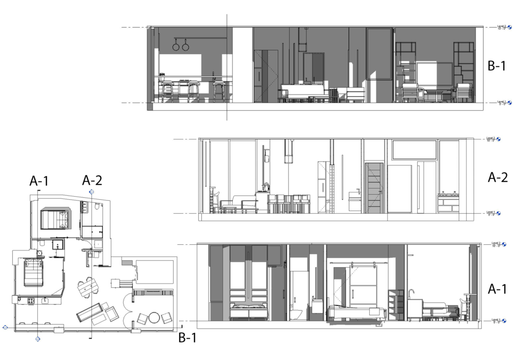
The following three writing interludes are from a student based on their loft design as shown in Image 4 below.
Writing Interlude 1
Dripping in tranquility, absent of antiquity, the Loft at 611 West 56 street is a true feat of modern design. Upon entering, each handcrafted detail envelopes the senses and creates a true sense of convenience and ease. Looking to enjoy a mellow brunch with your significant other? Try sitting at the kitchen bar, presenting you with views so breathtaking you may find yourself wondering if you should have married the skyline instead of the person next to you.
Come evening, as you retire to the master bedroom, you are ushered by a gradual funnel of light in the private corridor. With only the highest quality materials throughout the loft, you can feel the weight and sturdy nature of its design reflected in the many sliding doors. As you enter the master bedroom you are then presented with a choice of rest or wash and you are only every a few steps away from each with the bleeding design of the bathroom using glass elements. When you find yourself beckoned by the drowsiness of a long day, you are once again reminded of the modern beauty the NYC skyline has to offer. The ever-changing painting of unbridled elegance.
Writing Interlude 2
In the automotive world, few come close to the dapper and luxury of Aston Martin. The sophistication, demeanor and reputation all drive the world-renowned design of the vehicles. Put quite simply, the space at 611 West 56 is the Aston Martin of the modern loft. Much like a place the titular spy James Bond may spend an evening making martinis while saving the world. Only that would be an understatement.
This is the loft James Bond wishes he could stay in but is far too exclusive for the likes of MI6. The space is a perfect marriage between sophistication and comfort with notes of domesticity and elegance. With views so encapsulating you start telling others to save on a trip to the Empire State Building and come visit your loft instead. Every detail is crafted with the inhabitant’s emotions in mind. Such individuals want a passive reminder of the power they hold in society and with a god’s view of the greatest city on Earth all while eating breakfast and reading the paper each morning, this space does just that.
It never asks anything from those staying in it other than how they prefer their valuable leisurely moments to be spent. Perhaps in one of the two Eames Lounge Chairs in the library? Or cooking saffron infused pappardelle in the linear kitchen, all while reflecting an abstract view of the skyline at your back. For the loft is yours to do with as you please, but be careful. Having that much power could get to your head.
Writing interlude 3
Entering the loft, I am once again reminded of the many ways a spatial conversation can emerge. A negotiation of the forms and functions coagulating in a single, salient emotion. All the space asks of me is to attempt to understand the incoming transmission. This happens within seconds of emerging from the elevator. I sat on the entryway bench as I removed my shoes and placed them in the brutally convenient shoe cabinet across from me. Passing the static column on my left and suddenly I am teleported to an expansive, open concept layout. The contrast between the entryway and this newly discovered region borders on jarring but is calmly reserved using the furniture to create smaller sub-pockets of function.
This space is clearly evoking the essence of public and cooperative interaction that bleeds into the skyline of the city. Heading towards the kitchen I look to my right and almost feel pulled down the corridor towards what I instantly register as the bedrooms. This is apparent from the inclusion of doors in this space while the open layout to my left is void of any such necessary obstruction. The only threshold in the living room with any form of division is the elegant library I see.
However, the walls surrounding the door and the door itself are composed completely of glass allowing a combination of privacy and open interaction. The kitchen seems to be a blend of practicality and simplicity with all the storage and necessities hidden under the single plane countertop. At first, I am confused by the lack of vertical diversity but as I turn to face the counter I am suddenly seeing a reflection of the spectacular skyline that I initially thought was limited to my back’s view. It is clear the designer is using this subtle reflection of the many different building elevations as the embodiment of emotional verticality.
As the sun sets, casting layers of shadows throughout the loft, I retire to the bedroom, finally succumbing to the funnel-like pull of the private corridor. The bed seems to be the centerpiece of the room with a floor to ceiling element surrounding it. Acting as a closet, nightstand, lighting and storage, once again reminding me of the natural convenience designed into the loft. As I circulate around the room and begin to face the doorway in which I entered; I find myself at the entrance to the bathroom. It’s not demanding me to enter but rather welcoming me when I am ready. Eventually I settle into bed and gaze out at the synthetic skyline of lights, and I think about how throughout this spatial journey through the loft, I never once had to wonder where or what something might be, I simply felt the emotion the space was conveying.
Postscript
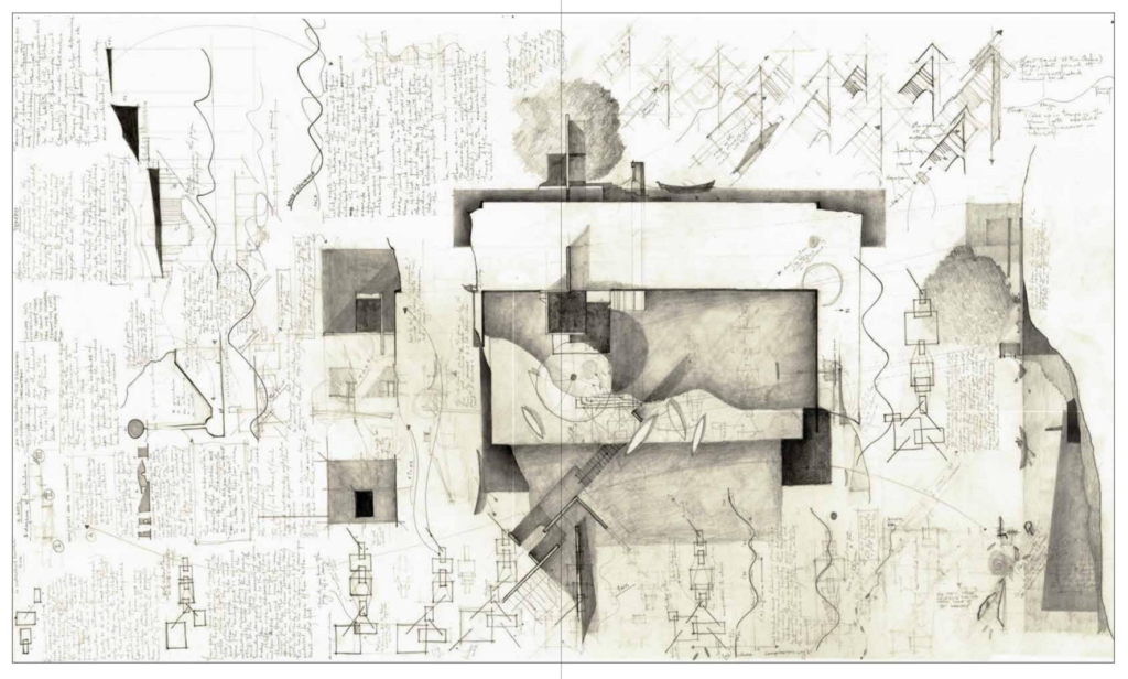
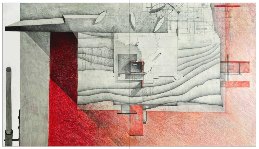
At times, the act of writing and drawing takes another path and merges to form an architecture thesis. The following six panels represent the culmination of a year-long research where the final deliverables showcase process and concluding architectural artifact as one single IDEA. The entirety of the student’s thesis can be found at Issuu.com.
