Drawing spatially. In a number of previous blogs, I reiterated that translating ideas into space is one of the essential responsibilities when educating an architect. Typically for students, coming up with an idea is not an issue in their design process. But transforming an idea—spatial complex ideas created in the mind and transcribed digitally or onto a sheet of paper—is altogether another beast.
This act of transforming from thought to paper is slowly mastered through iteration—a process that must be understood early on in education as it leads the designer to the next move and all those thereafter. This process is accomplished through various skills and techniques, ranging from conceptual sketching to representing a project through recognizable systems of notation such as plans, sections, elevations, axonometries, and perspectives, models, or digital fly-throughs. That those deliverables are presented in an analog or digital medium has little to do with a student’s ability to understand space as a three-dimensional entity.
To think spatially
The apprenticeship of learning to think spatially takes time and, as an instructor of second-year students, I emphasize that they need to acquire early on the ability to make design decisions through an integrative approach to projecting; one where spatial complexity is synthetically and simultaneously revealed. This allows students to gain an understanding that will allow them to tackle multiple issues simultaneously, rather than simply progressing homeopathically from one topic to another.
I know very well that this methodology is far from easy to absorb, especially as younger students tend to—at least in our program after a year of learning to design images and objects rather than thinking spatially—lack fundamental design principles pertaining to the discipline of architecture. This attitude seems to have been exacerbated over the past two years of the Covid-19 pandemic where online learning was often the sole source of formal knowledge building.
Thus, asking students at the outset of their first weeks in second year to juggle between several design questions sets them understandably in an uneasy and confusing situation, yet, over time they slowly—and eventually for most of them—acquire confidence that each design move is never to be understood as an isolated strategy. Within this process, I accept that students lack at the outset an ability to elegantly execute a holistic approach to the program’s description. Eventually, students gain an appreciation that moving between parts (e.g., functional distributions) without ever losing sight of the big picture is a welcome challenge.
After some time—along with the necessary growth done through a number of iterative exercises—students develop complex projects, even though the narrative prompt as described in the program’s brief is simple. However, beyond becoming skilled with basic analog and digital representational techniques, students tend to my dismay, to continue to present their designs as if plans and sections are not fully cross-referenced when amplifying spatial qualities of the design.
Or worse, that those two fundamental representations are still seen as separate and incongruent spatial entities of a project. The same uncertainty unfolds between perspectival and axonometric representations, one which emphasizes the perceptual expression of a space versus the second, which recognizes the objecthood of the described space. Both plan and section, and eventually elevations, as well as axonometric and perspectives must be thought of as complementary to truly think spatially.
An exercise: a spatial drawing

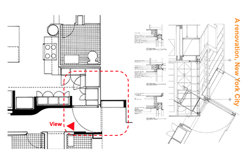
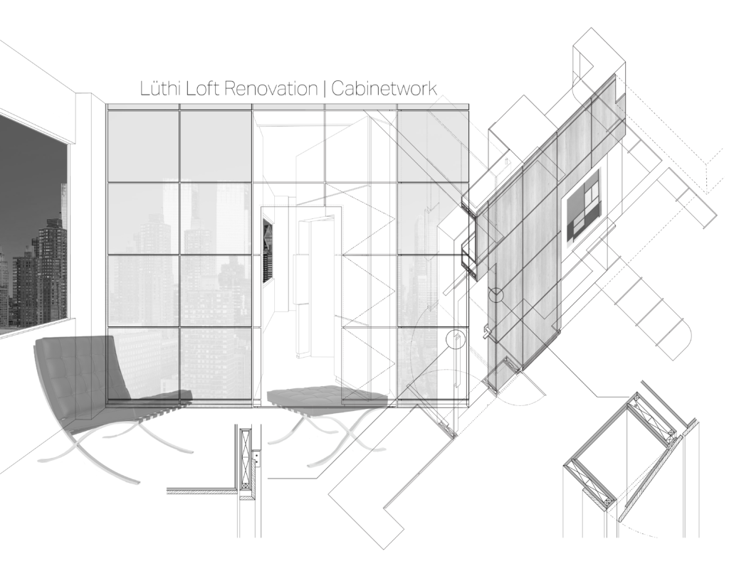
To have students focus on a particular spatial condition of their project, I recently developed an exercise based on a presentation drawing I did decades ago for a New York City renovation (Image 1, above). The idea was to combine a plan, section, elevation, and axonometric (I did not think of including at that time a perspective in my own drawing) of a particular space. In this instance it was one defined by built-in cabinetwork that included a door that closed two independent separate spaces through its positioning. The idea behind the drawing was to understand that particular space as not simply the door pivoting but the entire space pivoting around the vertical Z-axis.
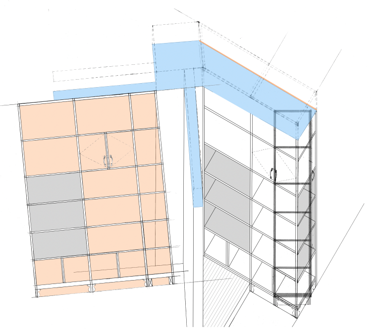
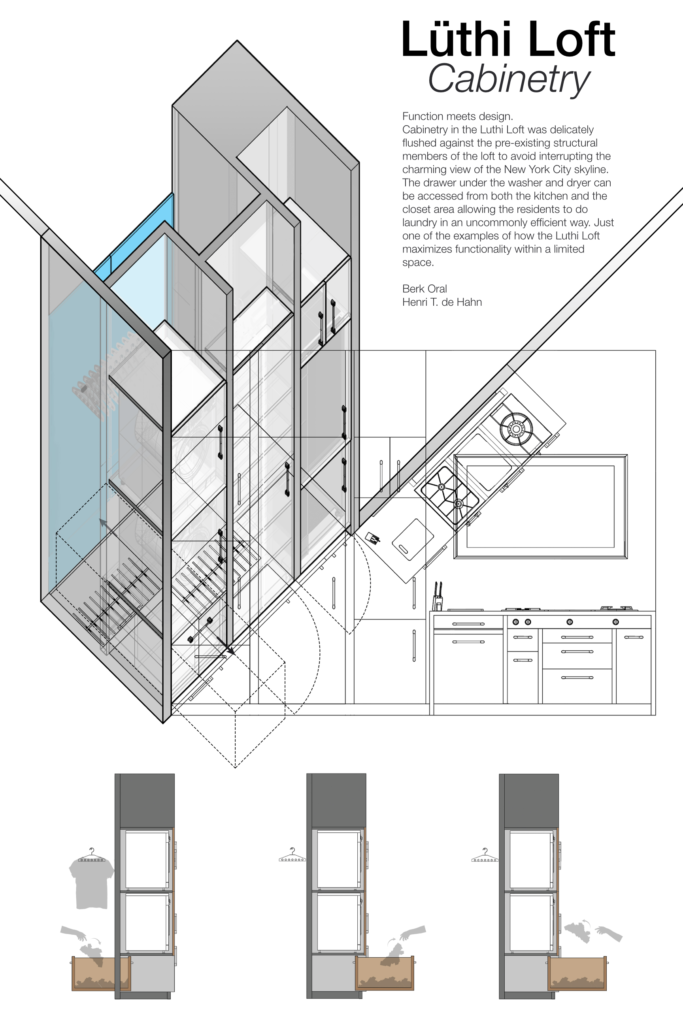
In the classroom charette, the students worked from an exercise where they already had to define casework and furniture, and provide construction and detail drawings appropriate for a cabinetmaker as a set of shop drawings. This exercise was their first foray into construction, anticipating topics generally covered in third year. With now having a charette focused on smaller scale ‘objects’, the hope was that students would appreciate that architecture is a matter of construction, or better stated, a matter of a culture of construction.
Thinking spatially
To be honest, as an educator, and arriving at the end of almost a year mentoring this group of students, I also wanted to test punctually their ability to see spatially, specifically to see if they could demonstrate that what they had conceived through various representational mediums were done with an integrative and synthetic approach. After discussing the assignment, there was the usual consternation and confusion (retrospectively, a student admitted that he initially thought it was nonsense) despite my sharing the example presentation drawing to avoid a prolonged period of them “not knowing what to do.”

It is evident that this exercise demands acuity and the utmost intellectual precision. Suggesting that the students work from a plan, then carefully select a section, and extend that section in axonometric, all the while providing an elevation, I recognize it is not something that comes easily at first. In addition, students had to—in the conceptual stage—understand that the final drawing would encompass a number of layers, thus the need to make each layer readable through appropriate line weight and transparency.
A representational drawing
Most importantly, students needed to define how to assemble the five modes of representation (plan, section, elevation, axonometric and perspective) in order to create a drawing that emphasized an idea; a synthetic way of thinking about their chosen space. Desk crits discussed various ways to accomplish such a drawing and emphasized that while clarity of reading was essential, students should develop alternative ways to express the legibility of their final drawing (i.e., working with various scales in order to not confuse overlapping lines and shapes).

Conclusion
All in all, beyond the ability to visualize a space, this exercise pointed towards something I cannot truly teach, namely the interior process of conceiving and thinking spatially in one’s mind. Seeing the end results of this charette opened up for each student not only how to represent space beyond the basic conventions, but it trained them to combine and seamlessly integrate an idea of space prior to setting any graphite or digital imprint on a piece of paper or on a screen.
Creating links between ideas and images became an essential modus operandi. Yet, students were experiencing once again a learned recuring theme, that the act of creating (aka projecting) is a recherche patiente (patient search accordingly to Le Corbusier) that can only be tested through sketching and thinking, thinking and sketching.

For additional select student’s renderings, please visit Axonometric drawing