Cafe do Cais, Portugal. During my first visit to Porto, the northernmost city in Portugal, I strolled through the charming historic neighborhoods and streets lined with beautiful facades, of course, stopping far too frequently to sample freshly baked pastel de nata, the country’s famous custard tart.
Like every visitor, I eventually ended up at the edge of the Douro River on the Cais da Ribeira, Porto’s famous river front walk, which serves mostly as a venue for endless souvenir stores (a necessity when you collect miniature metal buildings!), and hawkers selling tickets for boat trips and tours of the world-famous Port wine warehouses located catty-corner across the river.
The weather was temperate that mid-November day and offered those on the board walk a festive ambiance with views upstream of the nearby Ponte Luis I bridge (a double-deck metal arch structure designed by French engineer Gustave Eiffel, designer of the Eiffel Tower in Paris), and downstream to suburban Porto and, eventually, beyond range of sight, the Atlantic Ocean.

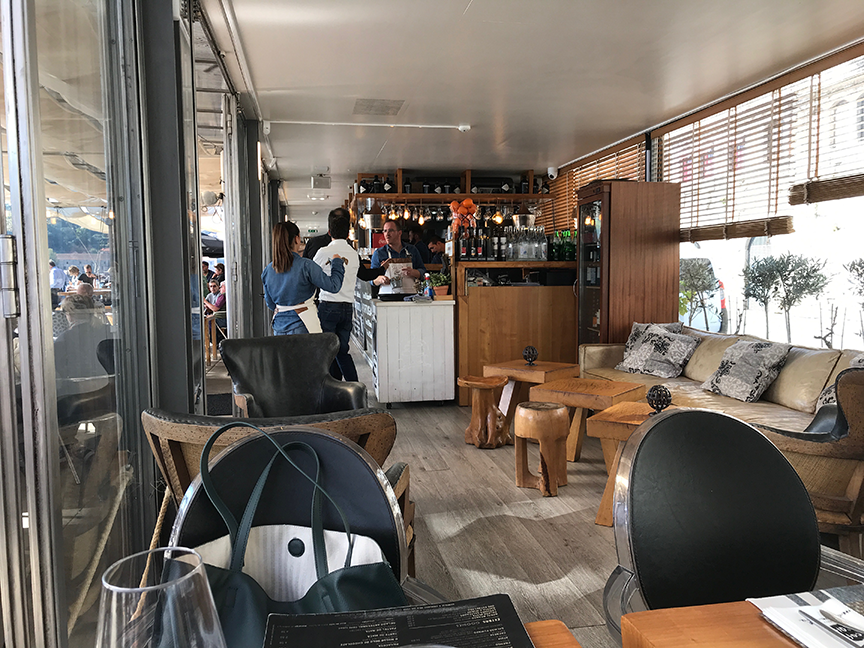
Looking for a place to enjoy a local meal with a cold white Sangria, I spotted a café that had an enticing menu and, particularly appealing to me as an architect, featured some very nice spaces—both inside and outside.

Unlike many other cafés built into the arched foundation walls of the river front, originally intended as storage space for incoming goods, the Café Do Cais was an isolated modern pavilion that took advantage of the increased width of the boardwalk. With its large outdoor terrace fronting the long narrow inside spaces, the architecture mimicked that of the wagon restaurant train cars which decades ago crisscrossed the continent between Paris and Istanbul.
Long and narrow, the café’s shape accommodated restrooms, an efficient galley kitchen, a modestly sized bar with a small yet comfortable lounge area, and ample dining space to seat thirty patrons, while the outside easily hosted quadruple that number of guests, critical for an all year-round climate.

The architecture was elegant and airy and, while wood furniture created a cozy and convivial atmosphere, the pavilion was constructed out of steel and glass with large doors opening to the front terrace. The architecture was industrial, straightforward in its constructive expression, and beautifully executed in its detailing.
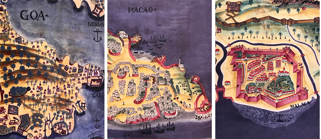
Particularly remarkable were the outside spaces that were covered with long removable canvas shades—complete with rope and pulleys to open or close them. Beyond being visually pleasing, the shades have an important role in regulating the outside climate. The shades were also reminiscent of small waves or perhaps the sails of boats arriving and departing the port filled with goods from near or far Portuguese trading posts—recalling exotic names such as Goa (India), Macao (China), and Malacca (Malaysia).
 The metaphor and the café’s architecture were perfect and at the end of the meal, provoked my interest to inquire who the designers were. Not surprisingly, the waitress promptly responded that the architects were Guedes Cruz Arquitectos (who designed the elderly housing in Alcabideche, outside of Lisbon) described many of the features of the pavilion. Yes, I was in Europe and the word architecture had meaning to most citizens.
I was so enamored by the simplicity of this pavilion, which reminded me how much I favor interventions that are not ostentatious or boisterous in their form making. Upon further reflection on my experience, I later incorporated a design project for a small café as part of the repertoire for my second-year design students.
For additional images, visit Café Do Cais
Housing complex in Alcabideche, Portugal