Chipperfield’s Kunsthaus in Zurich. During a visit to the latest addition to the Kunsthaus in Zürich, Switzerland—an extension that opened October 2021 more than doubling the museum’s exhibition space and making it the largest cultural institution in Switzerland—I was first and foremost enthralled by the magnitude of the art collection.
A collection of celebrated modern artists whose names, but not work, was mostly known to me. I was delighted by my visit, and this, despite the increased public controversy surrounding the origins of the collection, which had belonged to Swiss industrialist Emil Georg Bührle.
As collectors, patrons, and philanthropists are key to the growth and identity of many named collections around the world, at the Kunsthaus, the now permanently exhibited works that constitute much of the primary collection of the annex stem from Bührle’s fortune. This has become a well-founded malaise. Knowing that Bührle was “…selling arms to Nazi Germany, and that he bought art that was looted by the regime,” could not be easily dismissed as I entered the temple of art.
Emil Georg Bührle
With further research on the prominence of the collection, I also understood that Bührle’s ruthless arms profiteering did not stop at the end of WWII, but expanded to key geopolitical regions during the Cold War. Of course, concerns over the looting of art in any shape or form is not new among the holdings of prestigious museums in the western hemisphere. This continues to raise contentious questions about the provenance and legitimate ownership of the artwork, with the obvious mounting pressures and increased demands for the restitution of disputed art to their original owners; be it individuals, families, indigenous nations, or countries.
Switzerland and neutrality
Switzerland made a first step in this direction regarding Holocaust Era Assets by endorsing the non-binding Washington Principles on Nazi-looted art; but this was twenty-five years ago—in 1998. These principles state that “governments agreed to encourage museums to conduct provenance research, identify art seized by the Nazis, and seek ‘just and fair solutions’ with the original Jewish collectors and their heirs on works lost due to persecution.”
On a side note, one which is nevertheless timely since the invasion of Ukraine initiated by the Russian Federation in 2022, much is discussed about Switzerland’s neutrality, especially as its arms industry remains a flourishing and lucrative business. Switzerland’s celebrated stability in the middle of Europe is much predicated on an earlier move towards neutrality in 1515—after devastating losses to the French at the famous Battle of Marignano—which was formally declared as armed and perpetual neutrality three hundred years later in 1815 at the Congress of Vienna; renewed in 1920 by the newly created League of Nations.
This position means that the country is armed for its defense, and is receptive to exporting arms to countries not currently involved in a war. Needless to say, Switzerland has capitalized on its neutrality by acting as an active diplomatic participant. And let’s not forget that The Swiss Guards have provided security to the popes at the Vatican since 1506.
This armed neutrality sadly reminds me that when living in Switzerland I was aware of the contentious deliberations surrounding that country’s role during WWII. With the opening of the new Kunsthaus annex, this unsettled history is again center stage. In other words, while having great pleasure viewing this extraordinary art in Zürich (170 exhibited out of the 203 donated), I could not help but filter my appreciation through the tragic histories behind the acquisition of this collection.
Karl Moser and David Chipperfield

This intellectual and emotional conflict was accompanied by mixed feelings about the architecture of the newly opened addition designed by British star architect David Chipperfield (2023 Pritzker Prize Laureate). Having visited a number of his projects, including, in Berlin, the Gallery building Am Kupfergraben, 2003-2007, and the Neues Museum, 1999-2009; in Vienna, the Perk & Cloppenburg department store, 2011; in New York City, the Valentino flagship store, 2014; and in Venice, the San Michele Cemetery, 1998-2017, I have—even as I write this blog—struggled with my feelings and remain unsure of how to approach his grand architectural gestures.
Chipperfield’s emphasis on distinctive abstract geometries throughout his buildings; the use of monumental and imposing spaces that were teased out in drawings through the sublime renderings of paper architecture of the 19th century (e.g., Etienne-Louis Boullée); and a conservative materiality based on stone (façade, precast pilasters, and interior cladding elements at the Kunsthaus); all remind me of styles sanctioned by despots who used architecture as an expression of their tyranny.

Of course, such forceful and deliberate intentions through the use of powerful vocabularies have been applied throughout the history of architecture. But my appreciation for humbler, yet distinctive additions to existing museums, makes me wonder why Chipperfield’s strategy failed to promote a more contemporary vision of a museum, rather than relying on the known building types that have exhausted their role in serving as a temple for the arts.
I will admit that this stance started with a certain preconception. First as a student, then as an assistant professor at the ETH, and later during impromptu visits to Zürich, I remember the original museum designed in 1910 by renowned Swiss architect and ETH professor Karl Moser (1860-1936). This style was considered a “paragon of architecture for art”; an austere revivalist Neo-Greek Secessionist building that nevertheless expressed its Vitruvian firmitas as a mediator between the 19th and 20th centuries in Swiss architecture. For this, Moser was fittingly given the title of “father of [Swiss]modernism.”
More about Hodler: click on image below

With multiple extensions, the first one by Moser himself in 1925, followed in 1958 by the Pfister brothers, and a modern annex by Erwin Müller in 1976, I have mostly fond memories of many paintings in the Kunsthaus’ collection. Art work by Hodler, Giacometti, Klee, and Tinguely to name a few, contributed to my formative education in Swiss art, as well as influencing an overall architectural language that I would use as an architect. The impact on me https://atelierdehahn.com/baron-tavernier-cafe-lavaux-switzerland-architecture/ is perhaps due to Moser’s intention that architecture supported the art, and was not—like many of today’s museums—a work of art in its own right that obsessively draws attention to itself (e.g., Jewish Museum in Berlin by Daniel Libeskind).

At Libeskind’s museum in Berlin, I remember the galleries standing silent for three years after the building’s completion, waiting for the opening of the permanent collection; almost acting as a memorial to the extermination of Europe’s Jews. The building fascinated the architectural world for its boldness—”A museum that has been hailed as one of the greatest architectural achievements of the past 100 years,”—and perhaps, more importantly, acted as a stamp of approval that Danny was able to translate his fabulous Micromegas series of drawings into buildings. I remember visiting the empty building as a young architect and being impressed by specific spaces that still had resonance during subsequent visits (Image 3, above).
However, after returning years later to the Jewish Museum, with the permanent collection solidly in place, I could only wonder at how the boldness and strength of Libeskind’s architecture had failed to carry the weight of its ambitions: to celebrate 2,000 years of Jewish culture in Germany.

Seeing in one of the elongated rooms a number of Holocaust era colored drawings by children depicting themselves in front of cattle cars or at Nazi Concentration Camps—unknowingly or fully conscious of their fate—I could no longer take seriously a single vision of an architecture at the expense of multiple collections that surpassed in meaning any tectonic intervention under the pretext of encapsulating the architect’s interpretation of a collective memory.
The Kunsthaus annex

In a certain way, I have a similar attitude towards Chipperfield’s sense of place and the role of architecture as a cultural act, while acknowledging that he does celebrate the work of artists within the confines of those newly created spaces. Therefore, I found delight in particular moments of his work at the Kunsthaus.
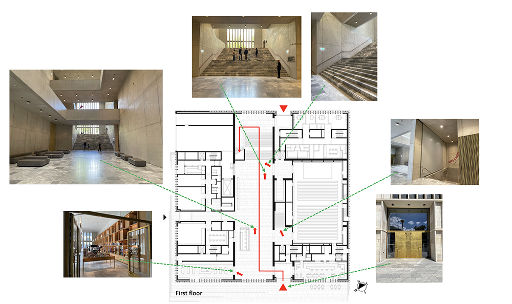
Although my delight was certainly not in the monumental central entrance hall. Nor, to a lesser degree, Chipperfield’s modern interpretation of an established museum typology, or the gallery spaces per se—although they are successful because the art is allowed to take center stage. My interest was twofold: first his urban principle of settlement (Image 5, above plan), and second his transitional spaces between galleries (Image 7, below).
1. Site strategy
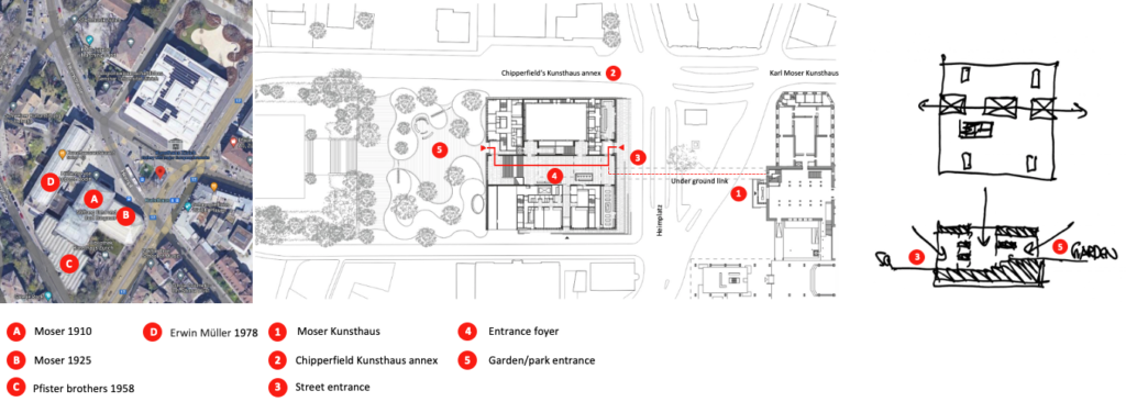
Developing an architecture promenade throughout the site (Image 4, above), Chipperfield was able to link visually and physically (e.g., through an underground passageway) the elements of the existing Kunsthaus site (1, A, B, C and D), to the new annex across the street (2), culminating in the upper-level public gardens (1-5).
This urban strategy was further emphasized by a clin d’oeil to the materiality and treatment of the original 1910 stone façade and its subsequent 1970 addition; the latter with its vertical striations made of prefabricated concrete panels (Image 1, above, left and middle). Both tactics reminded me of the striking site strategy employed by Chipperfield in the Gallery building Am Kupfergraben, in Berlin; although in Zürich, the annex forms an isolated volume rather than being an infill to a site that remained vacant since WWII (Image 5, below).

Chipperfield’s projects cleverly comment on the existing context, and this mostly within a historical environment. He creates new interventions that incorporate, but do not replicate, previous architectural languages of neighboring buildings. But what really drew my attention in Chipperfield’s Kunsthaus in Zürich is how he developed key transitional moments as the visitor moves from one gallery to another. I delighted in recording them photographically in order to understand how they worked (Image 7, below).
2. Transitional passageways between galleries

Perhaps, my interest in many of Chipperfield’s transitional moments was triggered by my morning’s visit to the Landesmuseum addition (Swiss National Museum), which is in walking distance from Zürich’s train station and is a museum extension authored by Christ & Gantenbein completed in 2016. The 19th century existing building, which now acts as a preamble to the new intervention, features numerous door entrances between galleries; mostly taken from patrician houses as the museum collection focuses on Swiss artifacts, culture, and identity (Image 8 and 9 below).
Magnificent and opulent in their own right, the decorative aspect of those doors formally expresses a dignified passage from one space to another. And yet, despite the thicker structural walls of the building (because this was the method of construction at that time), the doors did not explore additional symbols of entrances as passageways, limits, edges, and thresholds; something that I saw more pronounced in Chipperfield’s abstract language at the Kunsthaus (Image 6 above and, 9-11 below).


After the monumental procession to the second-floor foyer of the Kuntshaus, which overlooks the ground floor, one can either enter the galleries to the left or right, as the building type is based on a symmetrical parti (a Beaux-Arts term where the spatial organization is based on function).
Pictorial expose
The following images (Images 10-12, below) associated with the three floors of the new Kunsthaus, showcase various passageways between galleries. They express transitional moments between the main hallway and galleries, and between rooms. At times, they provide a thickness between exhibitions spaces while disguising the six fire stairs. Treated with either a painted gray color or brass (a theme found throughout the entire museum), many passageways are more spatially pronounced and help curatorial design strategies differentiate collections and art periods.
The other treatment of transitional moments between galleries is expressed by the lack of thickness of the gallery walls. This allows continuity of a visit, unifying themes and artists through smaller gallery-type rooms—in contrast to the large gallery spaces. Analyzing the three floor plans, Chipperfield was able to subtly articulate moments between galleries, allowing curatorial liberty to focus on specific art work, with visual continuity or disruptions between galleries.
At times, he uses an enfilade to link four and five galleries, thus creating depth, which allows the visitor to appreciate the entire length of the museum. One of these spatial events is emphasized by floor to ceiling black curtains, giving both a sense of gravitas and domesticity to those spaces.
First floor plan

Second floor plan

Third floor plan

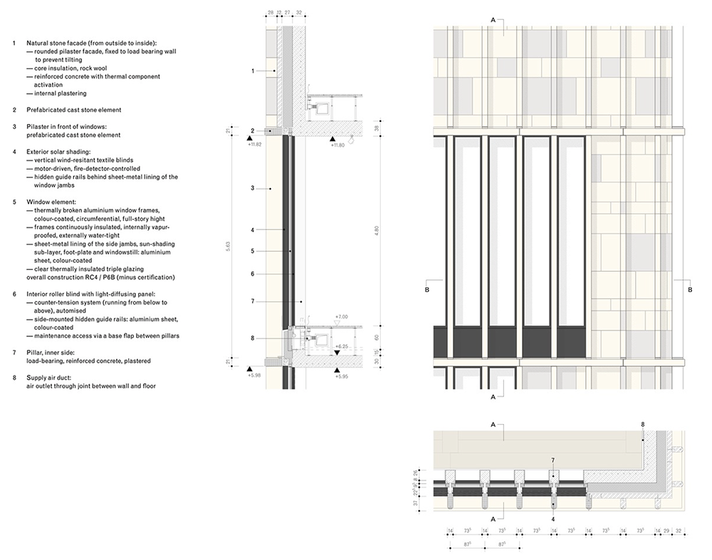
Construction detail of the facade

Conclusion
As stated earlier, there is so much to be appreciated in Chipperfield’s intervention beyond the use of the monumental architectural language that I find outdated and no longer appropriate for what a museum may stand for in the 21stcentury. I hope that when students visit either modest or monumental architecture, they take time to find pleasure at many scales. One does not need to ‘like’ the building to discover delight at other levels—perhaps without ever missing the purpose of the visit; at the Kunsthaus, the appreciation of art.