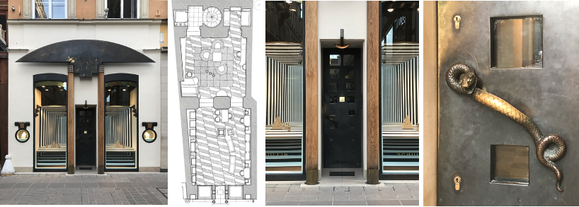
Revisiting Hans Hollein Schullin 2. In 1982, Herbert Schullin moved his store Schullin 1 (see blog) from the Graben to the Kohlmarkt, and commissioned Hollein to design the new store’s exotic façade, and luxurious salesroom interior (Schullin 2).
The Kohlmarkt, which became pedestrian in 1989, was, and remains, one of the most exclusive shopping streets in Vienna and frames the Emperor’s winter palace, the Hofburg, located opposite to the Looshaus, a masterpiece of Viennese Modernism located at Michaelerplatz. Certainly, a judicial choice for the second Schullin store.
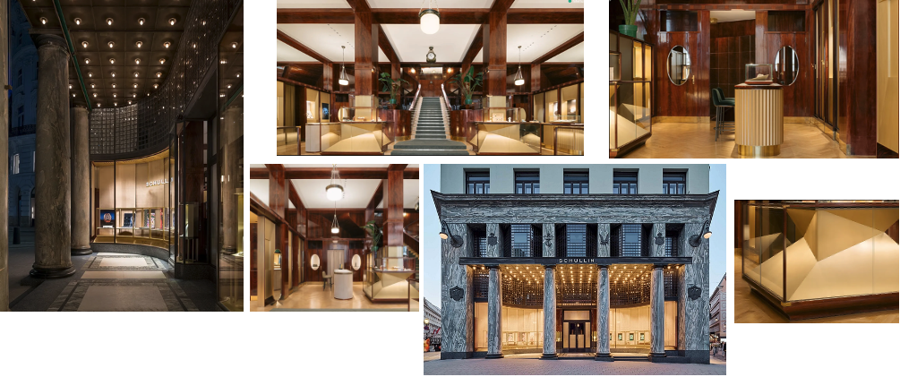
Of note, Schullin expanded and reopened in 2025 a third boutique marking the 50th anniversary of Schullin 1 on the Graben. Interestingly, the new store in located on the ground floor of the Looshaus and was designed by Italian firm Studio Plattner Mezzanotte Architects (Image 10).
The overall project for Schullin 2 continues the subtleties featured in the first Schullin store, but here, Hollein shows interest in the treatment of the facade as an expressive language of quotation that is part of a postmodern idiom. Intriguingly, without the witty ironies of his Anglo-American postmodern architecture colleagues (i.e., Robert Venturi).
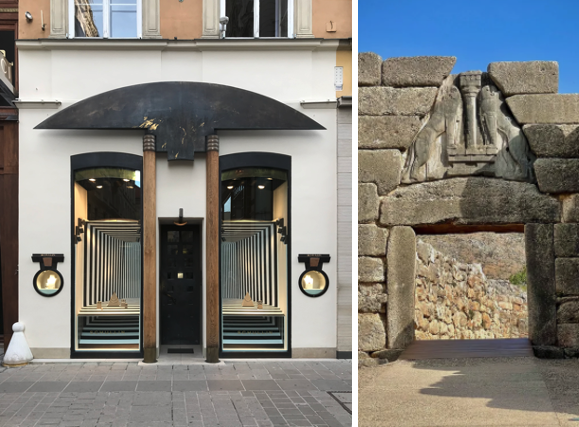
The façade acts as a sign; a ritual portal expressed through a strong symmetrical organization. Here, Hollein works with various opposing scales ranging from the urban, to the architectural, to the user. He accomplishes this with a 19th century ground floor typology, portal, overscaled display windows, tight entrance door, small jewelry vitrines emphasizing the preciousness of the contents (similar to Schullin 1), and door handle by sculptor Gero Schwanberg.
The architecture of the facade
The overall intervention of the facade demonstrates how Hollein is in perfect command of a symmetrical partie, one that has moved from a modernist idiom of asymmetrical ordering systems, to one that emphasizes architecture as symbol and artifact that conveys cultural memory. Between message and medium, Hollein’s interest is to move the debate from how a building works to what a building says and represents (Image 9).
While the white and almost pictorial neutral ‘canvas’ acts as a middle ground to the various tectonic elements set in motion by Hollein, the various spatial illusions of depth are strategic and clever.
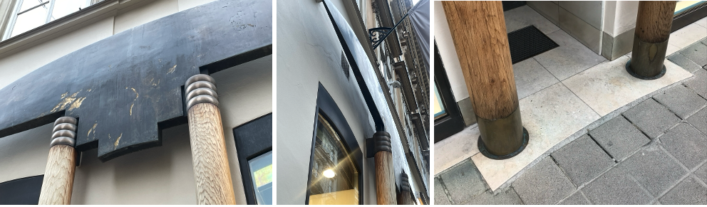
Starting with the foreground, Hollein sets in place an entrance constituted by two wooden circular columns of deliberately distorted proportion. Acting at an urban scale with the above canopy, they frame a deeply recessed entrance. A clin d’oeil to the work of Joseph Hoffman through the design of the bronze entrance door with square windows; a language also appropriated by Richard Meier in his 1980s coffee set for Alessi. The columns are slender and beautifully proportioned. Not in a Vitruvian way, but exaggerated in the vertical dimension, giving an urban scale in rapport to the white stucco defining the store’s facade.
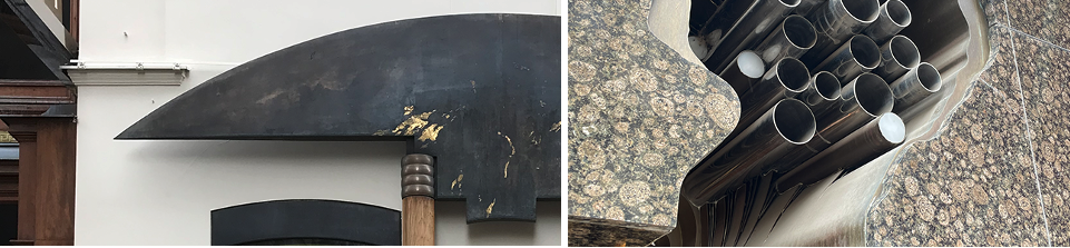
The columns have a base anchored to an entrance treatment with a slight inviting curve pavement, and capitals reminiscent of rings, on which a broad, flattened metal wing-like keystone is delicately set as if acting as an umbrella shielding the entrance and the adjacent display windows (Image 9 and 11). There is something tribal about this composition, a symbolic sign akin to the craftsmanship of a warrior’s spear, or the emblem of a daily tool hand-formed from steel.
I am perhaps even reminded of ritual markers set in ancient times in front of entrances to mark transitions and give protection or blessings at the moment of threshold between public and private. I mention this as the metal shield carries man-made gestures of its making. Notably, in these intentionally designed scratches, one perceives gold or brass that might be hidden beneath the steel (Image 10). A beautiful tension between abstract and classical materials.
The identity and symbolic value of this awning is unknown to me as I cannot find reference in any texts by Hollein. However, its form reminds me of the book by George Kubler, The Shape of Time: Remarks on the History of Things where Kubler talks about man-made objects as signs that are part of an interest in material culture, which jewelry has always been.
Conclusion
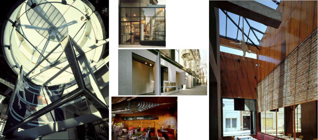
For students, it is imperative to understand that to become a great architect, one must start somewhere, and many of those that I admire started designing showrooms, stores, and restaurants, all places of an intimate scale. A few that come to mind: Steven Holl (Pace Collection Showroom, 1986, and Storefront for Art and Architecture in collaboration with artist Vito Acconci, 1993, both in NYC); Morphosis (72 Market Street Venice Beach, 1983, and Kate Mantilini restaurant, Beverly Hills, 1996, both in Los Angeles); Frank Gehry (Rebecca’s restaurant, 1980, Venice Beach, and New York Bagel and Co., 1990, Los Angeles). These are in addition to the turn of the century architects mentioned above and in the Schullin 1 blog.
I like to show my student these early works as they speak forcefully of the forthcoming maturity of each architect. To aim to design a Bilbao or Seattle Library is laudable and legitimate but not day one. There is so much to tackle in small spaces from programing, to aesthetics, and the formulation of one’s own language.
Postscript 1
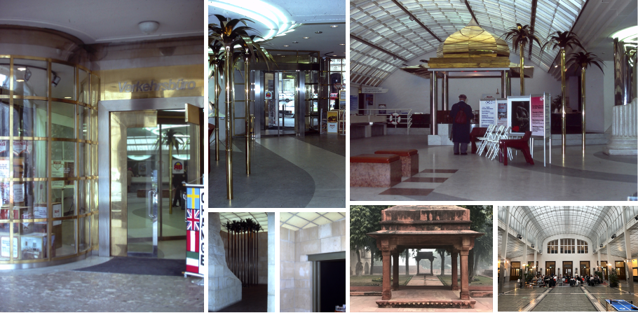
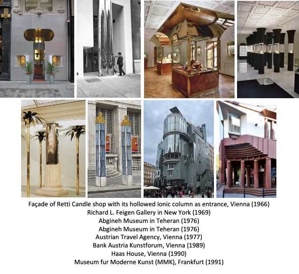
Two additional projects that have unfortunately been demolished or partially lost that I also visited as a student are the Austrian Travel Agency completed in 1977 on the Opernringhof fronting the Opera (1976-1978) and the Austrian Airlines/travel agency facing Stephansdomplatz (early 1970s). For the latter, only the entrance and the exterior column remain of the original intervention, almost like a fragment of a bygone past.
I vividly remember the Austrian Travel Agency. Freestanding architectural objects were placed within the space, almost like theatrical moments that offered a sense of travel to distant countries. I had not seen an interior space so playful with a miniature travel pavilion inspired by Indian Mughal architecture, stylized palm-like trees scattered around broken classical columns or forming an oasis in a back room framed by stone like a distant Egyptian temple. All of this covered with a translucent ceiling reminiscent of Otto Wagner’s Postsparkasse. Everything was so playful, the indiscriminately luxurious and reflective materials such as brass, gold tones, and marble where patrons could imagine the idea of elsewhere and easily project their next travel destination. I should have not appreciated this given my education, but in the moment, there was something undeniably sensuous in Hollein’s architecture.
Postscript 2
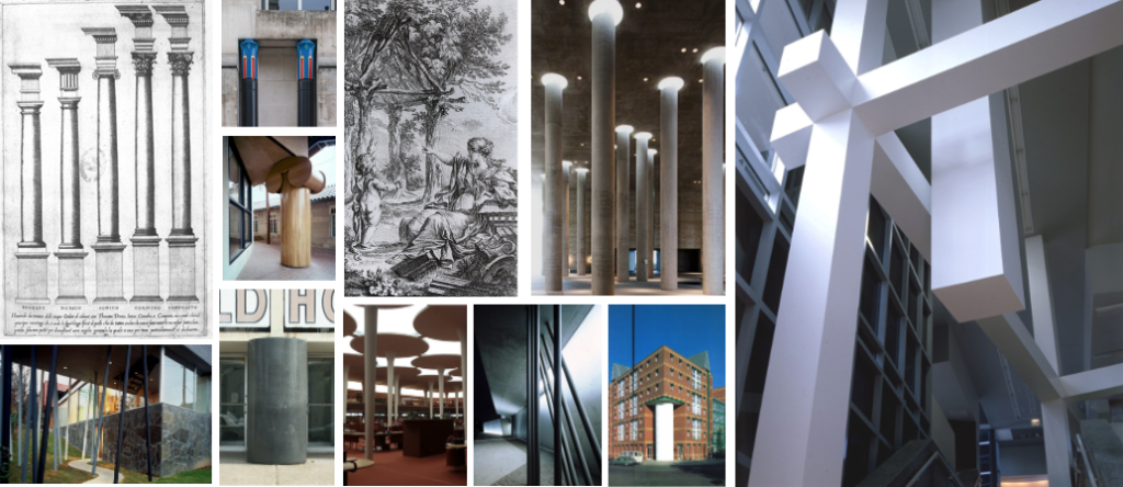
Researching this blog and the first blog on Schullin 1, I rediscovered that Hollein favored columns in many of his projects (Image 16). Hollein’s interest was in building on the lineage and poetics of the column as one of the earliest carriers of architectural meaning. This structural element has been explored, defined, and codified in the earlier treatises of Vitruvius, Alberti, and Palladio, moving through Quatremère de Quincy’s idea of the Primitive Hut, and leading to the development from column to the piloti by Le Corbusier, which later was reinterpreted by Venturi and other contemporary architects (Image 14).
Postscript 3
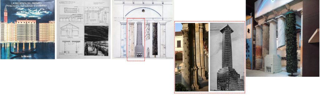
At last, I am reminded of Hollein’s entrance gate at the first Venice Architecture Biennale in 1980 titled Presenza del Passato. In line with his earlier interest in columns (Image 15), Hollein reclaimed the motif of the column—a key element of postmodern architecture—now at an international level.