Kuramata’s Kiyotomo Sushi Bar. During my last visit to Hong Kong, I learned that the Kiyotomo Sushi Bar, designed in 1988 by legendary Japanese interior designer and furniture maker Shiro Kuramata (1934-1991), had been purchased by the M+ Museum of Contemporary Visual Culture (M+).
I was unfamiliar with Kuramata’s work and his fame. Perhaps because during my studies, faculty at the EPFL favored Japanese architects (and sadly not interior designers) such as Ando, Isozaki, Ito, Kurokawa, Maki, and Shinohara. They had become the center of my preoccupation when studying contemporary Japanese architecture.
This cultural deficiency did not hamper my enthusiasm when discovering Kuramata’s postmodern interior of the sushi bar and I was pleased to see efforts by M+ to preserve the sushi bar. Their endeavors reinforced that architecture can and should at times be seen as Art.
Brief history
After a brief operational chapter between 1988 and 2003 in Tokyo’s Shinbashi district—known as the salarymen capital of Tokyo—Kuramata’s Sushi Bar switched ownership in 2004 to Richard Schlagman, a British entrepreneur and owner at that time of the design-oriented Phaidon Press. He was already an afficionado of Kuramata’s work.
A decade later, after the bar had been vacated, in order to save the iconic interior space from disappearing physically and culturally, the built project—which included the street façade and all designed interior furnishings—was purchased by the soon-to-open M+ in Hong Kong. This purchase was in line with the museum’s endeavors “collecting and studying Asian designs.” The foresight of including a built interior artifact was an extraordinary commitment from the museum to showcase design issues within the realm of the constructed.
Precedence
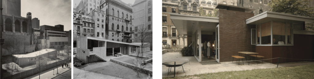
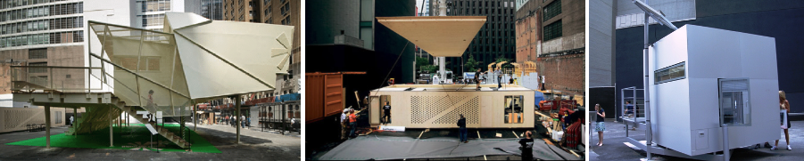
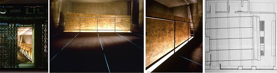
The Museum of Modern Art (MoMA) in New York City had twice hosted prototypical full-scale houses within the museum’s Abby Aldrich Rockefeller Sculpture Garden: Marcel Breuer’s Museum House (1949), and Gregory Ain’s Exhibition House (1950). Adding in 2008 the exhibition Home Delivery: Fabricating the Modern Dwelling, which featured five prefab dwellings commissioned by MoMA “as well as wall fragments that could be used in designing prefabricated buildings” (Image 2).
Four years later, MoMA purchased and brought back to life two iconic kitchens: The Frankfurt kitchen (1926-27) designed by Margarete Schütte-Lihotzky, and Charlotte Perriand and Le Corbusier’s cuisine minimaliste (1947) extracted from the Unite d’Habitation in Marseilles, France.
While I believe that showcasing modern exhibition houses was advocated by MoMA, already the World Fairs and International Exhibitions had similar roles providing the public with knowledge about modern design (e.g. the 1929 Barcelona Pavilion designed by Ludwig Mies van der Rohe and Lilly Reich). Furthermore in 1908, the British tabloid paper DailyMail of London launched the Ideal Home Exhibition in order “to bring together products and ideas for modern homes.”
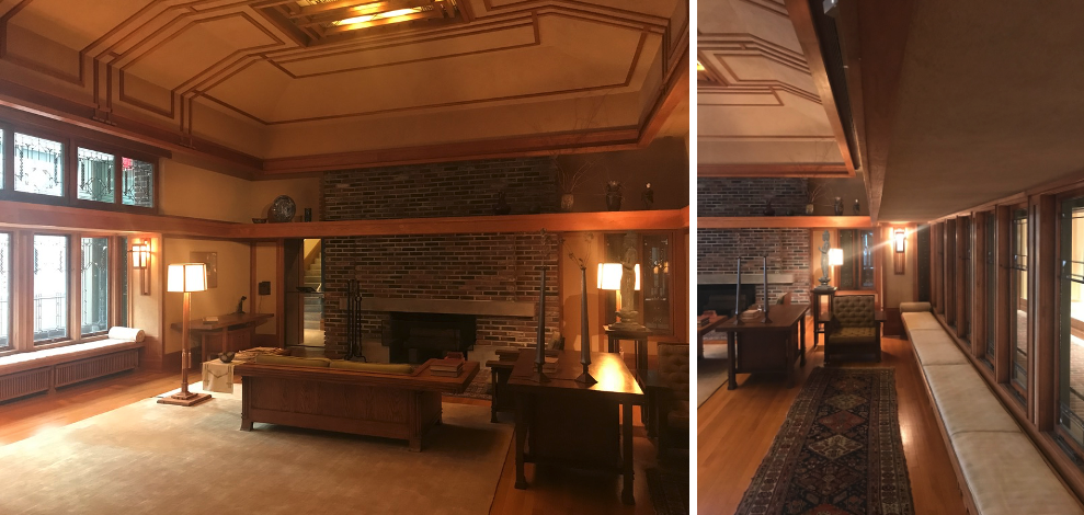
On a smaller scale, many museums have traditionally displayed period rooms or the façade of a building as part of their permanent collection (e.g., the façade of Sir Paul Pinder’s home completed in 1599 and now exhibited at the Victoria and Albert Museum in London). Mentioning rooms, I am reminded of one of my favorite that is displayed at the Metropolitan Museum of Art (MET) in New York City. It is the living room from the Francis W. Little house located in Wayzata, Minnesota, built between 1912 and 1914, and designed by American architect Frank Lloyd Wright (Image 4).
However, the exhibition of a non-domestic interior space (e.g., commercial space) had to my knowledge not yet been presented to the public until M+ acquired Kiyotomo’s Sushi Bar (aided by a gift from Schlagman). The careful dismantling, transportation, punctual restoration, and meticulous reassembly of the sushi bar in the M+ East Galleries, has been extensively documented along with its history, particularly in the following video and article.
Thomas Leeser Golden Bar
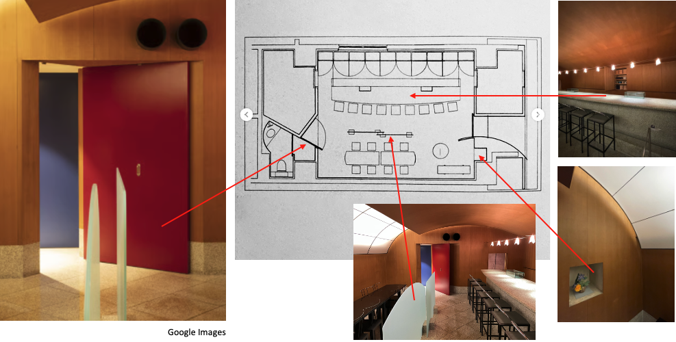
On a side note, Kuramata’s Sushi Bar opened the same year (1988) as the Thomas Leeser’s Golden Bar in New York City; a bar I visited occasionally while living there. Thomas Leeser was owner and designer of the bar who was at that time senior associate in the firm of Eisenman Architects. I mention the Golden Bar here as a comparison to Kuramata’s design. In an interview about the Golden Bar, Leeser mentions that “It’s a weird place,” and “…the Golden Bar is probably the most uncomfortable place in New York. And the most scary place” (Image 5).
Perhaps Leeser’s remarks reinforce the extraordinary appeal that Kuramata’s Sushi Bar exhorts about design excellence in a most understated way. The lesson here for me is that a statement can be made within a vocabulary of simplicity, elegance, humility, and quiet confidence. This is particularly interesting as Kuramata’s intervention was created in the midst of the postmodern movement whose key design leader was the Memphis Group.
Kuramata was invited by Ettore Sottsass to join as a founding member. And yet in the climate of quotations that gave postmodernism its design framework, Kuramata’s sincerity as a designer seems unapologetic in borrowing western ideas in their most understated and refined manner.
Kuramata Sushi Bar
The forms and spaces of traditional Tokyo sushi bars was reinvented by Kuramata with extraordinary subtlety, positioning it years ahead of the simplistic and intellectual provocations of the Golden Bar that was created solely to “disturb and challenge.” I lived at that time within the vibrant NYC architecture and art climate that accompanied the Wall Street of the “go-go 80s. This period was refreshing, provocative, and boisterous—despite an increasing commodification of art and new architecture that was sponsored and venerated by a want-to-be upscale clientele.
The output during that decade exhibited glitzy and gilded buildings such as the Lipstick, Trump Tower, and AT&T. I must however say that the newly acquired status symbol of art and architecture always failed to impress me beyond the simple WOW effect. I was at that time studying at the IAUS and Cooper Union; two educational approaches far from what was unfolding at our doorstep.
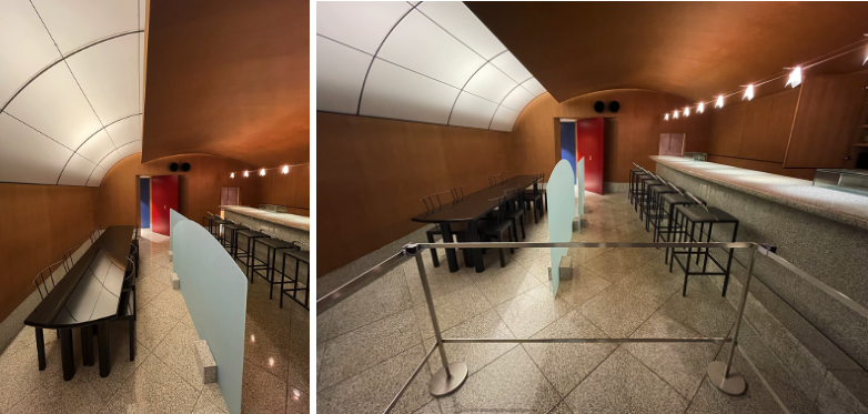
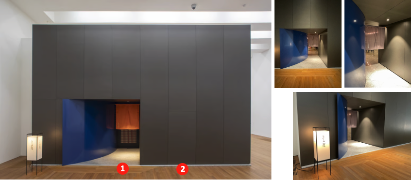
Needless to say, the preservation of the Kiyotomo Sushi Bar was a work of love, reassembling and adjusting each piece meticulously to restore the interior atmosphere as designed. The plan of at first glance seems of great functional simplicity: a rectangle with a dining area and sushi bar area, all within a single perspective.
Description of the sushi bar
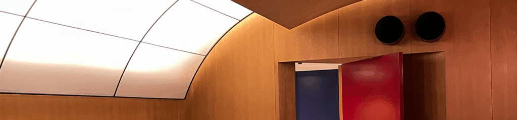
Traditional sushi bars reflect an iconic popular Japanese cultural and culinary experience. Kuramata’s design is faithful to this tradition where the sushi counter is the focal point of the space. There, a master sushi chef (itamae) is responsible for the perfect execution of all orders. At the Kiyotomo Sushi Bar, the overall space (roughly 656 sq. ft.) remains faithful to Kuramata’s minimalistic and serene ability to create a unique atmosphere by choosing materials that reflect a deeply acknowledged Japanese aesthetic. To complement the sushi counter, one finds an elongated two-piece wooden seating area that creates a convivial and communal dining experience.
To differentiate from the counter seating, the table is located behind two low translucent opal glass screens; one topped by a rectangular form while the other features a shallow semicircle. No booths or adjacent rooms disturb the all-embracing space. Everything seems in balance between what needs to be on display and what is not to be revealed. This strategy is emphasized by muted colors with the exception of the red and blue de Stijl palette that give definition to the front entrance and back bathroom door, all this with the complementary color orange featuring the traditional noren curtain at the blue curved front entrance wall.
If the floor plan seems functionally simple, the formal complexity is brought to a consecration in the verticality of the space. The ceiling features two asymmetrical gentle curved segments. The larger is made from veneered cedar panels, while the smaller curve allows a backlight to glow through a delicate metal frame made from acrylic panels. Although traditionally a vault suggests strength and material solidity, here the ceiling is ephemeral and almost paper thin and seems to float above the room.
Conclusion
Much can be said about the delicacy of Kuramata’s intervention and how, in a certain way, both form, space, and materiality are key to the success of the Kiyotomo Sushi Bar. While in the space, one feels a strong sense of belonging to an inner sanctum. I spent ample time admiring the delicacy of the room, asking myself what attracted me to the simplicity of its organization. I guess that once again, the conceptual thinking of the design made me envious, which was accompanied by a smile that great interior design continues to exhort magic and does still exist to be enjoyed in the built environment!
Postscript
The below description was featured near the entrance to Kuramata’s Kiyotomo Sushi Bar.
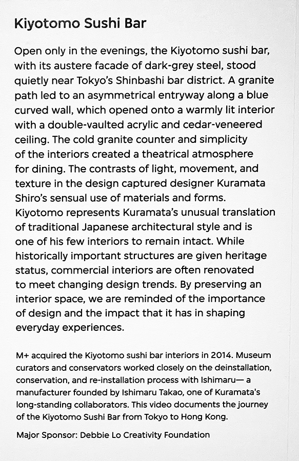
Image 8: Description of the project (author’s collection)