
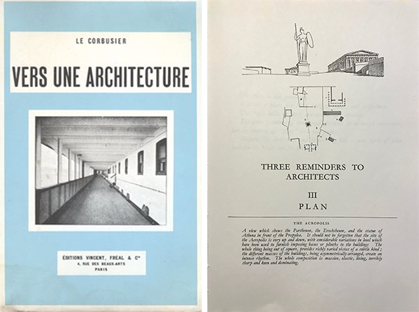
Question of section, Part 1. Swiss born architect Le Corbusier (1887-1965) wrote in his book Vers Une Architecture (Towards A New Architecture, 1929) in the chapter titled Three reminders to architects [mass, surface, and plan], that:
“The plan is the generator,
Without a plan, you have lack of order, and willfulness,
The Plan holds in itself the essence of sensation,
The great problems of to-morrow, dictated by collective necessities, put the question of “plan” in a new form,
Modern life demands, and is waiting for, a new kind of plan both for the house and for the city.”
Le Corbusier: the plan
Le Corbusier’s statements underscore the importance of the plan through words such as generator, order, willfulness and essence, as a way to understand how an architectural plan— which is a two-dimensional representation at a horizontal sectional cut through a building— establishes order, and above all, stimulates our senses at the scale of the house and the city. These exhortations are followed by the subdivision of the chapter’s contents into two equal parts: one included architectural plans of historical significance as well as from an architect contemporary to him, and the second part featured Le Corbusier’s unbuilt urban projects. The chapter concludes with a photograph of “A roof garden of a private house at Auteuil [Paris, France],” suggesting to the reader that a roof garden is a plan in its own right.
The Five Points
For those immersed in architecture, one understands that for Le Corbusier the roof garden is one of his “Five Points” that constitutes the second of the five key design principles towards a new architecture. By shifting the ground plane to the roof, the house now stands on pilotis (columnar structure), thus allowing the roof plan to be reinvented from a traditional roof style (i.e., gable, hip or mansard) to a flat landscaped and habitable space. As to the photograph at the end of the chapter, of course discretion seemed de rigueur at the time of publication, as the image was the home designed in 1923-1925 by Le Corbusier for his cousin Pierre Jeanneret.
Through Le Corbusier’s own sketches, the diagrams below describe the five points that are seminal to his architecture and which are always explicated in the following order with a proposal for a universal ordering system:
1. the pilotis (load bearing columns)
2. the roof garden
3. the free plan
4. the free façade
5. the ribbon window

It is important to note that in each pair of diagrams accompanying his ordering system (i.e., 1. load bearing columns), Le Corbusier opposes his principle to the traditional way of building (i.e., 1. load bearing walls). The dialectic between his vision of a new architecture and the currency of building is reflected in each of his diagrams.
Parallel projection
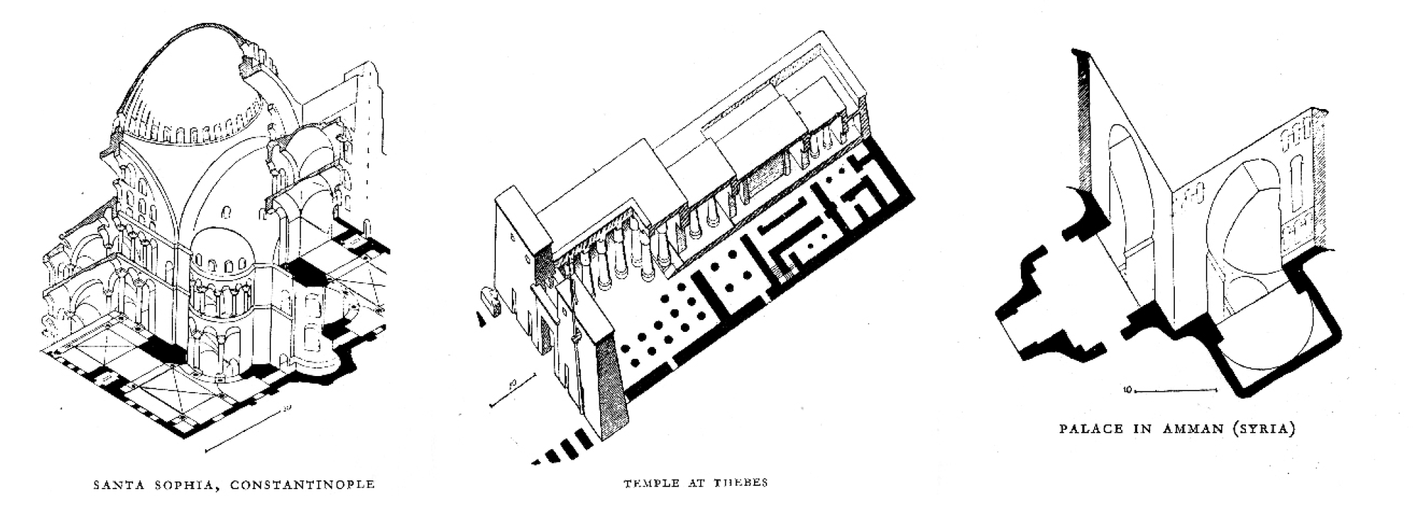
Returning to the chapter Three reminders to architects, III Plan, the importance of the plan is furthered through a number of images and their accompanying legends: “The plan influences…,” and “The plan is organized….” Of particular interest are the inclusion of several drawings from French architectural historian Auguste Choisy’s (1841-1909) book Histoire de l’architecture (1899) representing key historical monuments in pictorial parallel projections. These specific drawings are pertinent to Le Corbusier’s argument, as they represent buildings in plan (often seen in a worm’s-eye view) with their vertical expansion in space, thus creating volume and surface; two key reminders preceding the chapter on plan in Towards A New Architecture. Furthermore, it seems to be no coincidence that Le Corbusier included those types of “oblique drawings [as they] emphasize likeness, repetition, pattern, and order…” to underscore the importance of an ordered plan for a new architecture. (see below images).
Ecole des Beaux-Arts
Historically in an academic setting, the training of an architect was mostly accomplished through the drawing of plans where design and layout showed an interpretation of functional requirements, all the while giving meaning to the project through a major idea or thesis (an idea of the building). This was particularly true at the Parisian Ecole des Beaux Arts, the 19th century official French educational system that taught students to develop projects first and foremost through the drafting of a plan (below three images).

This approach to designing a project was best expressed by the word parti, which had to do more with the functional organization of a building, rather than today’s interpretation of parti to mean a big idea. The school’s traditional design process required students to relate the meaning of parti to the nature and relative importance of the constituent parts of a building. That mode of thinking trained students to decide what chief functions were to form the essential parts in the compositional hierarchy of their design, thus learning how to materialize those primary activities in plan, volume, and surface.
While we have briefly explored the primacy of the plan, what about the importance of a section in the design process? Especially that I often see students shy away from a thorough investigation of their design project through section.
Section
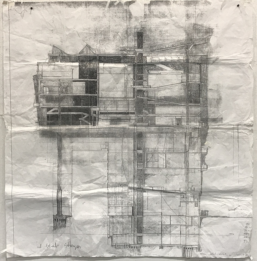
Similar to the plan, a section (cross-section) is a two-dimensional representation of a vertical cut through a building revealing spatial relationships between various floors and their extensions beyond the building. For a section to be meaningful, one typically chooses a particular moment in the building to capture specific spatial qualities that are expressed through both lateral and longitudinal sections.
Creating spatial qualities in section remains challenging for students, thus to ease any future hesitation, or even reluctance regarding the design of a section, I propose four simple thoughts. Each of the examples focus on the floor and ceiling/roof plane (see below images and diagrams)
Example 1: The floor and ceiling planes are constant
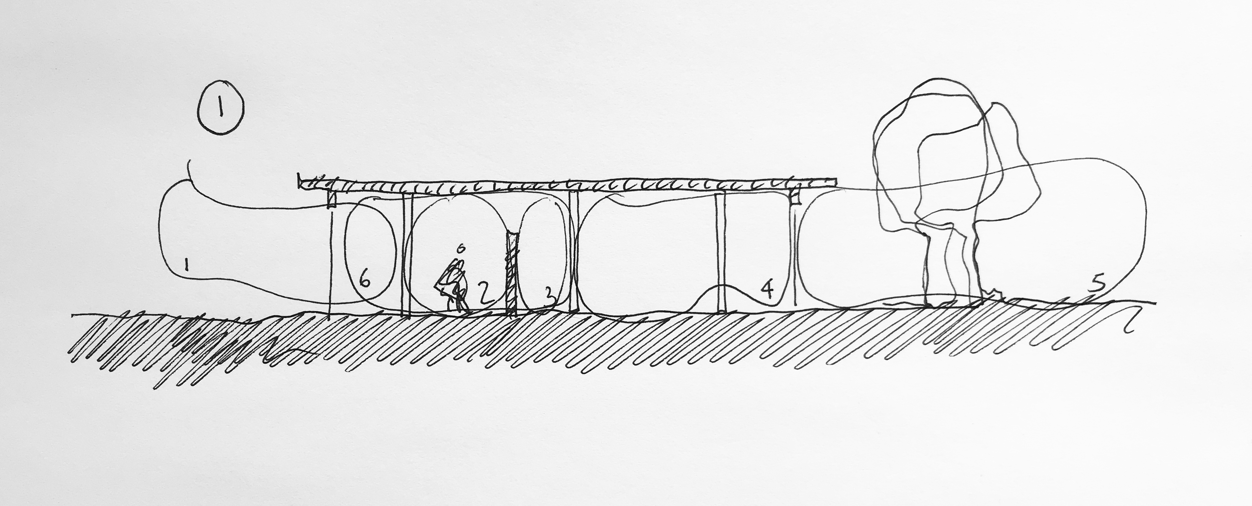
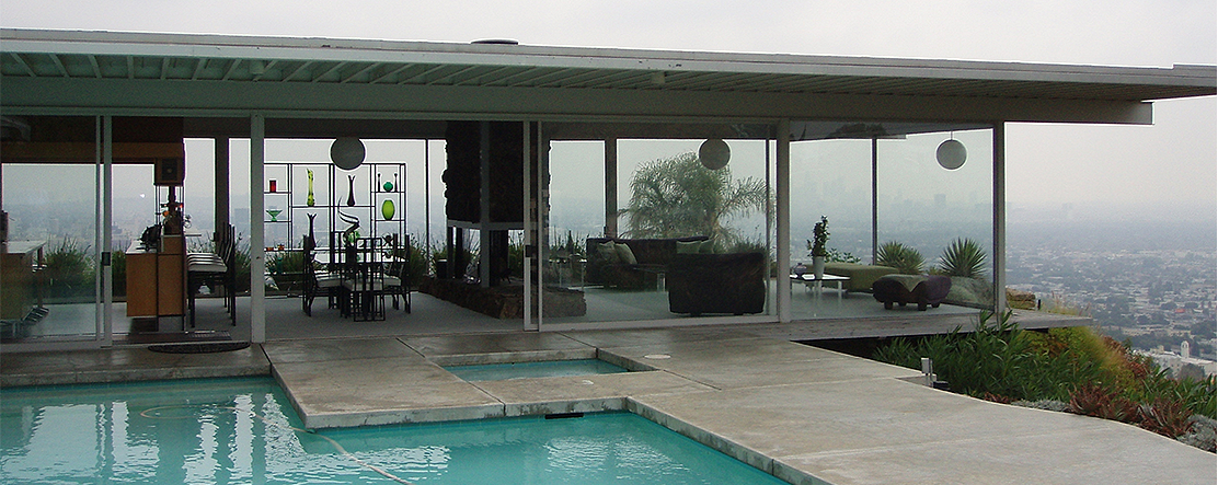
When the floor and ceiling/roof planes are constant most spatial qualities are not defined within the section through a specific floor or ceiling treatment. The above sketch outlines from left to right a continuous space, yet provides through a low cabinet and glass exterior walls multiple sub-spaces (1-5) suggesting possible functional attributes that are only fully revealed in plan. While the floor and the ceiling/roof remain neutral in articulating zones of spaces, the overall spatial conditions are present to give richness to the interior spaces.Detail of Case Study House #22, Stahl House, Los Angeles, CA, by Pierre Koenig, 1960
Example 2: The floor plane varies while the ceiling plane remains constant
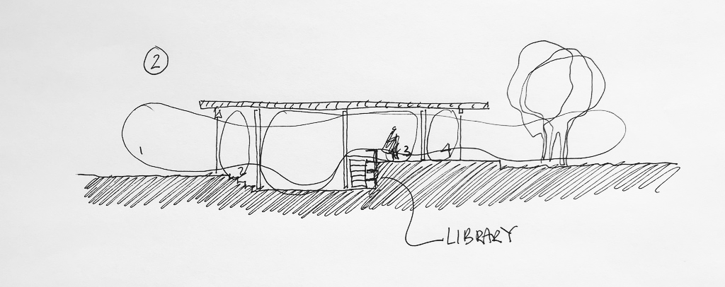
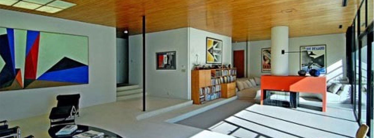
The above sketch outlines volumetric qualities based on a continuous space, yet it defines sub-spaces through the manipulation of the floor planes. While the ceiling/roof remains neutral, zoning of spaces (1-4) is defined primarily to the left by the floor recessing into the ground and accessed by steps. Simultaneously, an interior retaining wall forms an elevated floor ending with a terraced platform extending into the landscape on the right.
Most functional requirements take place on the various horizontal surfaces—although one many envision a library surrounding the steps, thus suggesting that the basic function attributed to the internal stair can be elevated to serve both as a transitional space and a library. The design’s volumetric complexity is defined primarily by the floor.Detail of Case Study House # 9, Entenza House, Los Angeles, CA, by Charles Eames and Eero Saarinen. 1949
Example 3: The floor plane remains constant while the ceiling plane varies
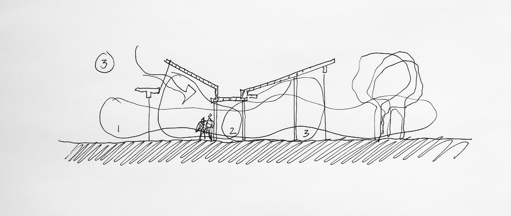
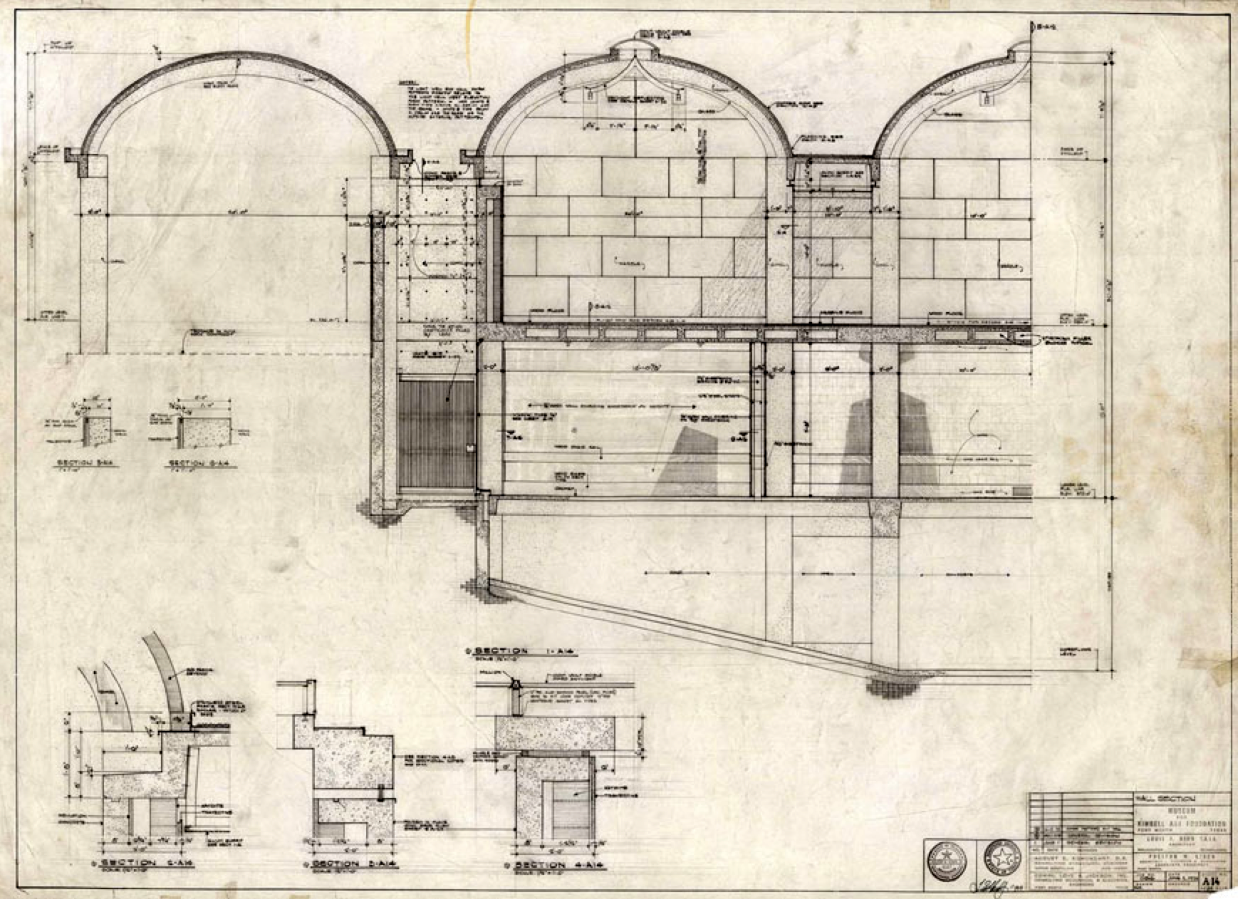
The above sketch outlines volumetric qualities based on a continuous horizontal floor plane, yet it is defined by sub-spaces (1-3) due to the manipulation of the ceiling/roof plane. While the floor remains neutral, zoning of spaces is achieved by the introduction of various skylights, a dropped ceiling, and a sloped roof. Each of these vertical changes in the ceiling/roof have a direct impact on how space is perceived and, most importantly, how it can accommodate or suggest functions within the house.Detail section through the Kimbell Art Museum, Fort Worth, TX by Louis I. Kahn, 1972
Example 4: Both the floor AND ceiling planes are variable
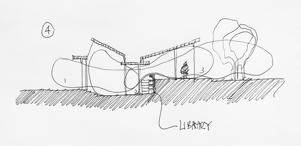
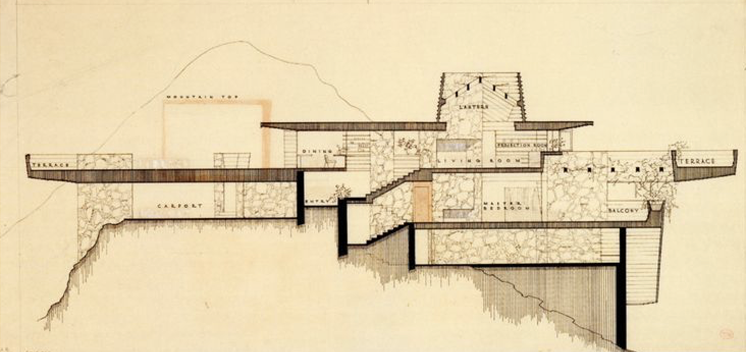
The above sketch represents a complex—and perhaps an over the top section—suggesting a number of sophisticated spatial conditions that take place within the sectional cut. For the convenience of following each example diagram (1-4), this last illustration is a result of combining the floor in example 2 and the ceiling/roof in example 3. There is an unintended connection between floor and ceiling in terms of spatial zoning, which was kept to not overwhelm the already complex section.
The intricacy in this example does not suggest that each section within a project needs such elaborate spatial conditions. Case in point, examples 1 and 2 remain, in the history of contemporary modern California architecture, two sublime examples of a new way of living, and this, despite the simplicity of both sections. Section of the Arch Oboler House: Eagle Feather Estate, Malibu, CA, by Frank Lloyd Wright, 1940
Conclusion
While each of the above diagrams and examples emphasize an exclusive approach to developing a section, it remains critical that the understanding and expression of a simple spatial (not a simplistic) design and/or spatial complexity (not a complicated space) is always accompanied by a deep understanding of the plan and the relationship between it and the section. This allows one how to think spatially.
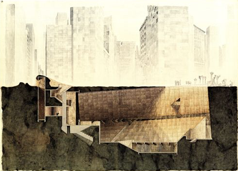



Cinematographic traveling in architecture
Architectural Education: Questions of section. Part 2
Architectural Education: Raimund Abraham