
I believe that there is always the need, a desperate need, for a world inspired by ideas. The Covid-19 pandemic interrupted many of our dreams, and while long overdue attention to pervasive societal inequalities has finally taken center stage, I fear that ideas, modest or radical in their outreach, are desperately missing in our daily discourse.
This might be true in many of our lives in general, but when it comes to architecture schools, I am particularly troubled when I see students who no longer dream, dream BIG, and dream BOLDLY. Perhaps this is because today’s world is so interconnected digitally that their youthful aspirations seem to already be fulfilled. Thus, the need to dream has become forgotten, or worse, is no longer treated as a necessity by some educators.
When looking back at my early years in academia, when I was at the University of Kentucky (UK), I feel the brash energy of the 1980s, a time when students challenged the established design world; a challenge often accompanied by the artistic commitment of the faculty’s individual or collective interests.
There is no question that the energy at that time at UK can be directly attributed to the leadership of Dean Anthony Eardley followed by Dean José Oubrerie, along with key faculty such as Leonardo (Leo) Ricci (1918-1994) and his wife Maria Grazia Dallerba-Ricci, Anthony Roccanova, Jerzy Rozenberg, Michael Cranfill, and Leonard Wujcik. Under their mentorship, student projects set in place ideas, a process, which often had little to do with integrating mundane elements such as bathrooms, assigned functional attributes, or even well-calibrated spaces. The phenomenological experience and its expression in space was for students and faculty the primacy of design decisions.
University of Kentucky
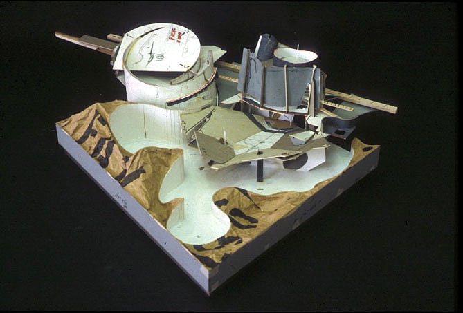
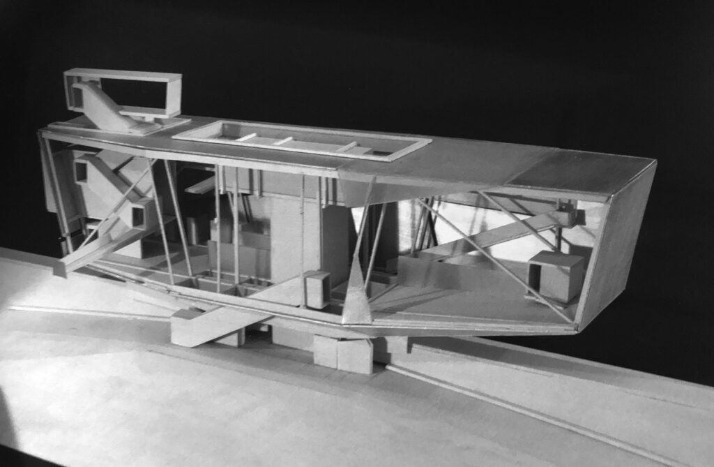
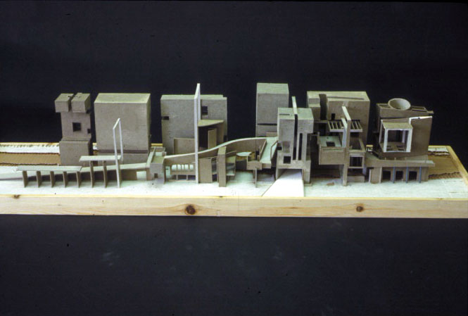
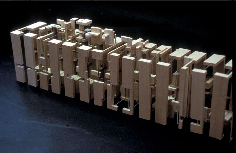
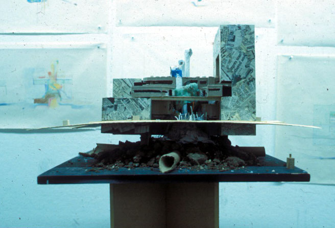
At UK, innovative solutions were often formally daring, personally courageous, and visually complex, but always associated with an innate dexterity of visual elegance, accompanied by an unsophisticated smartness and a healthy attitude toward the art of making. Rarely were models and drawings superficial, as students pored their heart and soul into the craftsmanship (at that time crafted by hand). It took time and dexterity, but their intuition ruled their design thinking process (Image 1-4, above).
In particular, three-dimensional models were the preferred method, as digital technology had not taken center stage in the art of making. Models were experimental and brash, and made out of any available found materials; always assembled as something that was astonishingly provocative as well as tectonically beautiful. Students knew how to combine ad-hoc materials while letting form suggest materiality. What made those models so astonishingly seductive was that they were both architecture and part of an art tradition named collage, and rarely a representation of a drawing or a building. They were about the IDEA of a building.
All of this was done with a je ne sais quoi attitude that made them the hallmark of UK’s architecture program, one of the leading design schools of the era. As Leo Ricci often mentioned, “students had guts” and were less interested in an overall intellectual correctness than in designing spaces and places. Having a vision overrode any notion of precedence, the design was intended to provoking the end user—most often faculty and reviewers. For the students, architecture was a dream that still had meaning not yet codified and domesticated.

The design courage of students
Leo’s comment remains appropriate today, especially for anyone familiar with his work: Housing in Florence, Maison Balmain, Palaces of Justice in Savona and Florence, cemetery in Jesi, and his book Anonymous (Twentieth Century). Throughout his built projects you will see the influence of his mentor Giovanni Michelucci (architect of the church of the Autostrada near Florence), and his partnership with Leonardo Savioli (apartment building Via Piagentina in Florence). All three men exhibited a seminal influence on the expressionist architecture represented by the Florentine school at that time (Image 5, above). Leo taught students to strive for an architecture that had a vision of society, and while he was critical of Le Corbusier, I think he would have agreed with Le Corbusier’s statement that “society is new, but form is always just” (emphasis mine).
For students at UK during that era, crafting the projects was intuitive and done mostly in model form, always carefully articulating the assemblage. To this end, students often expressed structural principles such as daring cantilevers through the subtle folding of Bristol paper to reflect static principles. Models displayed a process of making that was always personal without much regard for what the visual meant to an outsider. In a certain way, students still had the ambition to create their own architectural language through form, even at an early stage.
The necessity for an idea
The urgency to have an idea was about endless possibilities and the creation of spatial narratives, and I will admit that they were often fictive narratives and mostly evanescent story telling. Ideas that were not yet seen, while compelling tectonics were re-invented giving each project a naivety, a passion of gesture, and always an idea about architecture and the nature of complex spatiality.
In that climate of cutting-edge design excellence, I retained a pedagogical balance between the nature of ideas and the pragmatic necessities that needed to work in tandem to create an architecture of the present. Don’t forget, I am Swiss and enjoy at times a healthy dose of pragmatism. And yet, while over the years I have come to favor an approach to space making that often approximates that of interior architecture—because I like students to focus on the experience of space and care that students design a project with a user in mind—I still insist with my students that ideas, the fundamental production of ideas, are key to the success of any project. It is the setting in place of a vision—a model of life that Leo Ricci lived through his architecture—that sustains a project, and can never be done without a certain degree of boisterous tectonics.
Two student projects
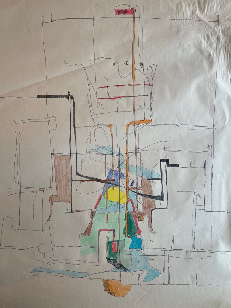
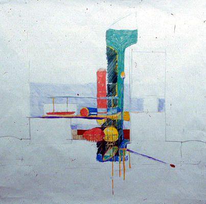
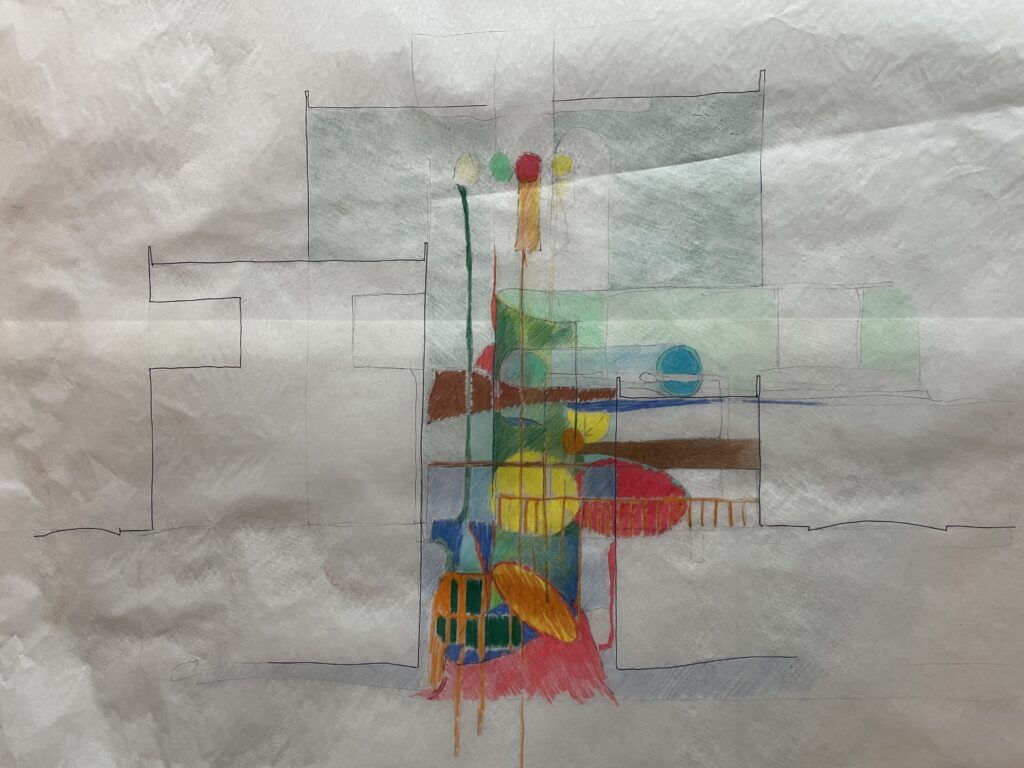
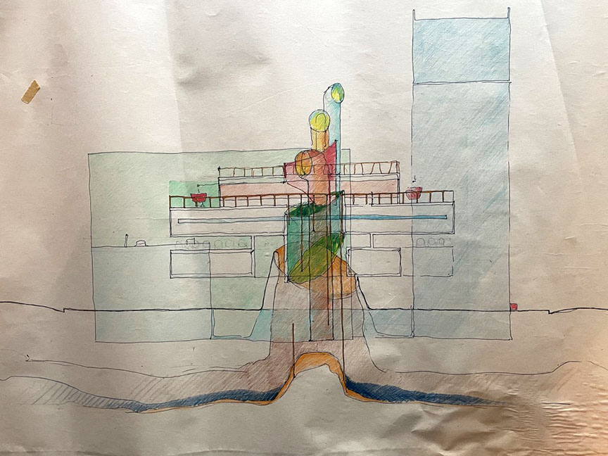
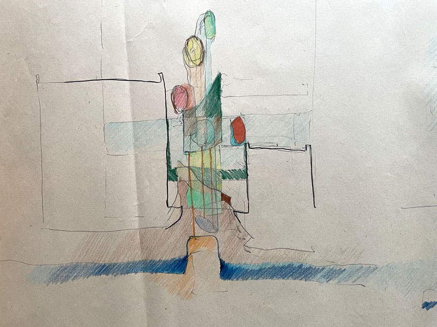
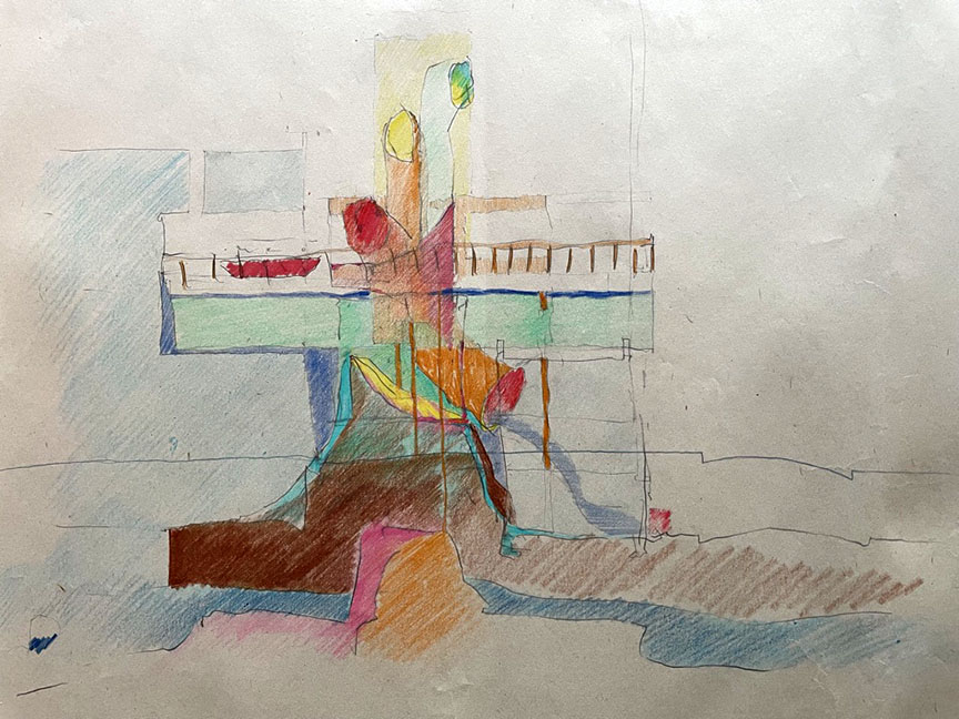
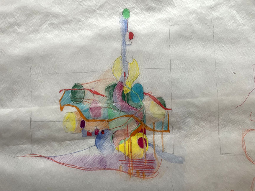
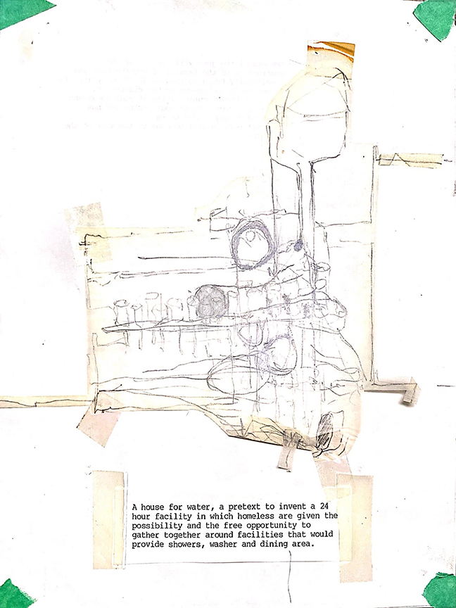
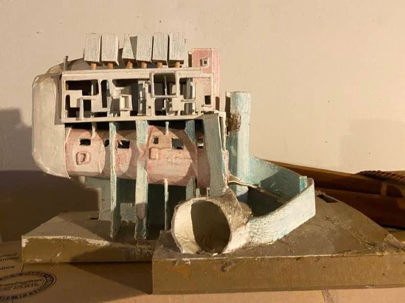
In this context, I remember two second-year projects based on one program brief where I proposed the design of a House of Water, a metaphor for public showers for the homeless in Lexington, KY. The intention was that social concerns could have an important role to play in architecture, even in a second-year student project. While this building type traces its history to Roman bathing institutions, the city would also provide shelter and food for the homeless dispersed throughout the urban context. Thus, no home per se but an urban infrastructure that allowed multiple meanings of homelessness to co-exist and allowed for the nomadic life (chosen or imposed). The underlying social idea was that civic engagement would partake in assisting with the growing homeless population in Lexington.
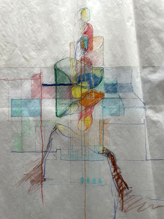
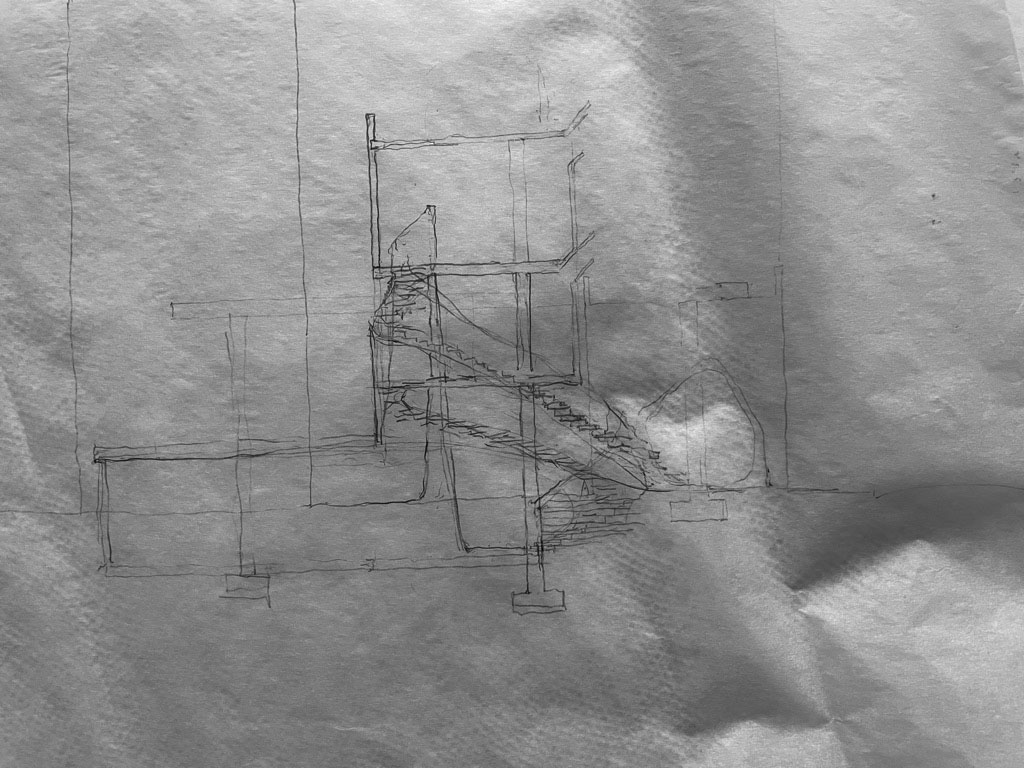
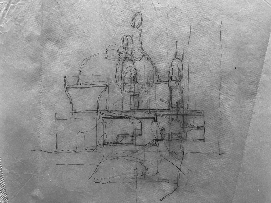
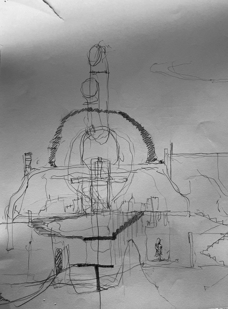
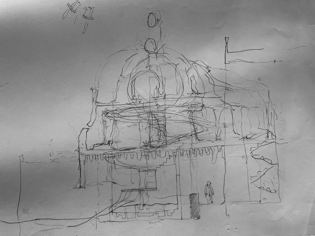
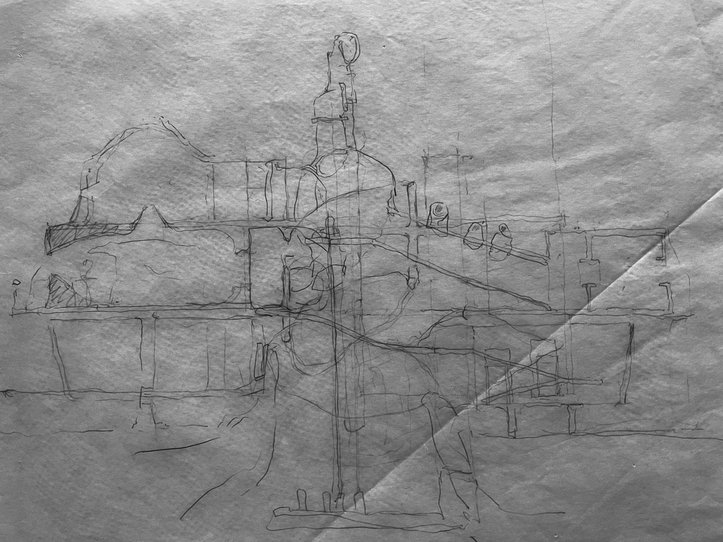
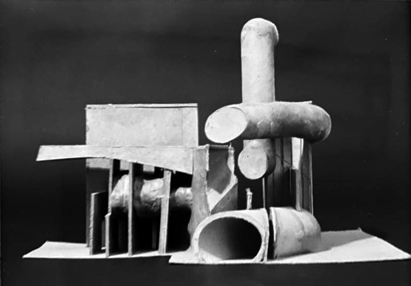
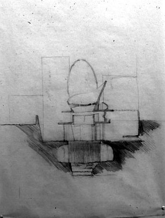
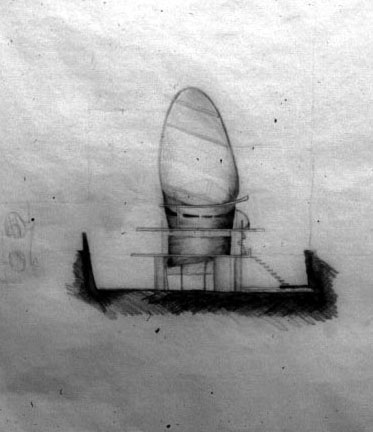
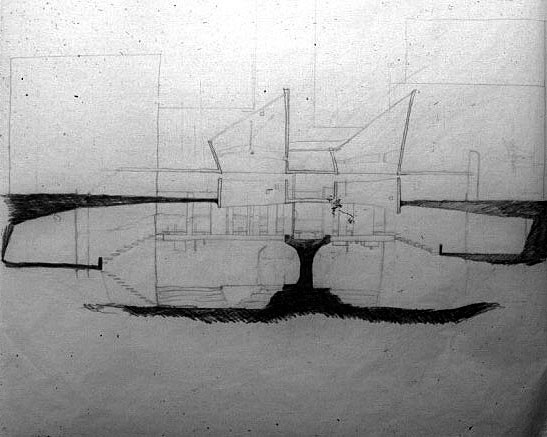
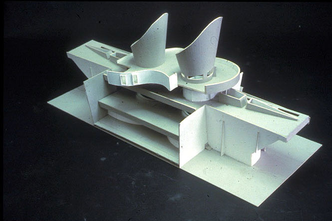
Both second-year student designs had a vision, yet one student furthered the project as pure idea (project 1: Jim Laing) while the other student transitioned the idea into a tangible expression in the form of a building (project 2, Jim Pinholster).
Project 1
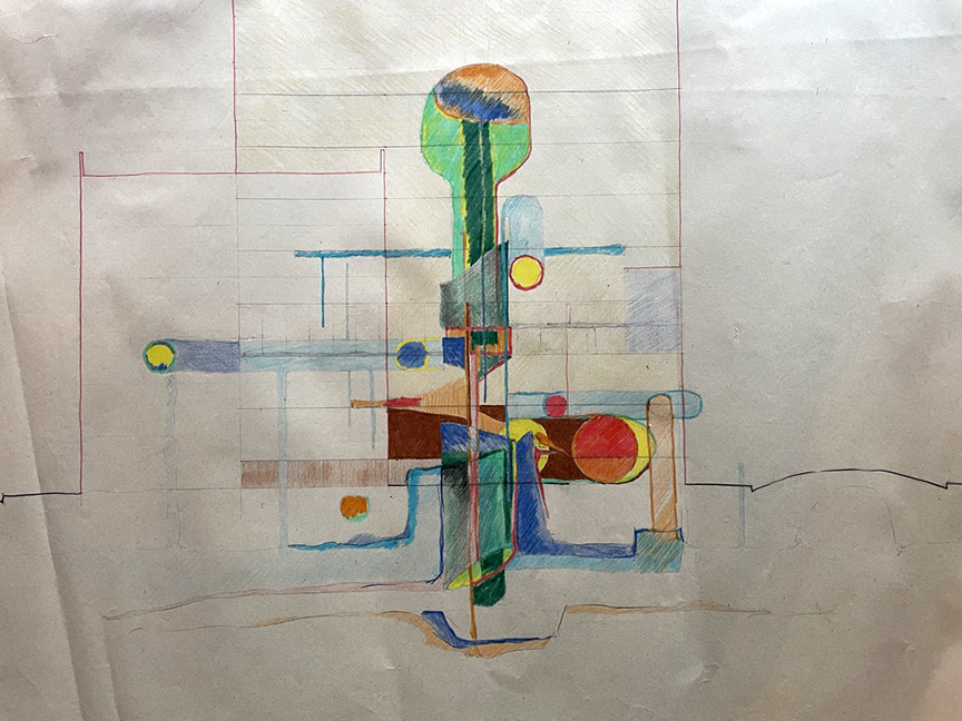
The following drawings and model were part of the student’s final presentation which described the imaginary inner program of the House of Water—from water source to sewer, with layered spaces suggesting that the viewer imagine their spatial organization of places for rejuvenation.
Project 2
The second project might seem the antithesis of Project 1, as the world of ideas ended with a more pronounced functional resolution. Yet, the idea remained visible, although in a tangible tectonic which found an inner voice of poetic resolution.
Conclusion
Today, I hope that students, regardless of their stage of study, find an idea to celebrate. They should dream because they are the future of architecture, and thus of the wellbeing of society.
Architectural Education: Question of Pedagogy. Part 6
Architectural Education: Question of Pedagogy. Part 5
Architectural Education: Question of Pedagogy. Part 4
Architectural Education: Question of Pedagogy. Part 3
Architectural Education: Question of Pedagogy. Part 2
Architectural Education: Question of Pedagogy. Part 1