 Le Baron Tavernier: a cafe. There is a myth that Switzerland is one of the most beautiful countries on earth. Indeed, its picturesque landscape, pristine cities, orderly society, and unconditional belief in a constitution that engages each citizen through direct representation—often to a fault—are all accurate descriptions of the place and culture. While the country of my youth is truly magnificent, there is a mundane reality that mitigates the perfection. Throughout the project that I will describe of Le Baron Tavernier Hotel Restaurant, there is a sense of craftsmanship that accompanies the entire design.
Switzerland
Having lived and worked in three of the four linguistic regions of Switzerland (French, German and Italian, and not the Romansch), I have come to enjoy teasing about my country’s image of flawlessness. After residing outside of Switzerland, I gained a more balanced understanding of my Swiss upbringing. Thus, upon every return I find that the day-to-day societal pressure is a struggle. It is useless to discuss with a Swiss those truths about the rigid societal norms and the impossibility to deviate from them. This is particularly evident after living in the Unites States for over three decades, a place where almost anything is possible.
 Image 1: Postcard and Swiss banknotes featuring Le Corbusier (author’s collection), CFF clock and cuckoo clock (google images)
To have divergent views on life’s daily rituals will easily set you into the category of foreigner—even if you hold a Swiss passport! To question Swiss stereotypes of being punctual, efficient, privately minded, and having an infatuation with cleanliness and frugality is stifling when I, as an expat, return home.
Among the things I have come to not question is why Swiss citizens fold banknotes into four quadrants. Traditionally, the banknotes were of unequal size and this allowed them to all fit neatly in a wallet. Why do they use officially approved garbage bags? Easier to understand as they are conscientious about recycling. And why is it sacrosanct that only a specific kind of cake is appropriate for a birthday party? The answer, just because.
Despite these stereotypes, Swiss cultural behavior is a far cry from Orson Wells’s film The Third Man, where he comments that “In Switzerland, they had brotherly love, they had five hundred years of democracy, and peace—and what did that produce? The cuckoo clock.”
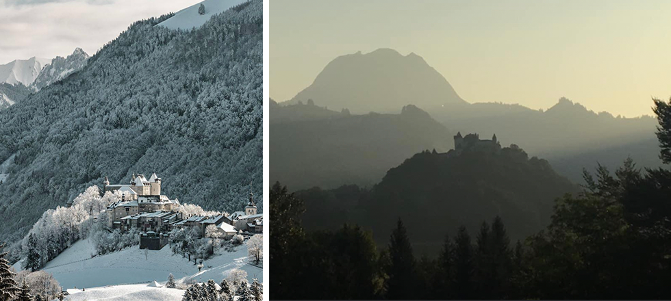 Image 2: Gruyères (photographs by Thomas Schõn)
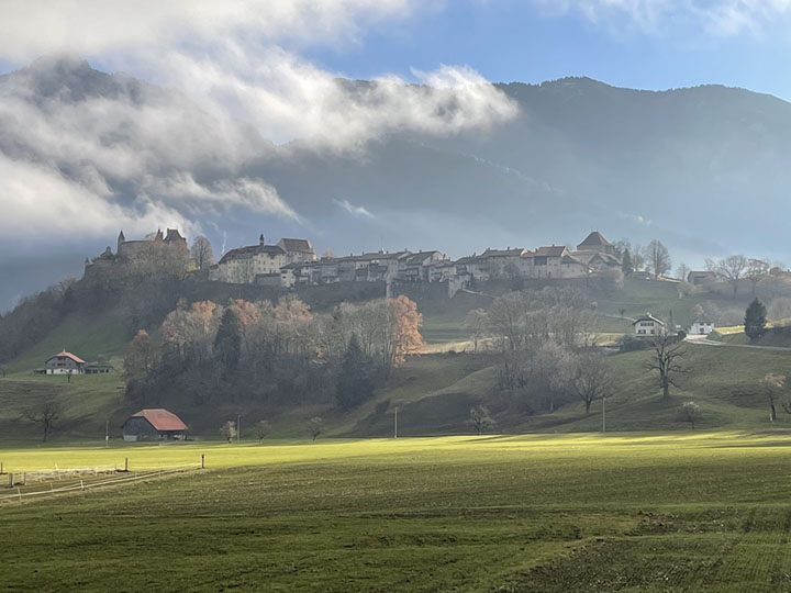
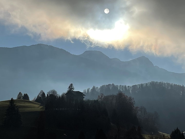
Of all of the stereotypes, how the Swiss revere the landscape holds my admiration. Some of my fondest childhood memories refer to the pastoral landscapes of Gruyères in the canton of Fribourg (Image 2-4 above) with its medieval castle and the Moléson mountain as a majestic background. As unforgettable, are the scenic views of the Région Lémanique spanning the cantons of Geneva, Vaud, and Valais, all linked by the magnificent Lac Léman often incorrectly referred to as Lake Geneva.
Lac Léman
Attending boarding school in Gruyères, I remember field trips to Lausanne and Geneva, descending to the lake, and eagerly awaiting the first glimpses of the Swiss Riviera just above Montreux where the panorama opens, offering views that to me were unequaled anywhere. I remember the landscape as magnificent and poignant—and it still is—dominated by the nearby mountains in France which cut a perfect horizon as they dive into the lake. Most often, this landscape seemed perfectly staged to include horizontal clouds with dramatic strips of light reflected on the surface of the lake (Images 5 and 6 below).
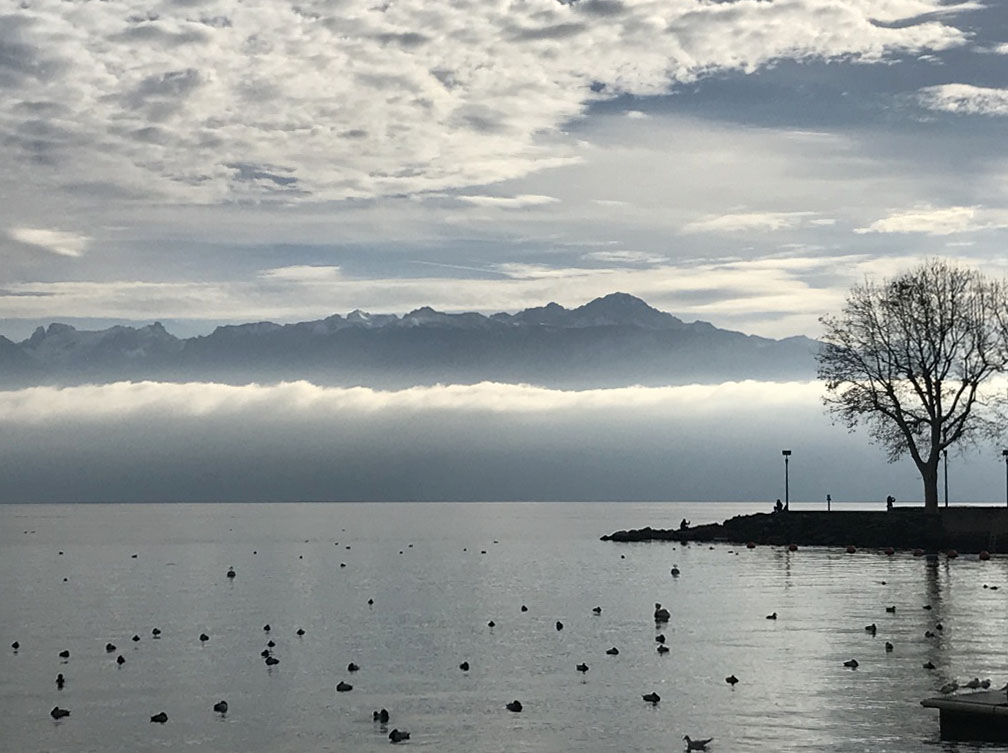 Image 5: view of the French mountains from Lausanne-Ouchy (author’s collection)
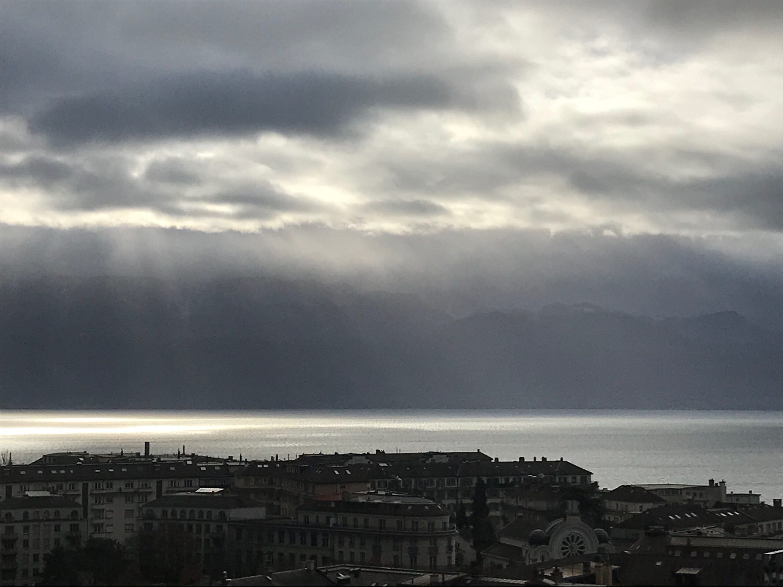 Image 6: view of the French mountains from midtown Lausanne (author’s collection)
Ferdinand Hodler
I am not alone in my infatuation with this regional paysage. In fact, one of my favorite Swiss painters is Ferdinand Hodler, whose predilection was to depict landscapes. Repeatedly, he favored painting views of Lac Léman moving from a symbolic genre to a style en vogue at the turn of the 19th century called Art Nouveau. The selected eight images of Lac Léman (Images 5-7 below) capture similar impressions of my youth, all-the-while showing Hodler’s progression in his way of seeing; from realism to an interiority of view.
 Image 7- Google images: Ferdinand Hodler, View of Lac Leman from Chexbres, 1885, 1898, 1904
 Image 8- Google images: Ferdinand Hodler, View of Lac Leman from Chexbres, 1904, 1905, 1905
 Image 9- Google images: Ferdinand Hodler, View of Lac Leman from Chexbres, 1911, 1911
By purging the landscape to extract the essence of being, Lac Léman becomes—in Hodler’s chronological progression—an abstract surface that joins the sky. In the second of the 1911 paintings (Image 9), Hodler depicts the paysage with the faintest trace of a misty horizon, exploring the vastness of the space by suggesting the magnificent French mountains of the Haute Savoie at the edge of the canvas. (Images above 7-9)
Le Corbusier
In the mid-1920s, Swiss architect Le Corbusier also picked up on the beauty of the region’s landscape to integrate a modest home for his mother in Corseaux at the immediate edge of Lac Léman. Similar to Hodler’s sensitivity expressed in painting, Le Corbusier created an architecture that moves the inhabitant and visitor as the southern views are carefully framed through either a stone garden window, a ribbon window spanning the entirety of the interior public space, or a terrace above the house; all echoing the architect’s passion for nautical architecture (Image 10 below).
 Image 10: La Petite Maison (1923-24) by Le Corbusier (author’s collection)
Le Baron Tavernier Hotel Restaurant
During each of my visits to the French region of Switzerland, I return to the idyllic setting of the café terrace at Le Baron Tavernier Hotel. Located to the north-west of Lausanne, at the height of Chexbres—close to the majestic viaduct of Chillon, which was named after the nearby Chateau de Chillon—the café’s idyllic setting overlooks UNESCO World Heritage vineyards. These Lavaux wines are a product of a terroir with renowned names such as Epesses, Saint Saphorin, and Villette: names associated with charming hamlets scattered among “stone terraced vineyards of the Lavaux [that] were first planted by monks in the 11th Century.”
The Deck
 Image 11: Google image of site, and views from the terrace (author’s collection)
While Le Baron Tavernier Hotel exhorts Swiss charm and hospitality associated with delectable regional dishes, it is the architecture of the café-terrace (Le Deck-Lounge Bar Restaurant) that has always drawn my attention. Building on the tight corner of the Route de la Corniche, the café acts as a promontory above the steep sloping landscape characterized by stones walls which are interspersed with perfectly manicured vineyards facing south. Upon leaving the car and walking down the entrance path, one is presented with a striking view that, in my mind, is quintessential Hodler. (Image 12 below)
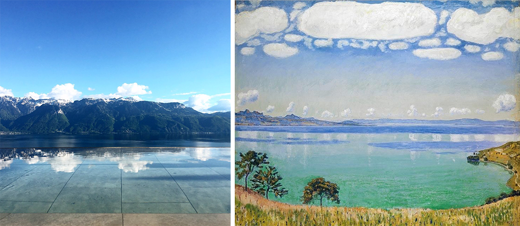 Image 12: Google images -view over the lake and terrace pool, and 1905 painting by Ferdinand Hodler
Yet, at closer view, the reflection of the clouds are not those featured cotton ball-like ones on Hodler’s painting of Lac Léman. Here, in a brilliant move, the architects (Brönnimann & Gottreux Architectes) created a subtle artifice that acts as a mirror to the framed mountains, bringing the lake inside to the entrance of the café. This is achieved through a shallow infinity pool that defines the man-made horizon while underscoring the natural one across the lake. A shaded walkway in the shape of an elongated pergola enhances the entrance experience and suggests a gateway to nearby France: A Le Corbusier fenêtre en longueur framing the landscape that is now center stage. When a gentle wind blows on the pool’s shallow water, it is magic as the ever-slightly moving reflection engages the panorama (Image 11 above and 12 and 13 below).
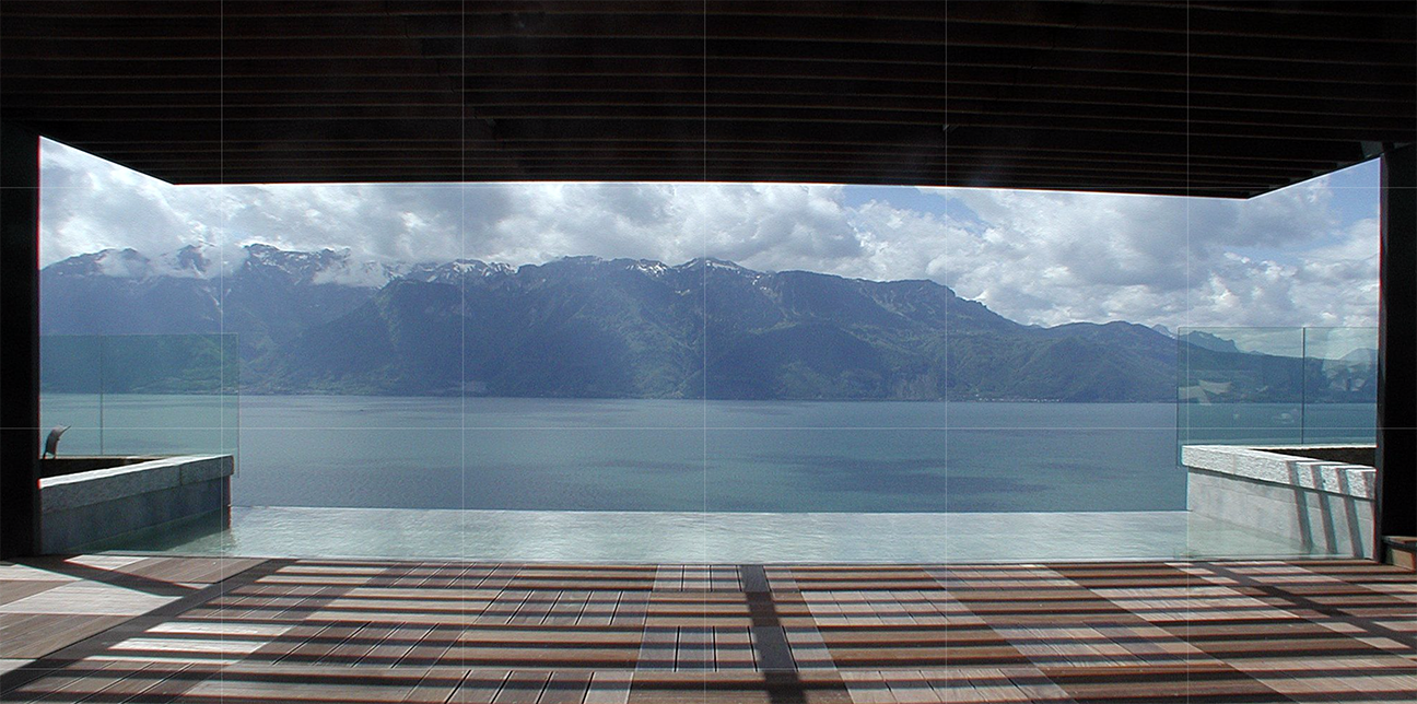 Image 13: -view to the lake and terrace pool (Brönnimann & Gottreux Architectes)
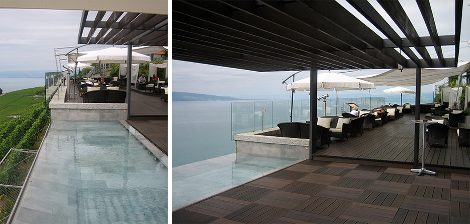 Image 14: view of the entrance with pool and roof (author’s collection)
This simple and striking move is book ended by two separate functions of the restaurant. To the right is an open terrace with comfortable furniture overlooking the vineyards, with additional beach-like seating areas behind: semi-circles tucked into the lush sloped landscape below the hotel. During the summer, sail-like parasols create shaded terrace zones and provide necessary relief from the sun, and a place, during larger events, where guests can mingle in groups (Image 16 below).
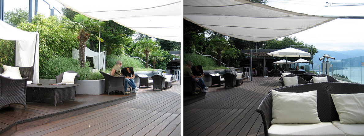 Image 16: view of the café-terrace looking over the landscape and tucked into the lushes slope (author’s collection)
 Image 17: view of the café-terrace looking over the landscape and tucked into the lushes slope (author’s collection)
To the left of the entrance, is an outdoor dining area leading to the indoor restaurant, both overlooking the lake. Tucked into the slope behind a stone wall are the kitchen, storage, and public restrooms. The ceiling of the dining room is noteworthy for its color and sail-like shape.
Conclusion
I continue to marvel at such spatial simplicity. Having a design strategy that sets in place the scenography of the existing landscape, one where the vineyard terraces are domesticated to become a café and frame the view towards the lake is nothing less than a great thesis. During my academic tenure, far too often I have witnessed students struggle to find an extraordinary gesture and narrative that claims innovation and strong tectonic shapes, instead of discovering forms related to the calling of the site or a genuine principle of settlement.
The gestures proposed at Le Baron Tavernier do not come easily and are part of the repertoire of seasoned architects. Distilling ideas from what is obvious is a true mark of design excellence. Here, the outside view of the mountains is painted, framed, set on stage and brings value to the hotel offering which is namely, a gorgeous and welcoming place to enjoy the day, sunset, or dinner under the moon.
The expression of an economy of means ranges from material selection and floor patterns to shading devices and selection of furniture. A culture of construction associated with subtle detailing is part of the deeply anchored tradition key to what makes Swiss architecture, but, above all, this project stands out because the premise, the thesis, the BIG idea remains simple: to enhance the view and make architecture out of it.
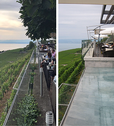 Image 18: view of the café-terrace looking over the landscape and tucked into the lushes slope (author’s collection)
Additional blogs of interest
Cafe do Cais, Portugal
La Petite Maison, Le Corbusier
Chipperfield’s Kunsthaus in Zurich
Hubert Robert copying paintings at the Louvre
Still lifes by Ben Nicholson
Hubert Robert: Painting as a source of knowledge
Simone Martini: three principles of settlement
Le Baron Tavernier: a cafe terrace in the middle of the Lavaux vineyards, Switzerland
Architectural Education: Robert Slutzky. Part 2
Edward Hopper
Robert Slutzky
Netton Bosson, Gruyeres, Switzerland
Achtung: Hödler statt Hodler im (Zwischen-)Titel…!
Danke, denoch soll Hodler ohne dem Umlaut geschrieben sein! Henri