Vilhelms Kuze cafe in Riga. In most European cities, café culture is an institution. For me, coffee houses are more than simply a place to indulge in delectable drinks and extravagant pastries—they are also destinations enriched by an architecture that gives each place its own identity. Be it in Padua (Café Pedrocchi), Paris (Café de Flore), Porto (Café Majestic), Prague (Café Imperial), Venice (Café Florian), Vienna (Café Central) or Zürich (Café Odeon), among many other favorites, I have always considered cafes a must when traveling.

Beyond the enjoyment of indulging in a rich, hot chocolate and delicious pastries (yes, plural is important here), and inhabiting the architecture of the cafe, for me, a visit to a celebrated coffee house is also a chance to eye urban flâneurs going about their lives. Cafes are places where patrons’ activities were/are about newspaper reading, political discussion, and socializing, the latter often acted by cafe goers as if the space was their own living room, telling me that these intimate conversations and social behaviors are meant to be seen and overheard.
Certainly, the close proximity of each table contributes to my occasional eavesdropping; thus, I meet the day’s actors, whose gestures and intonations, social encounters, and political small talk betray their city’s cultural distinctiveness.
Cafe V. Kuze

During a recent trip to Riga, the capital of Latvia, I made a point to patronize the famous Vilhelms Kuze cafe. Located in the historic city center at Jekaba iela 2-/22-1, the entrance is flanked by two large vitrines that feature the name of the cafe in cursive. The day of my visit, the sun was at its zenith, and patrons mingled around the outside tables.
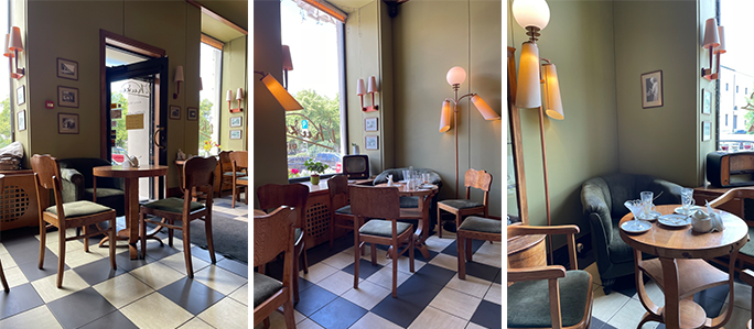
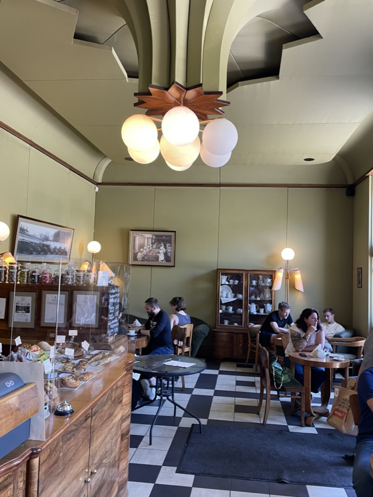
The interior space was modest, lending the cafe a cozy atmosphere, and may I say, a little aura of romantic nostalgia; especially when most of the patrons returned to work and the cafe became almost mine. Establish in 1910, by Vilhelms Kuze as a confectionary, the interiors were carefully renovated in the 1970s to maintain the earlier charm from the Art Nouveau to the 1940s including tables, sofas, chairs, lighting, a coat rack, and pastry vitrines (Image 2, above).
The cafe’s layout
The cafe’s layout is cleverly arranged to create intimate areas while the variety of seating gives the decor an eclectic atmosphere, all contributing to the desire to extend one’s stay, creating a memorable moment.

I appreciated the eclecticism, perhaps because I like to collect furniture, and here at Vilhelms Kuze cafe, one finds vintage chairs nestled around a variety of sizes of round tables, alongside sofas and plush armchairs. Most of the furniture is made of warm wood—mainly mahogany and walnut veneers with their deep undertones of yellow or red (Image 3, above).

If I could a seating arrangement, it would be one of the table-chair-sofa combinations. However, all of the seating arrangements are elegant and exhort a Germanic Gemütlichkeit, a sense of warmth and coziness. Many of the chairs are bentwood with ergonomic barrel backs and armrests. Others are dining room-like, showcasing straightforward elegant detailing covered with comfortable suede upholstery in a muted green color. While much of the furniture is Art Deco style, some pieces remind me of the Arts and Craft movement. Certain others embody a clin d’oeil to the Thonet or Werkbund aesthetic.
The menu

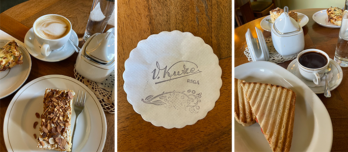
There is much to talk about the drink card and food menu at the Vilhelms Kuze cafe. They offer a variety of specialty beverages (with an emphasis on the city’s best hot chocolate with homemade whipped cream). In addition, there are snacks ranging from toast, to pancakes, salads, and the daily pastries and desserts, all which tease your belief that restraint is a virtue! Needless to say, I splurged during my visit (Image 5, above).
Plat de resistance

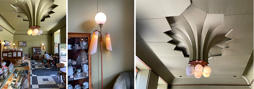
What might have been so far subtly omitted in the photographs, is the unique treatment of the cafe’s ceiling. One finds an impressive and towering ceiling light centrally positioned within the space. The entire ceiling seems to float, because it is recessed from the wall and true ceiling. Emerging from this dropped ceiling, and beginning with an anonymous pattern near the walls, the ceiling panels are cut away at the center in diamond shapes of different sizes to finally end by creating a striking reverse shape evocative of a bouquet of lilies. The ‘stems’ converge into six identical light globes with a slightly larger one at the center, suggesting the corolla of a flower.
The cafe’s lighting system has also been referred to as the bristles of a broom, or the dust tail of a comet. While both analogies are seductive, I favor the metaphor of the flower because numerous stylized floral patterns have been explored throughout the pictorial, sculptural, and architectural work of the Art Deco period.
The geometric qualities of the lighting system are enhanced by the light and shadow reflected on each of the hanging surfaces. A wooden flower petal is used as a transition piece between stems and lamp shades. The effect is stunning, especially when looking at the overall space where the crown molding seems to disappear under the floating ceiling, to re-emerge as an architectural ceiling light.
Conclusion
It might become clear that throughout my blogs, I favor anonymous rather than star architecture; interventions that are within the old rather than the new, and that show how history is part of design continuity, and most importantly, that small interventions (some might be called interior design) deserve equal attention in the portfolio of contemporary architecture.

Additional blogs on the Baltic States
Public Fountain in Kaunas Lithuania
Pharmacy in Riga (Office: Substance)
Latvian National Museum of Art (Processoffice), Part 1
Latvian National Museum of Art (Processoffice), Part 2
Dubulti train station at Jurmala, Latvia, Part 1
Dubulti train station at Jurmala, Latvia, Part 2