Pharmacy in Riga (Office: Substance). A recent trip to Riga, capital of Latvia, was to trace my ancestors and visit many of the sites and residences where my father had lived until he was a young adult. While the history of my family is well documented, I had not to this point visited any of the family properties in Latvia or nearby Lithuania.
Various architectural style in the Baltic States
While researching what to visit, I also wanted to take advantage of my first foray to the Baltic States and include other places of interest such as urban spaces, landscapes, and buildings (classical and modern, Soviet constructivist, Stalinist, brutalist, vernacular and indigenous). The latter turned out to be represented by some exquisitely detailed 19th century wooden structures that have been preserved to a degree of neglect (Image 1 and 2, below).
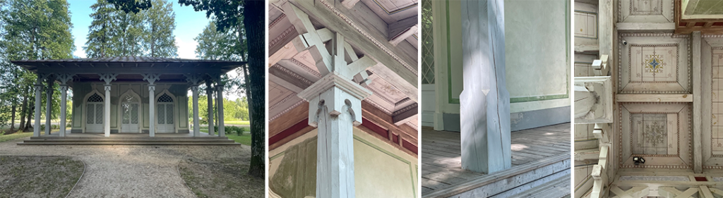
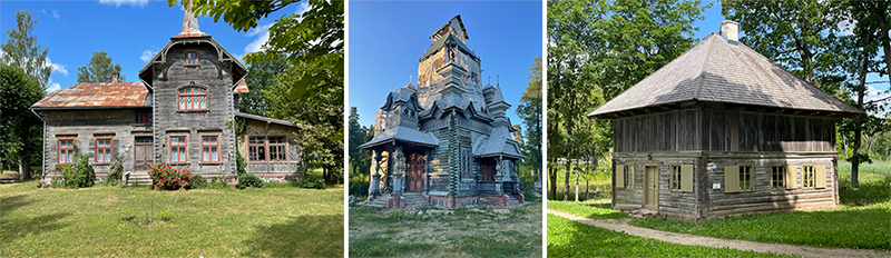
This inattention to an important indigenous material culture of the region is due to the fact that under the rule of the former Soviet Union (USSR) between1944-1991, there was a nonsensical territorial management that had only minor interest in this particular cultural past. In fact, many wooden buildings were destroyed during that period to accommodate mass social housing that was poorly designed and badly constructed (Image 3, and 4 below). To my delight, during my trip, I was fortunate to still be able to discover many remnants of the nation’s heritage.
Museums, cafes, and antique galleries to visit
There were also many interesting modern and contemporary interventions to visit, and I recommend that if you are in Riga, you go to the National Library of Latvia (architect Gunnar Birkerts); three museums in particular, the Riga Art Nouveau Center and Museum, the Museum of the Occupation of Latvia, and the Latvian National Museum with its exquisite intervention by Lithuanian architects Processoffice; as well as two famous cafés (V Kuze and Black Magic); and end your tour with the antique store Galerja Antiqua featuring unique Latvian and European objects.
The pharmacy
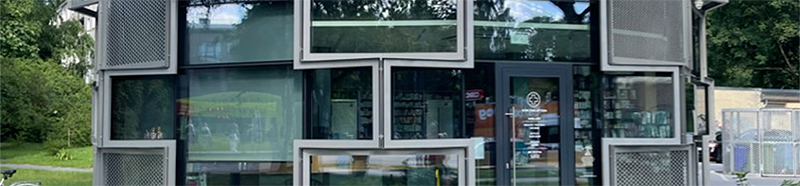
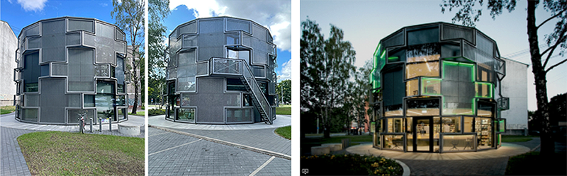
My focus in Riga was to discover the historic center and any contemporary interventions there or in the larger city environs. The latter interest led me to discover a pharmacy / drugstore designed between 2017-2020 by the Latvian architecture office Substance. Of note, this project received the prestigious 2021 Prix Versailles Award for ‘Special Exterior’ in the category of shop and commerce.
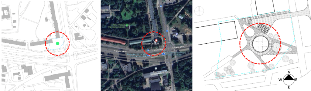
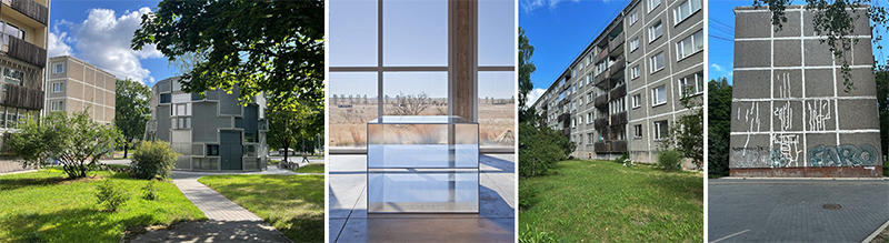
Octagonal in shape, the pharmacy is situated along a narrow piece of grass interspaced by several mature trees. It is alongside a Soviet-era housing complex that faces both the intersection of Jürmalas gatve (alley) and Dzirciema iela (street). The street nomenclature was to me an understatement, as the ‘alley’ and ‘street’ were more the size of two major throughways; particularly when negotiating them to reach the building (Image 3, below).
Upon arriving at the site, I was first struck by the modest scale of the pharmacy: one that is reminiscent of many historical follies that I had visited in Great Britain and France. Those intimate edifices are often called Edicules and were designed during the 18th century as integral features within English landscapes and French gardens. Typically, those follies were constructed solely for aesthetic purposes, and featured a number of historical and stylistic attributes, often accentuating eccentric, ornamental, and sculptural qualities.
While the Pharmacy in Riga (Office: Substance) was similar in scale to those follies, it has a function. However, its practical purpose is not what made it unique. The form of the pharmacy and its construction were what made the building innovative; especially as the pavilion-like structure stood out within the bleak and rigid conformism of the Soviet-era context (Image 3 above, and 4 below).
The context of the pharmacy
The architects describe the intervention as “a peculiar hybrid between an environmental installation and a building.” Reflecting on my experience there, I believe this description to be particularly relevant to the quality of being an installation. Not only does the pharmacy give the corner a sense of place—inhabiting it—like a Donald Judd sculpture, it creates a powerful new perception of space around itself.
Adding to this analogy, while touring the site, I wondered if the architect’s interest in modularity, in addition to the obvious pursuit of a parametric design expression, was also influenced—at least subliminally—by the nearby prefabricated modular façades of the housing complexes.
The Khrushchecvka
These typical Soviet-era housing blocks were designed by state architects (e.g., engineer Vitaly Lagutenko). The buildings came to be known as Khrushchecvka (named for the former Soviet leader Nikita Khrushchev), and were typically five stories in height. They were all built well before the 1991 dismantling of the Soviet Union. Research shows that these housing complexes were found in the USSR as well as throughout the European Eastern Block which constituted neighboring countries that were forcibly incorporated under the Soviet regime.
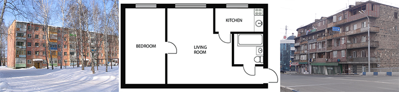
Today—as perhaps already when they were built in the 1960s—according to western expectations the Khrushchecvka buildings were regarded as “the very symbol of sub-standard living.” Built of a poorly constructed panel system of concrete or brick masonry, they were monotonous, “drab, dreary, bleak, and dilapidated,” with five flights of stairs and no elevator (if there was one, it was coin operated), interior paper-thin brick walls, leaky windows, low ceilings, faulty plumbing, all to offer tiny apartment spaces with no comfort at all.
The Khrushchecvka buildings were originally intended as temporary structures (25 year life span), and thus were seen by many Russians as an improvement from earlier communal apartment types.
The plan of the pharmacy
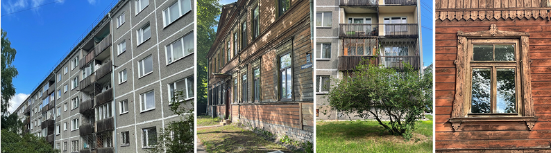
My visit to the pharmacy took place on a weekend afternoon. To my disappointment, the building was closed and I was unfortunately unable to return that evening late enough to witness the structure illuminated after dark; a moment that would have given me another reading and a confirmation of the cross as the symbol of pharmacies (Image 6, below).
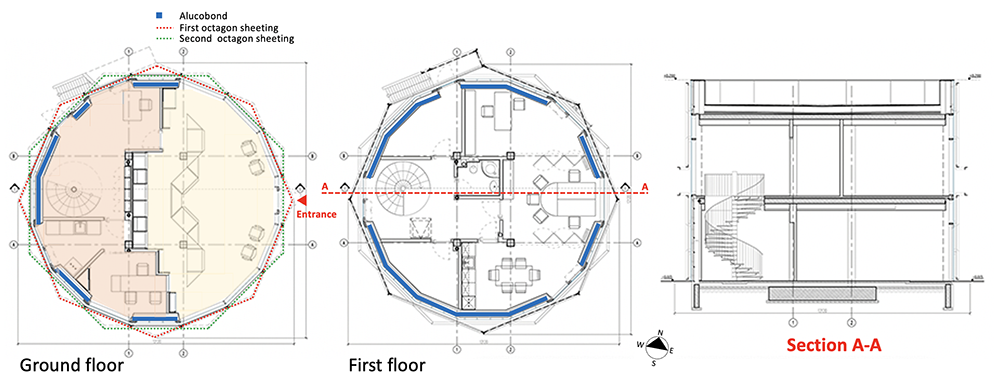
The first and second floor plans of the pharmacy are elegant and functionally well organized. In general, when architects choose to use a geometry of such visual and symbolic power, there is always the need for rigor in confronting the form (geometry with meaning) with the function, as well as confronting the function when it emerges from the form.
The entrance to the pharmacy faces a large symmetrically positioned counter that divides the public activities of the pharmacy: counseling, prescription pick-up, checkout and drop-off-area, and patient waiting (Image 7, yellow, above). The secondary tasks of the pharmacy (e.g., medication shelves, storage, and desks) are relegated to the back of the counter area (Image 5, tan, above), which includes a circular stair that gives access to the second floor offices, conference room, and bathroom (Image 7, middle plan, above). The structural system is straightforward and defined by four centrally located square columns that hold a grid of I-beams that span to smaller supports that follow the shape of the building (Image 8, above).
The construction of the façade
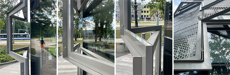
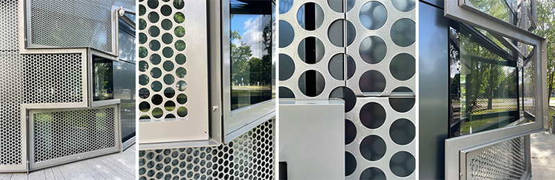
The basis of the design is modular. The construction offers a double façade made out of Alucobond paneling and glass infill which creates an inside façade that provides insulation between inside and outside, while the outside façade is made from large prefabricated cross-shaped panels made out of aluminum frames. The area within the cross frames are intermittently filled with sheets perforated with round holes. For both facades, the composition and location of each panel, glass surface, and perforated sheets, are contingent on the internal organization of the pharmacy.
The first facade of Pharmacy in Riga
The façade closest to the interior provides transparency and opaqueness according to specific public and private functions within the pharmacy. On the ground floor, large floor to ceiling glass sections offer ample light and visual transparency for the transactions between staff and patrons. The more private functions of the pharmacy are shielded by opaque grey colored Alucobond panels (Image 5, blue color, above).
To the front of the building (e.g. entrance), appropriate visual relationships are created between inside and outside, defining the entrance within the overall octagonal form. On the second floor, the same strategy is used, but this time incorporating a minimum number of openings to illuminate the offices and stairwell.
The second facade
For the second façade facing outside, large, paneled crosses are either left empty, or filled with perforated metal panels (Image 10, above). Both strategies (cross panels and infill) offer a visual sense of movement, resulting in a dynamic façade when compared to a traditional classical frontal façade that would have denied the richness of the form of the building and its context at this particular intersection. The architects at Substance skillfully developed a façade appropriate for the language and expression of an octagon while symbolically representing the building’s function (e.g., displaying both the cross and its green color as a sign of the pharmacy).
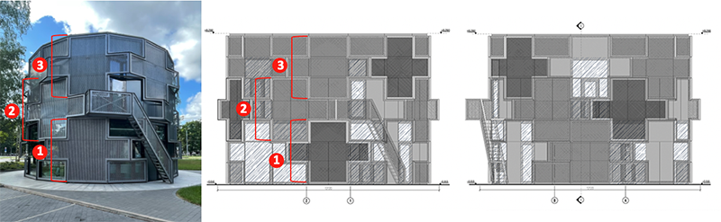
Similar to a Rubik’s cube, the architects gave the illusion that the outside facades could rotate horizontally and interlock up and down the floors (Image 11, above).
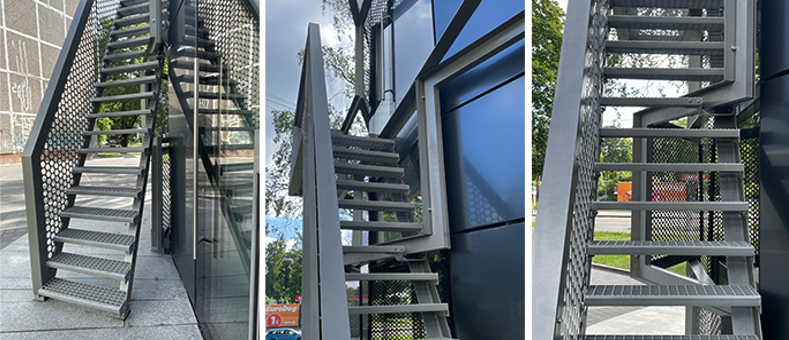
Of note, one finds on the north side of the building a secondary steel fire stair. It is judiciously placed within the geometry of the façade so as to not interrupt the subtle game.
Conclusion
Since a long time I have come to realize that architecture can and should serve a particular function, while being anonymous, and yet still rich in design strategies. As I write this blog, I continue to admire what the architects at Substance achieved with this pharmacy, especially as it sits on such an uninspiring plot of land.
The corner condition of the site was interpreted as an octagonal form. The pharmacy’s symbol at both the pedestrian and vehicular scale was beautifully conveyed. And, most importantly, the construction and detailing is innovative, playful, and has all the ingredients of what I call an integrative project; and this despite its modest scale.
The latter point remains key within the context of my education is Switzerland, and I wish that academia could provide students with more of these modest project briefs, where the need to show bravura is directed towards a holistic approach where design thinking overrides the sole need for form making without much meaning.
Additional blogs on the Baltic States
Public fountain in Kaunas, Lithuania
Vilhelms Kuze cafe in Riga
Latvian National Museum of Art (Processoffice), Part 1
Latvian National Museum of Art (Processoffice), Part 2
Dubulti train station at Jurmala, Latvia, Part 1
Dubulti train station at Jurmala, Latvia, Part 2