
What gets us safely up or down a staircase is a matter of law and engineering, the architectural uses of the staircase are a different issue altogether and the one cannot be replaced by the other—both are necessary. [1]
How to design a stair. Even though I have taught architecture students for over three decades, I still enjoy presenting them with this task. Not simply because the project brief calls for a building with several stories, but because stairs are never easy to design, especially for students, who need to first understand basic principles in order to make a stair comfortable AND to code. Designing prerequisite fundamentals (the stair) seems a natural way to engage students in a creative endeavor that is deeply anchored in pragmatism.
Three hurdles in designing a stair
Be it simple or complex, a stair is a design challenge for many students; one that can, with some basic knowledge, move easily from frustration to creative epiphany. In the course of the design, I see three major hurdles for students:
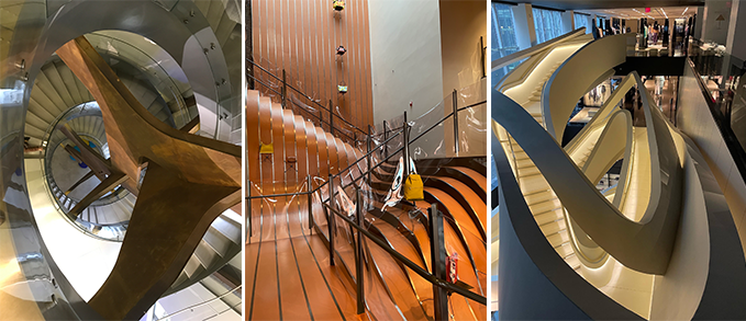
- First, students are typically unaware that stairs can be both beautiful and, if well positioned in the overall spatial organization of the building, partake in what is called an architectural promenade. While students should be aware of historical precedence through their history and theory classes, when it comes to designing their own stair, they seem unable to recall marvels of the past.
Perhaps a reason for this is that, for students, the celebration of a vertical ascension is consigned to a secondary role in the garrulous design strategies that often seem to generate an instantaneous self-satisfaction, i.e., being a great designer. In this, the stair is banal within the exuberant forms. Another cause may be that the stringent requirements for stairs suggest little room for invention, thus many stairs are either relegated to the form of a stairwell, or they simply mimic formal attributes without questioning assumptions.
- Second, students unequivocally design their first staircase with far too few steps. I often see a simple rectangle in plan with a number of dashed lines that fail to incorporate, even closely, the correct number of steps between floor levels (i.e., barely 10 steps for a floor-to-floor height of nine feet!). I recognize that at this early stage of the design, tangible dimensional criteria make little sense for most students. For them, intuition, courage, and gestural boldness will always trump pragmatic input as if design was a pure visual art and has little to do with how space or stairs are used.
- Third, and perhaps most importantly, is that prior to any attempt to design a stair, students need to know the correct representation of stairs in plan and in section. This comes with mastering the basic technical drawing nomenclature to show a stair when it departs, when stair flights overlap each other, and when a stair ends its run on a top floor. This will be a topic for an upcoming blog.
Candidly, I can’t fathom that despite using a staircase daily—at least in the building where I currently teach—when it comes to designing one, they become a quasi-impossible task. Perhaps being self-aware of the immediate environment is something that needs to be re-addressed in education overall, so that spatial experiences can be leveraged as design principles for student projects.
The nature of stairs

I have to believe that for all of us, using a stair is second nature. In fact, we never truly think about it; we simply move up and down and proceed to our chosen destination. This is because the staircase is well designed, regardless of aesthetic beauty. Thus, there is no need to think about how stairs are conceived, regulated, and standardized for the comfort and ease of ascending and descending.
When I was a student facing similar design issues, faculty would direct us to go to any stairwell and inform ourselves of the basic dimensions of a step, the number of steps between floors, the proportional rapport between step and riser, how a landing was shaped and dimensioned, and, of course, how a baluster and its component parts were set in place.
All of this without mentioning that most of what we were asked to study were elements that met building code. The aesthetic order was secondary until we mastered the basic concepts that constituted a correct stair. Today, I request a similar field trip of my students, with the caveat that I complement their in situ experience with some basic background information on the nature of a stair.
This learning opportunity is similar to how to design a door. As a student, I first learned the basic components of a door. Then it was time to bestow the door with a spatial dimension by thinking of it as belonging to either a threshold, an edge, a transition, or a passageway within the overall spatial organization. Of course, this approach is a matter of pedagogy, and in this particular instance, the question is dual.
- Should one give students immediate license to create and then follow up with a set of constraints?
- Or should one introduce the design of a stair by first considering its basics components, which are then interpreted through yet unknown spatial configurations as one moves vertically?
Both approaches are correct and depend on the situation; thus, I like to move from one approach to the other when teaching about the design of a stair.
The pragmatic side of a stair

Let me be pragmatic. As much as aesthetic, programmatic, and spatial ideas are central to creating a beautiful staircase, the reality of a stair’s primary use comes down to the simple question: does the stair work or not. While there is always the need to think big and bold when designing a spatial experience (Image 1, above), there are some basics that should be understood in order to design a stair that makes sense functionally and satisfies the haptic, cultural, and symbolic aspects of movement.
In response to most project briefs, my second-year students first foray into the shape and position of a stair is to set it awkwardly in a corner in a typical configuration without much hierarchical relationship to the adjacent spaces. This is perhaps because students see the architectural symbol of a stair, and initially pay little attention to how one moves and views space from different vantage points.
This becomes obvious when, during desk crits, potential design issues are explored through sketching opportunities about shape, position, and material. While I do not immediately discuss the stair’s spatial role within the overall organization of their projects, I tend to provide students with some basics that allow them to design a stair from which excellence can emerge.
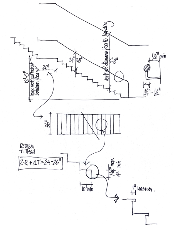
In a brief class presentation, dimensions such as riser and run (tread)—a proportional system codified by Jean-Francois Blondel in the 18th century—width of stair, vertical height of baluster and step to ceiling, and length of the stair flight are introduced. These numbers summarize the International Residential Code (IRC) for stairs, while explaining why they have been established for obvious safety concerns and the user’s comfort (Image 4, above).
Returning to the drawing board, student’s shift gears as the IRC constraints rapidly become a design impetus. As students explore the meaning of an architectural promenade, stairs emerge as more robust and meaningful within the overall project. Following a process from pragmatic to creative, I emphasize that a simple stair can also be truly majestic, thus I invite students to shy away from any acrobatic staircases as the implicit complexity of their stair may seem too much to handle within a larger set of learning opportunities. As witnessed many times, within a few hours, stairs emerge with a new volumetric quality and develop beyond the typical straight run.

My approach for a degree of simplicity in designing a stair is pedagogical, as at this point in the design process, I like students to immerse themselves in imagining how physically and visually one experiences the stair. For many students, such a level of scrutiny—especially during their first architecture project—seems unrelated to larger issues of learning how to design space, but with some persuasion, students gain a pleasure and understanding about how the design of a stair is truly a matter of seeing in three dimensions.
My rationale to this approach is that a simple stair offers four basis foci that can easily be addressed, all the while working towards an overall integrative design process. These areas of focus are: shape, position, components, and the spatial aspects surrounding the staircase itself.
Iterative design thinking
Assuming at this stage of the project, that the shape and position of the stair has achieved a certain degree of stability within the overall spatial composition (meaning the student is comfortable with certain moves and accepts them as permanent at this particular moment of their design process) I like to challenge the student to further develop their stair by focusing on the steps and balustrades, while working on the spatial edges that contribute to the visual pleasure of ascent and descent.
For most students, this stage triggers enjoyment and epiphany, as they realize how much more design thinking is required. It is a moment where design iteration is critical and balances intuition with rational thinking.
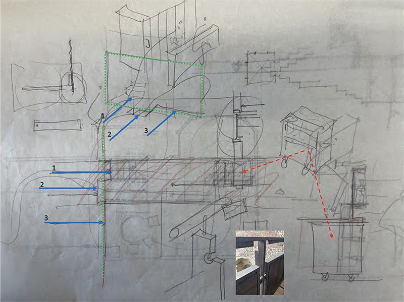
At this stage in the design, I like to sketch with the students as we discuss the process of development of the stair. The sketches below are mine (including Image 6, above), and done in conversation with the students by overlapping a new sketch paper over the student’s drawings.
Example 1
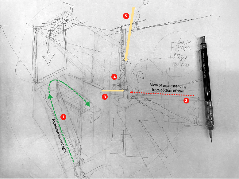
In this study (Image 7, above), discussions centered on how movement (1) and sight line (2) as one ascends, could be enriched by creating a gap of light at the landing (3). This would be accompanied by the tapering of the wall (4) allowing light from a skylight (5) to bathe and reflect on the surface, thus creating a particular moment at the turn. This approach emphasized working on the edges of the switchback stair, thus evolving from the banality of a traditional stair shape to a richer experiential movement through space.
Example 2
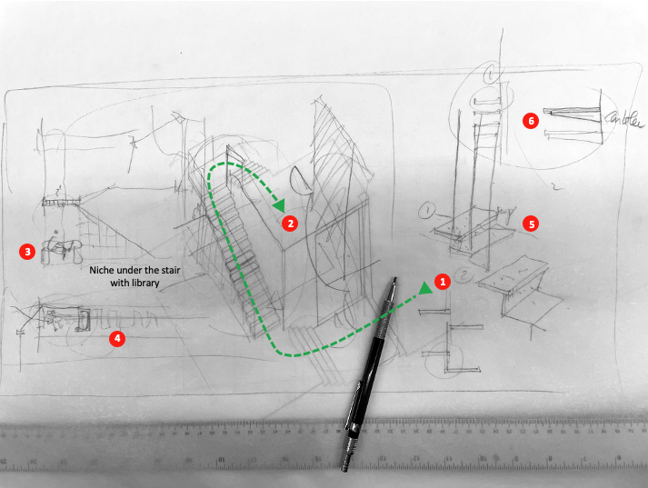
In this second example (Image 8, above), the development of the stair was part of a larger processional strategy (1 and 2). In an effort to give volume to the stair, it was suggested that a space for repose could be housed underneath (3), which eventually activated a set of bookshelves that could complement and give meaning to the newly created space (e.g., library). Further discussions introduced the idea of creating transparent steps, thus the need to develop a structure of suspension to hang them (5 and 6).
Examples 3 and 4
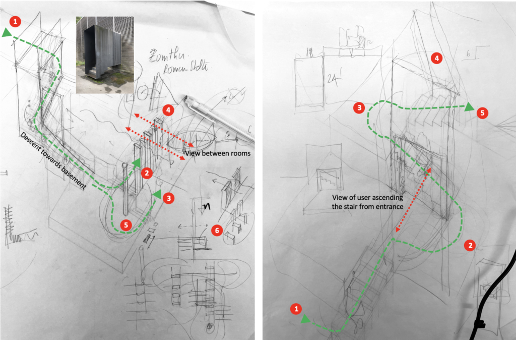
Examples 3 and 4 (Image 9, above) are similar as they develop an architectural promenade through a sequence of different stairs.
In example 3, discussions focused on how to favor one or the other of the paths (2) and (3) after descending into a basement (1). There was a desire to have visual transparency between bedrooms, thus the idea to develop pier columns (4). This reintroduced the discussion to begin those piers with a round column that could direct the path (2 or 3).
At this moment, it was important that not much should be done on the primary stair (1) and the structure would guide the user towards specific spaces. Upon reflection, the departure of the stair on the top floor could be treated differently, and the precedence of Peter Zumthor’s entrance for the Shelter for the Roman Archeological site, might be a useful example of how to signify an entrance.
In example 4, the student’s proposal pointed towards a series of floors seen as topographical levels, by which an entrance stair (1) would reach a foyer (2), then proceed to a landing (3). At this point the steps would expand to a library (4) or simply continue to the next level (5). Discussions suggested that a more specific treatment of the foyer wall could showcase an opening, thus providing a visual clue to the second part of the architectural promenade.
Conclusion

For each of these students, working in a more targeted manner on developing the sequencing of their stair encouraged them to pursue spatial conditions that interconnected the various experiences as one used the staircase. Sketching was key to their design thinking and gave them the opportunity to understand and practice how to enhance a scheme; in this case based on their initial staircase. For students, it seems always a challenge to deviate from a two-dimensional work habit, and truly think in space. For me, the stair is a key element that is often overlooked in projects as a design opportunity.
[1] Kipnis, Jeffrey, Mulling the Miller in Et in Suburbia Ego: Jose Oubrerie Miller House. Wexner Center for the Arts, The Ohio State, Columbus, OH, 2013, p.256
Additional blogs of interest regarding stairs
Latvian National Museum of Art (ProcessOffice), Part 1
Latvian national Museum of Art, Part 2
The Whitney Museum: stair by Marcel Breuer
Vittorio Gasteiz: a lessons in stairs (Francisco Mangado)
Hong Kong: a lesson in stairs (Bille Tsien and Tod Williams)
Porto: a lesson in stairs (Alvaro Siza)
Firminy: a lesson in stairs (Le Corbusier)
Lexington: a lesson in stairs (Jose Oubrerie)
Vienna: a lesson in stairs (Jože Plečnik), Part 1
Vienna: a lesson in stairs (Jože Plečnik), Part 2
Geneva: a lesson in stairs (Le Corbusier)
How to design a stair
Architectural Education: modernism, the incomplete project – John Hejduk and José Oubrerie