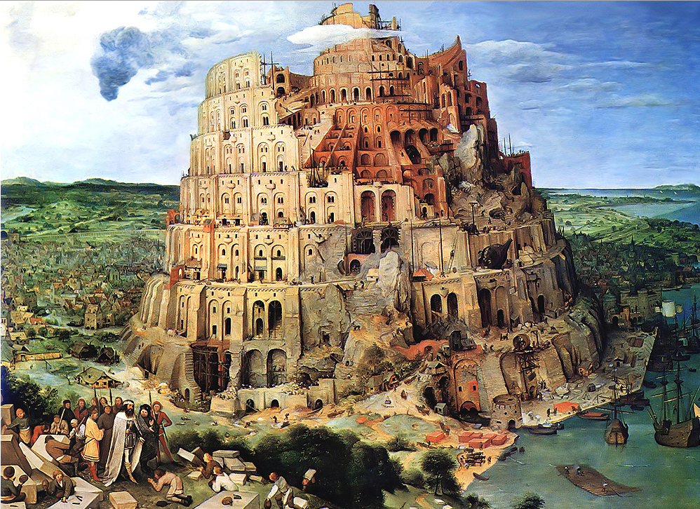
 Porto: a lesson in stairs (Alvaro Siza). For whatever reason, stairs have always fascinated me. Beyond their communicative power and symbolism (Image 1 below), their beauty, craftsmanship and spatial qualities mark a building in a variety of ways. It seems part of human destiny to defy gravity and erect tall structures—in fact humans have worked toward the idea of a sky scraper since the pyramids of the ancient world, and, more recently the 13th century towers in the Tuscan town of San Gimignano. Vertical circulation systems, primarily through stairs and ramps, have been integral to this cultural vision of building vertically.
Along with this urge to build taller and taller, in the latter part of the 17th century the architect, professor, and theoretician Nicolas-François Blondel (1618-1686) “establish[ed] the ergonomic relationship of tread and riser dimensions” a rule of art approved by the French Royal Academy of Architecture that was subsequently applied universally and is still in use today.
This rule meant that architects now defined the comfort of ascension i.e. the nature of appropriate flights (uninterrupted series of steps formed by tread, riser, nose, and stringer); the manner in which they are joined by the placement of a landing; and the accompanying rail system (balustrades formed by banister, handrail, and volute) that enhance the aesthetic and assist with ascent between floors. Of course, the virtuosity of an excellent architect is to find a balance between (these new) code requirements, the spatial aesthetic, and convenience. I try to remind my students that when constraints are introduced it is an opportunity to re-invent or to create something truly new.
We have all experienced the delight of encountering a stair with the emotional impact of a work of art. During those moments, we forget the physical effort in front of us, and let our feet and hands enjoy the tactility offered during the vertical experience. Walking up the stairs becomes an effortless journey when program, function, and the interpretative talent of an architect come together in full unison. Architectural marvels are born and highlight in an artistic manner the passage from one floor to another.
As part of a series of blogs on stairs, I have in the past presented two examples. The first one drew attention to how the very simple shape of a stair organized space as a central system of distribution for the entire building, the serving galleries, and the connecting floors. The second blog emphasized the more sculptural quality of an exterior stairwell that was essential in connecting roof with skywalk, without claiming to serve as an overarching component in the organization of the building. Today’s blog will focus on a third type of stair, one that is deceptively simple in its spatial presence, yet serves as a wonderful lesson about the importance of detailing and construction.
Faculty of Architecture building, Porto, Portugal
When visiting the city of Porto, I never miss—being an architect—a visit to the Faculty of Architecture, founded in 1979 and designed between 1985-96 by Portuguese architect and Pritzker Prize laureate Alvaro Siza Vieira (1933-). Situated in the parish of Massarelos, which includes parts of the city’s historic center, the university facility sits on a promontory looking south onto the steep banks toward the Douro River estuary.
The four stark yet figurative pavilion-like classrooms define a strong urban boundary to Via Panorâmica Edgar Cardoso and formed my first impression upon arriving at the site. The first of the pavilions is reminiscent of Adolf Loos’s Tristan Tzara House façade (1926). The remaining academic units (administration, auditorium, gallery, library and cafeteria) are housed in a series of connecting buildings that delineate the northern part of the site. A central courtyard between the southern and the northern buildings provides users access to various entrances, while offering a large exterior public space.
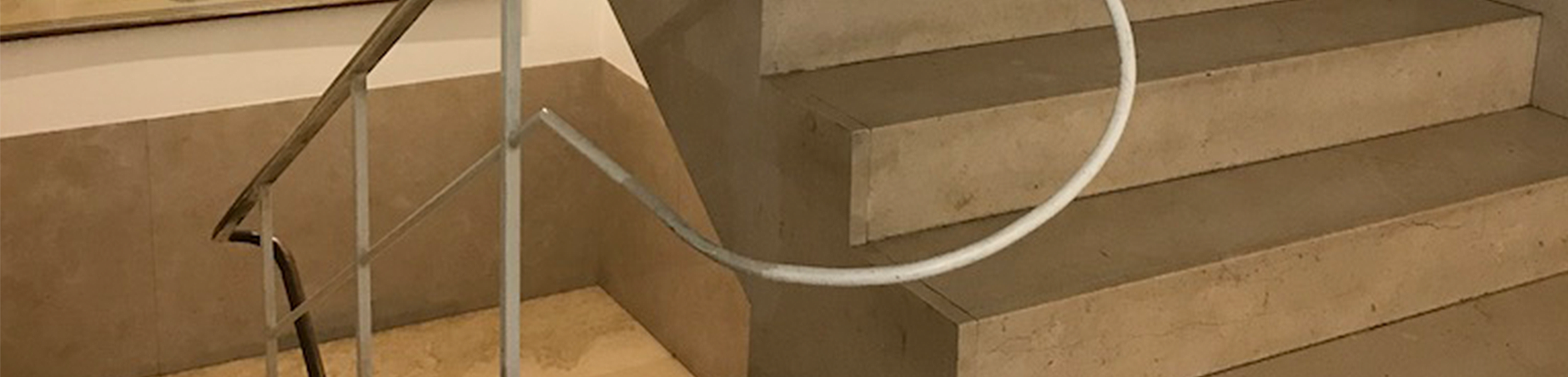
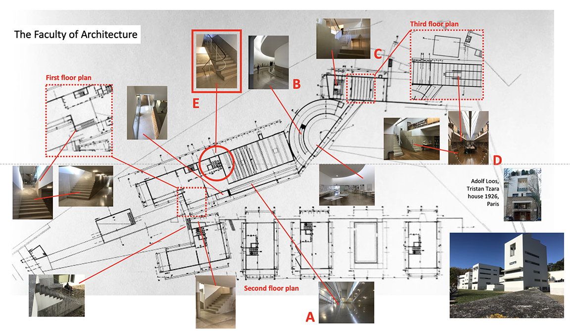
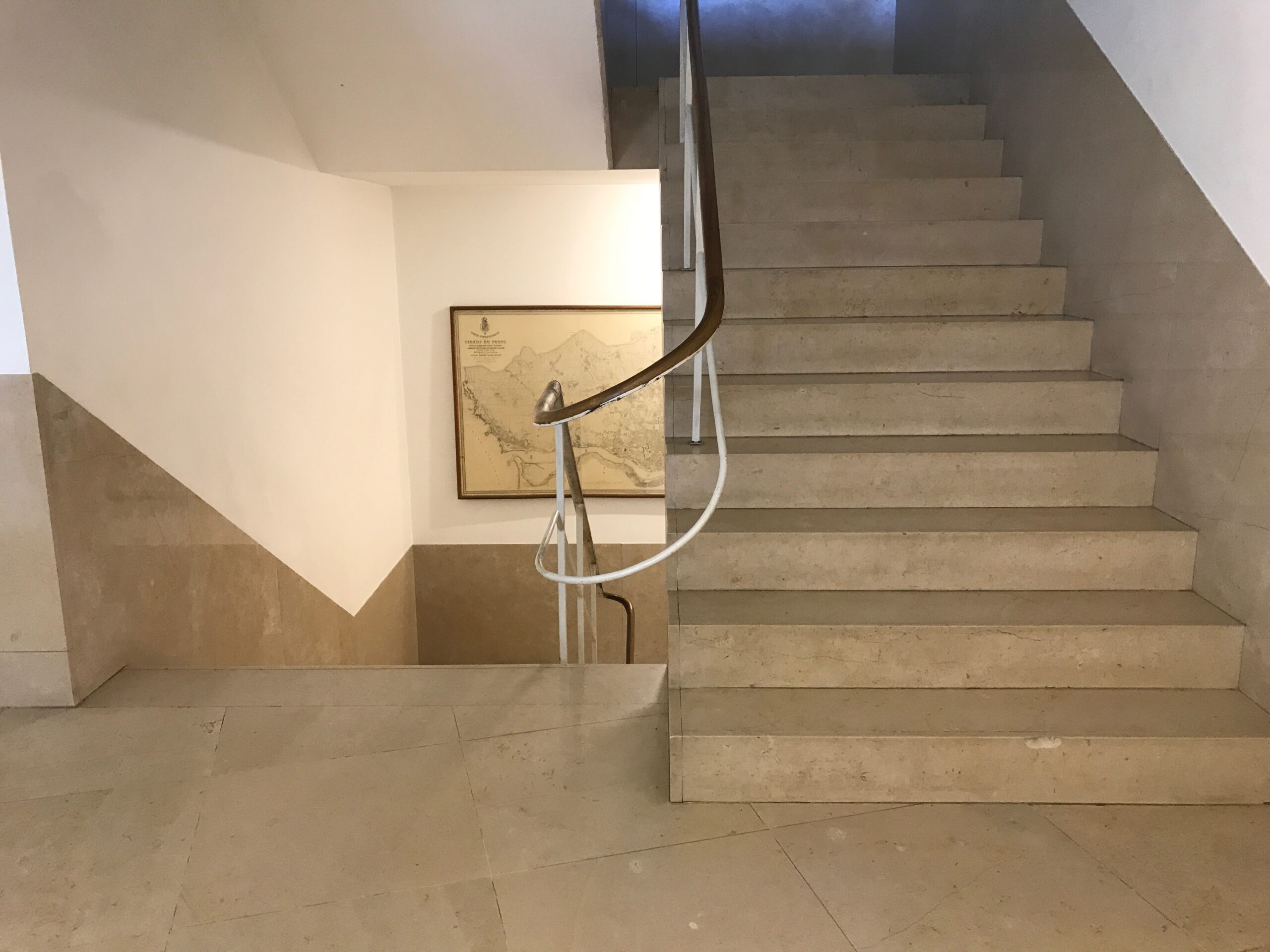
During each of my visits to the Faculty of Architecture, I am enamored by the multiplicity of Siza’s circulation system, notably the stairs and ramps that are judiciously positioned throughout the northern buildings. They provide vertical movement between various levels. Some are more prominent, such as the main ramp that serves as the umbilical cord throughout the main building (A), the gallery ramp (B), the double switchback stairs leading to the main library (C), and two symmetrically positioned interior library stairs (D) (Image 2 above). Other stairs are more discreet. One of these that drew my attention is located adjacent to the library bookstore and administrative suite (Image 3, above, E; and 4, 5, 6 and 7 below).
A sculptural stairwell
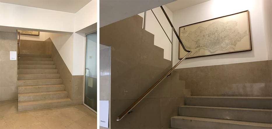
Seeming incongruous in the overall spatial strategy of the set of buildings, I walked up and down the stair, and could not get my mind off how much attention was given to what seemed at first such a banal stairwell. This is perhaps because Siza is “renowned for his deep understanding of materials, and his astute sense of light, color, and shadow,” thus lending great spatiality to the overall experience. The following observations reflect my understanding of several components that make this staircase such a good example of his expertise.
How is this done
- Siza tends to use identical materials (i.e., marble) for his stairs throughout the building, thus allowing the viewer to have a sense of unity between key elements of the stairs.
- To allow the stair to extend spatially within the stairwell, he lines the walls with the same material as the stair, thus creating a wainscoting (or lining) flush with the wall surface. This protective attention extends only to the height of a banister, and offers a visual continuity between stair and wall. Of note is that this covering follows the slope of the stairway with no joint between marble and plaster on the upper part of the wall.
- Both the thickness of the interior apron (fascia) and the riser are expressed visually, yet when the steps meet the wall, they are treated as if they would slide under the marble lining. Of note, no particular attention to a change of material is given to differentiate the nose tread, a moment that is always vulnerable due to constant pressure by foot traffic (Image 5 below).
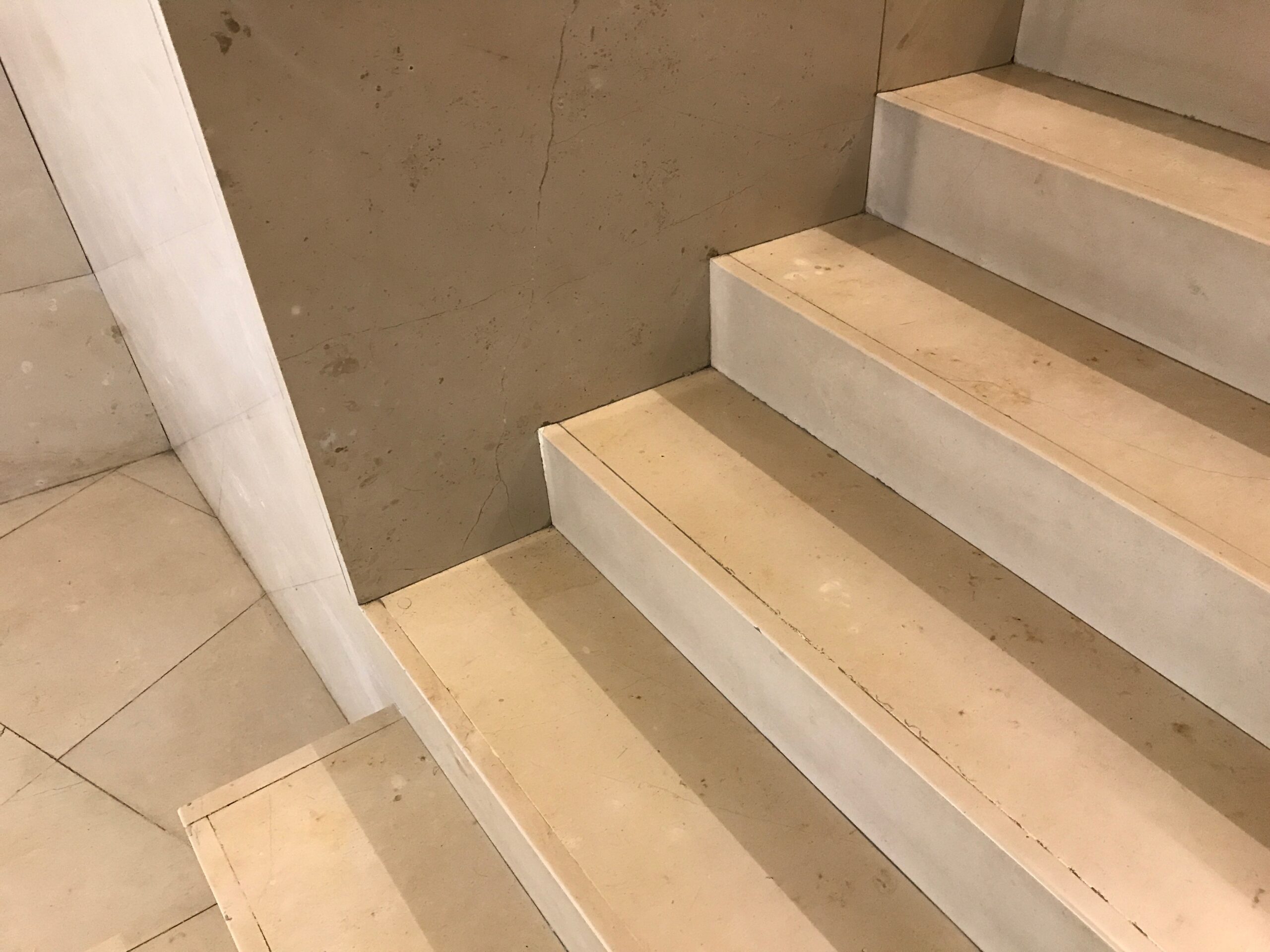
- The overall simplicity of Siza’s stair design gives the illusion that each step is like a piano key that accompanies your ascent.
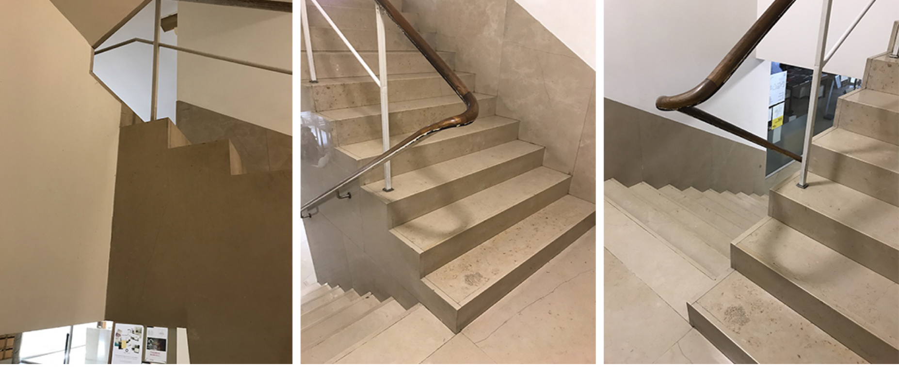
- As to the overall shape of the stair, I noticed different treatments depending on whether they departed from a floor or landing. Typical with Siza, on the main floor three steps protrude into the space as if they want to announce their presence and association with that particular floor. However, at the intermediate landing level, the top tread of the first flight is visible as it merges flush with the landing. This allows visual continuity between the top step and the landing; an important functional and visual moment between the change of direction between the first and second flights of the stairs (image 6 below, middle).
- The next flight resumes with a first step treated tectonically as if it was simply an extrusion of the previous step. While different, the visual effect of the first three steps is similar to that of the departure of the staircase at the ground level (compare image 5 above, and image 6, below middle and right).
- The landing level is subtle and provides a transition while offering a hierarchy to the first steps of the next flight.
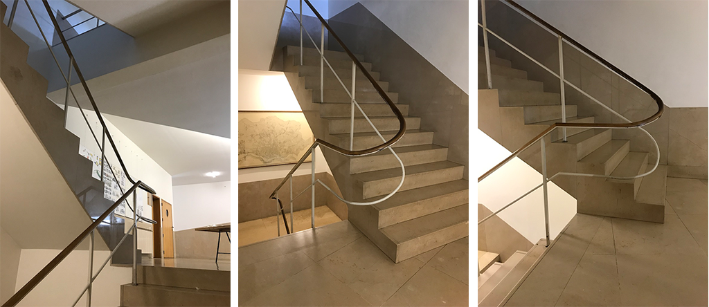
- Accompanying this change in direction, Siza provides an arial balustrade formed by two materials; wood for the handrail and square metal profiles painted white for the banister. The dialectic between those two materials, moving from a line accompanying the first flight of stairs, to both a handrail and a few well positioned banisters, gives a sense of transparency and an arial quality as one ascends. Of note, is the juncture at the landing and the elegant way which Siza achieves a beautifully stereometrically crafted handrail, a reminder of the importance of descriptive geometry in the design of complex forms, or in this case of the detailing and crafting of the handrail.
- Arriving at the second-floor level (Image 7 above, and 8 below), we find similarities to the treatment of the departure from the ground floor, specifically with the three steps. On the second level this allows the user to “depart” from the space of the staircase and belong, for a short moment, to the second level, even if they are continuing their journey to the upper floors. While this treatment of the three steps is a hallmark of Siza’s vocabulary, it makes spatial sense and it is unfortunate that we don’t see this in more buildings. Of course, his treatment requires the extra distance of the steps into the landing. . .
- Accompanying this vertical movement, the interior handrail of the stairwell makes another beautiful gesture while turning the corner, providing physical and visual continuity between stair flights. The combination of stair treatment, balustrade, and wall surfaces, makes this moment visually distinctive yet functionally fitting.
The atmosphere of a stairwell
Overall, I find the atmosphere of this stairwell so delightful—easily apprehended in its simplicity, but so much more complex in my understanding of the various principles behind such a straightforward architectural brief; namely to design a stair!
There is a timelessness, and perhaps discreet sense of anonymity in this staircase that has resonance with my understanding of what architecture can, and, at time should be. The carefully adjusted and well calibrated proportion of each part of the staircase emphasizes how a simple staircase in plan takes its true meaning within a material world. No excessive or frivolous gestures such as glossy magazines promote, just an understated elegance crafted through refined detailing that underscore the master craftsmen’s ancestral gestures, continuously reinvented with the aim to make the stair a little more sculptural.
Perhaps one day, we may be courageous enough to ask our students to once again detail a stair. Not as we often have them do, as construction drawings to satisfy regulatory NAAB requirements, but as part of a culture of construction where concept and execution are both seen as an intellectual endeavor.
Additional blogs pertaining to stairs
Latvian National Museum of Art (ProcessOffice), Part 1
Latvian national Museum of Art, Part 2
The Whitney Museum: stair by Marcel Breuer
Vittorio Gasteiz: a lessons in stairs (Francisco Mangado)
Hong Kong: a lesson in stairs (Bille Tsien and Tod Williams)
Porto: a lesson in stairs (Alvaro Siza)
Firminy: a lesson in stairs (Le Corbusier)
Lexington: a lesson in stairs (Jose Oubrerie)
Vienna: a lesson in stairs (Jože Plečnik), Part 1
Vienna: a lesson in stairs (Jože Plečnik), Part 2
Geneva: a lesson in stairs (Le Corbusier)
How to design a stair
Stair at the Latvian National Museum of Art (Processoffice)