
Lexington: a lesson in stairs (Jose Oubrerie). If you are unfamiliar with the Miller House designed by José Oubrerie, let me introduce you to this magnificent work of art through the lens of a particular element, namely a stair that is both architecture and an elaborate piece of furniture.
Located in Lexington, Kentucky, the history of the house is extensively documented in various articles, including Kenneth Frampton’s expose in American Masterworks: The Twentieth Century House, and the monograph Et in Suburbia Ego that includes an essay—and for the first time as-built drawings—prepared by my former colleagues at the University of Kentucky (UK) Melody Jackson-Ferris and Mark O’Brian, with the assistance of masters students.
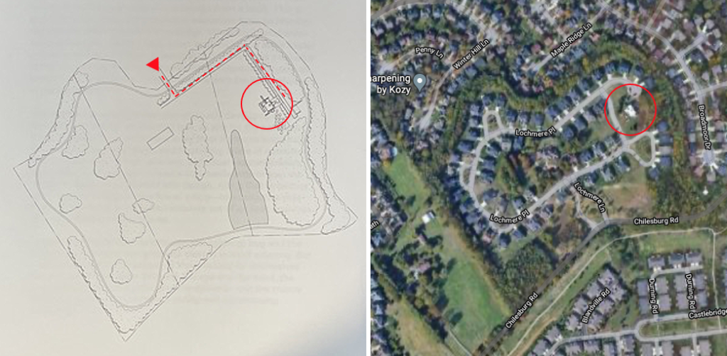
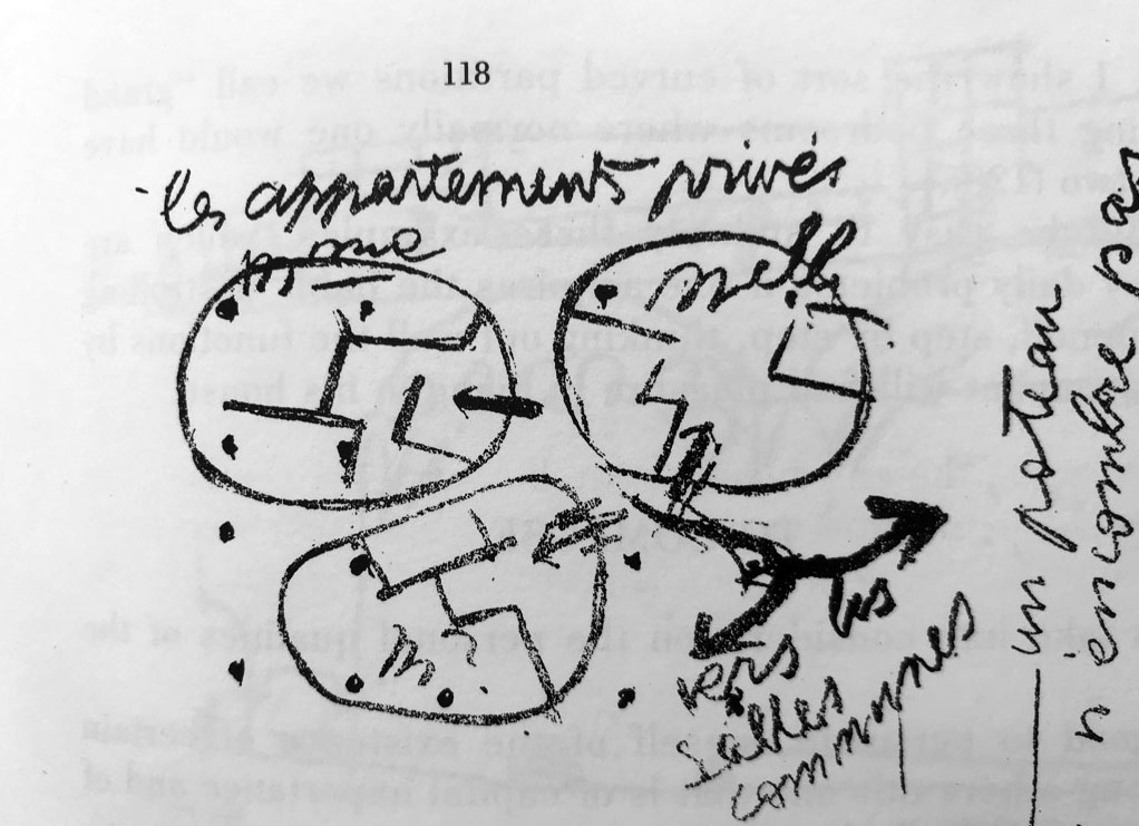
The Miller House’s birth (1988-92), is a story in its own right, when Atelier Wylde-Oubrerie’s collaborative spirit brought students, faculty, and alumni together to research, conceive, and build this unique place for a family with two adult children (Image 1,. below). Perhaps, it also starts a long time ago with a sketch by Le Corbusier, José’s master. (Image 2, below)
The Miller House
The idyllic site of the house was in the midst of thirty acres of unspoiled land south of Lexington. This changed after the death of the original owner and subsequent sale of the land for development. Now, after changing hands and a long period of neglect and quasi abandonment, the recent sale of the house in May 2021 indicates that the phoenix may have risen again. Perhaps a future that anticipates returning the house to its original state of perfection (if we manage to ignore the suburban houses now encircling it; tasteless mediocrity which exacted a revenge on José’s modernist manifesto for a unique model of life).

After serving as a faculty member in UK’s architecture program—where I watched the house being constructed on a nearly daily basis—I have visited the Miller House on numerous occasions. Most recently on a field trip with my second-year students, when we were given an inspiring tour by the architect himself. José’s description of the house and his unique design process—one where he crafted working documents as the project unfolded during construction, which we know can be a recipe for disaster, but not here—was punctuated by countless anecdotes and references to his time as a protégé of Le Corbusier at the Parisian Atelier 35 Avenue de Sèvres (Image 3, above).
The virtuosic moves throughout the Miller House remind me of the complexity developed in Carlo Scarpa’s work, although without the tectonic language so deeply embedded in the Veneto and its re-invention of regional traditions of craftsmanship. The Miller House is also rich in detail—perhaps to a fault. But the true innovation for me rests on how Oubrerie blurred architecture and interior design disciplines to create a domestic environment that should have become long ago a model for integration in academia (Image 4 below).

Interior Design
Too often in design schools, these two disciplines are at odds with each other due to fundamental preconceptions regarding the richness of the contributions of interior design, particularly when it is done with talent, courage, and inventiveness. To my regret, at my current institution questions of domesticity in interior design are rarely addressed at the expensive of corporate and hospitality design projects.
I have always found this attitude curious, as in most design magazines throughout the world, homes and apartments constitute a great number of the featured projects. This is particularly concerning in light of recent shifts in design thinking post Covid-19, a time when domesticity is being redefined after two years of self-imposed retreat. The pandemic, for many urban dwellers in particular, meant an excruciating experience due to the negotiation of tight confinement, need to re-purpose the usage of typical living quarters, the blurring of personal boundaries due to varied family activities, all the while working and/or attending school online locked up at home. New rituals never thought about prior to the pandemic now seem normal.
The architecture promenade

I touched upon the Miller House’s conceptual thinking in a previous blog, and suggested that the concept referenced a sketch by Le Corbusier. I also argued that José Oubrerie and John Hejduk (1929-2000 -Dean Emeritus of Cooper Union) shared an interest in completing Le Corbusier’s oeuvre, albeit in very different ways. In Oubrerie’s project, the Piranesian space of the Miller House remains memorable and offers unexpected surprises as new architectural promenades unfold every time one moves through it.


The main promenade is accomplished through a sequence of unusual paths of movement (alternating between stairs and nautically inspired catwalks) leading from the public first floor to the private bedrooms and office spaces on the second and third floors of each of the three individual ‘houses’ contained within the overall scheme. The Miller House is designed as a microcosm of a city where the triple height living room is a public piazza, surrounded by dining room and kitchen, the stairs and catwalks are an irrigation system similar to urban streets, and a pinwheel defines the organization of the private spaces (houses) contained within the overall Miller House (Image 9 below).
Master bedroom staircase
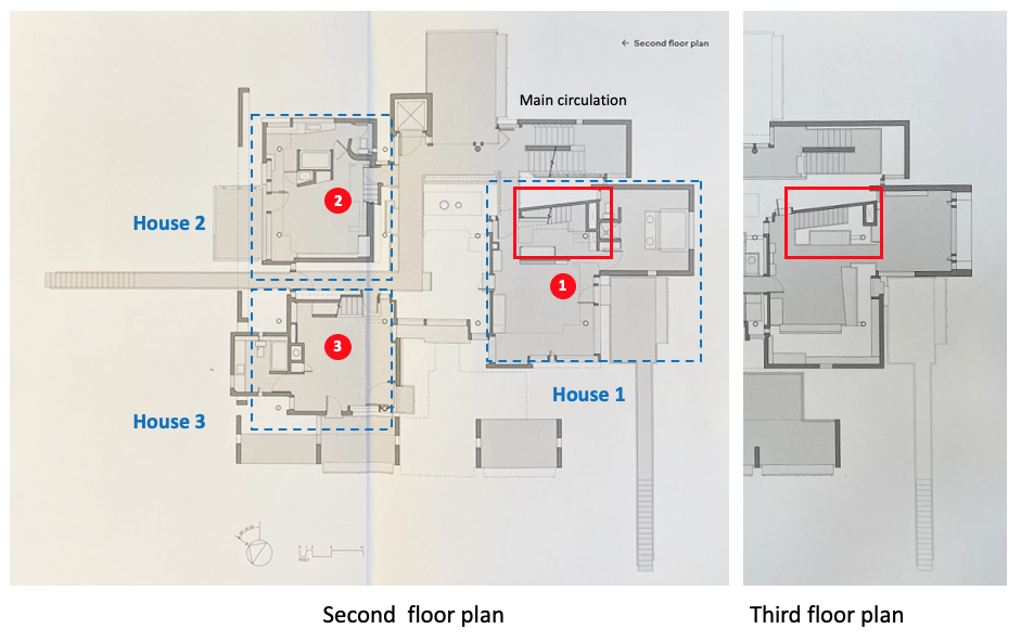
Of the three private stairs (1, 2, and 3) that connect the bedroom and studio levels within each of the individual houses (1, 2, and 3), the master stair is the one that has always captured my attention. Located close to the main circulation stair (Image 8 above and 9 below) as one enters the master house through a narrow catwalk, immediately to one’s left is a stair designed as a complex thick casework in which cupboards are housed under the steps and off of the first landing.
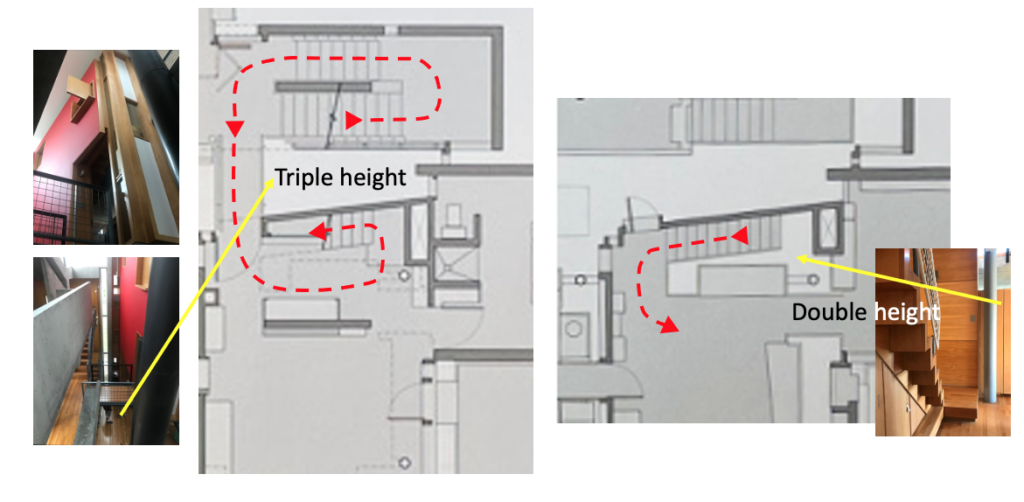
Some key features of the stair within House 3
- The first move (not only noticeable in plan) is the positioning of the staircase on a diagonal wedged between the ‘exterior’ triple height of the parent’s house and the interior double height between the bedroom and studio/office levels. This architectural promenade—from the first to the third floor (Image 10 above, dashed in red)—is treated as a set of delicate key moments, especially where it defines an entrance to the stair on the second level.
Equally important are the steps themselves, the nautically inspired balustrade, and the use of the underneath of the stair as a storage area. All of this is articulated three dimensionally around a column as if the entire stair system pivots around the structure (Image 11, below).
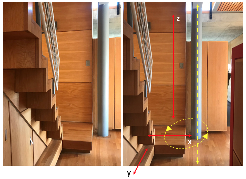
- The second move is the definition of the short L staircase, where the first step defines an ‘entrance’ prior to making a left turn, thus allowing ascension to the studio/office space on the third floor. This step is treated as a landing, and extends within the room, making a clear announcement (both visual and physical) of a more ceremonial way to proceed upstairs. One does not ascend immediately; one is prepared to move up. Of course, this first step has an equally important role as one descends, creating a welcome transition—perhaps a slight repose—prior to entering the bedroom (Image 10, above and 11, below).
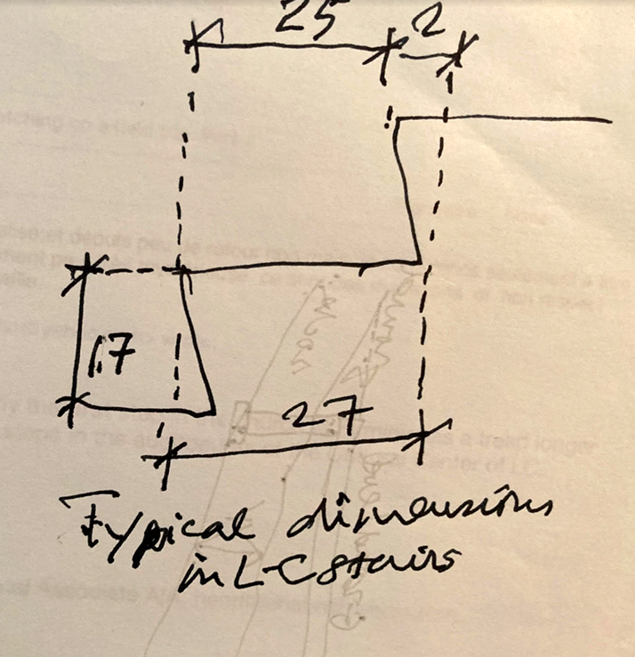
- To accentuate the landing’s spatial presence, it is detailed in a simple manner featuring a wider vertical nosing (contrary to the typical 1 ¼” thickness), which protrudes over a recessed base as if the step was levitating above the actual floor. Simultaneously, the detailing gives it weight by anchoring it to the ground, thus lending a contemporary and clean expression (Image 12, below).
- Lastly, the flooring of the landing is laid at 90 degrees to that of the room—but parallel to the steps—and follows the orientation of the vertical wall paneling surrounding the front of the stair (Image 10 above), thus, creating a visual clue of entrance, and perhaps, most importantly, a sense that the stair is a piece of furniture; in fact, it is a room in its own right. Also, noteworthy is that this landing extends under the steps, creating a ledge in front of the cabinets (Image 12, below right).

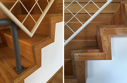
- The third move concerns the treatment of the stairs. There is no extended nosing over the tread, the angled risers create a larger foot surface for the tread (making stairs safer and gaining depth due to height and length restrictions while keeping risers equal and comfortable) allowing visual extension of the steps to the edge of the bottom ledge, and, finally, the stringers are hidden. The overall form is simple, leaving the construction of the steps readable, while giving a sense of solidity by virtue of the use of wood. The intention is not to express lightness, as again, it seems that the entire stair, including its immediate surroundings, suggest casework. The risers and treads are clearly expressed and, in particular, because of their protrusion above the casework below, create a beautiful play of light and shadow (Image 12, above).
- The fourth move provides storage underneath the staircase, thus utilizing the space for practical reasons. In this specific instance, the solution is elegantly expressed and, as with the entire casework of the area, Oubrerie celebrates the joint between key elements: stairs and wall, landing and floor, cabinet doors and panel, wall panels, etc. (Image 13 below, left).
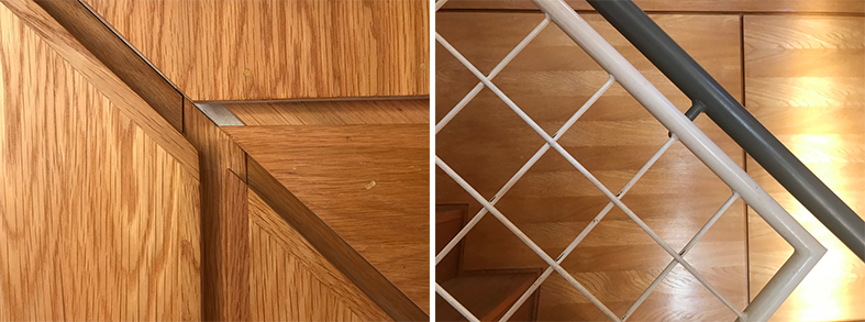
- The fifth move provides—to counter the use of wood—a transparent nautical-style balustrade where color is introduced to differentiate the handrail and newel post (blue grey) from the sturdy gridded diagonal wire lattice (white) which replaces traditional vertical balusters. The Le Corbusier inspired handrail is attached to the webbing and the attention to the dimensioning of each element of the balustrade is noteworthy (Image 12 above, right and video in Image 13, below).
Conclusion
While each staircase in the Miller House is treated with equal intelligence and formal expression, I have always delighted in the staircase of the Master Bedroom. Its corner position could have easily demanded a typical modernist airy staircase, but Oubrerie took advantage of the location, creating a stair as a piece of built-in casework, playing with thicknesses, and working with planes that hierarchically recess according to their functions, all to provide visual delight through the capturing of light and shadow as one ascends.
Too often, especially with architecture students, stairs are not given due respect or treated in an innovative manner. Overall spatial concerns—the actual detailing of an architecture promenade—legitimately take precedence over the expression of circulation. Thus, stairs are often dismissed and do not serve as an important spatial component in their own right. If, as in the Miller House, the stair is treated as a piece of furniture, I would say that great attention needs to be given to this very particular moment in the overall spatial sequencing, especially when thinking of the need to express construction and detailing. In Oubrerie’s case, the stair is celebrated in a manner similar to past grand stairs, but in a contemporary, delicate, and exquisite manner.
Additional blogs of interest regarding stairs
Latvian National Museum of Art (ProcessOffice), Part 1
Latvian national Museum of Art, Part 2
The Whitney Museum: stair by Marcel Breuer
Vittorio Gasteiz: a lessons in stairs (Francisco Mangado)
Hong Kong: a lesson in stairs (Bille Tsien and Tod Williams)
Porto: a lesson in stairs (Alvaro Siza)
Firminy: a lesson in stairs (Le Corbusier)
Lexington: a lesson in stairs (Jose Oubrerie)
Vienna: a lesson in stairs (Jože Plečnik), Part 1
Vienna: a lesson in stairs (Jože Plečnik), Part 2
Geneva: a lesson in stairs (Le Corbusier)
How to design a stair
Architectural Education: modernism, the incomplete project – John Hejduk and José Oubrerie