Vienna: a lesson in stairs (Joze Plecnik), Part 1. Each time I visit Vienna, the capital of the former Austro-Hungarian empire, it exhorts in me a mysterious feeling. First because I keep such fond childhood memories from there, and second because, as an architect, I have great sympathy for the city’s opulence in all matters of the fine arts and design. As a society, we have come to admire the magnificent artifacts that were created over the centuries, but those that retain my attention are from the turn of the 19th century, a period which reflected a new and rich artistic era when the city moved from eclecticism to modern functionalism.
At that time, pioneering modern architecture, progressive Gesamtkunstwerk (total work of art), Secessionist design aesthetics, utilitarian furniture manufactured by the Wiener Werkstätte (“a crafts-collective to make cutting-edge modernist design”), or simply the city’s insistence to safeguard the institutional traditions of the Kaffee Kultur (Image 1, below) all created a sophisticated atmosphere for the gathering of artists, writers, and politicians.
The early 20th century saw the emergence of new values that secured for Vienna its position as an art and design center representing modernity. Of course, there were other major protagonists in music, psychoanalysis, literature, science, medicine, and ideologically driven politics, which together embodied a Zeitgeist (spirit or mood of a period) of incredible vitality, and transformed all artistic disciplines as never seen before.

I shall not forgo the capital’s impressive history that left us with many remarkable landmarks, mainly scattered throughout the city center. I am thinking here of the Baroque palaces and the famous Ringstrasse with its eclectic public buildings and bourgeois residences celebrating ornamentation—often to an extreme. All of them remind me of the Viennese decorative confectionary pièces montées made out of nougat, often simply called marzipan.
Beyond my tongue-in-cheek culinary metaphor, this period of transition between the 19th and 20th centuries is vividly described in Carl E. Schorske’s monumental work Fin-de-siècle Vienna: Politics and Culture, as a place embodying many social transformations that accompanied the city’s design world. Architects such as Wagner, Hoffman, Loos, Olbrich, Moser, Fabiani, and Plečnik, each in their own right celebrated experimentation, opulence, and most importantly, an urgency in expressing progress under the label of modern architecture.
Thus, when I mention the word opulence in Vienna’s modern context, I am not thinking so much in terms of previous garrulous forms, but rather the richness of a high culture that set in motion a way of detailing materials as truthful ‘modern’ decoration, as described in Adolf Loos’s moralizing essay Ornamentation and crime (1913).
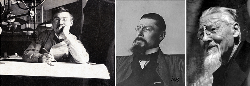
Josef Plečnik

In this artistic context, led under the auspice of the Viennese Secession, “a movement known for its rejection of the decorative motifs of historic architecture in favor of a new, organic mode of ornament,” a key figure who has emerged to gain my admiration is the Slovenian architect Jože Plečnik (1872-1957). Like Fabiani, Hoffman, and Olbrich, who were all students and apprentices of Otto Wagner (1841-1918), Plečnik’s built work left a significant legacy, specifically for him on three European cities: Vienna, Prague, and his native city of Ljubljana. During the decade he practiced architecture in Vienna, Plečnik’s notoriety grew and landed him with the important commission (after a competition) of designing the Zacherl House (1903-05).
Zacherl apartment block

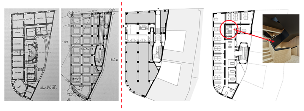
The Zacherl House is an apartment block, situated within the historic city center, minutes away from the Gothic St. Stephen’s cathedral. It was, and is still considered today, as “one of the most significant Viennese buildings of early modernism.” This unconditional approval is because of the following five reasons (Image 3 above, numbered below):
- The overall intervention offers an ingenious urban response to an irregular site facing three streets. The plot’s geometry resulted from the widening of medieval streets at the turn of the century.
- Uses poured-in place reinforced concrete columns for the first and mezzanine floors, while maintaining conventional load bearing walls at the upper levels. Hennebique’s 1892 reinforced concrete construction system, which integrated columns, beams, and slabs to form a single monolithic element, in the Zacherl House predates by four decades the famous 1929 Dom-ino house floor plan by Le Corbusier.
- Develops an innovative treatment of the façade by wrapping a continuous curtain wall (non-load bearing façade)facing all three street sides—a way of building not yet seen in the Viennese capital. Furthermore, following an aesthetic suggestion based on his client’s appreciation of a nearby grey facade, Plečnik used an untried construction method where vertical polished granite panels formed a cladding held up between vertical stone ribs (Image 4 below).
- Creates a new vocabulary of ornamentation following the Secessionist movement, creating for the Zacherl House Atlantis figures below the cornice in abstract shapes, and,
- initiates an entrance sequence leading to the magnificent internal staircase.
Overall, Plečnik’s understanding of form follows the early modern principles of rational and organized design, namely based on a new spatial order advocated by his teacher and mentor Otto Wagner. Yet, much of Plečnik’s fame with this building is due to his affiliation with Wagner, as well as a departure from his master; thus, Plečnik’s ambition to create a new language for architecture that not only partook in the development of Viennese modernism, but actually secured him a place as a forerunner of a new vocabulary in architecture.
Evolution of the Zacherl House plan and façade

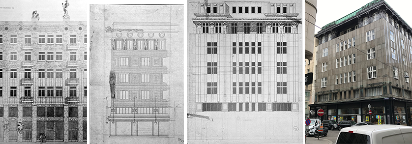
It is always a treat to research the evolution of a project and in this instance, find milestones of an architect’s work as Plečnik developed the façade (Image 4, above). The 1900 rendering shows the desire to combine the ground floor with the mezzanine, a leitmotif inspired by Otto Wagner and new to the typical expression of Viennese façades at that time. Furthermore, in this competition rendering, Plečnik developd an organic stylized surface that would become further explored in the Lange House of 1901 (image 8, below). The 1903 façade of Zacherl builds on the use of ceramic tiles by Max Fabiani in 1901 for the Palace Portois & Fix office building.

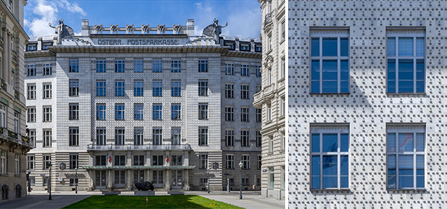
The final version of the 1904 Zacherl façade treatment sets in place the entire future language of the non-load bearing façade, anticipating, and in fact preempting Wagner’s treatment of his 1906 Postsparkasse’s main façade which featured ornamental aluminum rivets to attach the marble cladding to the building’s structure (Image 6, below). Wagner’s strategy was a subterfuge expression of construction that showcased more a decorative treatment of the façade, rather than a truthful handling of the birth of a curtain wall; one which Plečnik was by now in full command.

Furthermore, traditional treatment of Viennese facades—which framed windows in elaborate ways—is now, through Plečnik’s language, stripped down to provide a three-story flat surface where the proportions of the windows are part of the overall cladding (Image 4, above).

Finally, while the overall treatment of the entire Zacherl House façade follows a classical treatment of base, shaft, and coronation, Plečnik redefines the ground floor and mezzanine (entresol) as a unified element, while providing a recessed and more ornamental treatment of the coronation. These attributes of a modern facade suggest again that Plecnik follows to an extent Wagner’s innovations, yet anticipates Loos’s total abandonment of ornamentation as expressed in the Goldman & Salatsch building (coined Looshaus) with its two first stories clad in marble, topped by a blank smooth stucco white façade; a façade universally recognized through its lack of any treatment surrounding the window openings (Image 7 above, far right photograph).

These external advancements are often discussed as the heart of Plečnik’s achievements, failing to discuss the opulence of the entrance sequence of the Zacherl House, something I will cover in a future blog.
Additional blogs of interest regarding stairs
Latvian National Museum of Art (ProcessOffice), Part 1
Latvian national Museum of Art, Part 2
The Whitney Museum: stair by Marcel Breuer
Vittorio Gasteiz: a lessons in stairs (Francisco Mangado)
Hong Kong: a lesson in stairs (Bille Tsien and Tod Williams)
Porto: a lesson in stairs (Alvaro Siza)
Firminy: a lesson in stairs (Le Corbusier)
Lexington: a lesson in stairs (Jose Oubrerie)
Vienna: a lesson in stairs (Jože Plečnik), Part 1
Vienna: a lesson in stairs (Jože Plečnik), Part 2
Geneva: a lesson in stairs (Le Corbusier)
How to design a stair
Architectural Education: modernism, the incomplete project – John Hejduk and José Oubrerie