
Vienna stairs Jože Plečnik, Part 2. As much as the Zacherl House expresses the promise of modernism to come—from site strategy, structure, treatment of the façade, and ornamentation (previous blog)—I want to also celebrate the entrance sequence which, for me, makes this building so memorable. Perhaps this is because much research on the Zacherl House fails to go in depth regarding the staircase and because I find this particular space so beautifully orchestrated.
Entrance and stairwell
I know that my interest might seem a minor point among the major themes of Viennese architecture, but during a recent visit to Vienna, I was able to sneak past the concierge—who must have been enjoying a lunch break—to appreciate firsthand the Treppenhaus or Treppenraum (stair house/stair room) as it is called in German. This space was a revelation that I had previously only admired through photographs. My experience augmented my admiration for Plečnik’s interest in treating this, and other spaces as a Gesamtkunstwerk.

As a wonderful piece of architecture, the stairwell cannot be appreciated without understanding its sequence of spaces, which visually connect each other on an axis—reminiscent of an enfilade—zoned in sections serving various functions (Image 9, above, reference numbers).
1. Vestibule
Upon entering from Wildpretmarkt, one is greeted by a vestibule (1) immediately followed by a second set of doors. There is nothing exceptional about this entry chamber, but as soon as one engages in the elongated corridor (2), a set of visual clues accompany the journey until the start of the main staircase (5), which is the culmination of a linear architecture promenade.
2. Corridor
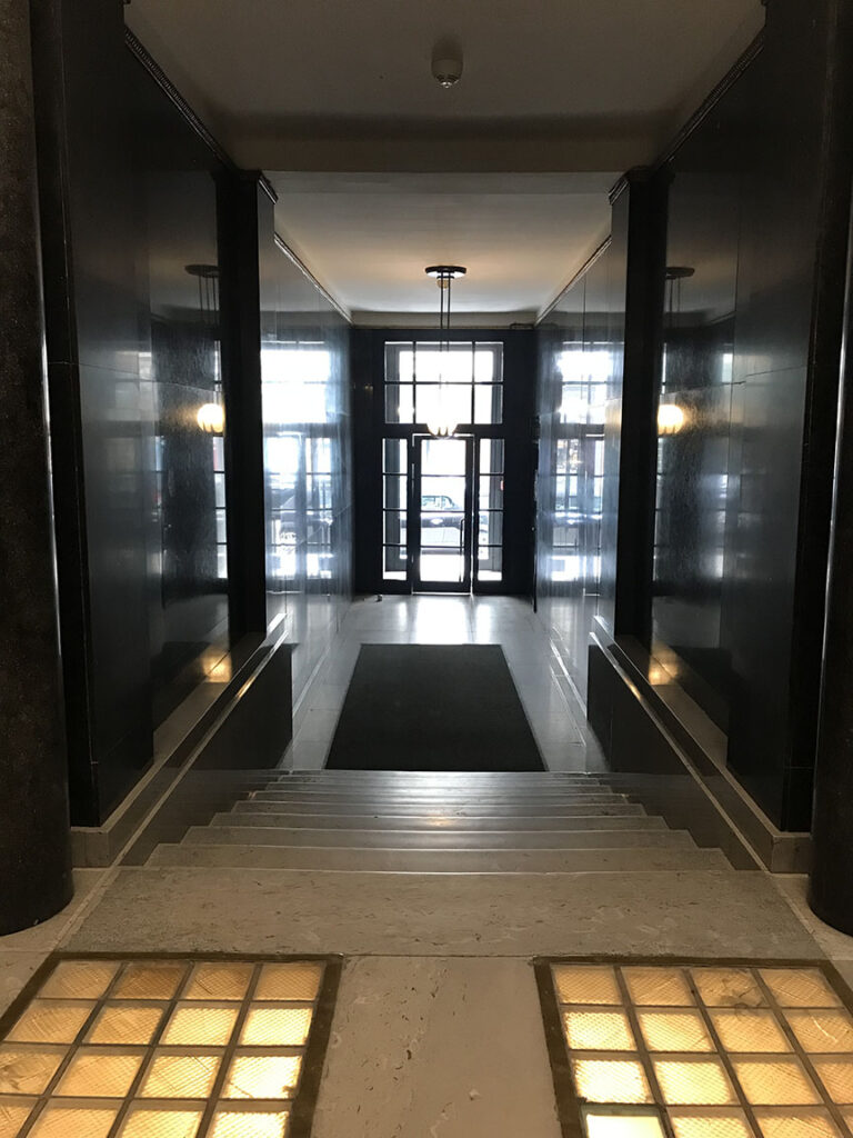
Rich materials frame the corridor, allowing us to proceed rapidly prior to encountering a set of stairs (3).
3. Stair
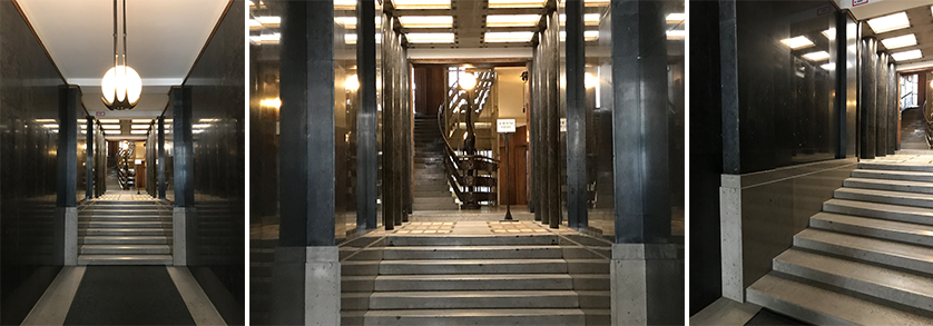
Gently dimensioned, the stair is full width and monumental in its own right. They belong in plan to the corridor, but seem to have their place more with the upcoming foyer (4). This is because the stairs are framed on both sides by polished black granite, which, due to the highly reflective surface, emphasizes the pilasters with their abstract classical architrave at the beginning and end of the steps (Image 11, above, left and right). The materials are repeated on each side to form a volume for the stairs as well as definition of a base for the black granite on the walls that visually accompanies the ascension to the foyer.
4. Foyer
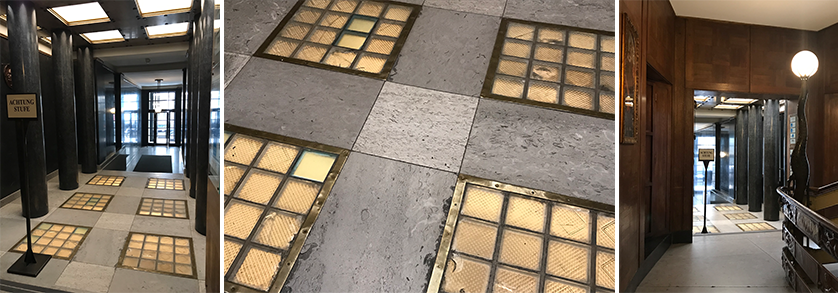
The foyer, located immediately atop the last step, serves as a place of orientation where the concierge’s space (to the left) assists in directing the visitor to the upper levels. The foyer is square, larger than the previous three spaces and is marked by eight majestic granite columns. A subtle dimensioning between the first and second column allows the opening to correspond to the concierge’s room (Image 12, above, left).
Looking back at the previous sequence (Image 9, above, No. 1-3), we find an intellectual dissolution of wall to column. The magic of this arrangement unfolds as if the entrance wall has taken the full height of the corridor, becoming a pilaster at the juncture of the stairs, and leading to the emergence of the columns, all within the same vocabulary of materials. Noteworthy is that the columns of the foyer and their treatment are reminiscent of those found in Plečnik’s subsequent work at the National and University library foyer in Ljubljana (1941), and in Loos’s later work on the exterior façade of the Loos Haus (1912).

At this juncture, far into the center of the building, the ceiling of the foyer allows light to enter and, while it is reminiscent of coffered Roman ceilings, it now includes light. This subterfuge is brilliant since, when one refers back to the plan (image 9, above), the foyer is located in the first courtyard, adding light to the gravitas of the materials. This artifice punctuates the journey, even further suggesting virtual square columns between the light sources (natural from the coffered ceiling and artificial from the floor) reinforcing the sense of while being enclosed also being inside a courtyard, which in fact, is absolutely true (Images 13 above).
5. Stair house

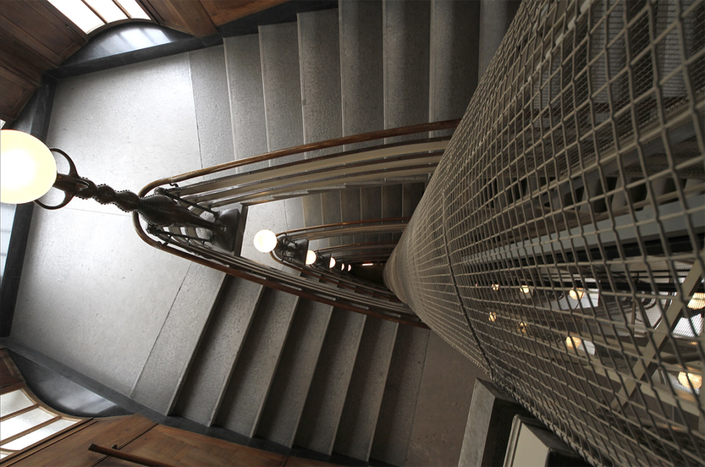
Finally, arriving at the main stairwell—which was in constant focus since entering the building—one appreciates its elegance and refinement as one proceeds to walk up the steps counter clockwise, reminiscent of the upward movement of spiral stairs in medieval castles (Image 14, above). The elliptical form was defined as early as 1903 by separating it from the main body of the building to create a presence within two smaller courtyards, thus allowing ample light to bathe the stairs at each landing from the second floor upwards (Image 5 above).
Plečnik’s interest in creating a representational stair house (Treppenhaus), led him to interpret the late baroque stair located in the Gruber Palace in his home city of Ljubljana (Image 9, above, right photograph). Yet, in the Zacherl House it is treated as a superb expression of art nouveau detailing and abstract elegance.
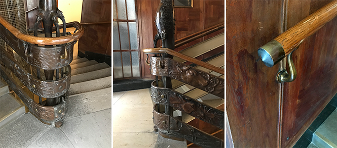
The detailing of the entire stairwell is beautiful in its own right. Craftsmanship through material culture is evident and perfectly executed. From the bell to call the elevator, the intricacies of the balustrade with their folded ornamental sheet metal, to the wood handrail, the wall paneling, and, finally, the lighting system which echoes the owner’s source of wealth (the industrialist Zacherl developed an insecticide powder that he called Zacherlin, thus the form of an insect in the lighting). Noteworthy is the inclusion of an elevator, a contemporary vertical circulation invented in 1852.

Conclusion
Overall, the treatment of the stair in the Zacherl House demonstrates the power of the German ability to combine words to create new meanings, this time the Treppenhaus (stair house), which becomes a true spatial component of the organization of a building. It is noteworthy that this tradition continued in 2015 with the addition of a modern stair (Previous blog, Image 5, right photograph), one worthy of the name stair house.
Postscript

During a visit to the castle ground in Prague, I was fortunate to visit an exhibition in which the above mentioned stairs was featured in a model.
Additional blogs of interest regarding stairs
Latvian National Museum of Art (ProcessOffice), Part 1
Latvian national Museum of Art, Part 2
The Whitney Museum: stair by Marcel Breuer
Vittorio Gasteiz: a lessons in stairs (Francisco Mangado)
Hong Kong: a lesson in stairs (Bille Tsien and Tod Williams)
Porto: a lesson in stairs (Alvaro Siza)
Firminy: a lesson in stairs (Le Corbusier)
Lexington: a lesson in stairs (Jose Oubrerie)
Vienna: a lesson in stairs (Jože Plečnik), Part 1
Vienna: a lesson in stairs (Jože Plečnik), Part 2
Geneva: a lesson in stairs (Le Corbusier)
How to design a stair
How to design a stair
Architectural Education: modernism, the incomplete project – John Hejduk and José Oubrerie