
The Whitney Museum: stair by Marcel Breuer. There are too many magnificent stairs in New York City to fathom visiting them all during one stay or even in a lifetime.
However, I am fortunate to have experienced a few that I consider seminal, ranging from that of the iconic New York Public Library (Carrère and Hastings), the grand Beaux-Arts steps at the Metropolitan Museum of Art (McKim, Mead and White), and the now absent circular stair at Apple’s flagship ‘cube’ store (Steve Jobs). All three stairs are located on Fifth Avenue.

There are other remarkable stairs in the city including Prada Broadway (Rem Koolhaas); Giorgio Armanis’s flagship store (Massimiliano Fuksas); and Longchamp’s “La Maison Unique” in Soho (Heatherwick Studio) (Image 1, above). However, my favorites are the anonymous fire escape stairs that marked my first steps through the East Village as a young man in New York. These stairs were added to many buildings like so many hanging spider webs; wrought iron structures of the turn of the century, which, while to me beautiful, were first and foremost lifesaving egress paths.

As an architect, I cannot ignore the visual expression of these fire stairs and how they contribute to the city’s distinct atmosphere; in particular, those belonging to 19th century brownstone tenements, where they often acted as terraces, gardens, and sunning pads during hot and humid summer days; inspiring the famous evening scene in the 1961 film West Side Story. These fire stairs also call to mind the memorable New York cityscapes painted by Edward Hopper (Image 2, below).

While all of these stairs are memorable, what make a stair iconic is debatable and is a matter of opinion. In the case of the interior staircase at the Whitney Museum of American Art—a brutalist building designed by German-American architect Marcel Breuer with his partner Hamilton P. Smith— its importance resides in the stair’s ability to represent the best of a post-Bauhaus movement.
Whitney Museum of American Art
I first arrived in New York City in the early 1980s to attend the IAUS (school founded by Peter Eisenman)—the era of the haunting atmosphere of Scorsese’s film Taxi Driver—and I remember visiting the Whitney Museum the first time. As it is still today, my visit was a pilgrimage to discover both the art and the architecture of the Whitney. Beyond the remarkable architectural features, I learned firsthand about the significance of 20th century American Art (Image 3, above).

In addition to the collection of antique Shaker furniture, my favorites among the collection were the paintings by Stuart Davis, Charles Demuth, Charles Sheeler, Wayne Thiebaud, (Image 4, above) and Edward Hopper. I discovered that Hopper’s depiction and sense of voyeurism echoed my own peregrinations as I walked the streets of the Big Apple late at night after a long day in studio; fearless despite a few tense encounters in the city that never sleeps.
Brief history of the Whitney
Let me pause and offer a brief history of the landmark building. After being housed in three different locations in Manhattan, in 1966 the Whitney Museum moved to its permanent location on the Upper East Side off Madison Avenue. In 2014, this posh address no longer accommodated the museum’s collection, and a new, larger facility was in the making. Today the Whitney Museum of American Art is housed at 99 Gansevoort Street in a new building designed by Italian architect Renzo Piano.
After the move, the original landmark Whitney became a temporary annex for the Metropolitan Museum of Art (MET), before serving as an exhibition and storage space for The Frick Collection (under the name Frick Madison) during that museum’s renovation and enhancement by Selldorf Architects.
Prior to finding its new home in the former meatpacking district in Lower Manhattan in 2015, the Whitney underwent a number of commissions teasing out proposals which would have entailed adding real estate to the landmark building either next to or on top! The following images showcase four contentious proposals by star architects (Image 4, below). As a side note, the landmark building will reopen in 2025 “as a [Sotheby’s] premier gallery space for the auction house giant.”

The Breuer proposal
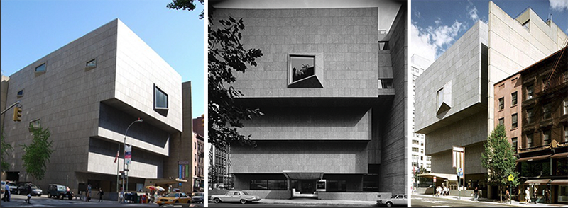
Every time I approach the landmark Whitney, I feel its presence as it is hovers proudly next to Madison Avenue. Proudly might be a personal feeling. Perhaps defiantly is more appropriate, as its three brutalist tiered floors unabashedly cantilever just shy of the sidewalk in an almost forbidding manner; deifying laws of gravity reminiscent of the facade of the Ducal Palace in Venice when completed in the 15th century.
I have no qualms saying that the building does not make any attempt to be sympathetic to its immediate neighbors; the brownstones and postwar apartment buildings. In fact, the urban site strategy—with its moat entrance above a sunken café garden—is what makes the landmark Whitney emblematic of post-modernity. Its presence is nothing less than gutsy in its formal attitude. The monolithic cube-like volume, distinctive gray granite materiality (in opposition to limestone and brick), lack of traditional ornamentation, and expression of a fire wall facing its southern neighbors contributes gravitas to the streetscape. In fact, this dignified, and fortress-like condition of the Whitney is best expressed by Breuer himself in the text he submitted to gain the commission:
“What should a museum look like, a museum in Manhattan?… It is easier to say first what it should not look like. It should not look like a business or an office building, nor should it look like a place of light entertainment. Its form and its material should have identity and weight in the neighborhood of fifty-story skyscrapers, or mile-long bridges, in the midst of the dynamic jungle of our colorful city. It should be an independent and a self-reliant unit, exposed to history, and as the same time it should have visual connection to the street, as deemed fitting for housing twentieth-century art. It should transform the vitality of the street into the sincerity and profundity of art.”
Marcel Breuer
The Whitney’s facade
To give form to his words, Breuer devised a front facade with three imposing cantilevers that staggered towards Madison Avenue, ending at the edge of the zoning frontage. The top blank picture plane façade includes a unique over-scaled trapezoidal oculus (Image 6, below). The overall chiaroscuro effect of the tiered façade emphasizes a scale and volumetric shape that is in direct opposition to the neighboring brownstones.
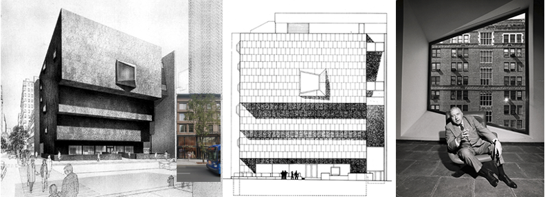
The north façade facing 75th Street is similar in its austerity to the front façade and includes six smaller windows. The treatment of the south façade is equally striking with the direct and unambiguous knife-like gesture expressed through the thin blank fire wall that rises from street to roof (Image 6, left and middle, above).
As previously mentioned, the building is brutalist in both its external and internal expression. However, I found a gentle gesture within this style, which is best expressed in the main staircase leading from the ground floor down to the café and the open-air courtyard under the entrance bridge.
The staircase leading to the sculpture garden and café
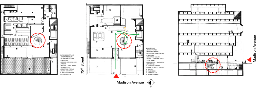
When working on a design project, multiple iterations are always part of a necessary refinement that takes time, diligence, and most importantly, relies on a process of editing. Case in point, during my research into the as-built Whitney staircase, I discovered an earlier design that featured a circular stair—in lieu of the half landing one that was constructed (Image 7, 8 above, and 9 below).
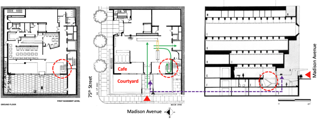
In the first proposal, the presence of the stair seems monumental in both size and geometry, yet fails to create a natural flow between entrance and front desk, or desk to elevators, or down to the café and courtyard. In opposition, the stair which was built is closer to both the café and courtyard that it serves (Image 10, below). Also, Breuer took advantage of the interior service wall that extends into the courtyard to position the stair, thus using what might have been a dead corner at the lower level to create a ceremonial moment of descent below grade (Image 10, below)
Some thoughts on the staircase

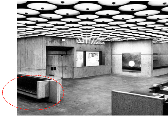
Because of the position of the stair within the entrance lobby, it is only after accessing the gallery foyer—which is in front of the elevator—that the stair makes its presence felt. Tucked neatly into the south corner of the double height ground level café, the bluestone flooring of the entire entrance foyer flows down the steps, giving the stair a material continuity between entrance and ground levels (Image 10, above).
Let us descend the stair and look at its key attributes as viewed from the café. The first visual element that draws attention is the triangular shape of the apron—typically referred to as a spandrel. I have always wondered about the triangular shape of the apron and could not find reference in Breuer’s drawing or writings to the chosen aesthetic beyond wanting a dynamic expression accompanied by the need to respect building code.
For me, the geometry of the stair suggests that it is unfolding, and reminds me of the built-in airstairs (also called aft or ventral stair) of the iconic McDonald Douglas DC-9 aircraft that allowed passengers to board and disembark at the rear of the aircraft.

This key feature of the aircraft stair was revolutionary because it was incorporated into the tailcone. The forward airstair was also part of the aircraft because contemporary jetways and movable staircases were not yet commonplace at airport terminals. Remember the famous people movers and plane mate vehicles complementing architect Eero Saarinen’s Dulles airport project? Today they still are used to move passengers from terminal to terminal. In the recent past, plane mates acted “like a mobile jet bridge, taking passengers right up to the door of parked planes.”
For me this is more than coincidence that the 1965 launching of the DC9 tail engine aircraft was followed in 1966 by the opening of the Whitney whose stair emphasizes, “…according to architect and author Robert McCarter, [that] the building incorporates ‘one of the best examples of Breuer’s ability to make staircases into functional sculpture.’” (Image 10 above and 12, below).
Materiality

The structural spine of the stair is made of reinforced concrete with a surface that has been bouchardé; a method of roughening the surface of marble, stone, or in our case, the concrete. The resulting granular texture offers the stair a pebble-like look that gives visual depth while avoiding the memory of the construction formwork—a texture that was explored by Auguste Perret and developed into quasi abstraction by Tadao Ando.

Another beautiful detail is echoed in the steps of the Whitney. The visual simplicity of the stacking (especially the first flight of stairs seen from the café), and the angled risers centered on each step with an edge treatment reminiscent of Czech cubist details all contribute to an understated elegance (Image 13, above).
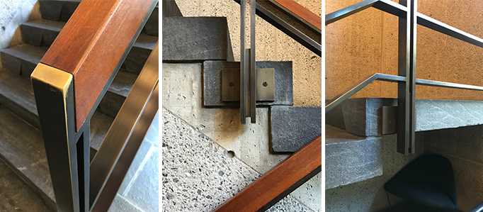
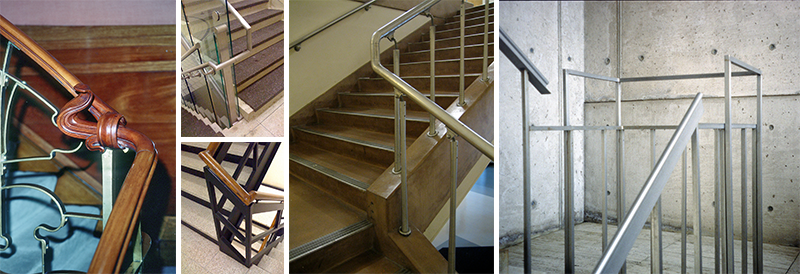
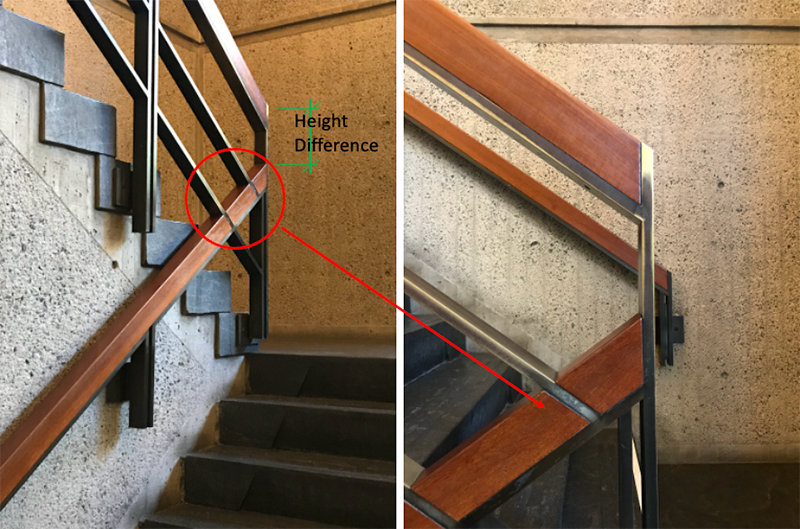
Of equal note, is the treatment of the both the baluster and handrail, and more importantly, how Breuer solves the obvious height difference as the handrail ‘turns’ at the landing. Typically, there is an jump in elevation of a handrail at a landing because of the need to negotiate the last tread before the next flight’s first step, which is always one higher. Many architects have made a point of articulating this moment in elegant, tectonic, yet personal manners (Image 14, above, and 15, below).
Breuer resolves this conundrum by choosing to have no space between flight of stairs—a design strategy that U-shaped stairs would typically have. The resulting ‘flatness’ between the two handrails obliges Breuer to devise a solution that negotiates both balusters and handrails in a single plane at the particular moment of the landing (Image 14, 15 above, and 16 below).
While the continuity between handrails no longer exists in a traditional manner, the resolution is elegant and offers a very strong tectonic solution; at least if one takes time to mull over how he achieved this transitional moment (Image 15, below).
Conclusion
The staircase at the landmark Whitney in not airy and light. On the contrary, is it massive and heavy, yet it has an elegance that talks about ascent and decent in a dignified manner. Craftmanship is expressed in its most elementary way, simple with clean lines, honest in its expression of materials. In short, representative of a Bauhaus aesthetic. And in my mind, an iconic stair.
Postscript 1
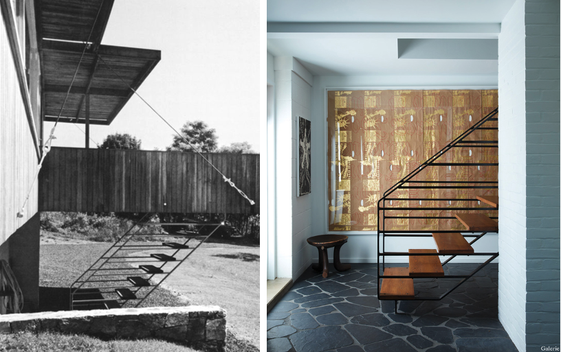
During my research, I encountered two additional staircases by Breuer that resemble the one describes in this blog. Contrary to the one featured at the Whitney Museum of American Art, these stairs are light and airy—almost tensile-like in their expressions—with a strong use of a metal horizontal frame to hold their wooden steps (Image 17, above). The virtuosity of these two stairs is how Breuer incorporates the handrail and balusters with the ergonomically positioned steps. A clear understanding of how to design in a synthetic manner and, why, for students, the design of a stair can be challenging if it is left as an afterthought after being merely drawn on a plan.
Postscript 2

(Nov, 04, 2024) Architect Magazine announced “Herzog $ de Meuron to renovate Breuer’s Iconic Building for Sotheby’s.” What a great opportunity, and this despite that a public building will become private with possibly no longer access to the building as when it was a museum. The Swiss firm will collaborate with New York-based PBDW Architects.
Additional blogs of interest regarding stairs
Latvian National Museum of Art (ProcessOffice), Part 1
Latvian national Museum of Art, Part 2
The Whitney Museum: stair by Marcel Breuer
Vittorio Gasteiz: a lessons in stairs (Francisco Mangado)
Hong Kong: a lesson in stairs (Bille Tsien and Tod Williams)
Porto: a lesson in stairs (Alvaro Siza)
Firminy: a lesson in stairs (Le Corbusier)
Lexington: a lesson in stairs (Jose Oubrerie)
Vienna: a lesson in stairs (Jože Plečnik), Part 1
Vienna: a lesson in stairs (Jože Plečnik), Part 2
Geneva: a lesson in stairs (Le Corbusier)
How to design a stair