About watches and their typefaces. Owning a wristwatch seems an old-fashioned approach, but I like to observe the human gesture of gently moving one’s wrist to reveal what time it is. I favor watches and, in particular, those that are analog.
Despite the move to the digital, traditional time pieces seem to have never gone out of fashion, and this despite Apple’s hegemony that offers a cornucopia of remarkable digital prosthetics. Yes, I am heartened to see how many wristwatches continue to be produced yearly, and how Baselworld, the world’s premier watch and jewelry trade show, presents, every spring, the latest innovations in horology.
Skagen
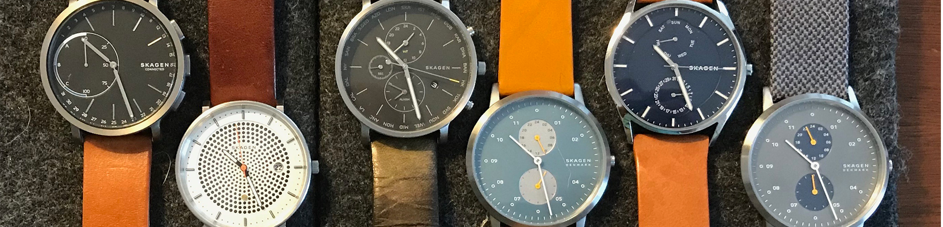
I have over the past years, fallen in love with Skagen watches. They are elegant, and as with any Danish-designed object, are beautifully crafted with a cornerstone in modern design ethos. The legacy of the Bauhaus in furthered by blending artistry and craftsmanship, creativity and manufacturing. This way of thinking is always on their mind, which makes each piece timeless. To boot, they are reasonably priced! Thus, I will admit, that I have splurged and own six Skagen’s -as well as a solar one given to me!
A question of classification
The other day, when looking at them so carefully arranged in a homemade felt travel pouch, I realized that they were all different, yet so similar. Like in the essays of Mr. Palomar (named after the famed telescope in Southern California) by Italian author Italo Calvino, I started to systematize my observations by comparing and contrasting key elements, understanding each aesthetic experience, and classifying forms accordingly. As an architect, I was reminded of the idea of type, which allows the reduction of form to something identifiable and general, something like a “root form.”
Typefaces
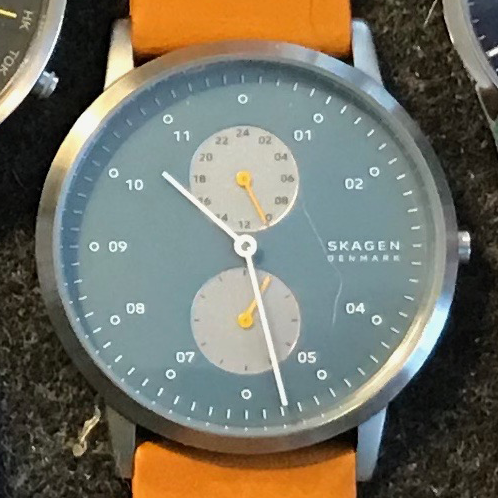
Case in point, I became interested in the last four watches on the right in the above top image; in particular, the organization and development of their watch dials or typefaces. The question of the design became essential when I acknowledged that within the matching stainless-steel cases were two identical-sized circles organized vertically on axis on the dial, showing either the minutes in increments of five seconds or a 24-hour cycle in military time. The indication of the date and day may also be included in the smaller circles. Finally, a more complex version included the time of world cities by clicking on one of the right pushers.
Of course, viewing the actual time remains essential. There is great simplicity in defining:
- the hour marks (thicker or thinner dashed lines, a circle accompanied at times by the appropriate numbers 01-11
- a variety of hour, minute, and second-hand arms — all well-proportioned and carefully calibrated)
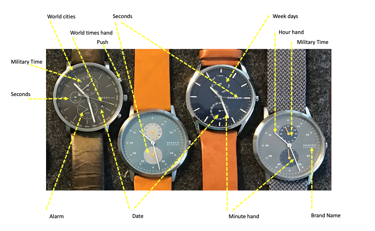
Finally, the subtle expression of the color choice for the dial, accompanied by slightly indented apertures, highlight specific moods by suggesting, for example, either a masculine or summer look or an evening atmosphere. Finally, the color, material, texture, and finishes of the straps add to the overall aesthetic idea of the watch.
Functional form with clean lines, a play of light and shadow, and overall beautiful proportions demonstrate Skagen’s desire to express time in a universal manner while building on the notion of type.
Additional blogs on design issues
- Antique primitive sideboards
- Miniature diecast airplanes
- Antique carpet stretchers
- Swiss white wine glasses
- About watches and their typefaces
- A compass set
- Harrods mid-century cocktail cabinet
- Lower deck lavatory: A340-600
- Mortician embalming cooling table
- Urban Posters in Paris, France
- Overnight sleeper train
- Post office Box Cabinet
- Secretaire a abattant
- Tri-fold mirror
- Vintage New York Postcards: Part 1
- Vintage New York Postcards: Part 2
- About miniature metal buildings