Representing space, and the experiencing of space, Part 1. Concepts, and theories of space (i.e., presenting and representing) and their role in place making, have been abundantly debated among philosophers, scholars, architects, and educators. From Kant to Hegel, from Giedion to Zevi, from Hejduk to Slutzky to name but a few, ontological, epistemological, and existential questions of what constitutes space, has given us (educators) much to think about, especially as we are trusted to impart fundamental notions of space, and more importantly architectural space, to students.
In these rich yet often stubborn and colorful discussions among colleagues—to which I believe there to be no ultimate answers—there seldom seems to be common agreement of what space might mean, and more importantly how to teach students to design and think of space. Each faculty upholds strong ethical positions regarding these questions, and within a context of academic freedom, I cherish these opinions as they represent truths in each of us. However, I feel that all of these discussions should at least lead to a minimum terrain d’entente that unites us as educators. But arguments set aside, and for the sole purpose of engaging our students with some common learning outcomes, there might be an understanding surrounding notions of creating space, and experiencing space. While these two design-thinking principles cannot be separated, perhaps clarity can be found at their intersection with some thoughts on representing space.
 Image 1: Google images: Frank Gehry’s sketch for the Guggenheim museum in Bilbao, Spain
Photograph of museum seen from the garden (author’s collection)
Representing space
Translating ideas into space is what our profession excels in (Image 1, above). As an educator teaching architecture classes, I see many students in their sophomore year—and sadly continuing at the thesis level—often express projects as conceptual diagrams, and this despite projects expressing sophistication through the intellectual approach and complete set of eye-catching analog and digital renderings.
By this I mean that the nature of the designed artifacts (i.e. project and not the act of projecting) often fail to acknowledge that space without the inclusion of human experience (i.e., the act of inhabitation or dwelling) promotes architecture solely as an object—or worse, reinforces architecture’s autonomy where shapes and visual strategies are forcefully present, but without much meaning or life. This dichotomy between creating space and experiencing space may find its locus in how we represent space (Image 2, below).
 Image 2: Google images: plan of Piazza San Marco (Venice) and a veduta by Canaletto (1697-1768) depicting the publicness of the Piazza as Napoleon called it famously “the world’s most beautiful drawing room.”
I like to remind students that the way we traditionally convey spatial ideas is through accepted systems of notation—primarily represented through plans, sections, elevations, axonometric, perspectives, and models. These specific visual illustrations are historically anchored in the act of sketching, and conceptual diagraming through loose and often spontaneous lines, shapes, surfaces, and textures.
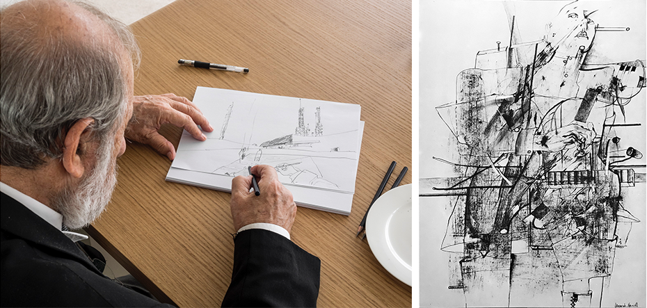
They can be done either in the form of analog or digital representation. On happy occasions, which become true moments of epiphany, architects include the human form in their sketches setting in place, as Indian architect Balkrishna Doshi (1927-) comments on the Portuguese architect Alvaro Siza’s (1933-) work: that sketching becomes at that precise moment a spiritual and not a functional approach to creating. (Below, image 5, hand and portrait and not the typical human figure.) Image 3: Google images- Alvaro Siza sketching and sketch by Leonardo Savioli
Some thoughts on representing space
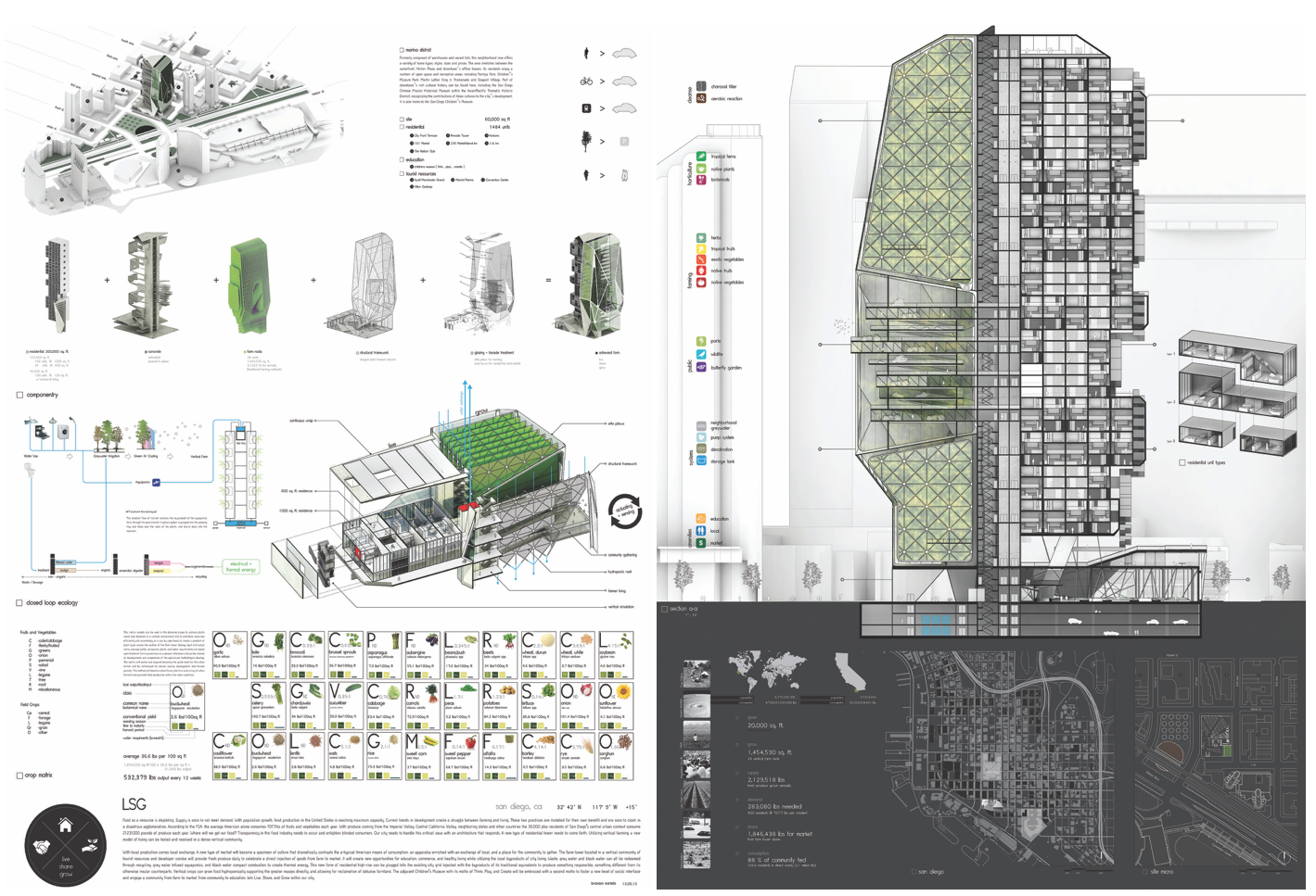
While digital sketching remains in its infancy compared to analog tradition, computer generated representations now include sophisticated visualization tools such as walkthroughs that expand traditional physical architectural models by approximating reality as viewers move through the project. The welcome benefit of digital rendering is that abstract conventional systems of drawing are either removed or rendered in such a way to convey reality, thus benefiting an immediate appreciation of the project for students, faculty, and clients who typically have little spatial literacy (below images 4 and 5). Image 4: Student project (author’s collection)
 Image 5: Student project (author’s collection)
Important to the above comments, is that the abstract conventions of architectural representation are for architects and educators our modus operandi par excellence. For centuries, the representation of architecture has been defined through spatial edges, BUT has had little ability to represent SPACE per se. And this, despite many rendering techniques; for example, the introduction of light and shadow provide spatial atmosphere, depth and modulation giving a sense of what the space may look like and how it may be experienced (below image 6).
 Image 6: Google image: Bertotti Scamozzi, (1776),John Ginocchio, student University of Kentucky c.1989 (author’s collection)
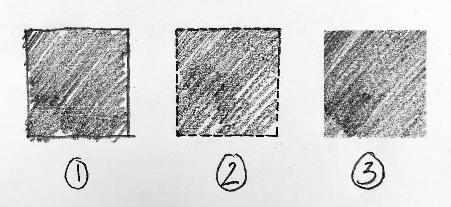
At the EPFL in Switzerland, I was educated in the analog tradition of drawing edges to represent space, and learned later as a professional to celebrate the art of approximating space. The ability to draw the contours of each space by emphasizing lines, edges, thresholds, boundaries and limits became exhilarating, yet the focus remained on the left-overs—the creation of voids—that are truly the essence of spaces and places (below image 7).
 Image 7: concepts of representing space. 1. Space (the hashed interior) is delineated by the dark edge; 2. Space is represented by a porous edge, and 3. Hashed area, the closest we come to representing the abstraction of the void without an edge (space).
This necessary duality between edge and space reminds me of the Roman God Janus. Not only because our art requires us to look simultaneously at the past and the future, but we work within a system of drawing that cannot represent the actual void, but simply suggest it, thus the need to constantly refer to both the edge and the void created by those borders to understand and define the space we are creating. Image 8: Google images: Tadao Ando’s, church of light, and Carlo Scarpa’s Gavina Showroom
(above image 8) Yet, in the process of creating space, I recognize that the edges of spaces are essential to set in place the beauty and experience of the place. Case in point, are architects Tadao Ando, Japan (1941-) and Carlo Scarpa, Italy (1906-1978), with their opposing abstract and exuberant expressions of the surface of spaces. Ando’s abstraction in the treatment of the building’s edges (i.e., walls) allows the eye to focus on the left over, the emptiness which gives a sense of monumentality despite the modest scale and desire to showcase the materiality of the concrete.
The edges of space
While Scarpa’s preoccupations are similar, his desire to articulate edges is different. Surfaces, textures, colors, materials, and his Venetian cultural sensitivity towards the language of construction and detailing are essential components in his approach to the creation of space. Image 9: Google images: plans of Tadao Ando, church of light, and Carlo Scarpa Gavina Showroom
Despite all of the interior (program) and exterior (function) concerns that constitute architecture, students should never forget that their art form must endow meaning to the spaces that they create and use the edges of those spaces as support of the higher aspirations that will create spaces for those who inhabit them.