Carlo Scarpa Gavina Showroom, Part 1. Recently a former student and I discussed progress on the design of his infill project. He presented a compelling argument as to how his proposal emanated from an urban concept, and how he wanted to create—at the pedestrian level—a public and hybrid gallery space to accommodate various functions such as car shows, science fairs, a night club, a pickleball court, wedding venue, lecture hall, and movies theatre, all in addition to the required retail space.
Student discussions
Since the program’s brief called for a number of apartment units, he decided to locate them on the third and fourth floors of his building. The domesticity of their design seemed well thought-out but lacked originality in the overall layout, especially as they were not consistent with the typology of his concept, one that I commented on as to be well expressed at the ground floor level.
Suggesting small adjustments that would enrich his parti, we came to discuss the notion of what type facade his building would need, especially as his design was within the historic setting of a mid-size town in Virginia. His intention to use modern material for his front and back facades brought us to discuss the nature and meaning of facades and what attitude would be both contextually appropriate as well as contemporary and innovative. He was determined not to mimic the immediate surroundings—which I fully endorsed given the architect Carlo Scarpa’s thought that “stupid imitations of that sort always look wretched. Buildings that imitate look like impostors, and that is just what they are.”
I proposed that he study a number of facades ranging from Carlo Scarpa’s Gavina Showroom in Bologna, Italy (see below); Fumihiko Maki’s Spiral Building in Tokyo, Japan; Rafael Moneo’s city hall in Murcia, Spain; and Frank Gehry’s Guggenheim in Bilbao, Basque Country, Spain. To the exception of Moneo’s project, I had visited each of them and could share my personal thoughts on my experiences. These projects take a definite stand and contribute to the existing context in a particular way, thus making them each unique. At the end of our conversation, I hoped that my former student would compare and contrast his ideas with those seminal building facades or others of his choice.
Facades
Facades are integral to the overall design of a building, yet ironically, while they are the first visual clue to the architecture and often a representation of the architect’s creative vision, for students, the design of a façade is often relegated to the last moment after careful studies of plans and sections. Today’s call for sustainable design and energy efficient envelopes means that facades are at the forefront of construction systems and detailing, and are no longer simply a matter of, for example, aesthetic, classical anthropomorphic proportions, or a way to link in an expressive manner the interior functions to the exterior building design.
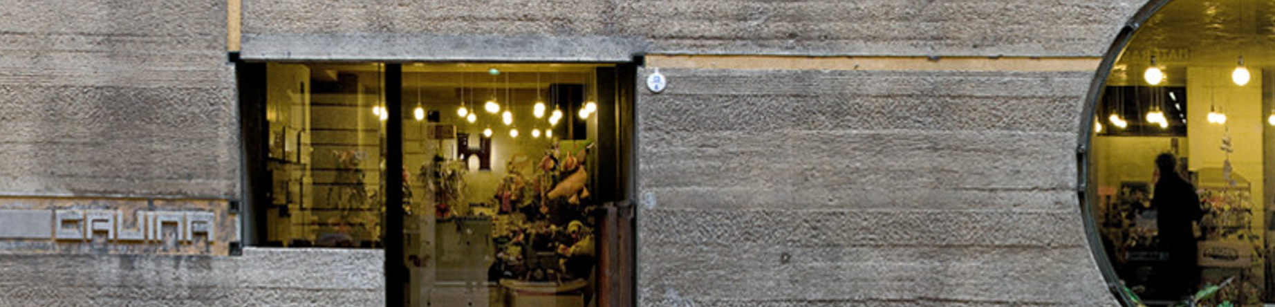
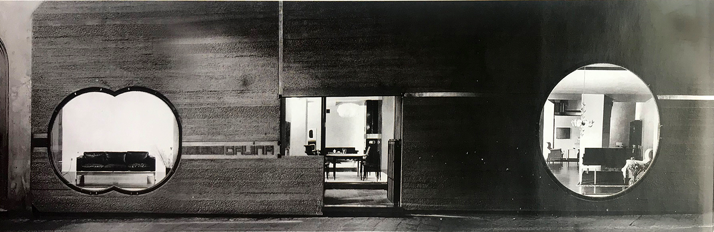
While there are infinite solutions in how to develop and express a façade, one of the examples that I shared in more depth with my former student was the Gavina Showroom in Bologna, Italy, designed by Venetian architect Carlo Scarpa (1906-1978). The design is emblematic of Scarpa’s aesthetic signature and is both remarkable and unique as it emphasizes a modern sensitivity about conservation and preservation within an historic urban fabric, and highlights both working within the confinement of an interior space and the treatment of the showroom’s façade. In other words, “fitting into a setting”[1] is what makes this project inimitable and worth discussing further.
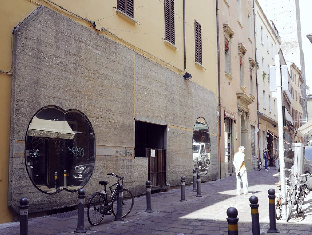
I remember visiting the Gavina Showroom during my field trip to Bologna, Italy as a student. I was immediately drawn to the overall abstract simplicity of the facade, which was bold and pictorial within the context of the narrow street lined by traditional Italian store fronts, restaurants, and neighborhood bar-tabacchi. Located at the crossroad of Via Altabella 23A and Via Oberdan in the historic district of Bologna, minutes away from the famous leaning towers at the Piazza Porta Ravegnana—two landmarks of the 12th century medieval city—the existing three-story historic house was humble with no distinctive attributes from which to draw inspiration.
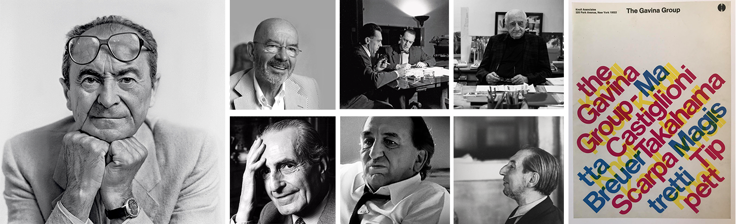
Dino Gavina (1922-2007) commissioned Scarpa to design the Bologna showroom (1961-63) at the height of the postwar economic boom in Italy. He was co-founder of Flos—a world class design manufacturer of artificial lighting—and founder and managing director of La Gavina SpA, a direct competitor of Cassina, B&B Italia, and Knoll Associates. Gavina’s fame and talent hinged on breaking down the cultural boundaries between contemporary art and designed objects by primarily manufacturing elegant, comfortable furniture.
The pieces were cutting edge and of a high technical quality designed by, and in collaboration with, Italian architects and design giants of the 1960s: (above images from left to right) Mario Bellini, brothers Achille and Pier Giacomo Castiglione, Luigi Caccia Dominioni, Ignazio Gardella, and Marco Zanuso. Included in what was called The Gavina Group were Carlo Scarpa and his son Tobia and wife Afra, whose first pieces were produced by Gavina. After Carlo Scarpa’s leadership role as director of La Gavina SpA, Knoll Associates purchased Dino Gavina’s business in 1968, thus acquiring “…the rights to Marcel Breuer’s Cesca, Wassily, and Laccio chairs and tables, which Dino Gavina had secured from Breuer some years earlier.”
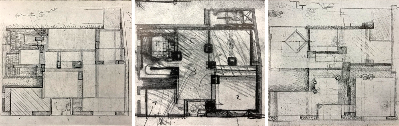
NOTE: Plan 3 and subsequent plans contain an indication of the façade’s long rectangular thin concrete slab
I recall the showroom’s interior was elegant and had over the past decades accommodated multiple owners. Prior to the Gavina showroom, the space was occupied by an ironmonger with his earthen shop floor and multiple small rooms, and later a hardware store. At the time of my visit, the Gavina showroom featured contemporary furniture, lighting and other industrial objects. Later it became a toy store, and more recently was home to the showroom Reverso, which I understand moved out of the space in 2017.
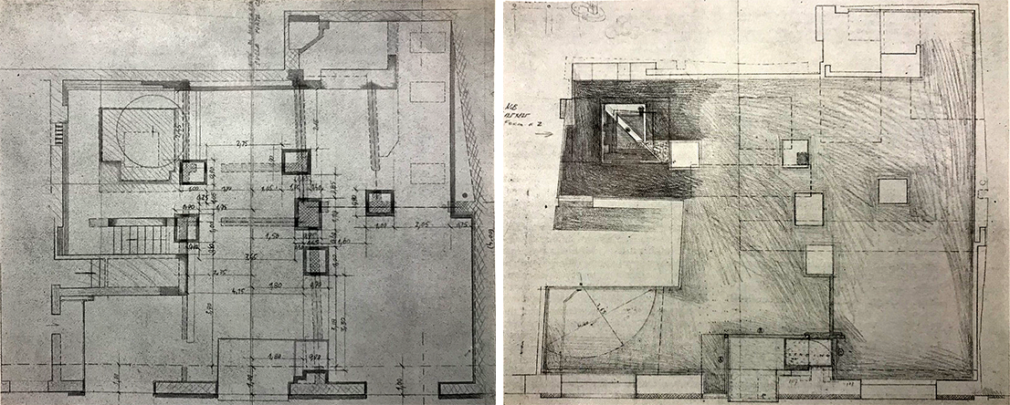
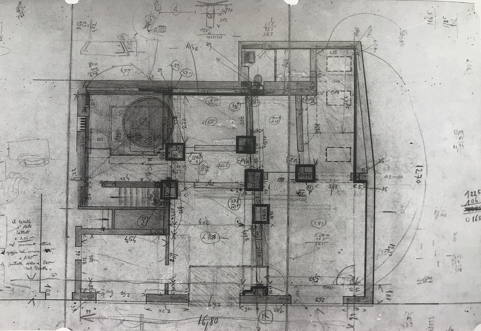
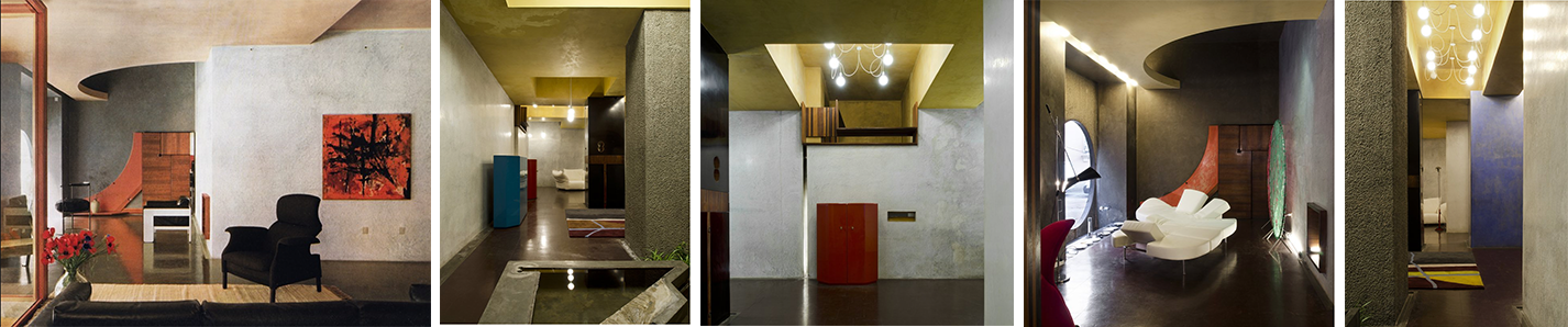
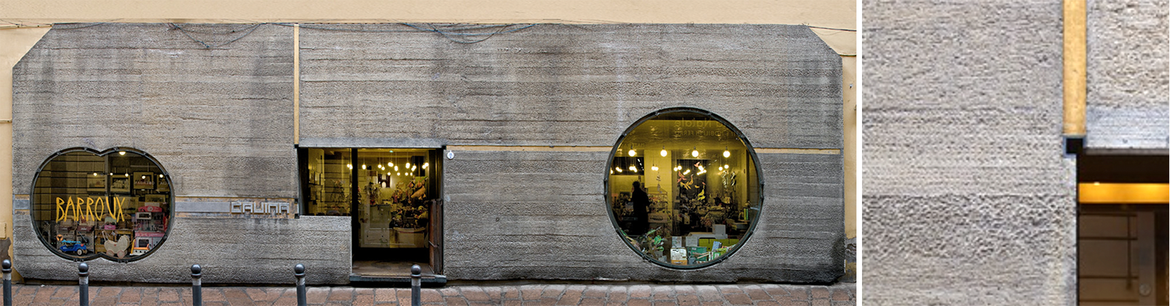
This “baroque” craftsmanship, in clothing the interior, achieves an exuberance of materials, textures, surfaces, colors and light, and gives its true meaning through an experiential understanding of those spaces. The virtuosity of the interior spaces is counterbalanced by an almost minimalist attitude in the design of the store’s façade. The straightforwardness of Scarpa’s gesture is to design a long rectangular thin concrete slab with beveled corners of different sizes that define the façade through a single, distinct gesture (below, colored drawing by Scarpa).
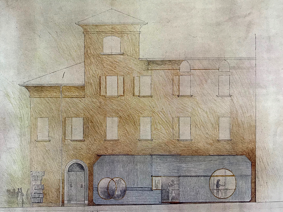
Within this strategy, one finds two large window openings and the store’s entrance, which show unambiguously that there is no intention by the architect to conform, nor respect the typology of nearby existing store facades or even the rhythm of the windows above. And yet, while contextualism is denied, there seems another precedence that Scarpa is working with, one that suggests a pictorial clin d’oeil toward abstract modern painting, one where the canvas often acts as a background on which platonic forms are carefully placed and spatially integrated.Google images, colored drawing by Carlo Scarpa
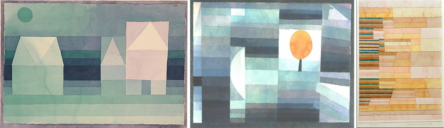
Paul Klee
This possible link with modern painting reminded me of the work of Joseph Alberts and Mark Rothko. This connection was confirmed when I learned about the architect’s ties with Swiss Bauhaus painter Paul Klee, resulting from a relationship when “Scarpa became intimate with Klee’s work when installing his [Klee] works in the 24th Venice [Art] Biennale in 1948.”
This seems particularly true as I look at Scarpa’s colored drawing (see above) and the quality of the tactile expression he gives to the concrete, a material that carries much resonance in several of Klee’s series of paintings that emphasize alternating horizontal lines of various colors of different sizes on which shapes and forms are often added and superimposed. (see below)Google images
The façade’s unifying rectangle suggests Klee’s color layering, but takes another meaning when seen in terms of construction as it echoes the passage of time similar to the sedimentation of layers of earth. This idea is accentuated by the expression of horizontal layers of various width interspaced by multiple chisel point effects similar to a herringbone pattern; the latter imitating the delicate, almost human scale of the fabric of a man’s suit.
In the final built work, it is interesting to note how Scarpa’s textured façade moved from one of a pinwheel concept (see above colored drawing) to a simple, more streamlined gradation of horizontal lines (see below collage photograph). The concept is identical, but textural changes support a different reading.(above, left to right). Above Google images, is a composite photo collage by d.teil (https://www.flickr.com/photos/dteil/7060974353) and detail as well.
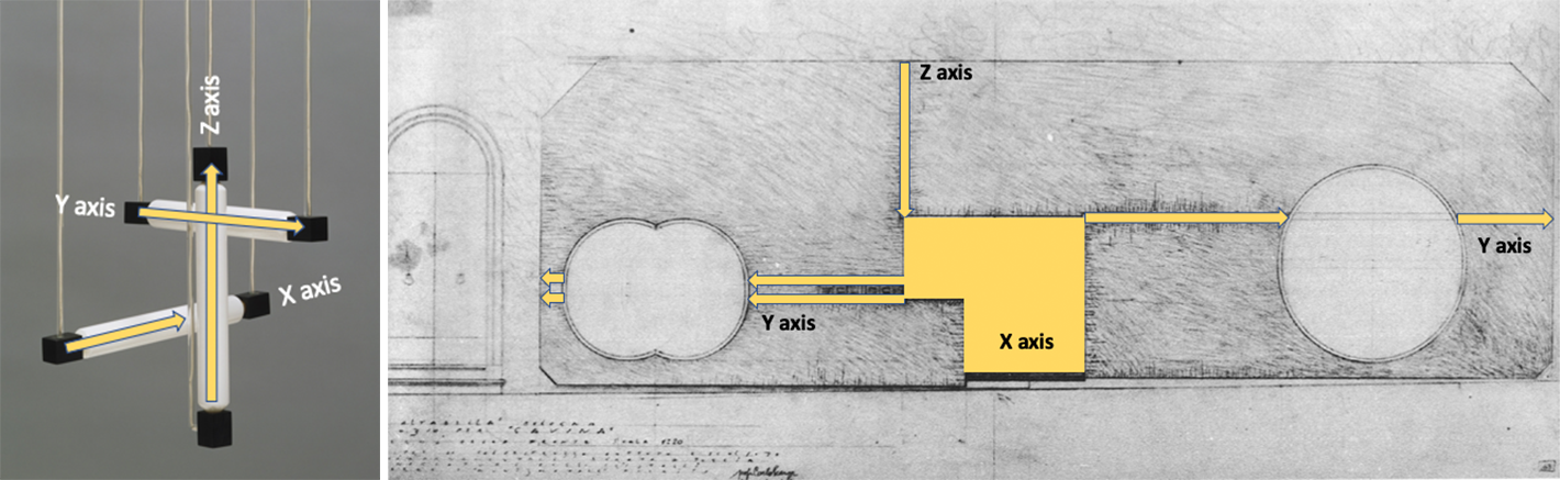
What I continue to find so intriguing in Scarpa’s design of the storefront, is that by furthering the comparison of the façade with the metaphor of a painter’s canvas, one sees the tension that emanates from the illusion between a three-dimensional world of forms and their representation on a flat surface. This conceptual position may be best expressed in the Hanging Lamp (1920) by Dutch architect Gerrit Rietveld, where the x, y, z spatial coordinates are suggested not on a flat pictorial surface, but in space itself.Google images, (Image 10, above from left to right)
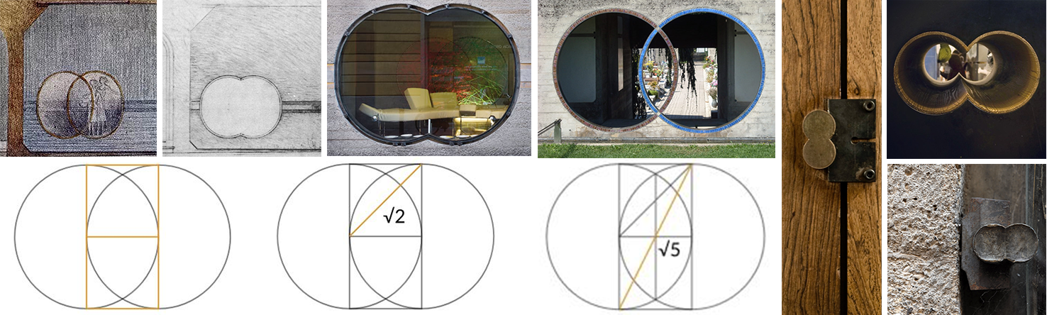
Scarpa seems to be working with a similar intention, and the façade’s composition is a metaphor of Rietveld’s essay (Image 9 and 10, above). If this is true, it is accomplished by letting the building’s existing gold colored façade bleed down through a thin vertical line (z axis)—which is treated as a groove and, like the other x and y axis were originally covered in gold leaf—ending at the store’s recessed entrance. From there, three lines (y axis) extend to the edges of the façade. The double line to the left incorporates a graphic rendition of the GAVINA logo, then reaches out through a vesica piscis type window—two interlocking circles of equal size—to end shy of rejoining the existing façade of the house.
To the right, Scarpa positions a single line that avoids the large circle window to end, again shy of the back façade. Note the changes in the double circle window (below, images from left to right) from the colored sketch drawing to the built work, the Brion Vega cemetery entrance (1968-78), various details in the Gavina Showroom, and geometrical proportional systems of the Vesica Piscis of interlocking circles (Image 11, above)
The final spatial coordinate (x axis), and perhaps the most important one, is defined by a keystone threshold that marks the entrance and allows the facade’s color to become a volume that extends into the interior ceiling throughout the store. The subtlety of the intervention is nothing less than extraordinary and is remarkable given that its success relies on a background that is a simple canvas of brushed concrete seemingly floating off the sidewalk.
Of course, the majestic windows on either side of the entrance contribute to the impact of the design, drawing immediate attention to the uniqueness of the solution by giving the store’s function—a place to showcase contemporary furniture and lighting—a legitimate role as a point of destination of design. The façade acts like a sign, a suspended billboard that engages the pedestrian to view into the store with a glance. Domus, Negozio a Bologna, 1962 Oct., v. 395
The exterior of the Gavina Showroom remains one of the most intriguing designs of the 20th century and qualifies, for me, as part of the pantheon of great store facades. Its elegance reflects what is pertinent as a formal intervention—idea versus shape, simple versus simplistic, and complex versus complicated. The logic of construction, the refinement of detailing, and the structural expression of each opening might not shout out to the passerby, but there is no question that its presence within the urban fabric marked the beginning of contemporary conversations about the Architecture of the City.
Perhaps most importantly, the Gavina project is a reflection on how to engage the past and the present; issues that Scarpa so well understood ahead of his times—a sensitivity towards history that he had “for the preexistent environment, and we would even say the constraints, the obligations, the needs of various aesthetic, static, legal, economic orders that these pre-existences entail.” I look forward to the day when such concerns return forcefully within the academic environment. Perhaps this humbler yet immensely powerful message will once again influence the education of an architect.
Conclusion
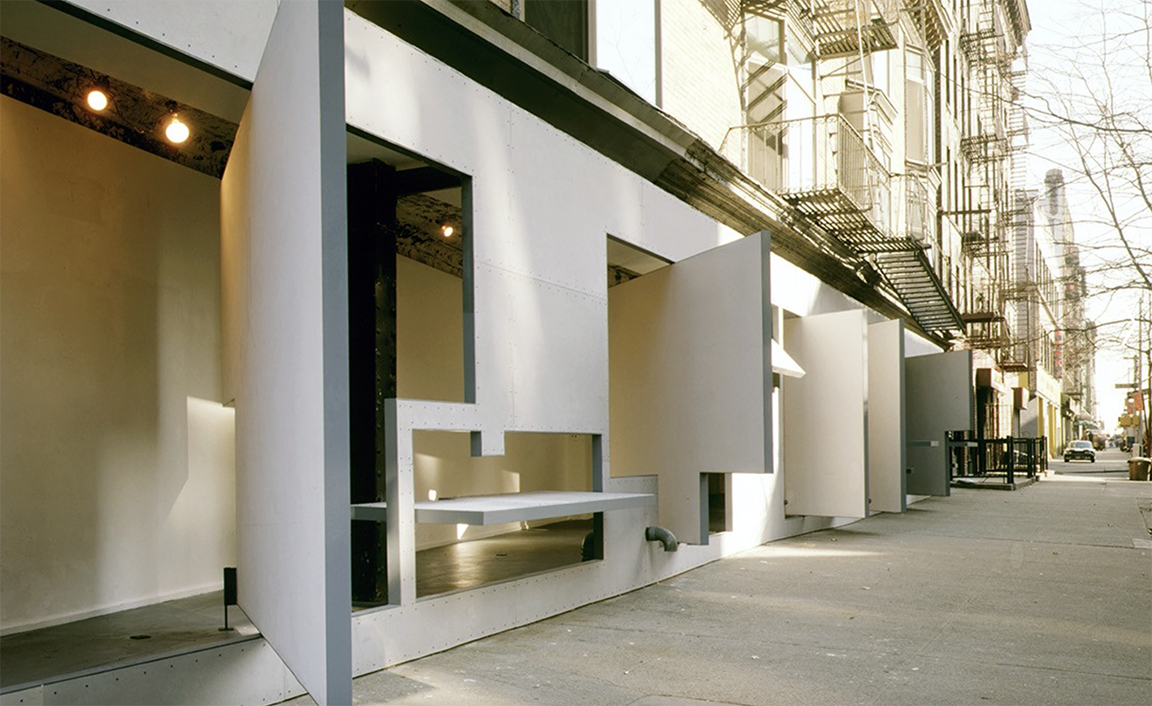
Seminal art and architectural works tend to partake in a historical and theoretical lineage of both the built and unbuilt environments. Within this continuity, I have always wondered if the New York City project shown below was not a contemporary homage to the Gavina Showroom façade.
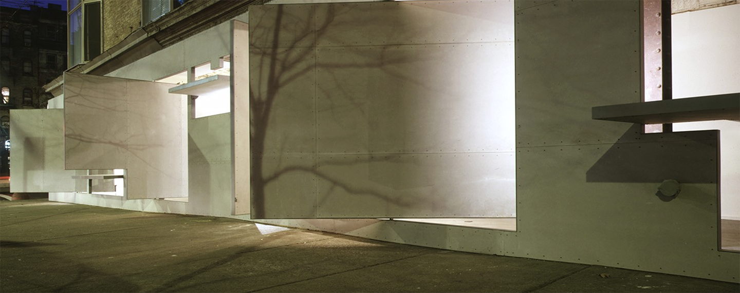
Designed by the collaborative team of architect Steven Holl (1947-) and installation artist and architectural designer Vito Acconci (1940-2017), the 1993 renovation of the Storefront for Art and Architecture seems to follow Gavina’s life-long commitment to expand the boundaries between art and design. The vision for the Storefront façade may well be understood by building on precedence to offer renewed meaning.Google images
“Seeking to introduce improbability and to puncture the facade, Acconci and Holl challenged this symbolic border which underlines the exclusivity of the art world, where only those on the inside belong. Using a hybrid material comprised of concrete mixed with recycled fibers, Holl and Acconci inserted a series of hinged panels arranged in a puzzle-like configuration. When the panels are locked in their open position, the facade dissolves and the interior space of the gallery expands out on to the sidewalk.”[2]
Additional blogs of interest
Carlo Scarpa Venice entrance pavilion
Carlo Scarpa Gavina Showroom in Bologna. Part 2
Carlo Scarpa Gavina Showroom in Bologna. Part 1
Carlo Scarpa and detailing
Carlo Scarpa Gipsoteca in Possagno, Italy
Additional Images of works of Carlo Scarpa
Carlo Scarpa, Cemetery Brion Vega
Carlo Scarpa, Castelvecchio
Carlo Scarpa, Giardini
Carlo Scarpa, Gypsotheca
Carlo Scarpa, IAUV Architecture
Carlo Scarpa, Querini Stampalia
Carlo Scarpa, Olivetti Showroom
Carlo Scarpa, Banca Popolare
Carlo Scarpa, Venezuela Pavilion
[1] Spinelli, Luigi, Domus 905, June 2017 quoting Pier Carlo Santini, Il nuovo negozio di Carlo Scarpa a Bologna, Zodiac, 1962, v.10
[2] http://www.stevenholl.com/en/projects/storefront-for-art-and-architecture
Hi!
Thanks for such an interesting and detailed article. I am visiting Bologna this weekend. Are there any other Scarpa buildings in the area to visit?
Thanks!
Joe
Dear Joe,
Unfortunately not, but I highly recommend that you visit the reconstructed pavilion de l’esprit nouveau by Le Corbusier and the house of Giorgio Morandi.
Henri