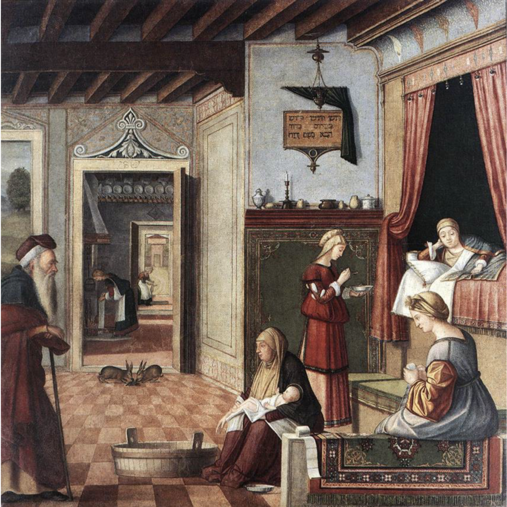
Both the practice and the teaching of architecture have led me to appreciate the idea of type; type as in building type (e.g. circular temple such as the Pantheon in Rome) or enfilade as space type. However, I will admit that this was not always the case. As a student at the EPF-Lausanne, I abhorred any thought about designing architecture that had anything to do with the idea of type. This was for two reasons.
A way of teaching
First, because during my studies, post-modernism was fashionable and of little concern to my young mind; I was preoccupied with creating space in another way. While implicitly understanding that history and theory were essential to anchor a design project, the visual “quoting” of architecture styles did not measure up to what I had learned during my earlier years when taught by die-hard modernists. At least this is what I thought at the time! Faculty assigned to fifth year (I was enrolled in a six-year master’s program) considered type as the sacrosanct way of teaching architecture. Their position (read insistence) was that any design project could only take significance through historical and formal typological precedence, which should be referenced appropriately in one’s design.
For those faculty, who taught through Bramante, Palladio, and Borromini to name a few of the non-modern masters, students had to update their architectural thinking and join a so-called elite of Xerox copy designers to secure praise and high studio marks. Well, I might exaggerate a bit, but leveraging any criticism towards this dogmatic approach was considered insensitive and disrespectful. Professors would treat naysayer students as renegades lacking any historical or theoretical sensitivity.
I still believe that this highly personal and myopic approach to teaching was among many reasons that I chose to study elsewhere during my fifth year. Specifically, I jumped across the Atlantic to attend The Institute for Architecture and Urban Studies (I.A.U.S) in New York City.
The Institute for Architecture and Urban Studies (I.A.U.S)
The second reason I was not interested in type as a student is that I did not understand the basic tenent of Quatremère de Quincy’s distinction of type versus model. I came to learn that “The word ‘type,’ he says [Quatremère de Quincy], does not present so much an image of something to be copied or imitated exactly as the idea of an element which should itself serve as a rule for the model . . .”
Fortunately, at the I.A.U.S, Anthony Vidler clarified the fundamental difference between model and type during one of his most memorable lectures. (He was not alone in this, as Diana Agrest, Peter Eisenman, and Mario Gandelsonas also influenced my new understanding.)
In a non-descript room that served as the lecture hall at the new facilities of the I.A.U.S at Union Square in Manhattan (they had recently moved from uptown to 14th street, the final location prior to closing in 1986), Tony used drawings and verbal bravado, to illustrate the idea of type—from Aristotle to Plato, Alberti to Durand, ending with Giulio Carlo Argan’s seminal text accompanied by Aldo Rossi’s ideas of the analogical city.
While he also covered the masters whom I had heard praised in Lausanne, Tony brought a remarkable understanding of type to his students through a holistic appreciation and referencing of precedence; a key intellectual dimension of the Institute’s pedagogy. Tony’s performance was memorable, and I wish I had kept the cartoon-like visual artifacts that he drew on long brown sheets of paper while lecturing. Fortunately, I do have a tape of his lecture along with my written notes, which I hope to transcribe one day.
Space-types
Fast forward to today. Ever since proposing project briefs to my second-year architecture students on the theme of domesticity—treated in different semesters as either a new intervention, or relating to issues of contemporary preservation—the notion of type has happily, may I say, resurfaced as a way to design.

Along with my teaching, on the practice side of architecture, I have developed a number of projects for a courtyard house (e.g., a historical building type tracing its origins back to Greek architecture). While working on various sketches, I realized that much of my research is not about an interest in the house-type per se (Image 1 above: the historical Palladian Villa and its multiple iterations over the centuries), but more about specific space-types.
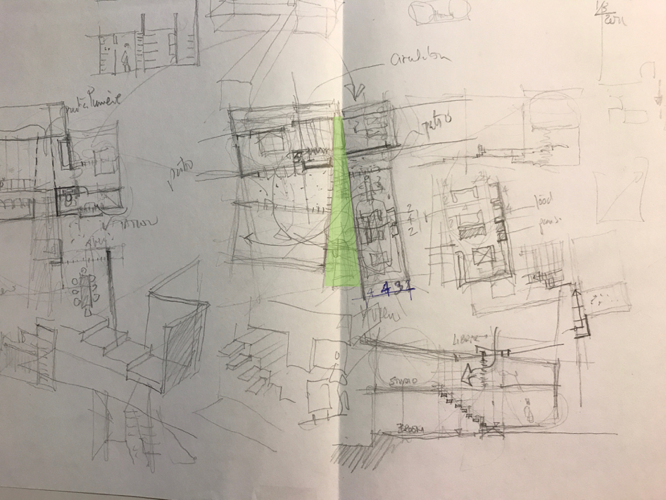
A more developed sketch of the courtyard house (Image 2 above) reveals a number of spatial configurations that balance a paralyzed plan (wall structure) and a free plan (column structure)—two concepts often discussed by Le Corbusier as opposing spatial strategies. In my design process, and beyond essential functional attributes that are constantly re-questioned, a wedge-like shape (in green in image 2) takes center stage. Looking closer at the potential quality of this unifying space, I see its role as similar to a passageway. It could also be called a transition, edge, limit and threshold, and could be formalized as space-types such as corridors, galleries, porticos, patios, courtyards, and the theme of this blog, an ENFILADE (Image 3 below).
These various space-types are often referred to in French architectural treatises as distribution architecturale des espaces (architectural allocation of spaces) and have as much to do with the user’s physical movement and the visual impact through these spaces, as it does to giving an overall conceptual arrangement and heightened sense of nobility. In other words, in classical architecture, these spaces belong to a type.
Enfilade
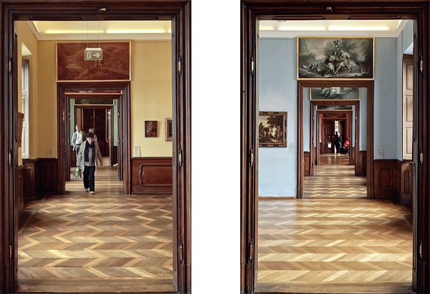
During a recent visit to Vienna, Austria—the city of my childhood—I was reminded of the space type called enfilade. Primarily used as an architecture arrangement in a palatial context, I became fascinated by the multiple expressions of moving through these spaces. For me, the question is how to consider such a traditional mode of circulation when applied to the domestic scale of a house and not a palace or a museum, and in particular, to the courtyard house that I am designing.
Furthermore, I wondered if I could innovate on the tradition of the enfilade by including vertical modes of circulation and other light sources, such as zenithal directional lighting. This seemed intriguing as the space I was equating to an enfilade (Image 2: green wedge-type space) was an interior space of distribution, not adjacent to a façade where an enfilade is typically located. To understand my interest, let me define an enfilade and the elements that constitute this processional route through adjoining spaces.
Definition
The term enfilade is an architectural “suite of rooms formally aligned with each other in a row so that upon entering, one is provided with a vista through the entire group of rooms.” Borrowing its meaning from the French word enfiler, meaning to slip into clothing or to thread a needle, an enfilade expresses a series of attributes, of which its most important one is to connect rooms through aligned doorways or passages along a visual axis, while offering depth and a sense of spaciousness (Image 4 above). Importantly, each room is open to the enfilade (typically on one side of the room) without any further partition walls, windows or doors, thus denying any idea of privacy.
In addition to this basic formal composition between spaces, which allows for ease of movement and natural ventilation, the purpose in a palatial context was that the stringing together of rooms created a hierarchy where guests had to move along the enfilade according to their rank. Typically, the first room had public gravitas, leading to state rooms, ending with the most private suite of bedrooms for the inhabitant, a place a few select nobles had access to when visiting.
Within the European structure of nobility, visitors were escorted along the enfilade as their title, rank, or connection to the owner would allow. While we have moved away from class distinctions since the French Revolution, I remain intrigued by the quality of these traditional architectural spaces that were the result of self-imposed social structures—spaces that are contrary to today’s visual production that emphasizes geometry and shapes, often without producing meaningful forms (geometry with meaning).
The spatial organization of the enfilade set one room next to the other, and has an equal meaning as a concept in military tactics. Many words used by architects come from military terminology (strategy, line of defense, and call to order—the latter often used by Le Corbusier), enfilade is described as a military formation providing enfilade fire.
Some spatial thoughts…
Elements
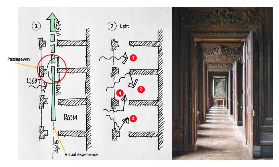
While conducting research on this topic, I could not avoid thinking of the boredom of a typical corridor or hallway that gives access to closed rooms. I wondered why the enfilade was different and had such appeal to me. To understand the primary elements that constitute an enfilade, I drew up two plans. The drawing on the left (Image 5 above) indicates a group of three rooms of generic size with a light source against the length of the facade, which is paralleled by an enfilade indicated by the long arrow defining the experience through the axis/path/vista.
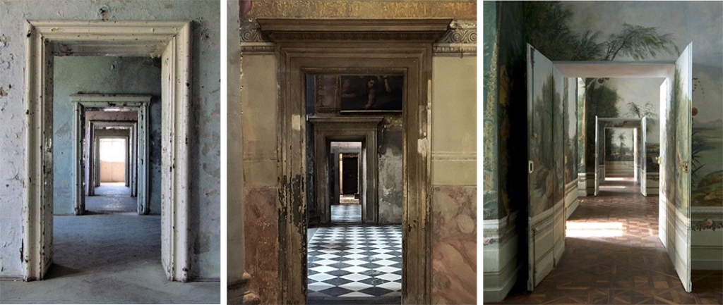
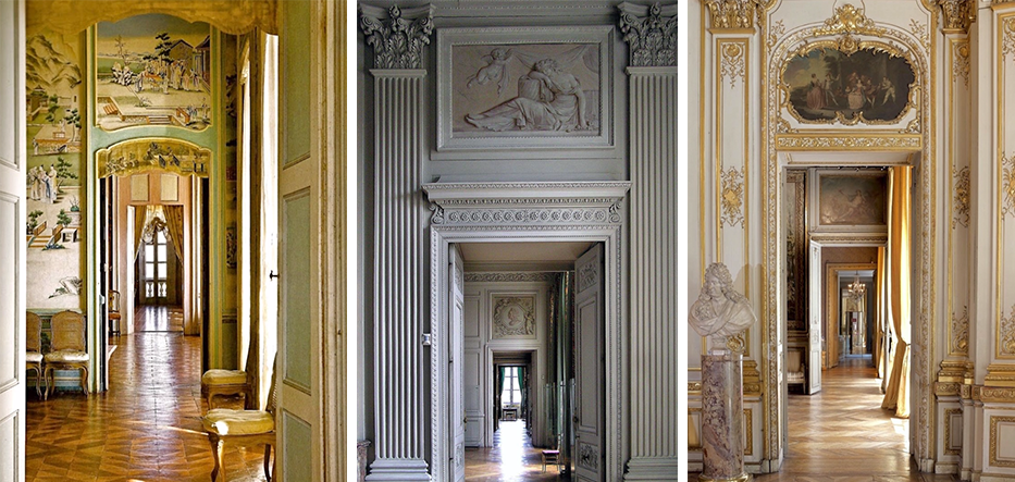
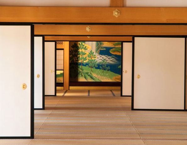
Between each room (Image 5 above, photograph) one finds a thickness—which is critical—that typically holds two separate doors on either surface and may be considered as threshold, passageway, limit and transition between the two rooms. Often this thickness is magnified as part of the decorative and ornamental paneling in each room, extending its character around the doorway. Of course, it may be treated in a more humble way with few embellishments (Images 6 above). Finally, what makes an enfilade work so beautifully, is the light source coming from the windows bathes the space and provides spatial sub-divisions as one moves from room to room.
Lighting
My second drawing (Image 5, right) focuses on four ways the light influences the spatial quality of the enfilade and rooms. In the first one, along the window-line light directly bathes the enfilade while allowing it to flow as far as it can within the room. Of course, in most images of an enfilade, the window is not seen in either shape or form, but without question, as Le Corbusier says, here the “Architecture [of the enfilade] is the learned game, correct and magnificent, of forms assembled in the light.”
The second aspect of light in an enfilade is how it reflects against the inner part of the doorway’s embrasure, illuminating the thickness of the wall. This leads to the third aspect where light is reflected directly at the intersection between the inner façade and the frame of the door opening. The fourth way is how the floor is illuminated to give a rich cadence as one walks from one space to the other (Also seen in Image 5 photograph to the right). Finally, as the enfilade is directional, it culminates either in a room, or at a light source which expands the journey beyond the building.
Conclusion
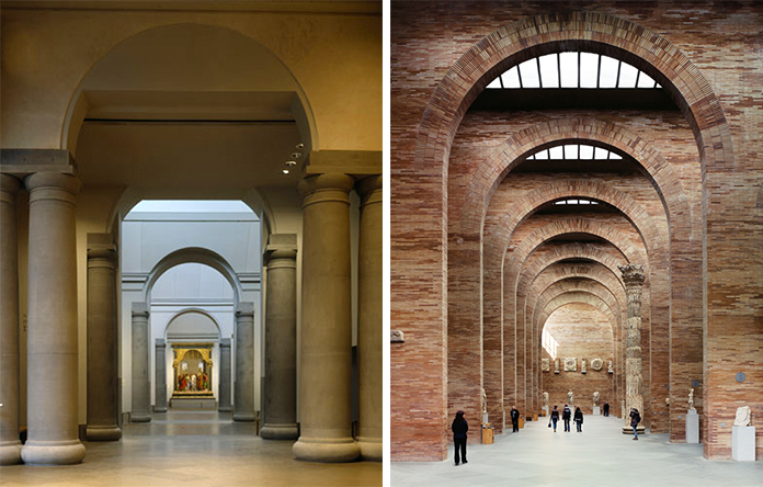
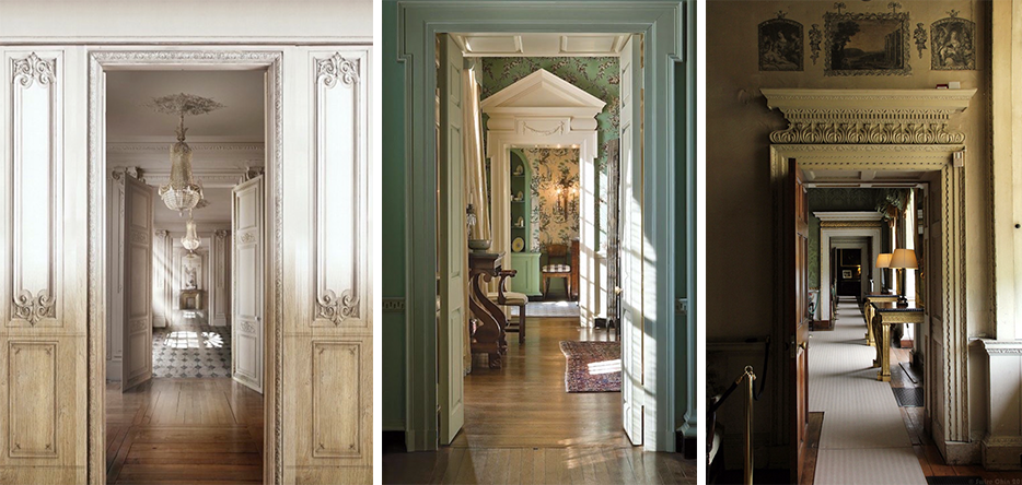
The enfilade continues to be reinvented (Image 9 above) but in all of my research I could not find an enfilade containing circulation featuring either a stair or a ramp. Perhaps the courtyard house will add to the enfilade space-type or simply be lost to history as a terrible and impractical idea.
Epilogue…
