 Questions of section, Part 2. After thirty years of teaching architecture studio at the undergraduate level, I maintain that translating ideas into space is one of the most challenging aspects of design that college sophomores need to learn on their journey to becoming architects. This is particularly true when working in section.
I mention sophomores, because at most architecture programs in the United States, teaching the basics starts only in the second year, as first year is dedicated to design immersion, which often stays far removed from architectural training. This is due to faculty insistence that first year is uniquely dedicated to a liberal arts education, thus the need to provide similar fundamentals to all disciplines: architecture, industrial design, interior design, and landscape architecture (these at the institution where I currently teach).
Don’t misunderstand me. A liberal arts education is not inherently contradictory to a professional degree in architecture. I recently had an email exchange with a colleague who defended the need for architecture students to be educated in a liberal arts manner as a way to avoid the perception of a professional “strangulation” associated with securing a degree. This position of crushing professional aspirations suggested that such a path lacked the necessary opening of student minds beyond topics specific to the discipline of architecture.
Given the context most of us have witnessed this year, where society is recognizing the need to include disenfranchised citizens in key roles in all matters of our society, perhaps the desire to open student minds is more valid than ever. There is an urgency to reassess academic curricula and remove inherited bias while training architects in a truly interdisciplinary manner.
Concerns
Yet, these concerns should never take away from architecture’s inherent role, namely creating meaningful spaces for human activities to unfold. Architecture loses its meaning when it only endorses au courant provocative discourse, or worse, facile shape making that fails to deliver tangible, sensitive, and meaningful solutions. Far too often, architects build and detail average to mediocre corporate buildings, unsustainable suburban settlements and office parks, often accompanied by disastrous shopping malls with their retail boxes resulting in a lack of understanding that architecture is neither pure art nor simply the design of new buildings that cater solely to functional requirements.
Consequently, and beyond inadequate spatial organizational strategies at the scale of the city, the building, and the human being, when buildings are constructed the average artifact is no better than upper-scale fast food eateries without much sensitivity towards a coherent principle of settlement, an economy of means, and, above all, a model of life; the latter, which should be the greatest motivation for architecture to exist, and for me, a natural extension from a fundamental immersion into a liberal arts education.
As faculty, we continue to have a fundamental responsibility in training architects—to be understood in its most generous definition—and I continue to wonder why we postpone the learning of architecture till a student’s sophomore year, especially since their junior year is dedicated to what is called the technical sequence, a moment that seems too late to learn fundamentals. This pedagogical stand seems rooted in an early 20th century tradition and denies a deeper and more holistic historical lineage to our discipline.
What I perceive is a blind acceptance of celebrated educational systems that are barely one hundred years old, i.e., the European Bauhaus. This deeply anchored stand about contemporary education espoused by most architecture programs in the US, is, perhaps, because a liberal arts teaching (for faculty) seems easier than the learning of architecture (for students).
Translating ideas into space
Translating ideas into space has been a passion of mine since I started architecture school and has continued into my career in education. I defend my position on attitudes toward architecture and education through the fundamental belief that central to any architectural thesis is the vocation of creating space, one in which the project, the territory of the architectural project par excellence, is central to all activities in this art form. In other words, “what [Italian architect and critic Bruno] Zevi considered to be its essence: an art of space.”
As a faculty member, I have my pedagogical strategies as to how this may be implemented, and one of them—at least in the locus of teaching second year— is to have students learn fundamental systems of notation and how to represent architecture in a traditional orthographic manner. While I recognize how important the digital world is in a student’s education, with a little act of resistance I persist in my belief that understanding plans and sections (in addition to other analog modes of representation) remain an excellent introduction to space making as a way of designing. Most importantly perhaps, is that I remember a faculty of mine express that if I could think in section when designing a plan, and conversely think in plan when designing a section, I would have an advantage in designing spatially.
One thing for sure is that too often faculty and students espouse tacitly Le Corbusier’s 1929 credo that the plan is the generator, thus insinuating that the idea of a building—or the idea of Architecture with a capital A as understood within an academic setting—is central to many processes from sketching, diagraming, conceptualizing, and even drafting digitally. I am often guilty in perpetuating this myth but recognize that the free plan of Le Corbusier has reigned far too long over modernity. Thus, I was delighted to read Pritzker Prize laureate and Spanish architect Rafael Moneo’s argument that his fellow Pritzker Prize winner, Dutch architect Rem Koolhaas, may have “invented” the free section. A new revolution had taken place.
The question of section: Phase 1
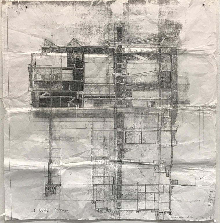 Image 1: John Ginocchio, fifth year student University of Kentucky c.1989
 Google; Image 2 -Cross section through a 747 Boing aircraft
Pondering this question as a learning opportunity for my second year students, and struggling to give a simple answer to a colleague’s inquiry about a recent studio project that emphasized the plan over the section (the project was a one story loft renovation with little room to make bold spatial moves vertically), I decided to launch a design charette that focused solely on understanding the section (Image 1 and 2 above). The following description traces the teaching objectives and two students’ journeys through this process.
- First, I decided that the exercise should be removed from any typical functional requirements such as those found in a house, library, or health club to name but a few. At this specific juncture in their learning process, and with this project’s objective, there was no need to think of appropriate relationships between function and use, sizes and shapes of spaces, or the expression of public to private—an approach that demands a serious introduction about the notion of function as not being the sole impetus in creating space. On the contrary, emphasis was given to those elements of permanence in architecture that advance an experiential way of understanding space; those fundamentals that partake in the autonomy of architecture.
- Second, to launch the creative juices of each student, I proposed six topics be developed in the following order: movement, structure, ground, openings, light, and ceiling/roof. I expanded on movement by requesting four types of vertical circulation: ramp, stair, spiral stair and elevator, as well as the incorporation of either a columnar structure, a wall structure, or a mixed system between wall and column.
Each of these topics was given five minutes during which the students were to sketch and develop a parti. During that time, I asked the class questions, suggested ways to approach the problem, opened up ideas while bringing them always back to the task at hand. This tactic unfolded until we exhausted the six topics followed by a time of self-reflection to understand what the drawings conveyed.
Mid-way through this demanding period of absolute intellectual focus, I asked students to imagine a narrative based on their sketch: how does one enter, why does one ascend or descend a specific way, and how does the roof give a sense of conclusion to their spatial progression?
Needless to say, and despite strong admonition to include all topics within their sketches, some students opted to dismiss all but one mode of circulation, or to simply consider the ramp as a moment that enabled the viewer to rise no more than a foot. Others “forgot” that structure could be expressed in section, while many had difficulties seeing a window as more than a hole in a wall. All of these topics were then addressed in a group discussion after the conclusion of the day’s exercise.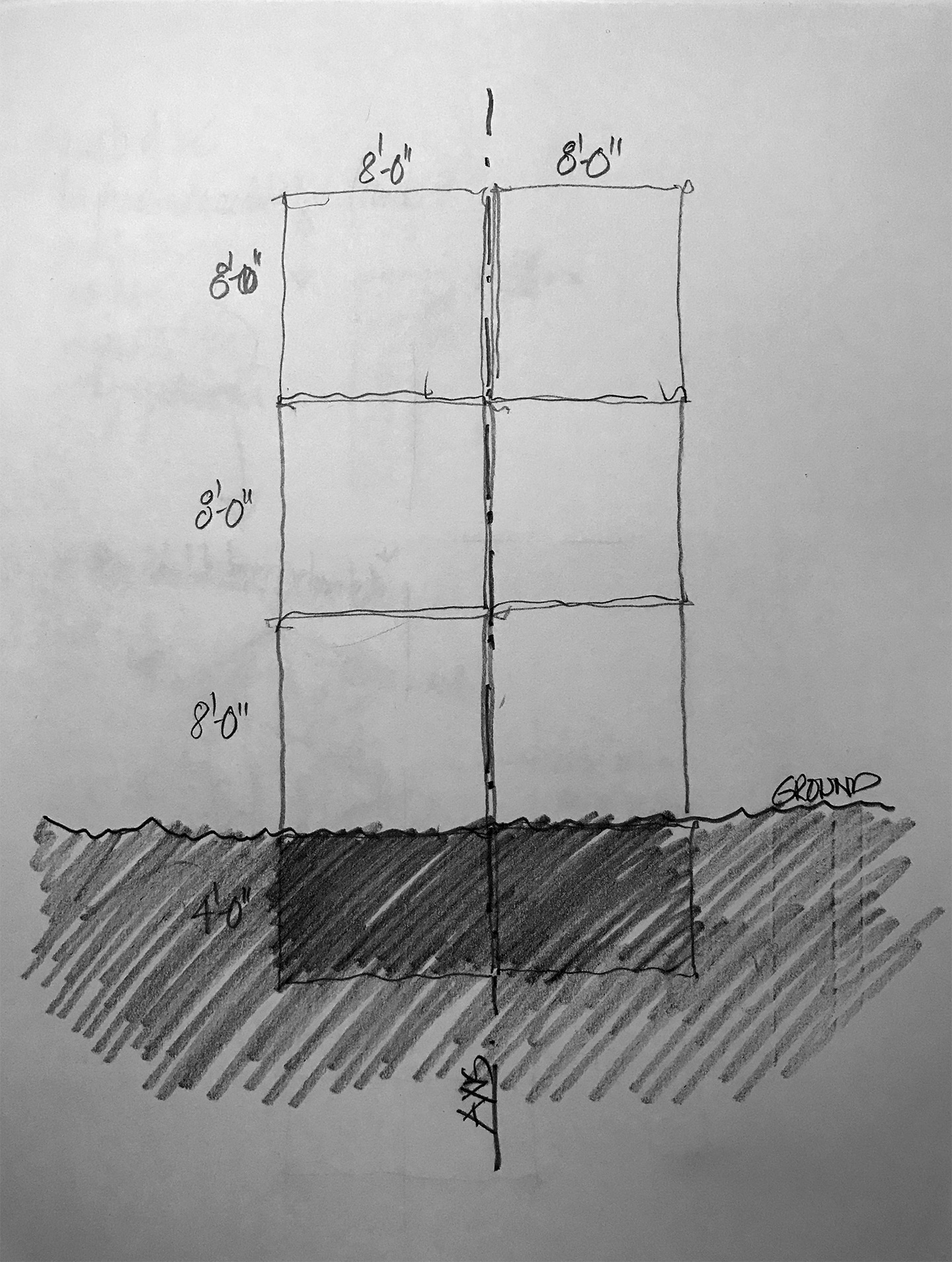 Image 3: diagram on which each student’s section was to be sketched
- (Image 3, above) Finally, to assist students to think of this exercise conceptually—and to compare and contrast between proposals—I drew up a simple diagram that showed in section a proportional system of eight feet between floors with basic dimensions that gave a sense of the canvas on which their section would be created.
Assessment and iteration: Phase 2
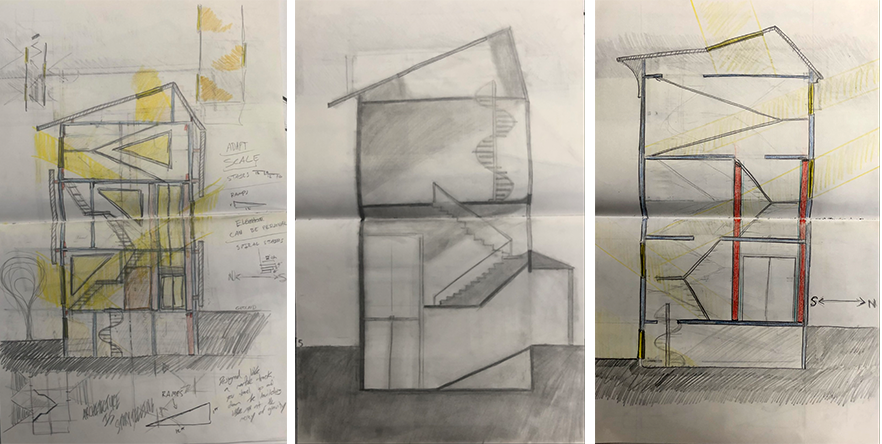 Image 4: (left) proposal of student 1 after working on the six topics; (middle and right) two subsequent iterations
After completing their first diagrammatic sketch, students assessed their work based on their initial and intuitive approach to space making by developing a number of new iterations, again in section (Image 4, above). In these successive sketches, it became evident that the group as a whole still did not fully grasp the notion of a sectional cut and how to record what is cut on an imaginary plane, in addition to what was seen in front of them, and what was beyond the sectional cut behind them.
This launched a discussion on line weight, the idea of poché and how to show unambiguously all elements that were cut in section; and of course, an understanding that, in particular, movement needed to be understood in plan—at least to recognize where the ramp, stairs, and elevator were positioned in order to understand what needed to be recorded in the sectional cut.
From these additional five iterative sketches, students had to now rework each of their sections by refining them with a particular focus on vertical movement as most proposals neglected the typical riser to tread relationship and failed to consider an appropriate slope for the ramp. For architects, I am sure you can image my disappointment in having 4-5 steps negotiate a floor to floor ceiling height or a ramp 20 feet in length negotiating the same eight-foot difference in height!
Desk crits: Phase 3
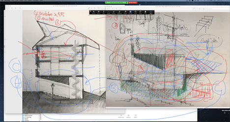
 Image 5: desk crit drawings by author overlapping student sketches
I pride myself on sketching with my students. Early on in my career, I felt that sketching, diagramming, conceptualizing and even drafting in front of students was eye opening for them. Not solely for the fact that they could appreciate and understand the importance and ensuing meaning of drawing and an ability to interpret ideas in a rapid, loose and expressive manner (mostly using a thick HB or F lead), but more importantly to show that I was equally vulnerable at times when we both agreed that the solution was not easily at hand.
Despite a necessary looseness in representing ideas, precision is an essential part of sketching and is a skill that needs to be acquired early on. The above sketches (Image 5 above) were suggestions about how to clarify the students overall concepts and move them from sketch to drafted sketch. It is equally important to note that a scale was not specified, yet students were asked to sketch “at scale,” an endeavor that required subtle coordination and an instinct about dimensions, beyond simple topical requirements.
Additional desk crits emphasized the birthing of ideas that spawn from a simple observation of what the drawing was conveying.
Hidden and suggested meanings were brought forth to move the sketch to its natural next stage (Image 6 below). With this pedagogical approach, I am mindful that my facility in drawing might be at times overwhelming for students, especially that they might falsely perceive this is what I require from them. Despite this, I remain convinced that at specific moments in a student’s progress, a faculty should lead by example and not simply let a student spend unnecessary time discovering certain obvious fundamentals, when they could be building upon them to create something exceptional.
Student 1
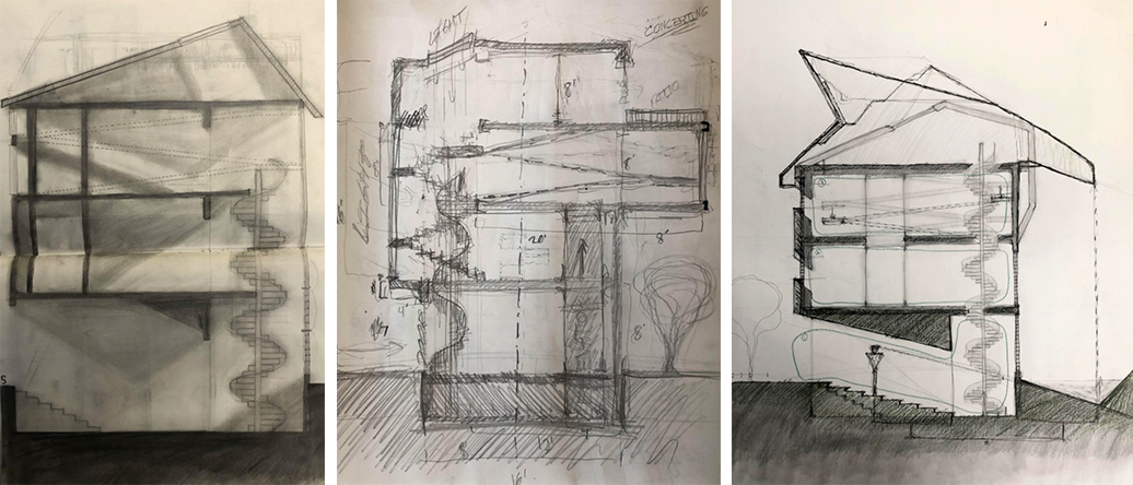 Image 6: iterative sketches of student 1, and refinement of the section
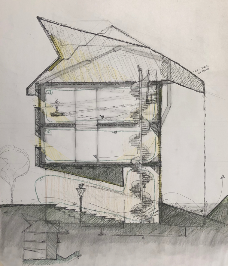 Image 7: in-progress iterative sketch of student 1
Student 2
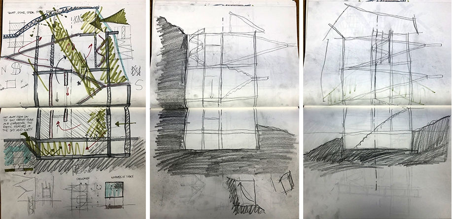 Image 9: (left) proposal of student 2 after working on the six topics; (middle and right) two subsequent iterations
 Image 10: iterative sketches of student 2, and refinement of the section
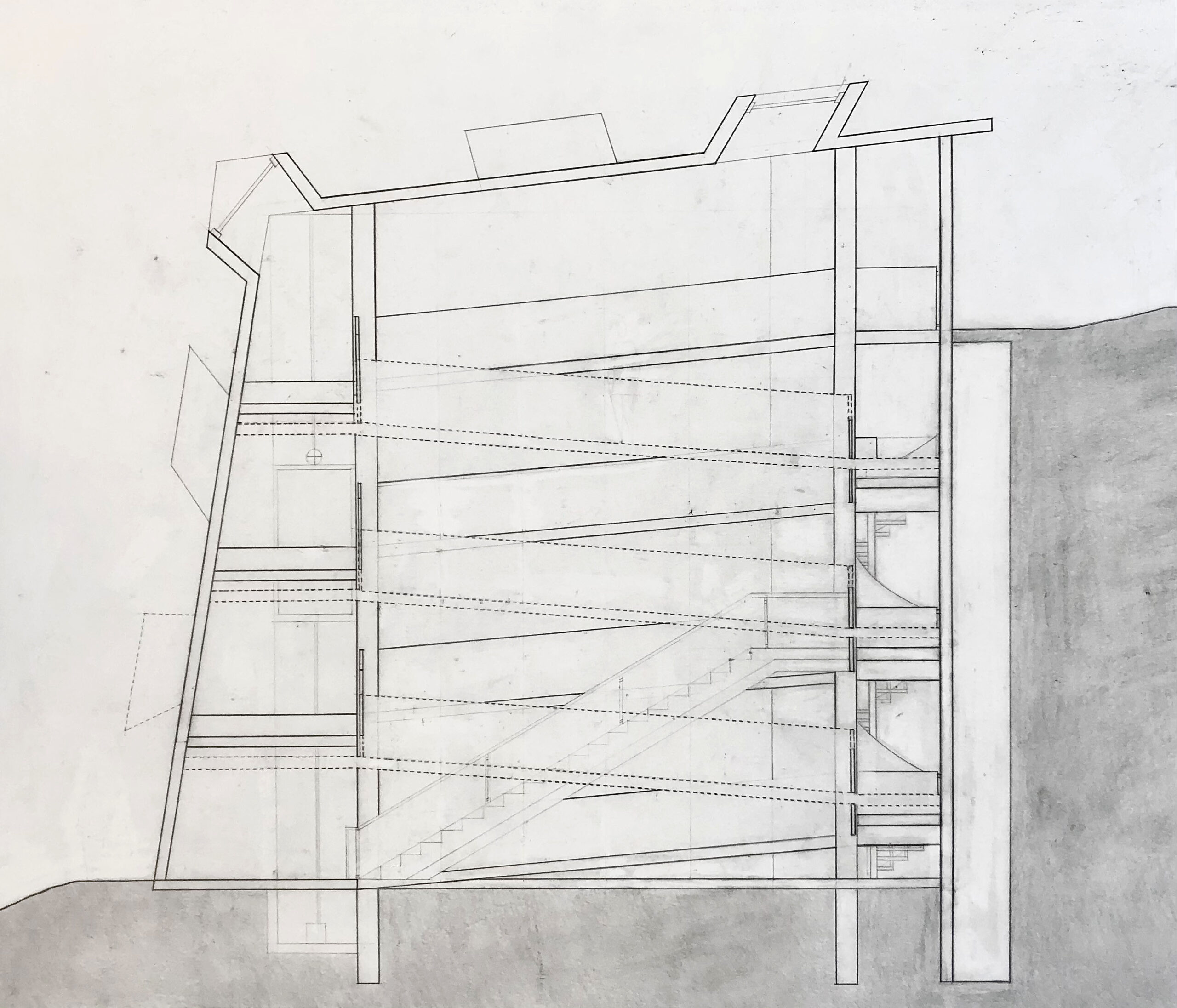 Image 11: in-progress iterative sketch of student 2
Cinematographic traveling in architecture
Architectural Education: Question of section. Part 1
Manual of Section