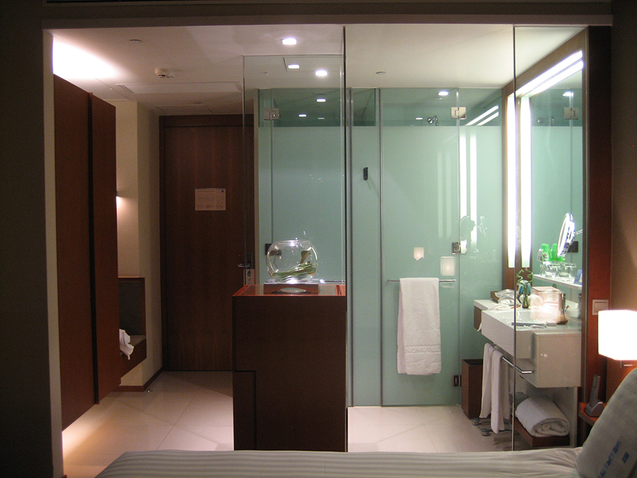
Bathroom at the Novotel in Hong Kong. It is typical that many students in their early years studying architecture will find themselves in front of what they think is an unsurmountable challenge when tackling a simple yet robust project.
I remember as a student having similar difficulties when confronted with basic functions, including the need to invent a program—let alone deciding how form could suggest meaning. The dauting and self-imposed need for the utmost creativity—often at the expense of understanding basic architectural constraints—made many of my projects a little unrealistic, or simply boring. Thus my desire to write this blog about creating a bathroom.
My education occurred in Switzerland, and through the mentorship of seasoned faculty who guided me, I slowly mastered the creative subtlety of a project; its poetics and world of pragmatics that constituted the basic ingredients that relied on an economy of means, defined a principle of settlement, and created a model of life that structured and gave form to a nascent architecture. While far from achieving excellence in my own projects during my early years, I realized that any ideas I sought could be developed on the shoulders of the numerous examples of the exquisite and iconic Swiss buildings around me. On that list, I will count those by the architect Le Corbusier, as he was Swiss!
Based on the above set of observations, I have, over many semesters teaching second year studio, presented the prompt of designing a loft with the purposeful intention of having the students address issues of preservation ranging from conceptual strategy to the detailing of particular cabinetwork. All of this within constraints that are geometrically driven, such as the overall form of the existing space in which the loft renovation is to unfold. As the project typically spans an entire semester, I punctuate it by inserting charettes such as essays, an in-depth kitchen design, the detailing of casework, and the recommendation of art and furniture suitable for the clients; clients who are of course the students themselves!
Bathrooms

Yet, what I have not yet addressed as a charette in this project is the quintessential master and guest bathrooms and optional powder room (per the program brief). Why not, is a mystery that I need to figure out. The functions of a bathroom might seem mundane in the overall scheme of learning how to provide quality relationships between spaces, but at the scale of the semester’s project, bathrooms need to be integrated within the overall design scheme. While academic program briefs may spell out a number of required bathrooms, they are typically seen as placeholders without much consideration as to why they deserve to be addressed architecturally.
Student design of a bathroom
Bathrooms, as I have come to witness in most student designs, are nothing more than the ugly and nasty little three-in-a-row layouts commonly called hotel bathrooms. Students tacitly mimic those spaces taken from their dorm rooms, apartments, or they reiterate verbatim those spaces in which they grew up. The bathrooms that student provide are efficient but give little space to dream of a program for a true bathroom.
To consider bathrooms as non-descript spaces is part of an unsound argument; the attention given to them cannot be overlooked in the overall design process. At least if we think that these spaces are essential for humans. This nonchalant attitude is common as many faculty (me included) tend to favor exceptional space planning rather than work on a room that, at the outset, lacks distinctive and interesting qualities such as standing, sitting, and laying down to perform a number of cleansing activities.
Generic museum briefs provide more design richness than a hard look at improving at a microscale spaces called bathrooms! But, let’s be honest, in any apartment renovation, or more importantly a hotel room, bathrooms become a key design issue.
Basic rules of thumb
When it comes to designing a bathroom, there are basic tried and true rules of thumb in organizing an efficient one. The obvious downside is that those competent bathrooms are rarely special. With the brief I give my students for an apartment renovation, bathrooms are no longer secondary in the overall scheme. Spaces of cleansing should accompany any good layout; at a minimum they should counter the exhausted banality of a typical bathroom. Add to this the inclusion of a walk-in closet and you have at your fingertips a wonderful opportunity to reinvent the trilogy between bedroom, closet, and bathroom.
On a side note, I remember that after gaining my US driver’s license at a late age, I drove to visit seminal architectural marvels across the continent, and during my field trips became a patron of the classic roadside motels or motor inns with direct access to the room from the outside as my budget could not afford the next level of comfort.
Nevertheless, I was happy to have a roof over my head after inching closer to understanding the wasteness of America’s continent. This is where I discovered the repetitive boredom of typical bathrooms, and how a simple move to set a sink outside of the bathroom seemed innovative.
Novotel Hong Kong


Fast forward to ten years ago. During a delayed return trip from India to Los Angeles, the airline staff at Hong Kong’s International airport agreed to set me up for the night in the nearby Novotel Citygate. Not only was I thrilled to be able to rekindle with a city that is at the center of my heart, but my short stay was nothing less than exhilarating. The hotel design of the room, its bathroom, and, as an extra treat, the view of hundreds of aircraft lining up over the city of Hong Kong in preparation to land.

What was immediately striking in the overall layout of the room was that the typical entrance corridor leading to the bedroom and the bathroom remained unchanged, yet the degree of openness and treatment of the basic components of this sequence was done in an innovative manner. The ceiling detail, with its variety of planes added to the spatial nature of the room. I will admit that the room did not include a bathtub, but I understand that a similar degree of innovation was given to the more elaborate bathrooms with a tub.

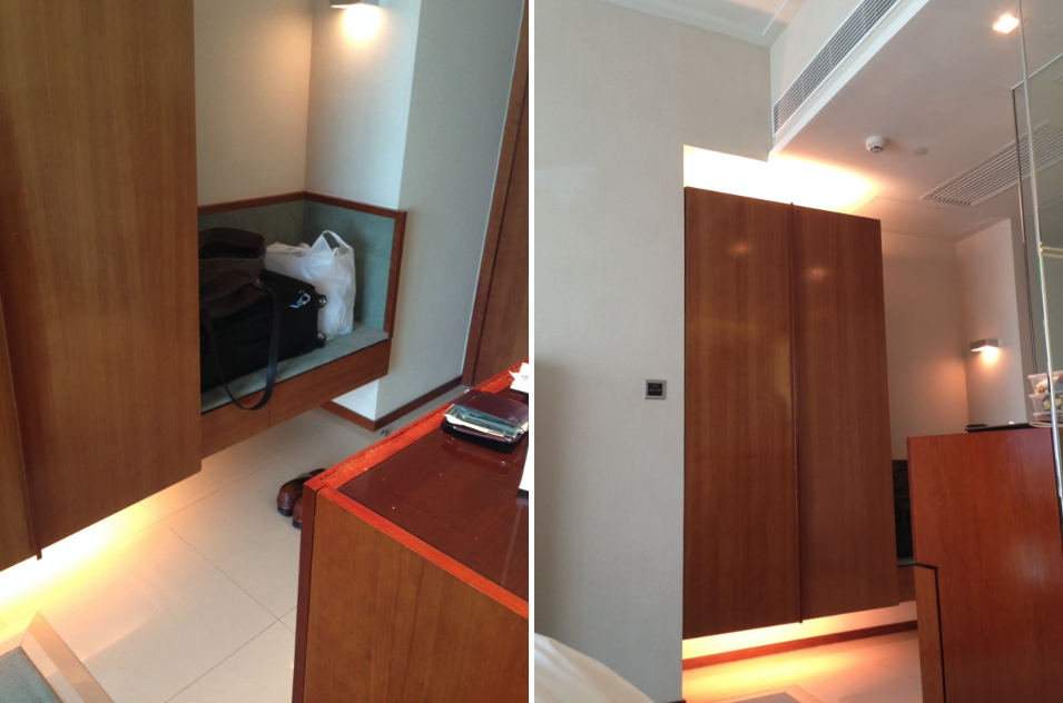
Upon entering, there was a small vestibule no longer than the width of the entrance door. There was a shelf upon which to set my luggage (Image 3, above). Next to it was a double closet. The immediate view into the bedroom was sequenced by a singular cube-like object that divided the bathroom from the bedroom. The cabinet held a mini bar, refrigerator and above it a vase with flowers. Facing the bathroom, the cabinet had a corner made out of two glass panels that subdivided the room into two spaces: the bathroom and the entrance to the bedroom. A very subtle and elegant way to feel a minimal degree of enclosure without feeling as if the bathroom was in the bedroom; although it clearly was (Image 5, above).
Sink area

The profusion of transparent and frosted glass in the bathroom area defined three areas: sink, toilet, and shower. The sink was generous and faced a large mirror occupying the entirety of the wall. All the necessary amenities were cleverly organized, including multiple folded towels, towel racks below the sink, sufficient space for toiletry bags, and a shelf for daily products. The area was defined by a wooden frame that held a continuous light source. To its right was a glass divider, allowing visual continuity between bathroom and bedroom, yet gave a necessary definition to ensure that you did not feel you were brushing your teeth next to the bed (Image 6, above).
When looking at the above pictures, one cannot fail to notice the close proximity of each element to the other, yet the design gives a sense of enclosure without referencing a banal wall.
Shower and bathroom

To the left of the sink, and parallel to the short side of the room, is the commode and the shower area (Image 2, above). Defined as two separate entities, they are both made out of glass that is frosted to offer necessary privacy. While the area of the commode is flush with the bathroom floor, the shower is counter sunk to channel the water so that it does not spread throughout the bathroom (Image 7, above).

Noteworthy is a nice detail that allows the floor of the commode area to be washed. There is a gap to let water flow into the shower area. I have never seen this detail and found it practical yet nicely thought out aesthetically (Image 9, below).

The overall detailing of the area is minimalist with chromed hinges, a towel bar, and peg. The glass treatment offers the entire bathroom a lightness and classy distinctiveness when seen from the bedroom (Image 7, above). The floor treatment provides a tile surface different than the carpet found in the bedroom where there is a work table, chair, and armchair. All of this with a large window facing the ballet of aircrafts taking off to distant countries.
Conclusion
More luxurious hotel properties tend to define a bathroom as another room, and are generous with separate bathtub, shower area, and double sink at a minimum. The Novotel’s overall strategy in organizing its bathroom was to be simple, yet new within the traditional idiom of bathrooms I experienced while discovering America.
For students and architects both, I would argue that to find the exceptional is always a challenge that can be redefined more simply. Thus, why not start by adjusting some of the traditional layouts to emphasize degrees of openness and closure, reconsider material selections, add beautiful detailing, and suddenly you have an innovative way to think about the pragmatics of a bathroom.
Postscript

On a recent trip to Berlin, years after my first encountered with the Novotel in Hong Kong, I stayed at the Dorint Hotel at Kurfürstendamm. Chosen for its location in the middle of the Western Berlin area (near Savigniplatz, shopping, and Christmas Markets), the room was generous and nicely layout out.
However, I was struck by the similarities in the layout of the bathroom at the Novotel, and even the interpretation of the piece of furniture that acted as a bar. While the Novotel include a more functional entrance with a square footage of the bathroom that seemed smaller, and provided the shower and toilet more privacy, the layout of the bathroom area remained as a room and did not try to push the spatial boundaries. Also, the attention to detailing at the Novotel, especially for the water drainage of the toilet and shower and between the two (Image 7) lacked design elegance. The sinks were too far from the edge, the Kleenex box hidden under the sinks (until it was noticed when talking a bath) and only an outside light with for the bathroom.
While design concept preference are important for the identity of the hotel, common sense goes a long way. But wow, what a difference in usage and how the bathroom was part, and not part of the overall room.

I invite the reader to make their own assessment of the difference between both bathroom and how a similar idea in principle, can be developed, and brought through contemporary materials to make it truly innovative. While the Dorint bathroom was more than elegant and acceptable, my preference remains for the Novotel!
Additional blogs of interest on this topic
Between Coffee at Tai Kwun, Hong Kong
Murals at Hong Kong Central station
Hong Kong trams, a way to travel
Hong Kong: a lesson in stairs (Central Market)
Hong Kong: Bauhaus style Central Market
Hong Kong: the history of Central Market
Hong Kong: a lesson in stairs (Billie Tsien and Tod Williams)
Hong Kong: a metropolis of contradictions
Blue Bottle Coffee: Hong Kong
Hong Kong Shopping Mall