
Blue Bottle Coffee: Hong Kong. Cafés are quintessential urban places that showcase the autobiographical identities of cities. In a past blog, I wrote about a famous café in Riga, Latvia: “…cafés are places where patrons often act as if the space was their own living room, telling me that these intimate conversations and social behaviors are meant to be seen and overheard.” In this new blog, I wish to reflect on another aspect that defines the cultural identity of cafés, where architecture is part of a larger sense of place.
On a recent trip to Hong Kong, I stumbled on Blue Bottle Coffee, originally a California-based specialty coffee roaster and retail shop now owned by Nestlé. I mention stumbling, as I had just visited a nearby building under construction designed by Hong Kong office DEFT where a graduate of my current institution now works.

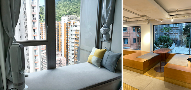
Although I could not gather much about the building because its façade was covered in green netting, I was very proud to know that this former student had elected to venture to Hong Kong and begin his professional life in a city that I cherish. While the construction site visit was a disappointment because I could not enjoy the emerging spaces, the discovery of nearby Blue Bottle Coffee, designed by Los Angeles based wrk-shp, was a welcome mid-afternoon surprise (Image 1, below).

Blue Bottle Coffee
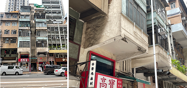
A stones throw up the hill from the construction site, I noticed a building with striking features. Located at the crossroads of St. Francis Street and St. Francis Yard, the building is cube like in form with a façade that does not feature typical Hong Kong bay-windows (aka windows that are typically featured in upper floors of apartment tower complexes such as the one above the coffee shop). This different strategy caught my attention.
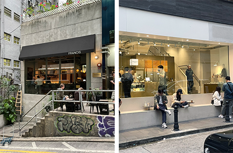
The large ribbon windows found at Blue Bottle Coffee seamlessly turn the corners, allowing a 180-degree vista from inside. The spatial result is that the three floors are highly visible and allow pedestrians to view most of the interior activities. I experienced this during my visit, becoming a patron and enjoying the panoramic view of the cityscape. There is a sense of both refuge and extension from the interior that creates a particular atmosphere at Blue Bottle Coffee. A specific cozy atmosphere.
Perhaps this space, with its large windows, is a reinterpretation of the modernist mantra of light and air, all with a clin d’oeil to Le Corbusier’s ribbon windows, constructed with contemporary language (Image 1, above). It is the coziness of an interior also enclosed by the immediacy of the city’s facades.
A little history about the site
Before I further describe the café, let me give a brief history of its context in order to showcase the particularity of the urban condition that eventually becomes part of the café. Prior to my visit to Blue Bottle Coffee, I perused the Monocle store on the opposite side of the street. At home in my local bookstore, I love to read Monocle (now I have a ‘perpetual’ subscription), a trendy hospitality and fashion magazine featuring curated news and media events about key metropolitan cities around the world. That day in Hong Kong, and to my surprise, I was made aware of the magazine’s physical retail presence—read actual building—in addition to the printed product and digital presence that I was familiar with.

At the Monocle store, I learned from an enthusiastic clerk about the brand’s decision to develop anchor stores around the world where they sell gifts and travel items, clothing, and design objects. As the clerk seemed to be a history enthusiast about his native city, I also learned about the neighborhood and the presence of the early settlement of the St. Francis Canossian Sisters that included a church, hospital, yard, cemetery, and orphanage. This long gone ‘campus’ was situated at the coffee shop’s location and had extended up the hill.
At the time of the early settlement on this site by the St. Francis congregation, the neighborhood of Wan Chai (meaning cove in Cantonese, deriving from the original outline of the coast) was considered a hillside slum, and “In order to teach and care for the moral welfare of the many poor children who lived in Wan Chai, in 1869, Canossian Sisters took a house to provide proper education with an emphasis on moral growth and self-respect to the poor and needy. …”
This established a Catholic community in Wan Chai, and the settlement is first recorded in the map dated 1855 (see above). Of note, today you will still find evidence of the Order’s contribution, with the continued presence of the St. Francis Canossian School and College located south of Blue Bottle Coffee.
The 1855 map, and subsequent ones of 1940 and 2024, show the Blue Bottle Coffee shop highlighted in light pink (Image 2, above). Looking at these maps, it is easy to realize that the cul-de-sac called St. Francis Yard is a result of the encroachment of the Old Protestant Cemetery, which created a dead end on the western side of the site.
Very rapidly, the area of Wan Chai morphed into a wealthy enclave at the turn of the 20th century. Today, this area is coined Starstreet Precinct, and has been transformed “into an eclectic hangout hotspot for those with a unique sense of style and appetite.” No wonder that Monocle, Blue Bottle Coffee, Spa Occitane and even a Lamborghini showroom have elected to move into this neighborhood.
Steep hills
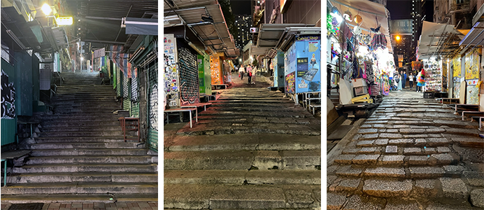
Like San Francisco and Lausanne, Hong Kong is famous for its dramatic urban topography and how the city negotiates pedestrian stairways and full width walkways. This mode of circulation is particularly present in certain neighborhoods in Hong Kong, as sidewalks negotiate slopes leading to the famous Peak.
In fact, on various occasions, streets become stair-markets like Ladder Street, Pottinger Street, or Stanley Street. In other instances they provide continuous narrow sidewalks organized by alternating steps and landings (Image 3 above, and 4 below).
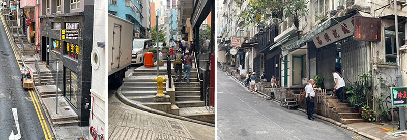
At certain moments, sidewalks become a natural extension of a minuscule restaurant or bar. This often happens without much consideration for pedestrians who need to now retreat to the street, which demands another skill to ably negotiate taxis and private cars driven by chauffeurs who have little respect for those who cannot afford a luxury vehicle.
And yet, this encounter between cars and pedestrians, between streets and sidewalks, gives a visual identity to many neighborhoods, and in the instance of Blue Bottle Coffee, the sidewalk is incorporated as the building hovers over it, and functional steps are reinterpreted as a place to congregate in front of the café (Image 5, below). Note that this was not the case with the previous owner prior to the renovation (Image 6, below).

The interior of Blue Bottle Coffee

The interior spaces of Blue Bottle Coffee have a formal restraint; nothing more, nothing less. I guess that this aesthetic is called urban chic, a style that represents a “cosmopolitan, modern, minimalist design. …” In the case of Blue Bottle Coffee, all three levels showcase a warm palette of golden colors with moments of darker accents: quasi-banal wooden chairs and tables, and a surprisingly innovative built-in seating area that provides informal gathering, all highlighted by yellow tile floors and wall coverings (Image 7 and 10, below). The place has a restrained Zen-like atmosphere which is a contrast to the frenetic pedestrian lifestyle of Hong Kong. Fashion conscious and not fussy; each floor is youthful.
In the words of the architects: “The ground floor offers quick grab-and-go service and sidewalk seating only. The first floor introduces the drip bar and full kitchen, plus casual seating for customers to linger. The top, second floor is designed with lounge seating and tables for longer stays.” Furthermore, the architect builds on this distinction by designing “each floor [to be] visually distinct and is a nod to the celestial elements of Sun, Moon, and Stars.”
What the architects do not mention, perhaps purposively, is that those three elements are nearby streets in the Starstreet Precinct. Furthermore, I have learned that these three streets “are said to be named after a verse from the 13thcentury Chinese text, The Three-Character Classic, which reads: ‘The three forces are heaven, man and earth; the three luminaries are the sun, the moon and the stars.’” I found the incorporation of this lineage from text, to street, and the floor nomenclature fascinating as it brought layers of meaning to the created spaces.
Returning to the windows, it might seem paradoxical to create a little oasis from the urban jungle by opening up three façades with an almost continuous ribbon window. In fact, the openings span nearly floor to ceiling, allowing patrons to not simply enjoy a panoramic view but be inside the panorama of the immediate streetscape.
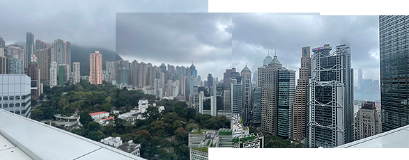
Let me be frank, the coffee shop views are not overwhelmingly sublime when compared with those of the Financial District of Central as seen from the wraparound rooftop terrace of Popinjays at the Murray Hong Kong (Image 8, above). I had a lunch meeting with a friend who knew that I would love the prospects, and indeed, they were sublime, particularly with the backdrop of a menacing sky. However, the memory of being up in the sky did not lessen my experience of the views from the coffee shop. Acting like a desktop monitor background, or a 19th century fisheye panoramic view, patrons feel enveloped by the city.
At Blue Bottle Coffee the floors do not have dropped ceilings. Showcasing the mechanical systems lends an industrial character to the place. Perhaps aesthetics are not the only reason, because, as we will see, omitting dropped ceilings throughout the coffee shop may be a clever way to increase the reinvented bay window size that the first architects of Hoover Towers Block 3 designed for the original shop and office spaces.
Some thoughts on Hong Kong bay windows

Walking through Hong Kong, I constantly marvel at the facades and, in particular, the variety of bay windows protruding from towers. While researching this blog, I came to understand how this extension beyond the façade is the result of the complicity between developers and government agencies. I learned that among other criteria, the bay window is defined by:
- the base is not less than 500 mm [shy of 20 inches] above finished floor level.
- the top is not less than 500 mm from the underside of the finish ceiling.
I wonder if this is a reason the architects chose to avoid a dropped a ceiling.
While bay windows in high-rise buildings are designed to maximize and be an energy-efficient way of lighting a space, it is interesting to observe more dramatic cantilevers with large bay windows in older neighborhoods of Hong Kong (Image 11, below).
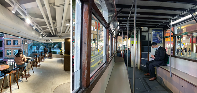
In the modern interpretation at Blue Bottle Coffee, such wide window openings on almost three sides is accompanied by a variety of seating arrangements for patrons to use while gazing outside, working, or sharing the day’s gossip. There is a new relationship with the outdoors, one that reminded me, during my voyage back to the hotel, of the famous Hong Kong trams (Image 12, below).
Conclusion

Since I was a student, I have always been fond of finding comparisons between buildings, cultures, and ideas. To draw similarities often leads me to spontaneous associations that, in the case of buildings, rely on some kind of combination between a formal attitude, urban condition, or materials. Perhaps more importantly, my mind seeks to find reasoning through time that can justify any contrasts that I see as part of a continuity, real or imagined. I have mentioned a couple of these associations in the above text (e.g. site strategy, sidewalks, and bay windows), but one that I found at first farfetched, but with which I am know comfortable, is how a traditional building may be the impetus to reinvent something new.
Ideas often come to me in sequence, thus I will admit that the following comparison relies on having first seen the Blue House a little further west from Blue Bottle Coffee. I am not talking of the color blue as the connection between the two buildings. That would be a stretch that does not make any sense beyond the color. What I am keen to further explore is the theme of re-invention.
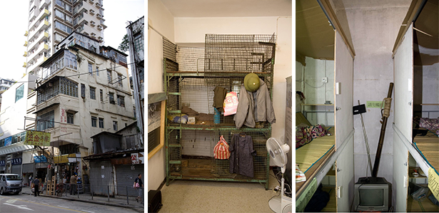
Retrospectively when I see the Blue House, built in 1922 as a 4-story balcony-type tenement block with traditional materials such as masonry and timber, I can see a direct correlation between that house and the Blue Bottle Coffee shop (Image 13, above).
Postscript
While researching this blog, I became fascinated with understanding the apartment type at 15 St Francis Street that formed Hoover Towers Block 3. With a simple click, I could find photographs of several apartments that were almost all identical and seemed to occupy an entire floor.
This seems now almost self-evident given the narrowness of the tower, but given that in Hong Kong there are minuscule apartments that can be as small as a coffin apartments (Image 14, above), I wanted to assure myself that what I was observing was an apartment type. The sketch below is the closest approximation of one of the floors in the St. Francis St. building which, given Hong Kong, seemed well designed, all coming at a price tag of approximately US $4,000 per month for a comfy 386 sq.ft! (Image 14, below).

The only lingering question that I have (perhaps a Hong Kong reader will clarify in the comment box) is that I was under the impression that bay windows were restricted to one room according to the criteria of 1980 (1.3.8 (2): only one such projection is situated in any one room). Here, in the apartment I’ve shown, the living room has two bay windows, which suggests that this specific criterion may no longer be in effect (Image 14, above, far left bottom is the living room).

Additional blogs pertaining to Hong Kong
Between Coffee at Tai Kwun, Hong Kong
Murals at Hong Kong Central Station
Hong Kong trams, a way to travel
Hong Kong Shopping Mall
Hong Kong: Bauhaus style Central Market
Hong Kong: a lesson in stairs (Central Market)
Hong Kong: the history of Central Market
Bathroom at the Novotel in Hong Kong
Hong Kong: a lesson in stairs (Billie Tsien and Tod Williams)