Edward Hopper Cape Cod. Of course, I have a number of favorites painters that span over five centuries; from the international Gothic to contemporary iconographies. Yet, as an architect, I am particularly fond of the American painter Edward Hopper (1882-1967) whose work reflects on the dramatic urban changes that America underwent during the post World War Two economic boom of the 1950’s.
Edward Hopper
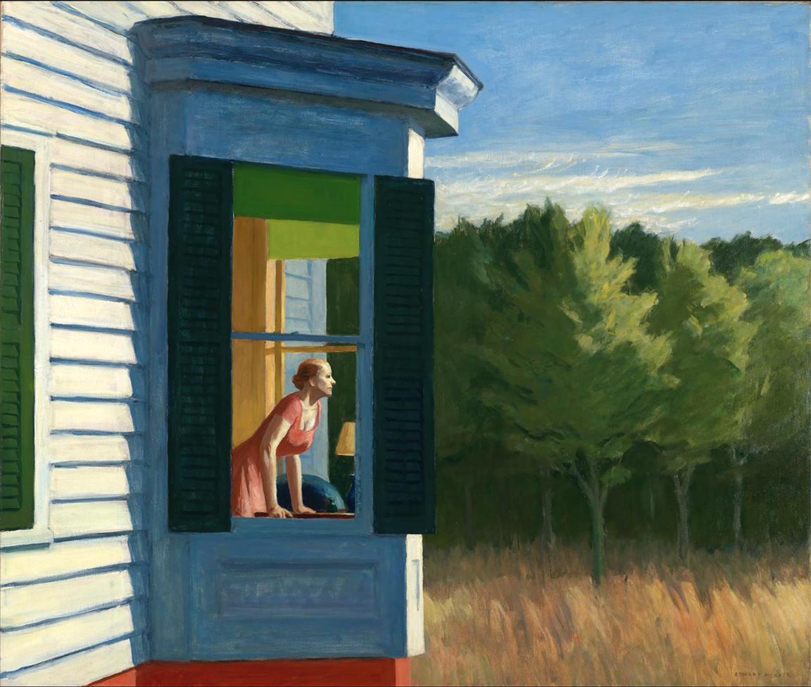
His depiction of the realities of a new city dweller -often expressed through the city’s bareness and its inhabitants’ domestic solitude, are often accompanied by our innate and primary desire to be at times a discrete yet accomplice voyeur to the painter. These are key themes that are magnificently developed throughout Hopper’s work. One of them (notable this time set in a rural context), is the famed 1950 painting Cape Cod Morning.
Cape Cod Morning
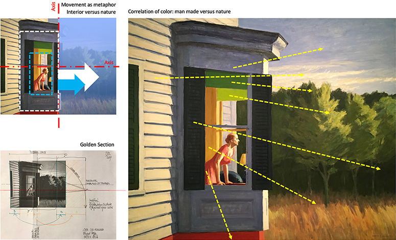
I was always drawn to this painting for the simple reason that I saw an “architectural” complicity between the protruding bay window and the figure of the women gazing out to the landscape. This likeness was further emphasized by the coordination of colors between the inside and the outside (the women’s red dress with the base of the building; the ochre walls with the color of the hay, the greens of the shades with those of the voluptuous trees, and the long horizontal shadows cast on the bay window with those of the late afternoon sky). For me, Hopper continues to exhibit his mastery by creating a balance between the literal and the metaphorical.
And yet, I felt that the commanding silence of this painting carried something more than I could see. Like in architecture, I proceeded to conduct a geometrical analysis emphasizing the relationships between key elements within the pictorial space.
I knew that Hopper was classically trained and used proportions to his benefit; thus I proceeded to find out where and why vertical and horizontal lines occurred, where major compositional axis existed (both literal and phenomenal), and where the perspectival lines crossed leading to a focal point in the painting. In many of these instances, defining a square and its ensuing golden section illuminates the above questions and often provides structure and visual clarity to the underlying organization of each part of the painting.


Findings…
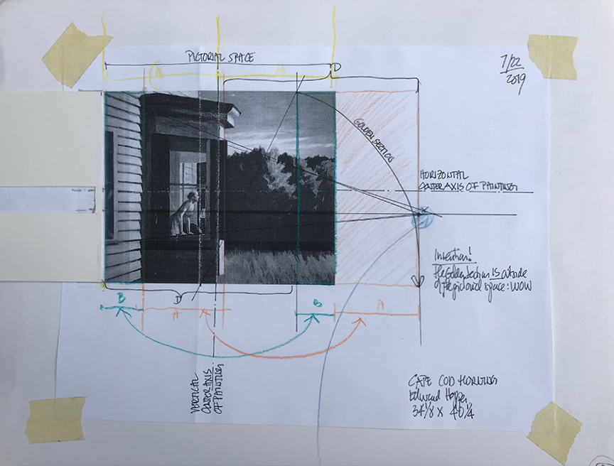
The sketch (Image 1, above) illustrates those proportional systems and the astonishment at my findings. In this instance, Hopper’s brilliance was to not only use the golden section to calibrate each compositional part of what may be called a still life, but, it suggested to me, that the painting’s meaning may well exist outside the visual canvas.

By aligning the picture’s vanishing point with the vertical edge of the golden section (Image 3, above), he not only emphasized the visual extension of the painting towards the right, but offered a terminating point for the women’s gaze. Everything now seems contained yet open within the painter’s instigation and the voyeur’s contemplation.
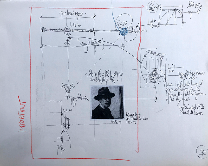
Furthermore, the sketch to the right suggests the perpetual pictorial ambiguity of the viewer taking the role of the painter. Our gaze retraces Hopper’s composition, one that establishes a trilogy between the painter’s eye, the woman, and the vanishing point of her gaze.
Conclusion
Paintings should remain mysterious while alluding to a more important metaphysical dimension, one that sets in place a world between mind and matter, potentiality and actuality.
Edward Hopper, American, 1882-1967 Cap Cod Morning (1950), oil on canvas, Smithsonian American Art Museum, Gift of the Sara Roby Foundation, 1982.6.92 (From Google Images)
Other blogs of interest about painting:
Hubert Robert copying paintings at the Louvre
Hubert Robert: Painting as a source of knowledge
Still lifes by Ben Nicholson
Simone Martini: three principles of settlement
Le Baron Tavernier: a cafe terrace in the middle of the Lavaux vineyards, Switzerland
Robert Slutzky
Netton Bosson, Gruyeres, Switzerland
Art by Mike Goodlett

