
La Clarte: (Le Corbusier). As an architecture student in the early 1980s, I was imparted with a profound knowledge—and may I say appreciation—for the history and theory of the discipline, which included a nearly devout emphasis on key modernists of the 20th century. One of them—perhaps the greatest for a student trained in Europe—was the Franco-Swiss architect Le Corbusier (aka., Charles Edouard Jeanneret; 1887-1965).
I was not alone in being enamored by the conceptual discipline of his projects; his co-founding of the art movement Purism with painter Amedée Ozenfant; the seamless relationship he had between painting and architecture; the variety of scales of his interventions throughout the world; and his creation of modern tectonics that reflected new “ processes of standardization, prefabrication, and its rational economic logic.”

Le Corbusier’s early built work including Villa Savoye (Poissy, 1928-1931) and Stein de Monzie (Garches, 1926-1928) were part of my early reference repertoire —which I later interpretated—through many projects beginning with my first loft renovation in NYC.
Later, with a permanent job secured, my passion for travel increased and among hundreds of buildings I visited, I came to admire Le Corbusier’s Heidi Weber Pavilion in Zürich, and his work in India, particularly four projects built in Ahmedabad, the capital of Gujarat (Image 1, above). There, I also enjoyed Louis I. Kahn’s work for IIT where he collaborated with Indian architect Balkrishna Doshi. Doshi was an assistant for both Le Corbusier and Kahn’s Indian projects, and I am fortunate to have met Doshi during several of my visits there.
Perhaps because of my exposure to numerous groundbreaking works of architecture, I developed an appreciation for the works of less iconic masters who redefined building as representing an architecture of silence, rather than of discourse. At the same time, in this process of selection, I came to appreciate the Immeuble Clarté in Geneva, Switzerland, as one of the great buildings of Le Corbusier’s early oeuvre; one which ironically is rather sidestepped when referencing works by the master.
Le Corbusier’s unités
During his life, Le Corbusier worked extensively on prototypical apartments that grew into massive housing units in the form of condensed vertical cities—this during a time when city blocks were still of a modest scale in Europe.
From the Pavilion de l’Esprit Nouveau (1925)—a protype for the immeubles-villas (apartment-villa-block)—to his utopic grand scale projects for Paris (Plan Voisin) and South America (in Buenos Aires, Rio de Janeiro, and Montevideo), the four unités in Nantes-Rezé (1955); Berlin (1958) completed the same year he submitted a project for the reconstruction of that city; Firminy-Vert (1967); and Marseilles (1952), the latter, which became his most representative unité as it marked the culmination of his ideas.

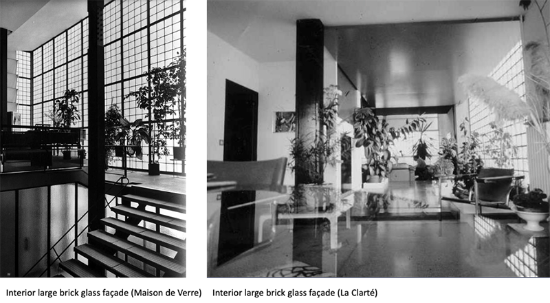
In this rich landscape of housing prototypes, the Clarté apartment building stands out for me as a step above in Le Corbusier’s search for a model of life. The overall sense of domesticity reminds me of the spirit of the Maison de Verre (1928-1931) designed by French architect Pierre Chareau (1883-1950) with Pierre Bijvoet (1862-1939) (Image 2, above).
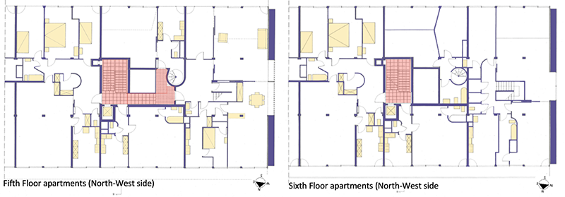
La Clarté expands on Le Corbusier’s ideas of modular spaces with built-in furniture as described in his book Precisions on the Present State of Architecture and City Planning (1930). The apartment block offers 45 rather luxurious free-plan apartments of diverse configurations and sizes. Compared to his future unités, the more generous apartment layouts might have been because La Clarté catered to an enlightened middle-class who wanted to live in an apartment-villa in Geneva (apartment building “townhouse”). Layouts not yet proposed in the city of Calvin (Image 3, below).
The Immeuble Clarté
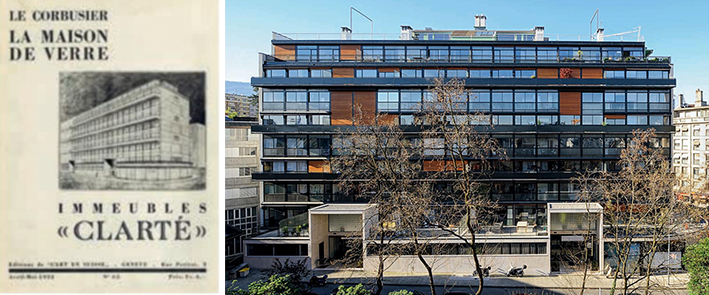
At the Clarté (1928-1932, and in 2016 inscribed as UNESCO World Heritage Sites), was Le Corbusier’s first exploration of modern principles in an apartment block, and considered in scholarly research as “one of the steps along the route leading to the unrealized urban plan of the “Ville Radieuse.” While Le Corbusier’s vision for the Radieuse city never went beyond his imposing plans, he was able in La Clarté to postulate a radically new spatiality for each apartment that reflected his sectional interest in layering flats one over the other.
This sectional quality was achieved through the introduction of two-level dwelling layouts, which was innovative in a post WW1 apartment complex. The various apartment configurations (from studios to duplexes that were based on the dom-ino principle) were not designed in a dogmatic way, contrary to what I believe was true of the subsequent projects based on a standardization of a habitation-type (aka., Marseilles).
The apartments at La Clarté
My above comment regarding dogmatism should be accompanied by a note for students and this for the following two reasons (Image 4, above).
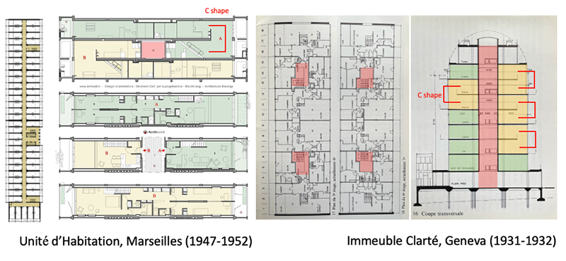
First, and despite the simplicity of the typical Marseilles apartments arranged in section as a duplex (formulated first in the Esprit Nouveau), the yellow apartment (B) is entered at the level of the kitchen, and overlooks the living room AND the master bedroom, from which one then proceeds in a slightly circuitous path to the two kids’ rooms on the other side of the apartment (Image 4, above).
For me, there is a lesser sense of privacy and an awkward sequence to the functional distribution of the smaller bedrooms compared to the plan in the above apartment in green (A). This might be a minor critique, but worth mentioning since it indicates that even the master, for reasons of conceptual integrity, is willing to give up an equal model of life for each apartment, if this was his intention.
Second, innovation is never the result of an isolated act of creation. Le Corbusier—as all good architects—works through a recherche patiente (patient research), where type elements are re-invented, modified, altered, adjusted, and at times radically changed. Yet there is a continuity within his research that should be introduced and slowly practiced among architecture students. For faculty, this approach is essential as a pedagogical strategy, as many of a student’s first drawing are tacitly accepted as too often their final one. Process and iteration is something that needs to be learned early on to benefit the unfolding of a rich design process.
It is worthwhile to compare the Geneva block with the one in Marseilles in terms of the C-shape interlocking apartments. This strategy has its origin twenty years before as a prototype at the Clarté; with a crucial difference that the ghastly horizontal corridor at Marseilles is at the Clarté an airy and light-filled vertical circulation system that joins four apartments on each level. It is this circulation system that I have always admired and want to showcase in this blog.
The color palette in the stairwell at the Clarté
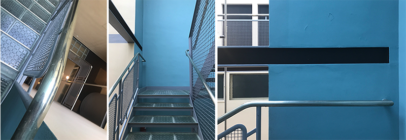
Along with his cousin Pierre Jeanneret, Le Corbusier emphasized that the residential building of La Clarté should embody “a) the reform of the apartment; b) the transformation of construction methods; and c) the elements of a new aesthetic.” This is true, and along with the façade and apartment types, the two stairwells reflect point b) and c). This is accomplished through the rational, scientific expression of steel, glass, and light. Noteworthy, and most importantly for Le Corbusier, is his use of the purist polychromy that offers the stairwell brilliance, depth, and a beautiful atmosphere as one ascends to the top floors (Image 5, above).

The composed use of materials, light, and color at la Clarté are important for me. Especially, as during many visits to Le Corbusier’s works throughout the world, I find that the ill state of many of his buildings leave me discouraged and focused on his interest in construction and detailing. Yes, he pushed boundaries and embraced new technologies, but being an artist who brought his talent in equal spatial terms through color, his choice of materials were not as celebrated as many of his peers (e.g. Pierre Chareau).
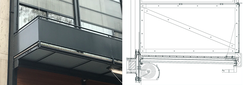
At La Clarté, the use of steel frame imposed by the owner (real-estate developer, contractor, owner, and industrialist metalworker Edmond Wanner), seems to have pushed Le Corbusier towards a refinement in detailing; one not seen again until the Heidi Weber Pavilion was completed after the architect’s death in 1967 (Image 7, below).
The stairwell at La Clarté

While there are many stairwells that I have come to admire—Treppenhaus or Treppenraum (stair house/stair room) as only the German language can describe space and art (aka., Gesamtkunstwerk and Gestalt)—hands down, the stairs at La Clarté so correctly express the aesthetic of a machine age. Nothing more, nothing less than what is accompanied by a minimal column-beam structural system most clearly expressed in the stairwells there. The stairs are inspiring; and perhaps a clin d’oeil to a Piranesian or Escher-like pictorial space (Image 5, left above).
The day of my visit, I was fortunate to have access to the east-side entrance of the building. I was familiar with the building’s importance as I remember visiting La Clarté years ago at the occasion of a gallery opening showcasing drawings by Alberto Sartoris (1901-1998). Sartoris was a founding member of the CIAM movement and was my teacher in urban forms at the EPFL. The afternoon of the exhibition, I must have taken the elevator as I did not remember much of the stairwell from that time; perhaps, I was anxious to discover some of the most beautiful axonometric drawings of modern rationalism (Image 9 below).

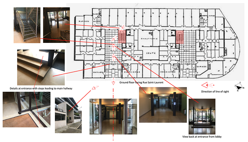
The stairwell in question is tucked at the end of the large entrance hallway that is reached through a series of gentle steps at the glass entrance doors (Image 10 below). Because of its location, the staircase seems discrete and not well illuminated. However, when one stands at the bottom and looks up, light bathes the entirety of the nine-story stairwell as each step and landing is made from translucent reinforced glass. The spatial result is one of a subtle luminosity that is further emphasized by a vaulted ceiling also made of translucent glass. A light gray and blue palette known as Le Corbusier’s colors further constitute the volume of the stairwell (Images 5, 6 above).
Construction and detailing of the stairwell
The following images showcase my ascent from floor to floor, discovering how a typical U-Shaped stair, can become in the hands of a master, something unique, refreshing, and spatial. The restrained use of materials and the genius of using brick glass to provide transparency throughout the entire stairwell makes this space memorable. The clarity of expression in both construction technique and detailing is demonstrated in all parts of the stair.
Wall and outside closed stringers are identical; risers and treads framed by a soldered L-profile leaving the tread open; rectangular glass bricks (solid compared to glass blocks that have a hollow core and are thicker) forming steps and landings; and an industrial profiled metal railing panels with a continuous gooseneck railing at the juncture between landing and stair. (Image 11, below)
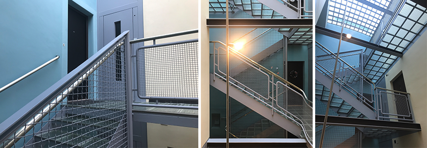

I had so much delight discovering the stairwell. Regrettably, I only recorded my curiosity through photos, and missed sketching particular details. For example, I would love to better understand the square in all its forms (glass brick, railing, geometry). Or simply, to have better understood the stairwell’s lighting system made from nickel-plated metal tubes that are suspended from the top floor, just underneath the skylight (Image aa, middle above).

Conclusion
Beyond the elegance of this stairwell, what impresses me most is how design gestures are not isolated. They are part of a continuity that balances artistic intentions with constraints: site, function, program, client, and budget to name a few. If these criteria are essential to achieve greatness, I learned early on (the hard way perhaps) that much of the dimensional constraints, both geometrically and mathematically, are essential.
If construction and detailing are never solely about favoring the custom made, La Clarté’s stairwell reminds me about the importance of precision, industry-standard construction, shop controlled conditions, and tolerance. Further research would hopefully confirm that innovative products and techniques were embraced by Le Corbusier. Conjecturing on the use of brick glass, the one used in the Maison de Verre was created in 1928 by Saint-Gobain and called Nevada glass tile modules. The challenge is to work with those constraints in search of an elegant, just solution to the art of building.
Postscript
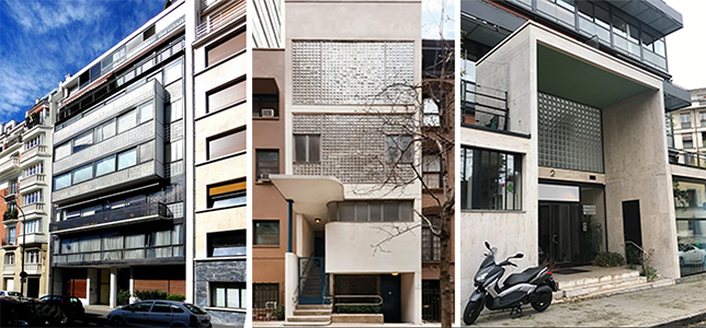
Beyond the similitudes with the Maison de Verre (Image 17 below), I am reminded of the façade of Le Corbusier’s apartment block at Nungesser et Colis (1931-34), or even the entrance portico of William Lescaze’s townhouse on the upper East Side in New York City (Image 18, below). Invention or re-invention! Finally, I am reminded how Le Corbusier choreographed his architecture with machines of his age -often with the iconic legendary Citroën Traction Avant!

Additional blogs of interest regarding stairs
Latvian National Museum of Art (ProcessOffice), Part 1
Latvian national Museum of Art, Part 2
The Whitney Museum: stair by Marcel Breuer
Vittorio Gasteiz: a lessons in stairs (Francisco Mangado)
Hong Kong: a lesson in stairs (Bille Tsien and Tod Williams)
Porto: a lesson in stairs (Alvaro Siza)
Firminy: a lesson in stairs (Le Corbusier)
Lexington: a lesson in stairs (Jose Oubrerie)
Vienna: a lesson in stairs (Jože Plečnik), Part 1
Vienna: a lesson in stairs (Jože Plečnik), Part 2
Geneva: a lesson in stairs (Le Corbusier)
How to design a stair
Dear Henri,
I am really enjoying browsing through your significant suite of wonderful architecture blogs. In doing so I spotted a minor error in your https://atelierdehahn.com/geneva-a-lesson-in-stairs-le-corbusier-clarte/
“Image 18: Google Images -the Citroën Traction Avant in front of Garches, AND La Clarté”
Just clarifying that Corb drove a clunky-looking but technologically advanced (for 1927) Voisin C7 (now owned by Norman Foster) as per https://frankieflood.blogspot.com/2018/12/le-corbusiers-voisin-c7.html and https://www.tbauto.org/project/avions-voisin-c7-chastness-1927-france/
The Citroen is way more elegant but also later, first being produced in 1934 https://en.wikipedia.org/wiki/Citro%C3%ABn_Traction_Avant
Trusting that you’ll receive this comment in the intended spirit of helpfulness, I’ll get back to my blog-reading!
My best, Ben Smart