 Hong Kong: a lesson in stairs (Billie Tsien and Tod Williams). There are many urban environments that I have come to cherish throughout my years traveling the world. I am an urban boy, and while I love Berlin, Paris, New Delhi, New York, Tokyo, and Vienna, and even at a more modest scale Lausanne where I studied architecture, Hong Kong remains top on my list of favorite cities. There is no place that has provoked me more than the Fragrant Harbor—Hong Kong’s nickname—which is in direct opposition to the more gentile landscapes of places I have lived including the Bluegrass region of Kentucky, the Central Coast of California, and the New River Valley of Virginia.
The idea of metaphorically inhabiting an elevator shaft (my term for Hong Kong’s nano-sized flats that are no bigger than a parking space) will always make me return to the world’s most crowded metropolis. Density, diversity and world outlook seem to be my credo.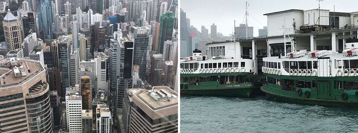 Image 1: skyline of Central district and Star Ferry boats on mainland with HK island in the back (author’s collection)
Contrary to cities such as Paris, which are deeply anchored in our minds by culture, history and revolutions, Hong Kong is a beast in its own right. A city that is geographically divided by one of the busiest and most important economic waterways in the world, the island of Hong Kong identifies itself primarily by the confrontation of old neighborhoods tucked between majestic overpowering skyscrapers of commerce.
Hong Kong
The mainland of Kowloon with the New Territories to the north include some of the densest neighborhoods in the world (Mong Kok district, meaning busy corner in Cantonese, is according to Guinness World Records, “the most densely populated place on Earth”). The extraordinary round the clock vibrant street life bursts with markets, food stalls, and looming over-scaled billboards, all offering a sublime in-situ experience similar to the science fiction film Blade Runner set in the Los Angeles of 2019!
At every level one sees the contradiction between tradition and innovation from arrival at the airport on Lantau’s island 20 minutes west of the city where a state-of-the-art subway network brings the visitor to the heart of Hong Kong and the journey truly begins. It is immediately understood that this is a special place, and that flavors the experience of seeing world class architecture, dense urban neighborhoods, wild and domesticated landscapes, heritage hotels, museums, historic sites, and, of course, shopping and enjoying exquisite authentic Cantonese and Mandarin food—from Dim Sum, to snake and bird’s nest soups. Image 2: city blocks in the dense district of Mong Kok (author’s collection)
There are few global cities that I have visited that have achieved such contemporaneity by transforming their skyline with verve, energy and promise than Hong Kong. Yet, the one country, two systems policy imposed by mainland China in 1997—ending one hundred years of British colonialism—is being abused and eroded by Beijing and their on-site proxies who relentlessly crack down on human rights to the point that basic fundamentals of a western democracy will soon be part of Hong Kong’s past. Image 3: Tai Kwun Centre under construction (author’s collection)
Within this rich and ever conflicting yin and yang environment, tightly-packed signature skyscrapers continue to rise even higher—often on newly reclaimed land around the port, while some international architecture firms favor bringing a new reading to the city, often in a more discrete and subtle manner.
Whether it is within the historic urban fabric, such as work by Swiss architecture firm Herzog et de Meuron in their 2018 renovation and addition to the new Tai Kwun Centre, a former police station during Hong Kong’s colonial time, or the negotiation between existing buildings within an impossible topographical landscape, such as the 2012 Asia Society Hong Kong Center (ASHK), designed by New York based Tod Williams Billie Tsien Architects (TWBT) in association with the engineering office ARUP. These examples are two of my favorite interventions which focus on incorporating the few left over traces of British cultural history.
Asia Society Hong Kong Center (ASHK)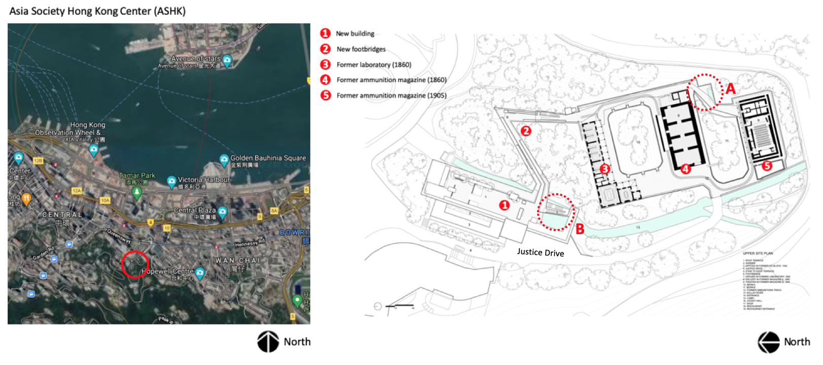
Image 4: Google Images -Arial view of site and plan of ASHK
Located on Hong Kong Island in the lush hills of the business district of the Admiralty—on what is considered a typical steeply sloped site divided by a ravine—TWBTA’s winning competition is an elegant yet sophisticated intervention incorporating features of adaptive reuse and conservation in addition to creating a new building at the edge of Justice Drive.
The site, high above Hong Kong’s harbor—a precautionary strategy when the site housed the British Military Explosives Magazine Compound called Victoria Barracks—was slated for a new entry pavilion added to house the main public amenities of ASHK that feature “a store, café, rooftop garden, and permanent exhibition illustrating the facility’s transformation.” (image 4, number 1 above). The success of the overall project showcases contemporary ideas of preservation (the site has the status of Heritage buildings) and Hong Kong’s need to maintain its economic world stature, while securing its position as a cultural, artistic, and intellectual hub in the Pacific Rim.
 Image 5: Google images-existing offices in former Laboratory (image 4, number 3), and renovated spaces with detail with canopy (author’s collection)
Overall strategy
Linking the transformed three ‘landmark’ buildings—administrative offices (3), exhibition space (4), and theater facility (5)—the architects devised a strategy to bridge the terrain with a new L shape double-decker footbridge (2) that extends into a covered walkway protecting the path towards the existing historic buildings (image 4 above). This open-air experience offers guests the sensation of levitating in the lush sub-tropical greenery, while enjoying views of the Hong Kong skyline and, at a distance, glimpsing the bustling harbor. During each of my visits to ASHK, I felt that it is a place for quiet contemplation, void of the constant noise pollution of the city, an oasis in the middle of the metropolis.
I am familiar with several of TWBTA’s projects including the Herford College, University of Virginia in Charlottesville (1992); the Phoenix Art Museum (1996); the former Folk Art Museum in New York City (2001); the Neuroscience Institute in La Jolla (2012); and the Barnes Foundation in Philadelphia (2012). Each of my visits caused me to think about space, construction, and detailing, and for me, TWBT has always exhibited a great sense of poetry through an architectural understanding of the life cycle of their projects, from concept to execution.
This is true despite some disappointment in the Folk Art Museum, which had an overly complex spatial strategy and perhaps missed opportunities to respond to basic functional requirements—a modest intervention that unfortunately was destroyed a decade later because of MoMA’s insatiable appetite to secure the entire city block between 53rd and 54th Streets, and 5th and 6th Avenues. This story was extensively covered and showcased, in my opinion, the fragility of architectural friendships when the securing of a commission is at stake.
Columns
Image 6: example of columns (author’s collection
In the Asia Society Hong Kong Center completed in 2011 (ASHK), the architecture exhibits superbly crafted details and I wish to highlight a number of key moments. The first one is the treatment of the supporting columns of the canopy in the areas of the existing laboratory and magazines.
Not only does the grouping of three slender stainless-steel columns offer a lightness in their expression of a structural system, but it is how they touch the pavement and the canopy that showcases TWBT’s focus on detailing. Here, the notion of discourse over silence draws our attention to how a careful orchestration of materials, textures, and their assemblage remain integral to the visual architectural promenade.
Carefully framed to negotiate the various geometries in play, the columns (image 6 above) do not show per se how they attach to the ground, yet its tectonics partake in a larger footprint incorporating a lined pea gravel rectangle with a system of lighting. The geometry of this “base” references the direction of the canopy while creating, and even distancing itself from the complex visual pattern of the pavement treatment. Image 7: treatment of the top of the columns (author’s collection)
Related to the treatment of the base of the columns, the top of the three posts (Image 7 above) terminates in the canopy with a reversed stainless-steel pan suggesting the volume of a traditional capital; yet this time expressed in its absence rather than as an actual capital as part of the canons of architecture.
Between ground and canopy, everything is airy and seems to float, guiding the visitor between open air walls that never touch and take a variety of scales and textures, while juxtaposing vertical and inclined wall surfaces. The resulting space is dynamic, letting light bathe the edges of the walls and pavement, punctuated by water features and direct views towards existing wildlife habitats and domesticated nature, all the while offering a direct vista of the path in front of the visitor.
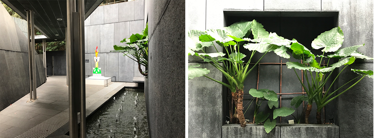 Image 8: treatment of the space between existing laboratory and magazine, dashed red circle A in image 4 (author’s collection)
Materiality and detailing
 Image 9: selected details (author’s collection)
Another quality of TWBT’s spatial treatment is the attention and careful choice of materials and textures, juxtaposing existing and new, and their expression of how those materials come together through beautifully crafted details. Many of the walls throughout the Center feature a dark striated greenish gray palette—marble sourced from southern China—which give a uniformity, yet the subtle changes in color, pattern, shape and size help define various spaces with incredible depth.
The Munitions Track
Image 10: Google image -munitions tracks in plan (yellow), and in situ examples (author’s collection)
“Constructed in the late 19th century to transport explosives within the British military site, the Munitions Track connected the Former Laboratory, where shells were filled and examined, with Former Magazines A and B [numbers 4 and 5 in image 4], where ammunition and gunpowder barrels were stored. Heavy shells loaded on four-foot long carts were pulled along the track by a winding engine located down the valley within the Victoria Barracks. In the early 20thcentury, the War Office erected an aerial ropeway near the end of the track on the northeastern edge of the Former Laboratory [number 3 in image 4].
This ropeway was designed to transport ammunition between the Explosives Magazine and the seafront within the Arsenal Yard in Wan Chai, it facilitated the deployment of explosives from the barracks to defensive locations throughout Hong Kong. The remains of the original tracks have been preserved in situ.”[1]
Main exterior staircase
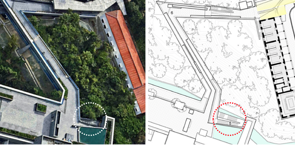 Image 11: Google image -exterior staircase
Another of the many themes expressed in TWBTA’s work is their quasi obsessive treatment of stairs. Whether they are interior or exterior modes of circulation, stairs are always given careful attention in their spatial positioning in the overall circulatory strategy; not only serving as vertical movement, but often drawing attention to themselves as a way to impact the space. This is similar to American artist Donald Judd, who not only sets his art piece within a context, but allows the art piece to redefine the context and its spatial conditions.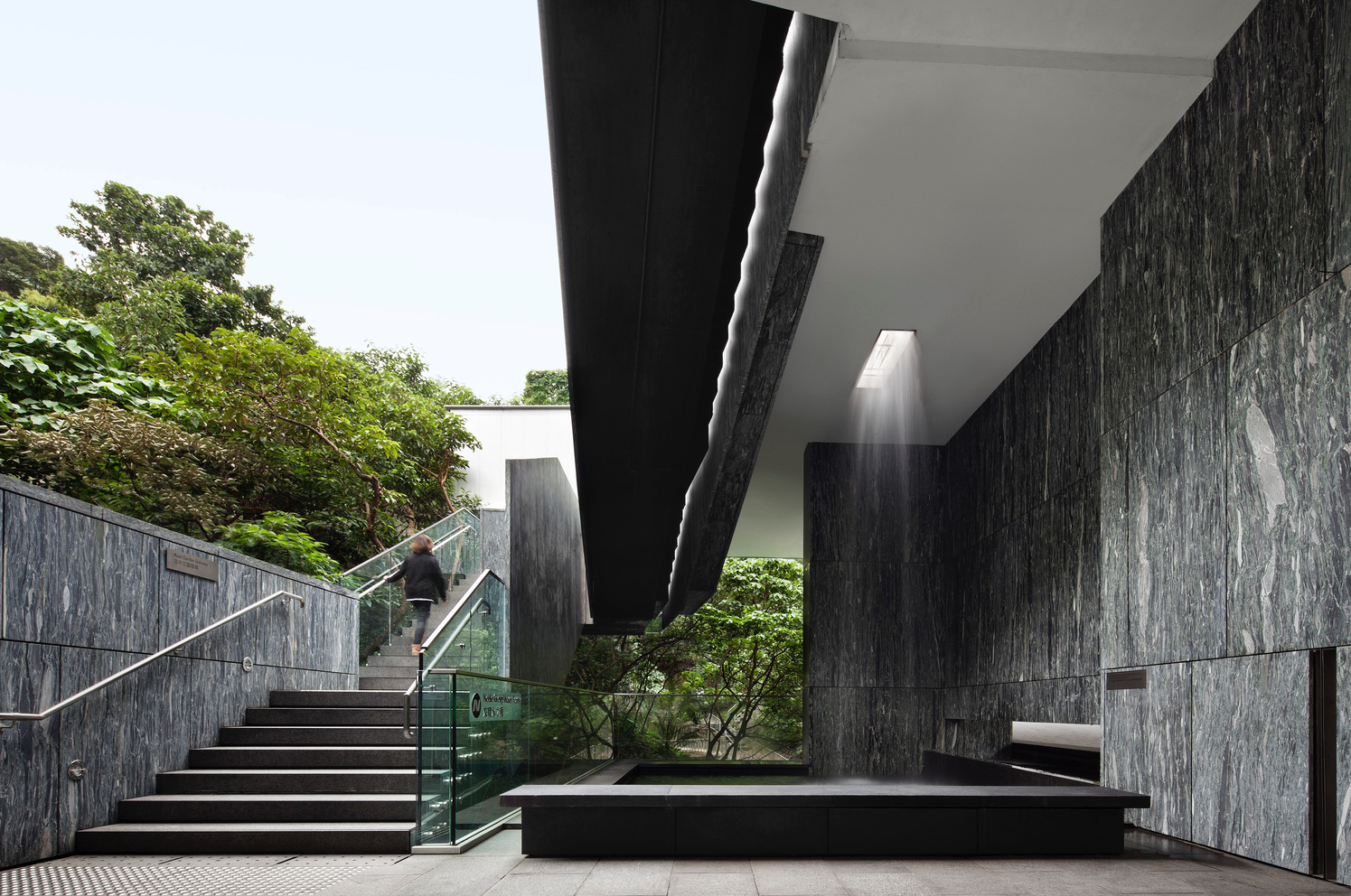 Image 12: Google image -exterior staircase
In a previous blog, I celebrated the stairs of the Archeological Museum of Álava by architect Francisco Mangado, there the stairs were extremely simple, yet created incredible spatial richness though well-orchestrated opaque and translucent walls, glass balustrades, and a restrained choices of materials.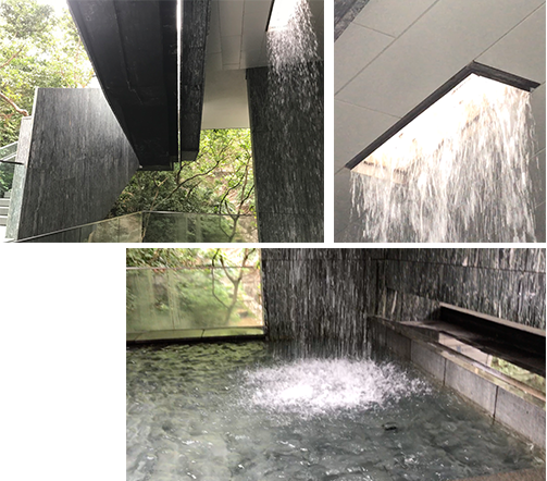 Image 13: Waterfall at lower level of staircases details (author’s collection)
At ASHK, the reverse seems in order. Here the staircase is a sculptural event, a tectonic celebration of the nature of a stair—diagonals in space, celebration of movement and the emphasis of various over-scaled stringers.
These moves form a distinctive unity, and offer key moments that accompany different perceptions as one ascends and descends the staircase. While the overall design has a strong volumetric quality, an undeniable presence as an object in space, the restraint in the choice of materials (marble veneer, stone, glass and stainless steel) is treated with such refinement that this staircase works magnificently at many scales.
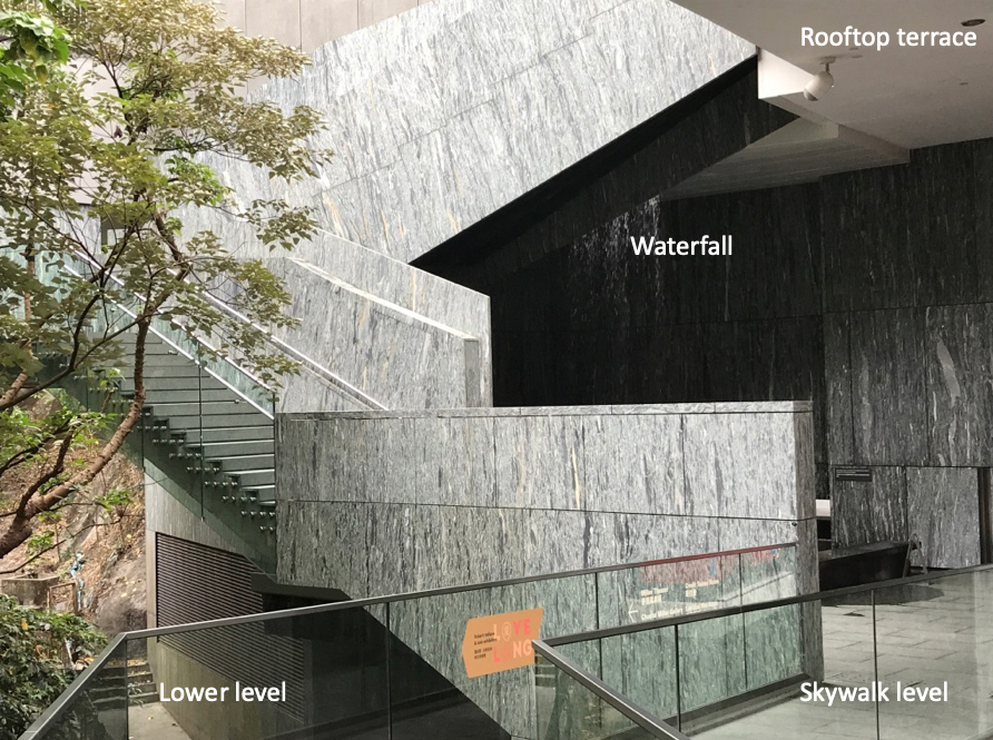 Image 14: View of the staircase from the skywalk level, dashed red circle B in image 4 (author’s collection)
At the skywalk level adjacent to the staircase, is an open-air space mostly dedicated to a waterfall and fountain created by an opening in the floor of the rooftop terrace. The verticality of this reconstituted natural element visually accompanies the ascension of the staircase and sets in place a number of planes parallel to the stringers, including a retaining wall on Justice Drive (far back in image), the waterfall channeling light in an area that would have been otherwise dark, and the diagonal planes accompanying and defining the stair’s edges.
Note in the first photograph in image 12, the architects were able to create a gap defining how the stair seems to hang between roof and skywalk. This space is of such beauty and repose, and with the light bouncing against multiple surfaces, results in a unique sense of spatial expansion in a rather tight space. Image 15: Staircase at main building with details (author’s collection)
The staircase in itself is a volumetric jewel. Starting from a series of swell steps—those of a staircase that mark the first part of the ascension—and terminating in a Z-shaped landing at which moment the opaque and transparent glass railing is reversed to move from the view of the fountain to the wilderness of the park.
The steps accompany this reversal of opaque to transparent in the balustrade create a gentle movement from right to left suggesting that ascension can—and should—take place near the transparent balustrade. This shift is further accompanied by the treatment of a three-tiered surface (image 14 and 15 above) of the same richly veined marble that is the central stringer of the staircase. At the scale of the human, the slightly inclined wall incorporates a lighting system that accompanies the railing. Finally, the thinnest of the three planes that define the void with the second set of risers lead to the roof terrace.
Conclusion
The visual effect that accompanied my journey to the roof terrace emerged from a complex set of diagonals reinforcing the sense of movement while paying close attention to each detail as a pretext to change materials, or simply to celebrate the fastening of the glass railing to each of the individual steps.
I wish that architects would return to their drafting boards and celebrate ascension in all of its complexity. The contributions of architects to the history of architecture must continue to include the celebration of staircases as a spatial moment, as a key articulation within a precise moment of an architectural promenade with all the delight, poetry and sense of construction that Tod Williams and Billie Tsien have shown us in the Asia Society Hong Kong Center.
[1] From exhibition panel on site.
For additional images of the Asia Society, visit
Additional blogs on Hong Kong
Murals at Hong Kong Central station
Hong Kong trams, a way to travel
Hong Kong: a lesson in stairs (Central Market)
Hong Kong: the history of Central Market
Bathroom at the Novotel in Hong Kong
Hong Kong: a lesson in stairs (Billie Tsien and Tod Williams)
Hong Kong: a metropolis of contradictions
Blue Bottle Coffee: Hong Kong
Hong Kong Shopping Mall
Additional blogs pertaining to stairs
Vittorio Gasteiz: a lesson in stairs (Francisco Mangado)
Porto: a lesson in stairs (Alvaro Siza)
Firminy: a lesson in stairs (Le Corbusier)
Lexington: a lesson in stairs (José Oubrerie)
Vienna: a lesson in stairs (Jože Plečnik), Part 1
Vienna: a lesson in stairs (Jože Plečnik), Part 2
Hong Kong: a lesson in stairs (Central Market). Part 1
Geneva: a lesson in stairs (Le Corbusier)
How to design a stair
