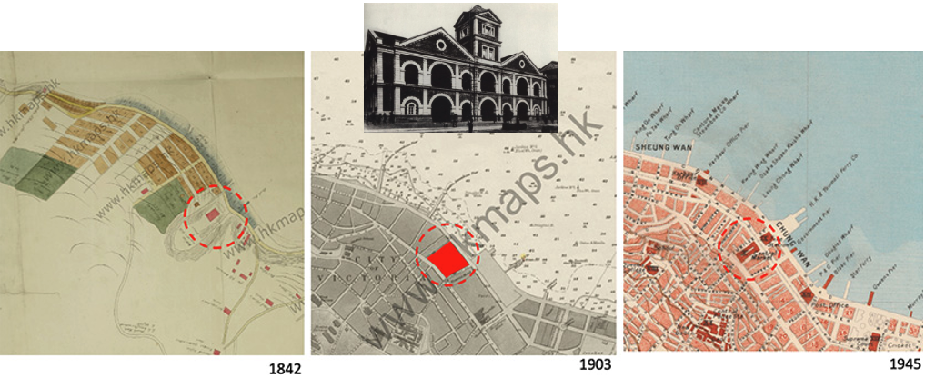
Hong Kong: Bauhaus style Central Market. Previous research on the Central Market in Hong Kong, resulted in a blog describing the genesis of the market through 1850. After 1858, the building—originally called Canton Bazaar, thereafter Middle Bazaar—was rebuilt, and from there on was officially named Central Market. The 1903 map (Image 2, below) suggests the market was a rather large structure.

In the 1945 map and subsequent ones, the Central Market’s morphology occupies a smaller urban lot, one that slopes up between Queen’s Road to the north and Des Voeux Road to the south; bordered by Jubilee Street to the west, and Queen Victoria Street to the east. My interest here today begins with the 1939 fourth generation, and its recent preservation and revitalization completed in 2021.
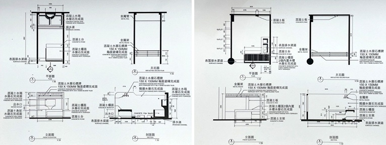
After the demolition of the 3rd generation market in 1938, a European Bauhaus or Streamline Moderne style offered the neighborhood a state-of-the-art wet market with six different types of stall clusters: fish, poultry, beef and mutton, pork, fruits, and vegetables each taking a different form, almost tailer-made in their various configurations. The layout of each stall was carefully orchestrated in different sections; not only based on the items sold per floor, but in its expression and interest in capitalizing on a modern way of embracing the development of market hygiene (Image 3 and 4, below).


Formal attributes of the Bauhaus style market
The fourth generation of Central Market adopts the modernist approach in construction; reinforced concreted columns and beams are used rather than traditional stone and masonry, construction with limited span. As a result, the market stalls and circulation are more flexible and suit the needs better. This non-structural partition wall is made of red bricks, in English Bond. The bricks were laid in alternative layers and perpendicularly, all the way up. The precision of this bricklaying technique and the exquisite craftsmanship of the builders is retained in Central Market.
The free planning interior design with systematic grid organization defined by the concrete column and beam structure is representative of a pre-war market of reinforced concrete construction in the 1930s, marking the milestone of the modern era.
Excerpts from exhibition panels at Central Market Queen’s Road entrance
Bauhaus style

When I learned that Central Market was designed along classic Bauhaus lines, I was rather perplexed to find this German design movement in Asia. I was well aware of important interventions by key Bauhaus instructors and alumni practicing in Europe, as well as in the White City of Tel Aviv in Israel, Johannesburg and Cape Town in South Africa.
But finding Bauhaus architecture in Hong Kong was, for me, a surprise, as I mistakenly felt the city in the 1930s relegated to a far-flung corner of the world. But, familiarizing myself more with the city’s history, and Central Market’s role in paving a new generation of markets in Hong Kong, I now understand why this style was so appropriate.

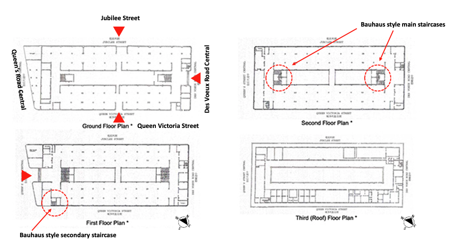
Central Market’s Bauhaus design was considered “a mark of progress in architectural design.” The style’s main characteristics are exhibited through reinforced concrete column-frame construction (allowing partitions to be erected freely per programmatic requirements); simple asymmetrical and cubic shapes; continues large horizontal windows held in thin steel frames; flat roofs; and simple detailing.
In Central Market’s rectangular 3-story layout, these attributes were accompanied by neutral unadorned façades of identical color; operable windows that allowed ample ventilation, as well as natural light to bathe the interior spaces; a free plan for the stalls’ needs; and an internal open courtyard. Retrospectively, I wonder, after seeing all these attributes work in harmony in this climate, that perhaps the Bauhaus style was more appropriate to Hong Kong’s subtropical environment than its native country, Germany!

For Central Market’s rectangular 3-story layout, these attributes were accompanied by neutral and unadorned façades of identical color; operable windows that allowed ample ventilation as well as natural light to bathe the interior spaces; free plans for the stalls; and an internal open courtyard. Retrospectively, I wondered if the Bauhaus style was more appropriate to Hong Kong’s subtropical environment rather than in its native Germany!
Most Bauhaus buildings were designed to express their intended functions; what came to be known as a rational approach that answered the building’s functions and user’s needs. For Central Market in Hong Kong, function was extremely important, and is best described in the excerpt below transcribed from a video shown in the market’s lower level gallery:
Central Market was designed for practical use, in essence to be used as a market. The core value of these kind of buildings is to be functional, its purpose is to serve the general public. The historical significance of Central Market is its social value in relation to the public’s sense of spiritual association and memories of the past. Most of the historical buildings in Hong Kong were designed with a specific purpose in mind as opposed to being aesthetically driven. It is its main reason for its existence.
Excerpt from a video at Central Market
This description seems in line with the modern precept, and in particular with the spatial ramifications of the Dom-ino plan. This concept was established by Le Corbusier and is exhibited in all original floor plans of Central Market (Image 1 and 9, above). Note that the market’s new structure (1939) had three floors with a roof level (initially noted as “offices and living quarters for hygiene inspector and other supporting staff”), and because of the slope between Queens Street and Des Voeux Road, access to the market took place on two different street levels.
A name or firm is typically associated with an architectural design project. For Central Market, there appears to be no single architect of record beyond my understanding that the complex was designed by the Hong Kong Government’s Public Works Department; which, in 1939, included a sub-department called Architectural Office; created the same year as the completion of Central Market. With an eye toward the prevailing International Style, rather than the traditional vernacular Chinese or the British colonial style, visionary and au-courant British architects designed unique public facilities for a modern Hong Kong.
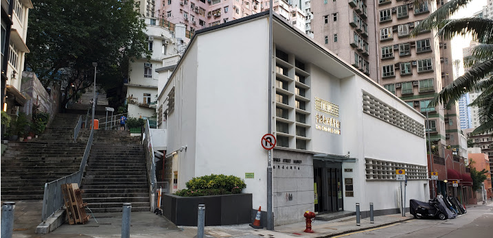
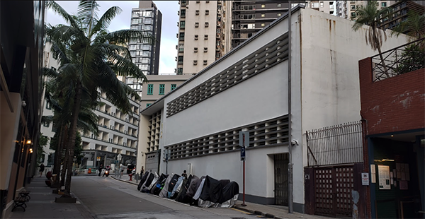
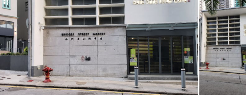
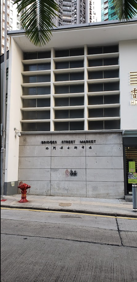
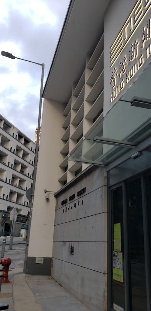
During my research, I also discovered two additional original wet markets in Hong Kong designed in the Bauhaus or Streamline Modern style: Old Wanchai Market (1937), and Bridges Street Market (1953). They are already on my to-do list for my next visit! (Image 8, below)

Conclusion: question of preservation…
From the history of its inception to two site locations, and four market generations, I find that the Bauhaus style used for Central Market is remarkable, especially because of its use of innovative materials and ancestral craftsmanship, iconographic portraits by Fan Ho (Hong Kong photographer), relationship to questions of renovation and revitalization, and its significance as a pioneer of modern markets.
I cannot conclude this blog without revisiting my comment in my earlier blog regarding my puzzlement at the Central Market renovation in which it seemed to lose its dialogue between container and contained – to quote a concept used by American architect Louis I. Kahn.
Previously when describing markets, I briefly touched upon the decision-making process regarding preservation issues. But I did not address an important topic: the controversial topic of gentrification when dealing with issues of renovation, restauration, rehabilitation, or simply adaptive reuse.
The structure of urban politics has in the past and continues to drastically change the character of neighborhoods or buildings that are altered; especially in areas of diverse race and socioeconomic status. In the case of Central Market, I realize that like many comparable markets in Hong Kong, these public places were integral and acted as the umbilical cord to the life of the immediate neighborhoods. Prior to its permanent closing in 2003, Central Market had served as a key actor for a close-knit residential enclave; one that was based on shared beliefs, and collective experiences where all citizens could come and shop.
Therefore, while I acknowledge the well-deserved reviews and countless accolades in the form of prestigious awards—which include mine after experiencing the building’s renovation which I know had to negotiate multiple concessions in order to maintain the integrity of the original artifact—at the end of my last visit, I had a growing sense of malaise about what some call a “Five stars shopping mall.” The overall ambiance of the place seems to have been anesthetized compared to other markets I had visited in the city. During the days of my visit, patrons seemed upper class or well-off tourists, not shoppers deeply anchored in Hong Kong “grassroots demographics” of the nearby Sai Ying Pun hustle and bustle.

Today, with new tenants on the second floor selling luxury items mostly of little significance for daily use, or worse, fake tourist memorabilia of a by-gone Hong Kong era, I was more enthralled with the first floor with its numerous food stalls filled with delicious dishes. Of course, I also found high-end dining that catered to moneyed visitors.
This last comment on the topic of dining is important, as I read an article titled Reviving an essential missing ingredient in Central (accessed 08.12.2023), where it was stated that “we need to make this Market just like they are in Europe; every counter with activity, more action.”
The article offers praise for the cornucopia of dining offerings (e.g., fresh gelato that seems to have little to do with the market’s previous incarnation!) as well as for events surrounding culinary experiences. Touting their connections with global suppliers (e.g., pigs from Austria, Serrano meat from Spain) is wonderful, but can a Hong Kong market not be something else? If this is one of the many definitions of gentrification, the content and container have little in common.
In today’s climate of appreciating regionalism, one that features local produce from the mainland to respect the well-established farm-to-table movement (also coined “farm to fork,” with its 1980 extension to the ‘Slow Food’ movement), as well as a growing appetite for organic products, there might be an important component missing to enhance not only the identity of Central Market but the integration of larger food systems mindful of our environment.
You might argue that my comment simply mimicks the currency of an international western attitude of dining, at the same time I am offering a critique of the need for more authenticity.

Do not misread me, I have no qualm with international gastronomic experience as part of a culinary destination. In a world of internationalization, so many questions regarding identity must be answered. But should it be a goal for Central Market to follow a yuppy life style? Are there no other models that would be more appropriate for a genuine model of life that brings an authentic level of energy to this neighborhood? No need to dwell on how Hong Kong is rapidly losing its identity. This topic was already been argued by Ackbar Abbas in his 1977 essay on The Culture and the politics of Disappearance.
In conclusion, I need to fully recognize what has been achieved, and project that with a constantly shifting market economy, current vendors occupying Central Market will change, adapt and perhaps, in a near future, when consumers demand more ethnic, and authentically diverse merchants and eateries, find a balance between container and contained.
Postscript 1
Finally, I wanted to point out various architectural elements that I found interesting when comparing the 1939 structure with the renovation
Staircase railings

- The additional railings on the staircases were designed to meet contemporary code regulations and be in harmony with the overall language of the staircase. This included tactile paving appropriately placed at all levels (Image 13, above).
Window treatment

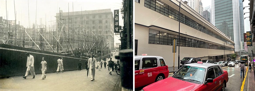
- Exterior windows no longer provide a continuous band. Note that the east and west sides have continuous sun shading devices in the form of fins above both horizontal window strips, which stylistically underline the overall International Style character of the building. Also, during my research, I noticed in photographs predating 1978, that the upper portion of the ribbon windows were either left open or similar to the below windows, were operable, thus allowing ventilation as the building did not provide air conditioning at that time (Image 14, above).
Courtyard façade

- At the ground level, the interior façades were opened to allow spatial continuity between the interior and exterior atrium. This alteration makes sense as seating was now provided for the food court. In the upper levels, there was an equally generous move to open the façade, thus providing ample light to the store tenants and visitors (Image 15, above).
Postscript 2
Similar to my analysis of the People’s Park Complex in Singapore, I discovered a student’s thesis project that offers alternative space planning alternatives to Central Market. It is rewarding to see a new generation of students genuinely interested in issues of preservation, and in particular wanting to address how to upgrade iconic modern buildings to contemporary standards. The one below drew my attention through its research and innovative take on connecting the building to the city (Image 16, below).

Postscript 3

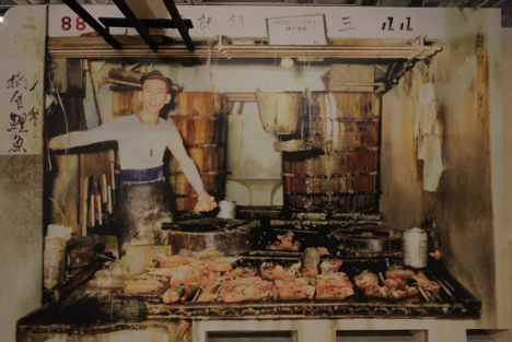
Few of the original stalls from Central Market c. 1939 have been preserved. The two that I could find were turned into an exhibition area in an effort to see how they were used during daily market hours (Image 17, above). Ironically, one of the preserved stalls was closed by a curtain, and the next day in the South China Morning Post I discovered an article about a photograph depicting a fish monger who had worked there. The past lives of Central Market are still alive! (Image 18, below)
Additional blogs of interest on this topic
Between Coffee at Tai Kwun, Hong Kong
Murals at Hong Kong Central station
Hong Kong trams, a way to travel
Hong Kong: a lesson in stairs (Central Market)
Hong Kong: the history of Central Market
Bathroom at the Novotel in Hong Kong
Hong Kong: a lesson in stairs (Billie Tsien and Tod Williams)
Hong Kong: a metropolis of contradictions
Hong Kong Shopping Mall
Blue Bottle Coffee: Hong Kong
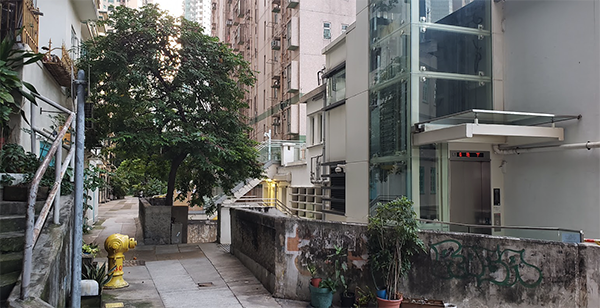
Additional images of the Bridges Street Market
Image courtesy of Desmond Lee
