
Hotel Park Royal Collection Pickering, Singapore. Cities have always been close to my heart because of the many iconic places that endow them with a specific identity. For me, beyond a city’s historical monuments, the overall urban charm, historical grandeur, and regional cuisines, what I most cherish is a city’s distinctiveness in how it brings to life transient places such as hotel properties; properties which are often part of a heritage of historical and cultural significance.
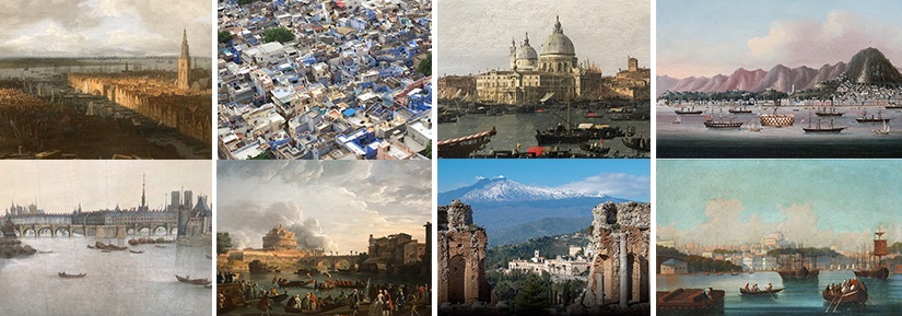
Be it The Imperial in New Delhi, the Ritz in London and Paris, the Danieli in Venice, the Plaza in New York, the Park Hyatt in Tokyo, the San Domenico in Taormina, the Peninsula and Mandarin Oriental in Hong Kong, the Çiragan in Istanbul, the Umaid Bahwan in Jodhpur, or the Fullerton and Raffles in Singapore, most of the heritage hotels exhort for me a history through their standard of excellence, décor and ambience, culinary delights, and exquisite service, all which often speaks of the past while catering to modern discerning patrons (Image 1, below).
Fast forward to the end of the 20th century. Ever since Ian Schrager launched the eclectic world of boutique hotels (after his tumultuous years associated with Studio 54 in Manhattan), star designers such as French interior architect and product designer Phillip Stark, have created hotels embodying this new identity through exotic interiors of tremendous imaginative power. The Hudson, Paramount, and Royalton in NYC, The Delano in Miami, The Mondrian in Los Angeles, the (renovated) Meurice in Paris, as well as the M Social in Singapore, are part of these out-of-the-world hip places where one may meet a jet set crowd while finding privacy surrounded by cutting-edge eccentric decor.

The ParkRoyal
If you are in the city-state of Singapore, as I recently treated myself, I was fortunate to visit another style of hotel that states unambiguously an innovative level of sophistication; one that blends the traditional with the exotic—the antithesis of hotels defined by their architectural anonymity. The ParkRoyal Collection Pickering emphasizes a contemporary eco-friendly interpretation of a tropical city garden concept. It is located between Chinatown, Clark Quay, and the civic district with its historic colonial Esplanade Park just north of the Singapore river (Image 2, above).
The building
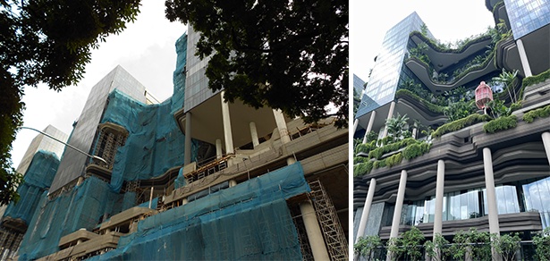
During my first visit to Singapore almost ten years ago (Image 3, above), I remember walking toward the bustling business district facing Marina Bay, and being struck by an unusual building under construction. I was drawn to the slender columns jetting up to the sky like naked Palm trees topped by three unusual narrow glass towers that seemed to offer a different urban configuration from the traditional boxy glass skyscrapers (although many of these boxes have turned into icons as their daring geometries contribute to an ever-changing urban skyscape).
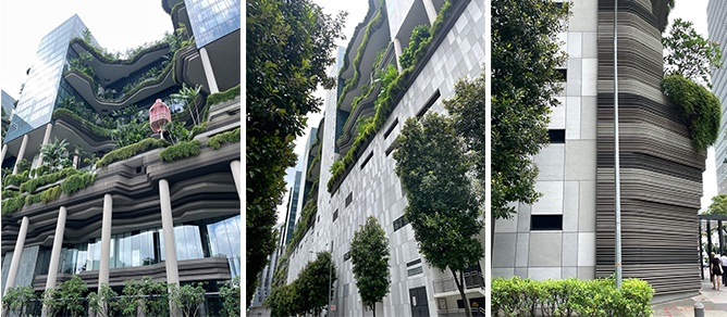
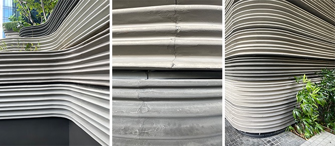
During my recent visit, I discovered the Singapore-based architecture firm WOHA’s intentions with this unusual building shape was to create a place of a “topographical architecture” that became such an important feature throughout the public areas of the hotel I had previously seen under construction. The base, lobby, hanging tropical gardens, and sky walkways at each guest floor level, are treated with stratified and undulating layers of various shades of gray, giving a sense of weightlessness despite the ever-present geological metaphor of schist rocks (Image 3, above).
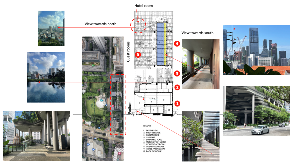
The section in the above image (Image 4) shows five characteristics of the building. From the hanging gardens spanning the three guest room blocks (5), to the attractive outdoor south-facing sky walkways (4), the gardens and infinity pool (3), the administrative and conference center (2), ending with the ceiling above the impressive porte-cochère, the green façade concealing the carpark, and the ground level extension to the hotel lobby, including the famous Lime restaurant (1). Overall, the balance between lightness and weight, glass and concrete, natural and man-made is superbly executed in this oasis in the middle of historic Singapore.
Lobby and restaurant
Any hotel, office building or museum lobby—in fact any dignified entrance be it modest or luxurious—acts as a business card for anyone entering the building. For hotels, the lobby is also a place to relax after a day’s visit to museums, a return from meetings, or a bleary-eyed check-in after a long international flight (for me it was a 17-hour flight from San Francisco). The lobby’s style, feeling, and visual disposition should provide waiting areas that are cozy and exude comfort and relaxation. Such spaces have much to do with offering either a warm and welcome first impression or a disheartening experience of déjà-vu.
The lobby at the ParkRoyal Collection has a definite personality and entry is preceded by an impressive urban porte-cochère where the hotel’s clientele is picked up and dropped off, all the while allowing access to the car park, and establishing the sequence of spaces leading to the main hotel lobby.

Four generous shallow steps lead to an upper outside foyer before proceeding to the interior lobby. Typically, entrance areas are treated as transparent thresholds within an opaque façade, but here the reverse strategy makes the actual entrance special and grand. The urban scale of the outside space is pushed inside as the undulating skin continues within the double height foyer. A beautiful and semi-transparent gabion-like wall acts as the physical barrier between inside and outside (Image 7, above, and 9, below). In fact, at closer look, the entrance resembles more of a screened fence, and this theme is repeated within the hotel in partitions, as well as for the cladding of a stair (Image 9, below).
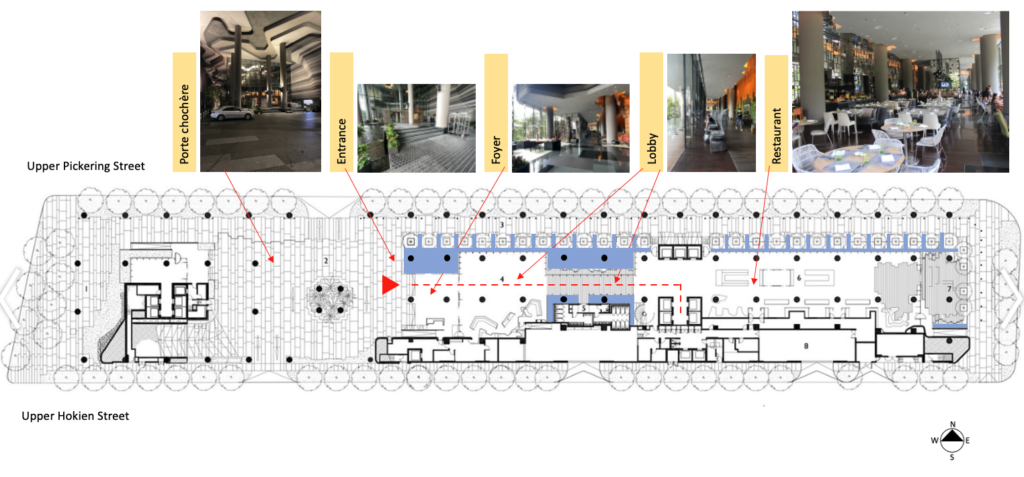

The inside foyer presents itself as a double height that rapidly redirect one’s gaze to the secondary elongated lobby that has a lowered ceiling and over-scaled seating. The seats face an artificial pond over looking the sidewalk below. The floor materials, textures, transparencies, and wall surfaces define a rich and elegant space; although its size and function serves as a transition between foyer, main elevators, and restaurant (Image 10, below).

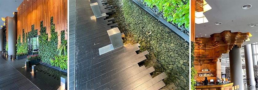
Behind the seating area are columns supporting the three slim towers of guest rooms. The columns echo the tectonic expression found outside through the theme of stratification, but this time it is accompanied by a space between the dropped ceiling and the wall surface; the latter formed by wood paneling and a vertical garden. The overall impression when walking through the lobby is that of being on an elegant boardwalk as each side is defined by water, both inside and out (Image 8, above; and 11, below).
Guest room
All guest rooms are accessed through a bank of elevators, and, contrary to typical hotel layouts where corridors are inside, the ParkRoyal has an outdoor skywalk on each floor. This is because the subtropical climate is hospitable to such a strategy which takes advantage of natural ventilation, all the while providing tropical vegetation on the south face, and luscious green-lined foliage, including moss and ferns which sprout from the walls on the interior side. The procession to one’s room includes exceptional views towards an ever-changing skyscape (Image 12, below).

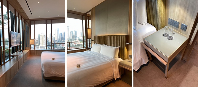
Leaving the skywalk, one finds a well-lit interior corridor. Upon entering the room from the corridor, I was struck by the vastness of the space that featured stunning views of Singapore’s north skyline. The room was subdivided into four zones: the entrance foyer (A), the living/working room (B), the bedroom (C), and the bathroom suite (D) (Image 13-16, below).

The suite
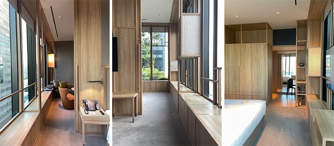
The overall strategy in defining the room was to promote a suite atmosphere by creating an entirely separate space for the bedroom, which was easily accessed on both sides from the living room, thus giving it a spacious feel (Image 11, below). In fact, there was a feeling of being high up in a futuristic treehouse in a garden. The impression of expansiveness was further emphasized by the window treatment which provided not only a thickness in front of the large bay windows, but offered a built-in ledge on which to sit (or lay down in the living room). This built-in depth was treated with a vertical airy grid that at strategic moments held shogi-like lanterns as light sources, especially nice during the evening (Image 13 and 14 above, and 15-17, below).
The bedroom
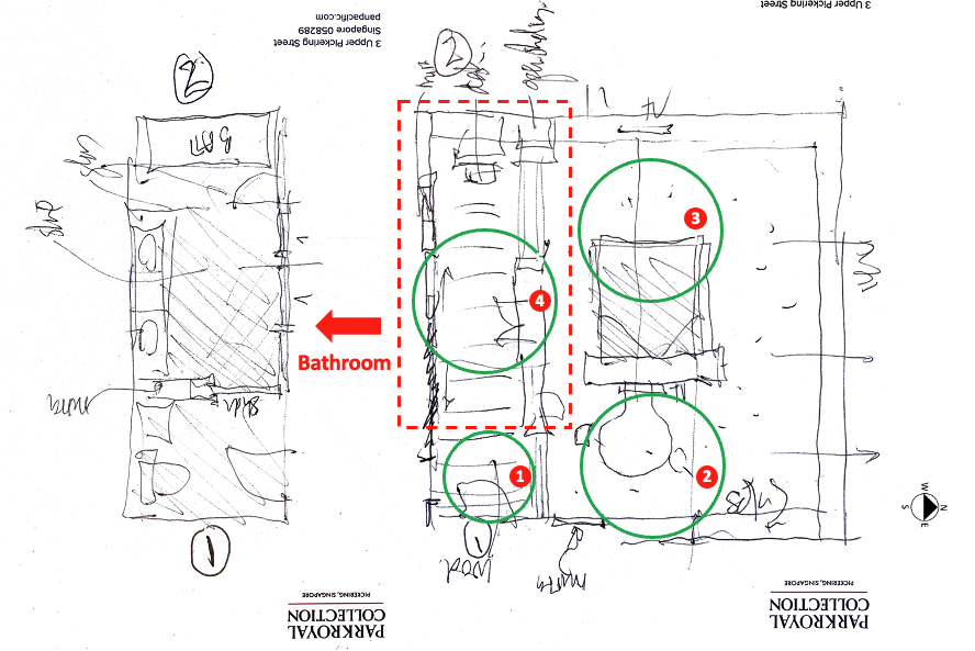
The generous bathroom could be directly accessed from the entrance foyer or the bedroom and was shielded by casework that opens onto the hallway: a storage area that provided a place to hang clothes, while offering an ironing board, safe, and drawers. Sliding doors give privacy to the bathroom. Other doors are found between the living room and the bedroom and between the entrance foyer and the hallway (Image 16, above). These various degrees of privacy between rooms allow distinct spatial configurations depending on the need of the user—as a compact apartment or simply as an office during the day where one could entertain without visual access to the more private areas.

The bathroom
A subtle feature is that from the entrance foyer one can directly enter the toilet room—which has a sink and can be locked from the bathroom. Of course, the toilet room can also be accessed from the bathroom. To the right of the bathrooms double sinks is a spacious separate area that features a rain shower as well as a generous window-side bathtub with a slanted back. Contrary to the overall lighter textures found throughout the suite, the bathroom features a darker tone, one that lends a sense of intimacy. Mirrors in the bathroom, as well as throughout the suite, are placed to strategically expand the space while reflecting outside views within the interior (Image 17, above).
Detailing
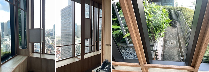
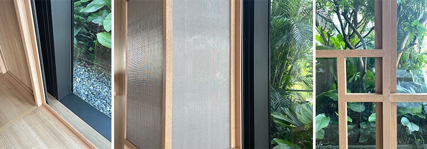
As previously mentioned, the detailing is superbly executed throughout. In particular, I found the thickness in front of the large glass windows was inventive. It lessened the possible impression of vertigo, while creating a sense of a bow window with the delicate screen-like feature that provides a more human scale to the room. Window-side seating allows comfortable views of the nearby historic district, and, in the distance, the cityscape of Singapore (Image 18, above, and 19, below).
The sky gardens
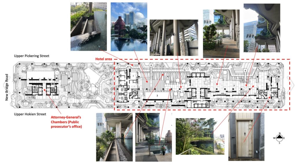
If you believe that you have already seen everything, the cherry on top of the cake for this hotel is the fifth floor, equivalent to four floors in height. There, is a tiered sky garden stretched between the three towers and a green rain forest style garden/swimming pool, all located above the main lobby and office spaces (Image 4 area 2 in the section, and Image 18, both above).
Hands down, the highlight of the entire hotel is this spectacular sky garden featuring “more than 15,000 square meters of lush vegetation that are powered by gravity-driven irrigation from a rainwater harvesting system as well as solar energy.” Beyond providing an infinity pool, ornamental waterfalls, and a gym/wellness center, this floor is open to the north and south sides of the city, allowing natural ventilation to cool the garden.
The exotic plants and flowers are curated and meticulously manicured to give visual pleasure as one jogs on a dedicated path that encompasses the entire site (inclusive of the left tower that houses the Attorney-General’s Chambers – public prosecutor’s office). Of note, I found it interesting that because of the lack of depth of soil, there are shallow roots, which require staking the trees.
Eco Friendly Site
The entire hotel is an ecofriendly property—which means that it adheres to basic environmentally-friendly bathroom amenities and biodegradable containers; water conservation with linen and towel reuse programs; low-flow faucets, showerheads and other fixtures; waste management through recycling systems including the reduction of usage of paper and implementation of food waste composting.
Those are by now recognized standards if any building wants to get the label of Green Mark certified building; Singapore’s “rating system designed to evaluate a building’s environmental impact and performance,” has taken the lead on green building in Asia. Unfortunately, such standards are not always practiced by more affordable hotels, and often guests still lack basic stewardship to adopt an environmental outlook that can make a difference in their carbon footprint.
The Hotel ParkRoyal Collection in Singapore has implemented new green benchmark credentials to become a leader in hotel hospitality. For example, beyond the tinted façade that has high performance glass that allows all rooms to be bathed with light, the property has a program to recycle most water. I understand that drinking water is bottled in-house using a purification system of rainwater.
Conclusion
My visit to the Hotel ParkRoyal Collection Pickering in Singapore left me in awe at what a hotel can, and should offer. Stuffy luxury is of a past that embraces comfort, sumptuousness, and opulence as the staple. Now days, patrons desire properties that provide a microcosm of the complex needs of the 21st century. Experiencing and researching this hotel reinforced to me that what might seem as competing arguments can be balanced in an architecture of our time; one that restates the Vitruvian trilogy of firmitas (strength), utilitas (functionality), and venustas (beauty) as timeless. I will add to these principles, that of sustainability.
As I continue to teach architecture, I feel ever more confident that it is our responsibility to educate graduates through an expansion of their knowledge of design issues, leading them to translate ideas into space with ease and confidence. Yet, without a call to order to address urban and climate concerns, we may continue to misunderstand that what truly matters—beyond the obvious quest to advance the discipline of architecture—are those people who will inhabit our structures. Perhaps, more than ever, I favor the term architecture in lower case.
Other blogs of interest about Singapore
Peoples’s Park Complex in Singapore-Part 1
Peoples’s Park Complex in Singapore-Part 2
Peoples’s Park Complex in Singapore-Part 3