Metropolenhaus Markgrafenstrasse: A precedent analysis. Just shy of four decades teaching architecture, I proudly continue to learn about my field through in-depth analysis of case studies. Along with precedent studies, this research method is for me a moment of intense engagement that is often triggered by an inkling of interest through a chance encounter.
Be it architecture or food, literature or photography, furniture or material culture, there is always something that awakens my curiosity to understand the who, what, when, where, and why. Learning about things that aren’t central to my field of interest stimulates my curiosity. In particular, when my findings initiate new knowledge, I am in heaven. With architecture, ideally, case and precedent studies are important catalysts for learning, and are a time when unexpected ideas may serve as the foundation of new design thinking for both my teaching and practice.
Case studies and precedent research in academia
In academia, research is critical for design professions that thrive on understanding the past to build a better present. And yet, during my time as a professor, I have seen an alarming growth in how many students in architecture rely on social media platforms to conduct their research, and this rather than starting at ground zero by simply observing, assessing, and developing their own thoughts in response to what is in front of them. Wikipedia is quoted, Google maps reproduced, Instagram images presented, giving the final research the semblance of having been understood by the students although it is merely a patina of knowledge.
In the process of analysis, I have seen that students tend to in their typical design process reproduce, wanting a quick elucidation to the prompt (analysis of a building). They ‘analyze the building’ by replicating (i.e., Xeroxing) plans and sections rather than studying fundamental conceptual content that is more universal despite specific distinctions of the building under scrutiny. For me it is self-evident that the beginning of any case study relies on an evaluation of the underlying principles of composition prior to pursuing larger conceptual, urban, social, moral, political, and cultural questions surrounding the subject.
Given this context, I embarked upon making a demonstration of the benefits of analysis through a small research project. Thus, this blog!
Why this blog?

This blog on precedent analysis focuses on exploring how a specific type of analysis—in my case, a façade—is used purposefully with the aim of demonstrating what can be done with the following thesis: Would it be possible, given the apparent continuity between three facades of a building (Image 1), to make a model by folding a single piece of paper. For this, I had to understand the overall design strategy of each facade in order to postulate that the three-dimensional model could be expressed similarly to past exercises teased out with my students. In short, let us call this ambition my thesis, where the obvious question becomes: How do I analyze the façade in response to my thesis?
Process
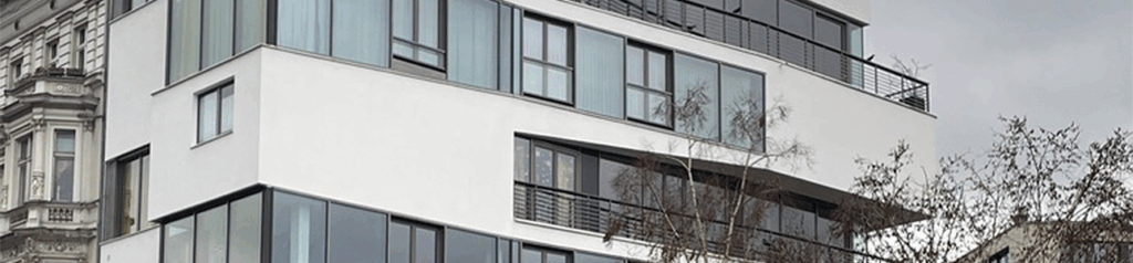
Let me start chronologically. During a trip to Berlin, I discovered a marvelous intervention minutes away from the Jewish Museum designed by Daniel Libeskind. While returning to the city center along Markgrafenstraße, I was admiring 19th century apartment buildings and noticed at the end of a city block a contemporary intervention that I came to know as the Metropolenhaus Markgrafenstraßedesigned by a local architectural office bfstudio-architekten between 2008-2010.
Talking its clues from the existing facades of the neighboring 19th century apartment building, the new building’s bay windows were re-interpreted with the particularity of being at the corner of the façade. The real surprise was the expansion of the street side bay window, which became an entirely different kind of façade as it turned the corner and fronted the small Besselpark.
Bay windows are typically formed by a series of windows that are arranged in an angular shape located at the center or side of a façade. Their primary function is to expand the interior space of either the formal living or dining rooms. Protruding beyond the exterior wall of a building, bay windows are typically designed as three-sided, enabling diagonal vistas up and down the street. This is particularly true in Berlin and many other European cities where streets are narrow due to the medieval conditions of the historic urban morphology. Functionally, bay windows often provide seating to enjoy a panoramic view of the urbanscape (Image 1 left).

In the Berlin example, as I walked around the building, I noticed the local architectural office cleverly used the bay window position on Markgrafenstraße to fold around the corner to face Besselpark (Image 2). A seemingly simple but majestic move to reinvent the bay window by allowing it to dynamically expand its cantilevered volume into a complex interplay of overlapping opaque and transparent bands representing the different floor levels. This visual interplay in the composition of the park façade let me assume that there were various organizations of interior spaces expressing day and night functions in the apartments. This was later confirmed when the architect’s office gave me access to their plans.
The other end of the building opposite Markgrafenstraße ends in a Bauhaus influenced aesthetic with semi-enclosed cubic-like balconies (Image 1, right). Despite what I perceived as quoted architectural languages; the building made perfect sense and carried its own presence.
A clin d’oeil to Le Corbusier

Another reason for my interest was the abstract language of the façade, which was reminiscent of the early work of Swiss-French architect Le Corbusier as represented tectonically in the early Parisian works of Villa Savoye, Villa Stein, and most evident, Villa La Roche-Jeanneret (Image 3, left and middle). I will admit that I had not recently seen contemporary interventions that relied heavily on such a Corbusian aesthetic, thus, my astonishment at seeing this historic language, particularly in Berlin, where there is a deeply anchored architecture developed in the early 20th century works of Behrens, Mendelsohn, Poelzig, Taut, and Sharoun, to name a few.
Beyond this initial clin d’oeil to the 1920s, my interest refocused on the building’s urban continuity. And this, despite differences in the façade’s relationship to the immediate context including the composition of the façade, materiality (plaster opposed to cut stone), color (white rather than sandstone), and similar ‘framed’ window openings organized within a ribbon window concept. While the façade of the Metropolenhaus had formal subtleties to appreciate, I came to discover significantly more about the building as I walked farther down the street: the façade that faced Besselpark was of the utmost complexity and magnified my overall enjoyment of this surprise encounter.
What is my thesis?

The more I tried to understand what might have been a comprehensive design principle at this specific urban context, the more the following idea emerged: Could I, upon my return home, represent the three façades out of a single piece of Bristol paper; a technique I had previously used for my own design work and teaching?
Phase 1

My first attempt to understand the building through model was nothing less than a disaster. Design research through folded models created from a single sheet of paper is not easy to grasp, much less to master. However, having been successful in past attempts, I was confident and overzealous in my assumed understanding of the task at hand.
With a Google site map glued to a piece of Bristol paper I began constructing the model. Wow, this resulted in a total failure in my translation of ideas to model (Image 5, left). The observed complexity of the façade with its reinvented ribbon windows, the subtle diagonals between floors facing the park, and the protruding cantilevered balconies on the western facade, demanded immediate reassessment and a return to square one.
Phase 2

With my pride in check, I pondered the unusual thinness of the street façade relative to the adjacent 19th century buildings. The street was composed of continuous apartments—at least those that were left after World War II—expressing traditional ornamental features, with typical tripartite vertical floor divisions topped by an attic; windows suggesting generous ceiling heights and light-filled rooms; and often well-proportioned widths featuring bay windows. Of note, two of the three remaining residential apartments on this side of the street suggested a dense and continuous urban fabric with a somewhat more affluent living standard compared to many of the typical Berlin Mietskaserne Tenements (rental barracks) found farther south down the street.
My interest in the thinness of the façade led me to do a quick precedent study of the overall site from the point of view of the new building (Image 6 with red circle). Note that further research identified the building highlighted with a yellow circle to also be designed by the bfstudio-architekten. By examining historical maps of the neighborhood, I discovered the following.
Based on 1850 and 1944 city maps, the block on Markgrafenstraße continued north until the current Besselstrasse, an area of Kreuzberg, which was almost completely destroyed during World War II. Following that this area was under American jurisdiction until 1994 and seemed to have been left untouched for decades after the war—especially after the building of the Berlin Wall in 1961, just three blocks north of Markgrafenstraße near Checkpoint Charlie (Image 6).
IBA and BA and two theories
Over decades the neighborhood decayed “into an urban slum area of squats and low rent, [with] poor-quality housing,” leaving most of the urban morphology similar to what was left after World War II. However, the decline of the urban context was reversed in 1987 with the International Building Exhibition (IBA)—the previous one in 1957 under the name Interbau—with the IBA choosing this area (Kreuzberg) to createthe “BA Alt aimed to explore methods of ‘careful urban renewal’ as standard strategy to demolish entire districts, and, IBA Neu for experimenting ‘critical reconstruction.’” The latter being next to the site of the building of my interest.
After the fall of the Berlin wall in 1989, the dichotomy between new and old building, and city planning became a fierce battle. Much of the reconstruction of today’s Berlin is a consequence of two theories. Both the Critical Regionalism (developed by German architect Josef Paul Kleihues), and the New Simplicity (theorized by Vittorio Magnago Lampugnani and championed by Hans Kollhoff, my ETH colleague at that time), “encouraged a return to traditional (pre-World War II) architectural styles and typologies, and sought to recreate the pedestrian-centered urban street life of the early twentieth-century European metropolis through the restoration of the inner city’s original baroque-era street plan.”
This return to a more traditional Berlin (called ironically the new Berlin) had an interest in unifying East and West Berlin as a whole by constructing, and not reconstructing, the pre-World War II Berlin), and could not have happened without the vision of the Senate Building Director for Berlin Hans Stimman. Looking at the project at Markgrafenstraße, I find that the façade offers a balance between reinventing the historical parcel structure and perimeter block development (maps in Image 6), with a contemporary intervention that does not seek to become a spectacular individual building such as the nearby Daniel Libeskind Jewish Museum.
Of note, whoever is interested in the built artifacts of the IBA will find other nearby projects by Abraham, Eisenman, Herzberger, Hejduk, and Koolhaas to name a few.
Facing basic ideas


This urban investigation (detour!) gave me a better understanding of one of the components of why the building may have been designed the way it is. I proceeded to lay down a structural columnar system taken from the photographic survey, which gave the necessary rigor to understand the overall composition of each of the façades. In addition, I was able to suggest that the north façade (facing Besselpark) expressed a horizontal division that separates day and night areas in order to not interfere between apartment floors (Image 8 left)—an assumption that was confirmed when looking at the original plans and additional photos found on the web.
A question of scale
Looking back at my first sketch (Image 8), I realized that I had underestimated the scale of the building and did not have enough real estate at the top of my paper to include the complete penthouse. While the proportions between floors were rough estimates, I was pleased with the first draft of the façade. Instead of rushing to the next phase (estimating actual dimensions for the elevation), I added a strip of paper to the top of the sketch (Image 9 framed in blue) and completed the penthouse to get a sense of the overall scale of the building.

I mention the addition of the paper strip to the top of the elevation, as too often students get frustrated when something is not exactly right. Their attitude is to not want to redraw what they have to bring about necessary improvements, or worse, that by adding a piece of paper they betray an aesthetic pursuit. I believe that this reticence is based on their first-year education where most deliverables focus on a final aesthetic rather than a process of thinking. The elegance of the problem solving should not never be solely aesthetic, but at first, quick and intuitive so that progress can be assessed without losing any creative/research momentum.

Phase 3

Redrawing the façade for a third and fourth times, helped me clarify the overall heights between floors as well as the slab thickness. In addition, the façade facing Besselpark revealed diagonals that a priori made no sense, but with further research, indicated that there might be a change in elevation of a couple of steps between the front and back of each apartment. This phase was conducted by close observation of the park façade and cross referencing it with German building codes. I also did not realize that I had not yet mastered the proportional system as I had no front photograph that I could use for this project.
Phase 4

It was now time to tackle the thesis by making again a three-dimensional model. With cutter, glue and ample Bristol paper, I crafted the Besselpark façade level by level in order to adjust proportions and navigate mistakes made during my initial construction. I had an idea of how the continuity of the façade might take place, but the translation of sketch to three-dimensions was an opportunity to work on the subtle depths that I had noticed across the façade. (Image 12)
Phase 5

The intention at this phase was to bring together all three façades so that a volumetric model could reveal specific conditions of my thesis. The support for gluing each façade was achieved in one single sheet of paper but, when completed, I realized that the thickness on Markgrafenstraße was off, thus a quick trim was in order (Images 13, 1 and 2)

Phase 6
I was not initially interested in finding any documentation on the web, which ironically I later discovered were few and far between for this project. I wanted to rely on my own on-site observations; along with my photographic survey to develop a sense of what the building was all about. Web images would only confirm what I understood and not give me a more in-depth appreciation. I, however, at this important juncture—when launching a third model that would validate my thesis which was to construct the entire building out of one single Bristol paper—reached out to the architects to get the proportional system correct for each façade. They generously provided me drawings, which are presented in image 16.


Conclusion
I wish to conclude this blog with a number of important points. First, after several attempts at a larger scale, I still have been unable to prove my thesis, which was to build the entirety of the building out of one single sheet of Bristol paper. The intellectual precision that I had wished for is impossible to demonstrate, although close in many aspects. Key to a certain frustration is that I am unable to fold paper at specific moments of the building (e.g., back façade) to give the necessary depth shown in the photographs. I have still not given up but wanted to conclude this blog so that a certain degree of closure can allow me to move to other topics of interest.
The second observation, which perhaps underscores the first one, is that despite not achieving what I had set out to demonstrate, I have learned so much by researching this building simply through my photographic survey and interpretating what I was seeing. It was a great lesson for me, that observing and not simply relying on a quick web search, would result in a greater understanding the apartment building on Markgrafenstraße. While the web, and now AI, is a critical tool to have access to most documents required for research, it is nice to know that the mind still has an advance to AI’s emerging technology. It might seem pedantic, but human pride remains essential in any design endeavor.
The third comment is that the web often, especially in the case of more obscure topics or more anonymous buildings such as this one, cannot provide substantial information to further research. It is the education of an architect that allowed me to pursue my research in a more traditional manner, which gave me immense pleasure and so many design ideas by simply being able to better understand the object under scrutiny.
Postscript

After much research, I was able to locate a single image of the interior that supported my assumption that the apartment had a number of steps. I am including the text found on the web page for the Metropolenhaus Markgrafenstraße that might add to my research.

The METROPOLENHAUS Markgrafenstraße 84 in Berlin-Kreuzberg is located on the edge of the Besselpark in the middle of Südliche Friedrichstadt and marks the end of an urban fragment of Gründerzeit buildings. The stacked floors are offset in all three dimensions, with reference to various historical urban grids. By interlocking the varying heights of the units, a continuous movement is created between the differing volumes of the building and the diverse spatial relationships and layers – between living space and urban spaces, between high and low spaces, and between expansion and withdraw. The generous bands that run along the façade alternate with closed surfaces and allow an unobstructed view of the urban park and the city landscape.
Models
