 Vittorio Gasteiz: a lesson in stairs (Francisco Mangano). If you have ever wandered off the beaten path in a small French village or an Asian megalopolis, then you have likely stumbled on a tucked away medieval church, a picturesque and vibrant neighborhood market at night, a small literary café, a quaint winding cobbled street, or perhaps buildings that stand out by their unique presence. The moment is rewarding and often lends a sense of privilege to be the “only” person who knows of this newly found secret place.
In these moments of discovery, I am often humbled by how many of these buildings and places were created by ‘anonymous’ architects who deserve more appreciation and serious study. In academia, we tend to fetichize stararchitects versus master builders, and too often fail to acknowledge architects who simply complete, day after day, extraordinary gems, all with great humility and immeasurable talent.
Architecture as “the very fabric that clads our society” tends to be relegated to the status of an elite profession, featuring designs expressive of memorable formal gestures, often at the expense of interpreting the needs of the client and neglecting to deliver new models of life that contemporary society so desperately requires. Perhaps it is time to acknowledge that the future of architecture will be brought about by a new generation of ‘anonymous’ architects and a line of defense would be to start with our students (below images 1 and 2).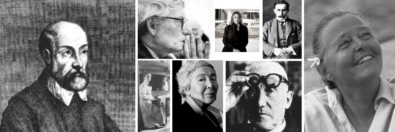 Image 1: Google images- Iconic masters taught in architectural schools
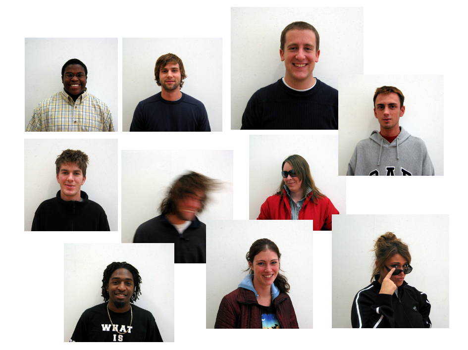 Image 2: Student body, Spring 2006, University of Kentucky (author’s collection)
The city of Vitoria-Gasteiz
 Image 3: street view of Vitoria-Gasteiz, Spain (author’s collection)
After a surreal visit to the nearby monastery of Arantzazu, the nearby medieval town of Vitoria-Gasteiz, capital city of the Basque Country of Northern Spain, offered a welcome visual repose and a chance to discover its ramparts, almond-shaped urban layout, and charming colored street facades with their amazing bow windows. In spite of the light rain the mid-morning of my visit, there was magic in the almost deserted streets.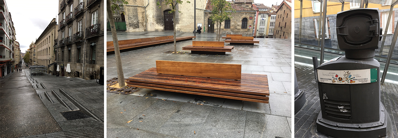 Image 4: street view of Vitoria-Gasteiz, Spain (author’s collection)
(above images 3 and 4) Negotiating the city’s steep inclines, I remember many of the contemporary interventions which ranged from public benches to innovative stair treatments, ramps and outside escalators, all punctuated by singular outer-space objects (which we discovered were collection containers part of an integrated underground waste management system). These urban gestures served a role in the rehabilitation of the historic center, and were lessons towards the contemporary civic responsiveness of Vitoria’s citizens, the abbreviated name natives fondly call their city.
The Archeological Museum of Álava
Walking through the historic city center, enjoying delicious freshly made artisanal churros dipped in melted chocolate, our group stumbled on the Archeological Museum of Álava (completed in 2009). It was one of those fortuitous and welcome surprises as the building had what Montesquieu—the famed 18th century French man of letters—defined as: “the distinguishing feature of great beauty is that first it should surprise to an indifferent degree, which, continuing and then augmenting, is finally changed to wonder and admiration.” Image 5: Google images- site plans of Archeological Museum of Álava with the new intervention as shaded
(above image 5) Designed by Spanish architect Francisco Mangado (1957-) the museum is defined by a set of buildings located at the northern part of the city block between Santa Ana Kantoia (street in Basque) and Kalea (alley in Basque), with its main entrance accessible through a courtyard on the upper level of Cuchillería Kalea—a consequence of the urban landscape where the museum rides on the slope parallel to the topography. Seen from the street, the urban intervention stands out because of its two very different façade treatments.
Facades
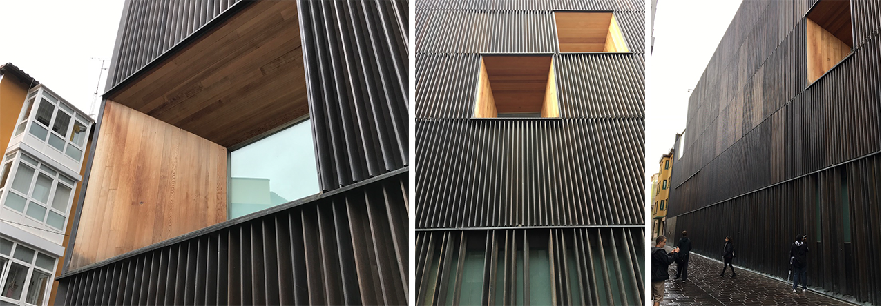 Image 6: Façades of the north east building on Pintoreira Kalea and Santa Ana Kantoia (author’s collection)
- (above image 6): Façades of the north east building on Pintoreira Kalea and Santa Ana Kantoia (author’s collection)(Above image 4) The first facade is remarkable in two ways. First, because of its austere and beautifully executed bronze cladding; perhaps a metaphor for the Bronze Age artifacts housed in the museum’s galleries. Second, by reversing the protruding shape of the bow windows of catty-corner patrician houses, the new building becomes urban, while retaining a human scale through the careful positioning of large prismatic openings. These “holes” are lined by natural wood which gives the surface a beautiful weathered patina. The industrial manufactured vertical metal bronze fins give a density to the cladding of the building, and, finally, the over-scaled and deeply recessed picture windows offer beautiful views of the city from inside the galleries.
It seems almost obvious that all of the careful decisions that led to the choice of materials, sizes and positions composing the facade make this contemporary building majestic with a gravitas not often seen within a medieval urban environment. The detailing is exquisite, elegant and simple, thus reconfirming to me that construction and detailing cannot be an afterthought; it must be at the beginning of any design process.
As a side note, this particular façade illustrates the concept of contemporary contextualism, one that is not expressed through mimicking, but relies on subtle interpretations of urban clues that advance tradition to innovation. Misquoting Le Corbusier, I remember him writing that tradition is the sequence of exceptional events!
 Image 7: Façade of the north west building on Pintoreira Kalea showing treatment of the joint between buildings (author’s collection)
- (above image 7) The second façade is located adjacent and in direct continuity with the previous building. The magnificence of the equally austere existing frontage on Cuchillería maintains the identity of the 16th century Bendaña Palace. However, on Pintoreira Kalea, the architect provides a contemporary interpretation of a traditional façade—wall with windows—transforming the finely-dressed stones of the adjacent palace into an abstract composition of mass and void. In a gesture towards the city, the architect uses new and existing openings to recompose the opposite facades by simply letting them be reflected in its windows.
The interior galleries and stairwell
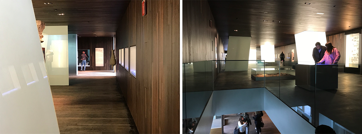 Image 8: Interior views (author’s collection)
(above image 8 and below image 9) The new building contains four above-ground galleries chronologically displaying the permanent collection of archeological artifacts dating as far back as the Paleolithic era (first floor), the iron age (second floor), and Roman and medieval Vitoria (top two floors). The exhibition spaces are generous and designed as a single room on each level, yet are punctuated by vertical shafts acting as lightwells reflecting natural and artificial light through frosted glass panels. These luminous objects define the exhibition spaces, allowing the visitor to appreciate both an overall view of the entire room and enjoy the areas of intimacy necessary to reflect on the collection of miniature artifacts. This sense of domesticity is reinforced by the treatment of the floor, walls and ceiling surfaces that are made out of wood and echo the treatment of the exterior openings.
The stairwell
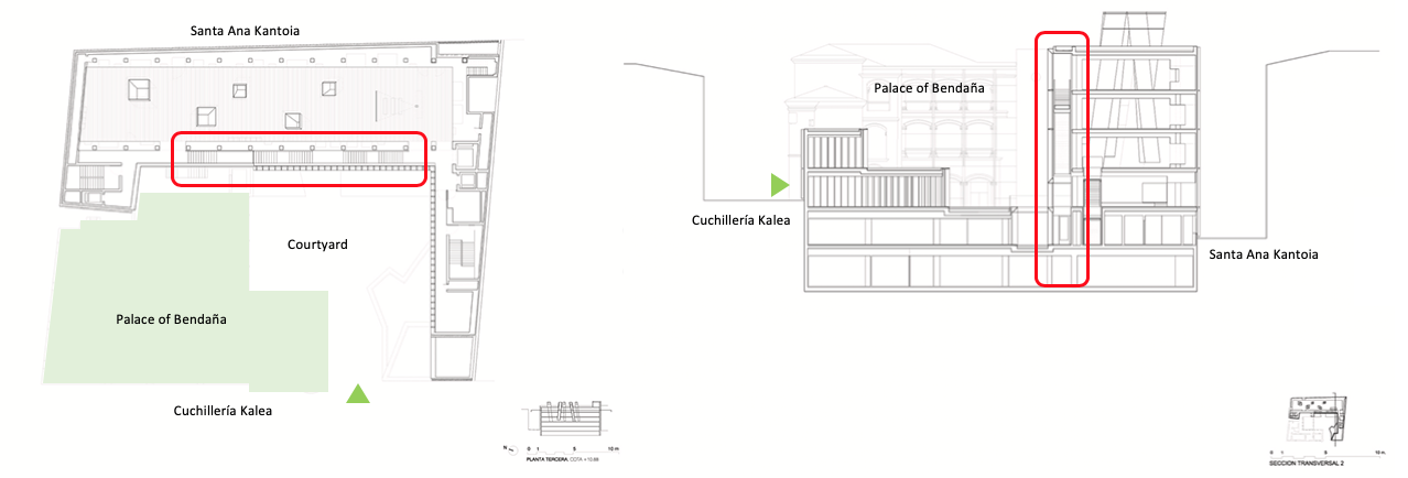 Image 9: Google images- plan and section
(above image 9) To access each level, an elongated stairwell provides the main circulation system that is judiciously placed at the edge of the gallery spaces (A) while it also visually negotiates the exterior entrance courtyard (B). It is here that I marveled again so soon after viewing the gallery light wells, as I experienced this transitional space and imagined it in plan and section. At that moment being reminded how important it is to trust one’s instincts when designing such a simple space.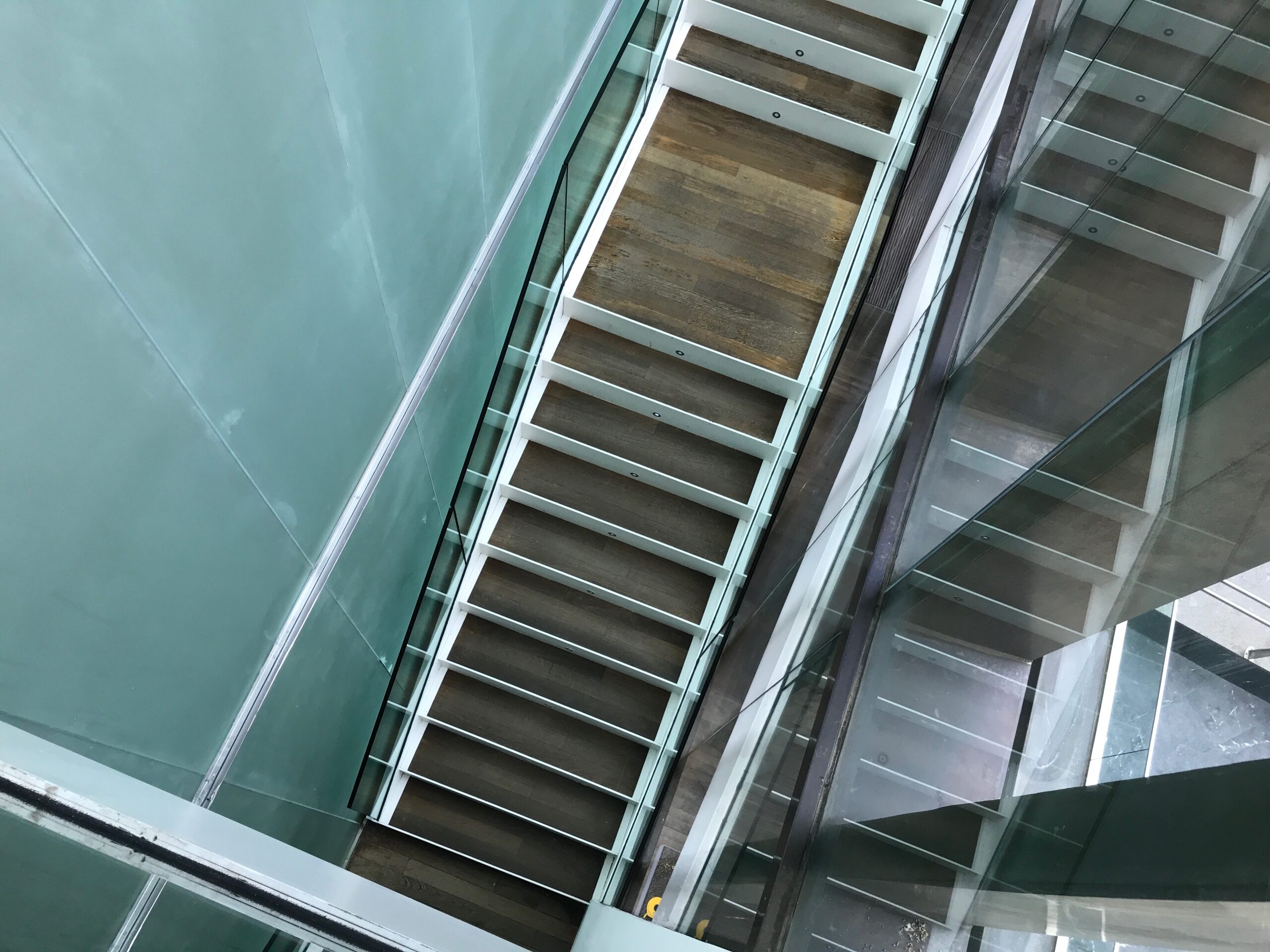 Image 10: Piranesian view of the interior stairwell (author’s collection)
By this I mean that in any design process, in particular for an architecture student, there is a need to create something exceptional, typically accomplished through an unusual shape or an elaborate spatial condition. This is legitimate and often rewarding, but my point is that at times what may seem simple in plan can truly be extraordinary in a three-dimensional built reality.
Of course, a circulation path is the place par excellence to showcase spatiality—which makes it sadder that many stairs are designed to be relegated as fire stairs. I like to imagine those simple moments drawn in plan becoming complex events through the introduction of a viewer as they negotiate the space.
As stated in several previous blogs (i.e., 1 and 2), architecture needs to be experienced emotionally and physically through all of our human senses. Yet, I do also exhort that for space to be successful, it is a matter of construction, materials and their detailing as they explicitly contribute to the heightening of our overall spatial experience.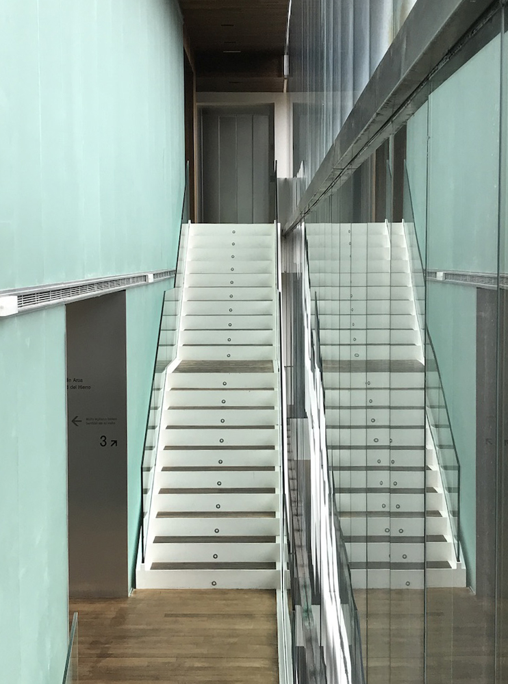 Image 11: Materiality and illusion (author’s collection)
When visiting the Archeological Museum of Álava’s stairwell, I was accompanied by a group of students and we discussed at length what made this space work so well. We conceptualized the stairwell in plan and section, and recognized that those necessary drawings would be almost mundane and uninteresting. Yet, our physical presence revoked any design preconceptions we would have seen in a drawing.
We walked up and down, delighted to experience the diagonal views to the inside galleries and outside courtyard, acknowledging the restrained palate of materials such as glass, metal and wood, mesmerized by the overall conceptual consistency and clarity of design. We scrutinized how the space was fabricated, and examined how the elegant detailing that echoed the façades was carried to the interiors. No fussy commercial detailing here, and we were made to evaluate what we decided was a Spanish culture of construction, one that so eloquently reinvented tradition with a new sensitivity of materials.
We left the museum with a renewed awe at what architecture could do. Many answered questions and so many lessons to be learned when visiting such ‘anonymous’ projects.
 Image 12: moments on the stairs (author’s collection)
Additional blogs of interest regarding stairs
Vittorio Gasteiz: a lessons in stairs (Francisco Mangado)
Hong Kong: a lesson in stairs (Bille Tsien and Tod Williams)
Porto: a lesson in stairs (Alvaro Siza)
Firminy: a lesson in stairs (Le Corbusier)
Lexington: a lesson in stairs (Jose Oubrerie)
Vienna: a lesson in stairs (Jože Plečnik), Part 1
Vienna: a lesson in stairs (Jože Plečnik), Part 2
Geneva: a lesson in stairs (Le Corbusier)
How to design a stair
Stair at the Latvian National Museum of Art (Processoffice), Part 1
Latvian national Museum of Art, Part 2