
Carlo Scarpa Gavina Showroom in Bologna, Part 2. When I wrote my initial three blogs (1, 2, 3) on the work of Italian architect Carlo Scarpa (1906-1978), in the back of my mind I had planned a sequel to the earlier Gavina Showroom blog which would analyze how its façade was conceived and erected. The topic might seem obvious or redundant since Scarpa’s oeuvre has been studied from so many perspectives.
“The material, detail and structure of a building is an absolute condition. Architecture’s potential is to deliver authentic meanings in what we see, touch and smell; the tectonic is ultimately central to what we feel…”
Steven Holl
In this regard, I have always looked towards Kenneth Frampton’s essay “Carlo Scarpa and the adoration of the joint” in Studies in tectonic culture: the poetics of construction in nineteenth and twentieth century architecture, to remind me of the uniqueness of Scarpa’s way of working, and the tremendous influence he had on how I think of detailing.
For Scarpa’s seemingly humble project, the Gavina project in Bologna (1961-63), I could not find any peer reviewed research about the actual construction, including how the long concrete façade was poured and given the final texture that makes it so special. There are only short exposés covering the project in plan, and those are always accompanied by photographs of the refined baroque-inspired interiors. But not much about the construction of the façade; the contemporary face of the store seen by the Bolongian flâneur.
Publications
This is not unusual. Beyond the wonderful, precise illustrations published in the German DETAIL Magazine, architecture journals and periodicals often fail to address the actual construction of a space. Perhaps because for many readers, the end visual result is more appealing than understanding the architect’s efforts to create a work of art. In Scarpa’s case, many references point to the love and rebirth of lost Venetian craftsmanship so evident in each of his projects.
In publications, when plans are available they are scarce, and sections are quasi absent although they could offer a more in-depth understanding. Photographs are abundant, and on some unfortunate occasions, are reversed to meet the design aesthetic of the page. When it comes to the description of a work of architecture, far too often, contemporary critics, scholars, historians, and theoreticians write overly elaborate and often esoteric essays on architects and their architecture. To my dismay, they include a healthy dose of Eurocentric philosophical quotes to legitimize their arguments. I believe that this attitude furthers the gap between the public’s appreciation of our art form by insisting that architecture remains an elitist profession solely for the purpose of academic discourse.
Peter Zumthor
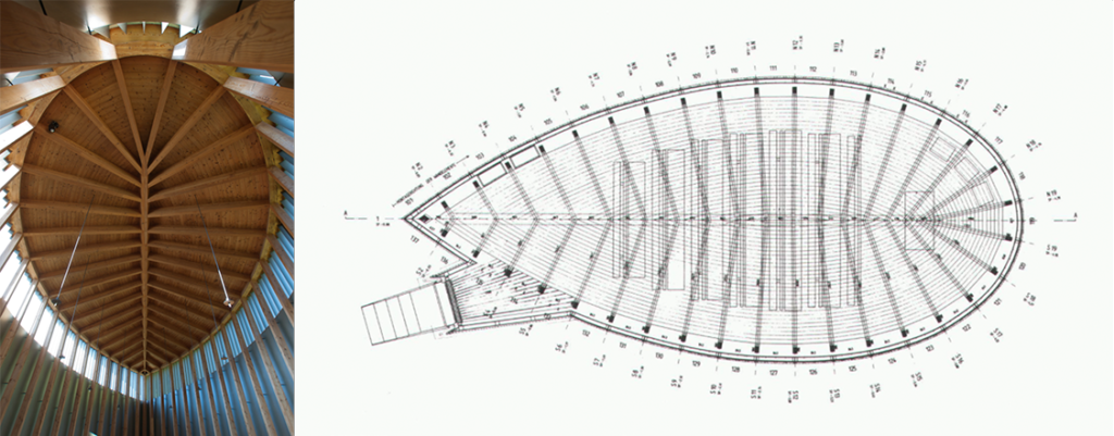
Case in point, I could never discover how Swiss architect Peter Zumthor drew up the refined leaf form used as a plan for the Sumvtig chapel in Engadin, Switzerland. Articles correctly name the geometry in plan as a lemniscate (conceived by Jacob Bernoulli), but avoid explaining the geometrical and mathematical formula. More importantly, there is not much written on how this geometry was used to create the volumetric identity of the chapel, which we so much admire.
Rightly so, since the poetry of the project should always take front stage, but in this case, why not add a more holistic understanding of the underlying geometry. My own research led me to discover how Zumthor incorporated the lemniscate that ordered both the plan and section beyond setting up the spatial meaning for the rites of the Eucharist.
Perhaps my interest in how things are built reflects my Swiss education as an architect. This education gave us students an early understanding and deep appreciation for a culture of construction; a sine qua non condition for architecture to exist not as a purely intellectual endeavor, nor as what academics call the autonomy of architecture, but a synthetic appreciation that favors the physical artifact that confronts the context in which architecture is to serve its users.
Carlo Scarpa

As a freshman architecture student in 1978, a year after Scarpa’s unexpected death in Japan, the architectural world took serious notice of his work. Not because his oeuvre was unworthy before, but, to my understanding, due to the stigma surrounding his professional life as he was not a registered architect. His early work was not understood as architecture. It was discreet, and located within existing buildings in the Veneto; a region of talent deeply anchored in a history of craftsmanship.
Despite a rich building heritage, the city of Venice was reticent to allow modern interventions within The Serenissima, the name given to the Venetian Republic when it ruled the Mediterranean and served as a major trading route between Occident and Orient. Case in point, projects by architects Frank Lloyd Wright (Masieri Foundation, later designed by Scarpa), Le Corbusier (hospital), and Louis I. Kahn (Congress palace) never came to fruition as they were deemed too contemporary for the historic city.
At the time of my studies, faculty became enamored by the novelty of Scarpa’s work, and the lessons they observed in how he delicately introduced contemporary interventions within an historic urban fabric. From small interventions such as the Olivetti Showroom on Piazza San Marco, to the Museo Correr and Querini Stampalia, all in Venice, ending with the cemetery in San Vito d’Altivole, and the Banca Popolare in Verona, all in the Veneto—the latter posthumously completed by his trusted assistant Arrigo Rudi—Scarpa’s work suddenly commanded attention from academia and the profession.
Construction and detailing in Scarpa’s work

While being introduced to Scarpa’s work in class, accompanied by multiple visits to experience his work first hand (living in Switzerland allowed me to hop on a late-night train and wake up in Venice in the early morning), I learned about Scarpa’s attitude towards detailing and construction. It goes without saying that the spatial experience was equally eye opening—it always surprises me how Scarpa created his spaces as an epiphany.

Scarpa was one of the first to create a complicity between architecture and the scenography of presenting art work—including the Italian designed objects for the Olivetti typewriters in the Venetian showroom. Understanding how he did this was a critical moment for me to appreciate the delicacy of his work. Retrospectively, perhaps the start of my interest in matters of preservation.

What struck me the most during these visits, was how Scarpa’s details not only responded to the anticipation of how materials work over time but also to how details are a celebration of a larger idea. Absolutely new for me was how he expressed the craftsmanship of the detail, which I plan to explore in a future blog.

The Gavina Showroom
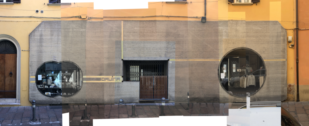
One day this past year I received an email from an architect (Bill Blanski) who had read my blog about the Gavina showroom. Bill was inquiring if I knew how the façade of the showroom was constructed. I didn’t, and together we wondered if Scarpa had used similar tilt-up techniques first used in Rudolf Schindler’s King’s Road House in Hollywood—shortly after tilt-up was patented in 1908—or was this hard-sheltering façade slab poured in place.

I expressed to Bill that I had not visited the store in over two decades, thus many of my comments would be speculative, based on past experiences, enhanced by a little soul searching into my knowledge of construction methods. What I did not understand through Bill’s initial email, was that he was at that time in Bologna, and thus could make direct observations, and record his findings in drawing and photography.
Tilt-up concrete construction
The two-step tilt-up method of construction seemed at first an obvious response, but this strategy called for the visual expression of horizontal and/or vertical seams (mortar joint profile) between sectional panels; sections that neither Bill nor I could identify. While he was making on-site studies, I was looking at my slides (yes, that dates my last visit) as well as at the plethora of images available on the web. Rapidly, we realized that this tilt-up technique could not have been used.
Conceptualized in North America around 1905, basic tilt-up construction consists of prefabricated elements designed to be used as a building’s envelope or elevation. Panels are cast horizontally on site in a frame—using concrete and steel reinforcement— “then lifted (tilted) [vertically] with a crane after the concrete has reached sufficient strength.” Leveraging my memory, with a click on Google Earth and Bill’s survey of the narrow medieval street in Bologna, we realized that the site did not offer the space needed to pour the concrete and negotiate the necessary heavy equipment to set in place the large horizontal façade.
Finally, the variety of dimensions of the unusual cut outs in the facade seemed to not offer the necessary strength without creating structural failures when lifting the precast element. We knew that Scarpa constantly innovated upon his work by merging inherited construction techniques with the use and expression of modern materials. We abandoned our initial thought, knowing that Scarpa must have poured the slab with carefully articulated joints. The question was: How did he do this?
Poured in place concrete
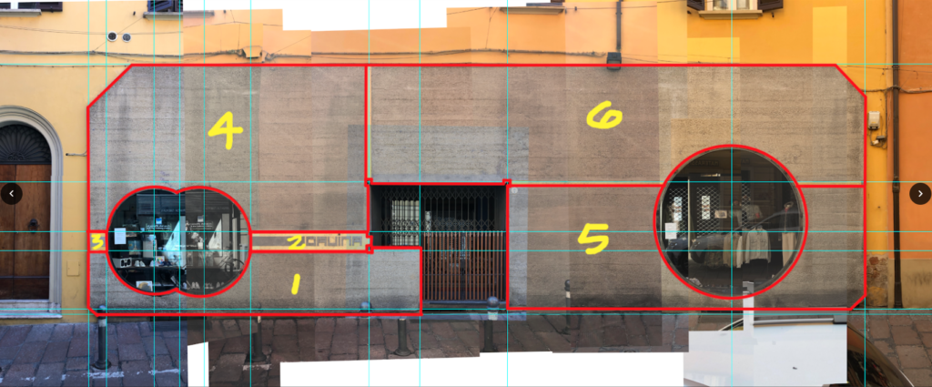
If the pouring of the façade was the favored strategy (poured-in-place concrete), we needed to speculate where the various control joints would occur—particularly those expressing the separate pours (Image 7 above). Looking closer at the façade, we observed a variety of surface textures on the concrete. Typically, during the 1960s with such a modest intervention concrete was poured against wood framed forms (board-formed concrete) that would be removed after the concrete cured.
There is an evident aesthetic result in the end pattern, often leaving a wood grain relief on the finished face. The trace of the formwork would be part of the history of the making of the wall. This method of construction is favored by many modern and contemporary architects, with various textures from subtle to complex, from rough to smooth, playing with light and shadow. Of course, these poured walls build on the construction traditions that continue to have immense aesthetic appeal beyond expressing patterns of how they were built, and this from wood, stone, brick and concrete.

Concrete texture 1

The showroom’s overall surface seemed to be roughened (and not sanded), consistent with the French technique boucharder, where the unified concrete surface is hammered and left with regular asperities. Traditionally, such surfaces were done by hand, which Bill and I believed was the case here to give horizontal surfaces less slippage and vertical planes a more pronounced aesthetic quality between light and shadow. To achieve this texture manually, the artisan uses a special hammer head, surfaced with pyramidal teeth of diamonds. The hammering lets the mortar of the concrete explode, imitating man-made surfaces of stone (Image 11 above).
Concrete texture 2

(Image 12 above). The second texture results from chiseling the concrete in a herringbone pattern, again using a special tool, to offer short grooves, lending another type of finish to the concrete, one that is reminiscent of Roman Opus Spicatum paving.
The use of these two techniques in defining the aesthetic of Scarpa’s façade offer an overall reading of the surface formed by horizontal stratification (Image 13 below, left), one that I suggested in a previous blog on Gavina’s Showroom as being influenced by Paul Klee’s color layering in some of his paintings of the late 1920s (Image 13, below).

Speculation
As Bill and I exchanged emails, I was interested in understanding—as the overall façade did not at first express the various stages of typical pours—if Scarpa had used the above techniques to hide any joints from a pour-in place process. I sent Bill a picture with my thoughts that focused on the complex articulation on the left-hand side of the entrance (Image 14 below). Could the use of various concrete textures have enabled Scarpa to hide the joints, thus offering a monolithic sense of a large façade panel with compositional elements as described in my earlier blog.
Conclusion
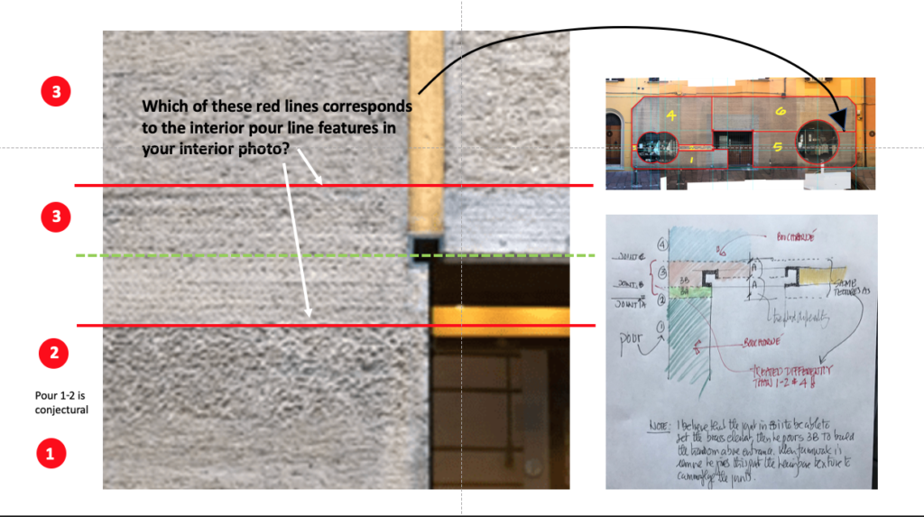
Looking back at our speculations, and the back and forth email discussions, as well as the initial conclusions, Bill’s drawing (Image 8 above) reflects our suspicion, an intuition that was later adjusted by our understanding that the vertical and horizontal panels featuring the gold bands must have been prefabricated and set in place after individual pours. The cold joints above and below the smooth finished gold-foil banded elements are clearly visible on the exterior edges of the façade (Image 15 below, left and right) and are also found inside the showroom (Image 16 below). This is also true when studying the entrance (Image 17 below). Thus, the revised understanding of the construction of the façade (Image 18 below).
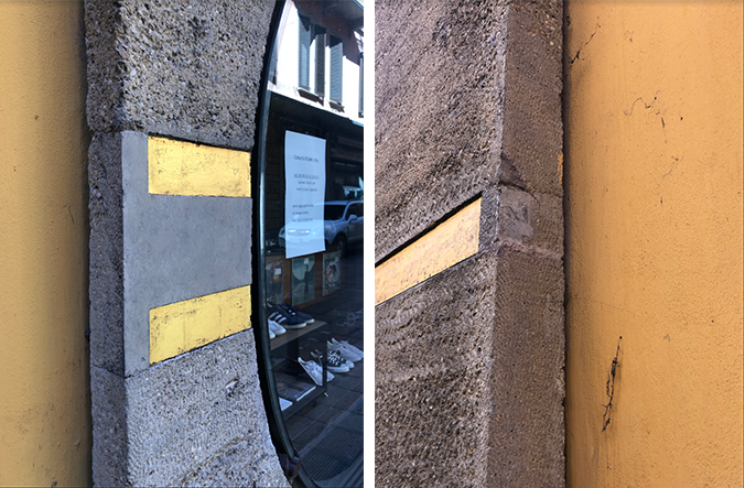

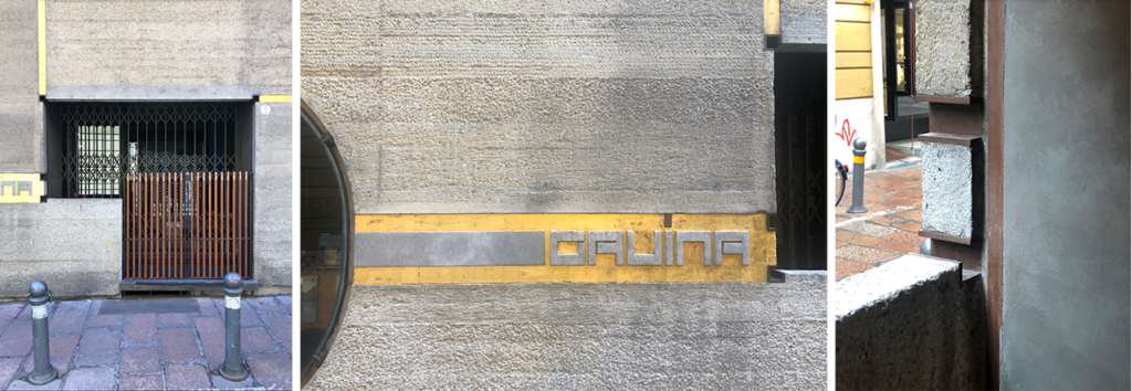
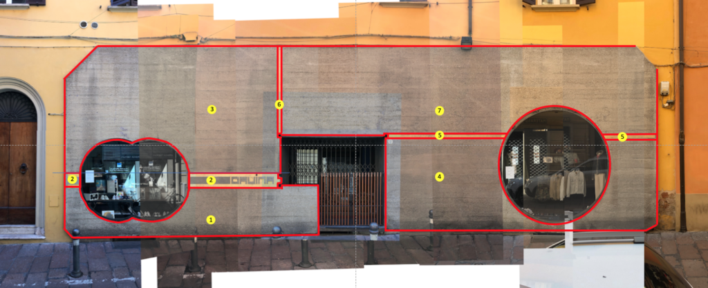
In addition to the treatment of the concrete façade, closer examination revealed a variety of visual patterns resulting from the wood formwork; yet our interest remained on the changes in texture that happen throughout the façade and, in particular, on our speculation about the joints shown in red (Image 18 above).
Needless to say, we would be delighted if anyone has additional information to confirm or refute our discoveries. This is a project that has opened many topics centered on the work of Carlo Scarpa, one that keep nagging us till we find more definitive answers. Please leave a comment.
Epilogue

As a final note, I am indebted to Bill for his on-site survey and thought-provoking discussions regarding Scarpa’s façade. I am including above, and on a linked web page, additional sketches he made while there, all are a tribute to his talent and curiosity.
Additional blogs on Carlo Scarpa
Bologna: https://atelierdehahn.com/carlo-scarpas-gavina-showroom-in-bologna-italy/
Venice: https://atelierdehahn.com/carlo-scarpa-and-detailing/
Possagno: https://atelierdehahn.com/carlo-scarpas-gipsoteca-in-possagno-italy/
Additional images of the work of Carlo Scarpa
Carlo Scarpa, Venice entrance pavilion
Carlo Scarpa, Cemetery Brion Vega
Carlo Scarpa, Castelvecchio
Carlo Scarpa, Giardini
Carlo Scarpa, Gypsotheca
Carlo Scarpa, IAUV Architecture
Carlo Scarpa, Querini Stampalia
Carlo Scarpa, Olivetti Showroom
Carlo Scarpa, Banca Popolare
Carlo Scarpa, Venezuela Pavilion
I have been enjoying the articles you’ve written about Carlo Scarpa tonight. Thank you for sharing your thoughts and experiences.
I am both a builder by day and artist at night. I have had the luck to travel to Venice and see first hand Scarpa’s designs there. On a house of my own that I have been building with my now, 83 yr old father for the last ten years, I am trying to design railing for a concrete entry landing to the home. I shamelessly plagiarized Scarpa with the build of the landing. Not as much to have the object but to try and understand the process of the making of it.
Likewise with my own art I have been pouring over any details and photos of his metal especially. I have sketched many details trying to understand the complexity of his designs. Wanting my versions in my own work, inspired by his design.
All to say thanks, appreciate your insights and words here.
If you scroll down on my Instagram page you will see a couple posts with photos of the concrete landing I refer. 🙂
Andy Graves
Dear Andy,
Thanks for the comment and I did look at your Instagram post regarding your landing and detail treatment. Very nice and it certainly looks like you enjoyed crafting it with much thought and passion.