
Hong Kong: a lesson in stairs (Central Market). In a recent blog, I described the origins of Central Market. I’d like to add that more detail of its history can be found at Timeline; at the Central Market website under Our Heritage Conservation; and in the comprehensive documentation Study on Historical and Architectural Context of Central Market.
Despite the abundance of historical information on the Central Market and the stories recounted by former vendors, little is written on the nature of the two major identical and exquisite staircases, not to mention the discreet fire stair next to Queens Street Central (which I will write about in a future blog). Descriptions of the restoration techniques of the stairs have been covered by others but little information is available about the nature of the majestic stairs. Thus, my interest in documenting them photographically during my recent visit.
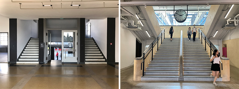
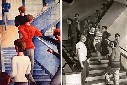
Stairs—if designed beyond their purely functional attributes—are symbols that convey meaning across generations. Case in point, and beyond my knowledge that Central Market was designed in the Bauhaus style, I couldn’t help but refer to my mental archives and recollect my experience of the Bauhaus staircase in Dessau by German architect Walter Gropius.
Added to this memory is the iconic painting by Oskar Schlemmer and photograph by T. Lux Feininger of that stair. In my mind, history, memory, and autobiographical lineage intersected during my discovery of the unique Hong Kong Central Market.
Fan Ho
During my research for this blog, I discovered Chinese photographer Fan Ho (1931-2016), who captured the soul of Central Market in a majestic way. Like Charles Marville, Eugène Atget, Robert Doisneau, and Henri Cartier-Bresson all of whose art was devoted to recording the city of Paris, Fan Ho was one of the major 20th century Chinese street photographers whose signature style “captured Hong Kong during the 1950s and 60s assert[ing] the zeitgeist of the time and continue[s] to influence and inspire today.”
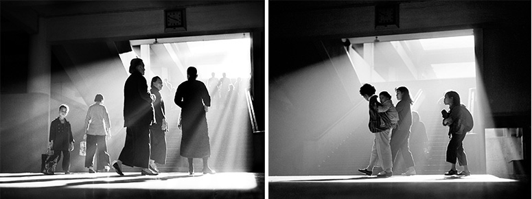
Ho’s sensitive use of black and white has resonance for me in how he captures the stillness and serenity of the stair that I had come to admire at Central Market. Ho, contrary to many architects including myself who intentionally stage architectural space with as few people as possible, captures the daily lives and peregrinations of the inhabitants of Hong Kong, making these urban portraits memorable and human (Image 5, above).
In addition to Ho’s artistic approach to capturing daylight with such extraordinary gradation of shadow—from gray-white to Chinese black, suggesting an atmosphere of winter—the angle of many of his views reminds me of the visual style of Japanese director Yasujirō Ozu (1903-1963), who placed the camera “at a low height, supposedly at the eye level of a person kneeling on a tatami mat…” in particular during scenes “when his characters walked in hallways.” A fabulous way of structuring space (Image 6, below).

I was made aware of Yahusjiro Ozu’s work through Wim Wenders’ 1985 documentary Tokyo-Ga that explores Ozu’s filmmaking. I mention this because of how I teach, through the subliminal finding of connections between seemingly disparate knowledge. In this case, the Central Market allowed me to re-ground ideas of the Bauhaus, staircases, art, photography and cinema—connections that are personal and at the threshold of inventing a living diary of images, thoughts, and ideas based on a set of unique associations.
Des Voeux Road interior staircase
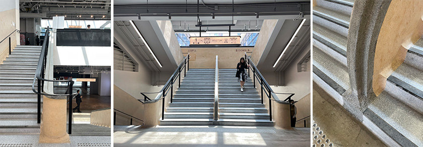
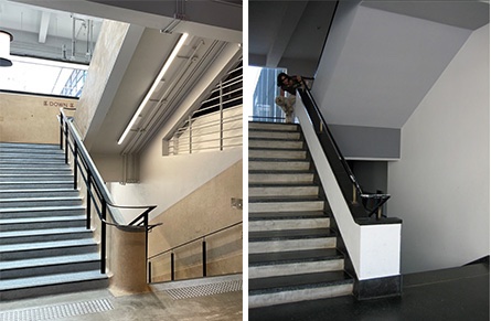
Needless to say, I was captivated during my visit to Central Market. But what defined my appreciation of the building was hands down the two internal main staircases. The generosity, simplicity of detailing, use of material, and the ample light filtering from the interior courtyard made my experience memorable.
Beyond the concrete, the metal window profiles, and the glass, the interior staircases have terrazzo and the walls are finished with a material called Shanghai Plaster. Throughout the building, there is superb craftsmanship, at least in the restoration of the stairs to a degree that I can assume that it was near the original configuration, with the exception of the additional black metal handrailing installed to meet modern ordinances. This change is evident between Fan Ho’s 1959 photograph and mine taken in 2023 (Image 8, below).
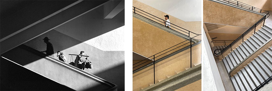
The Main stair at Des Voeux Road
“Central Market was designed for practical use, in essence to be used as a market. The core value of these kind of buildings is to be functional, its purpose is so serve the general public. The historical significance of Central Market is its social value in relation to the public’s sense of spiritual association and memories of the past. Most of the historical buildings in Hong Kong were designed with a specific purpose in mind as opposed to being aesthetically driven. It is its main reason for its existence.
To determine if conservation work is being done, the first criterion is if the renovation has been carried out properly, to be taken into consideration when assessing the standard of work, and whether the planned use can be combined with the original purpose of this building. The second criterion is whether any new additions meet the basic principle of conservation of reducibility so that any such additions could be removed leaving the original building’s state unaffected. The Central Market does seem to meet these two criteria.”
From video presented at Central Market.
Detailing
While there are a number of details that give the staircase its overall elegance, four elements captured my attention.

Shanghai Plaster
The first detail that I noticed particularly was the Shanghai Plaster that finished parts of the stairwell walls. Hong Kong architect Charles Lai says “Shanghai plaster is a kind of granolithic cement plaster that emerged in Hong Kong around the mid-1920s, and soon became one of the most popular material choices for modern buildings in the 1930s.”
This technique of treating the walls with visual depth reminded me of terrazzo flooring, a finish often used in the West, constituted mostly with small polished stones. Another finish for wall surfaces in the West, is plaster or stucco called Marmorino Veneziana: a technique of craftsmanship that Carlo Scarpa revived to become part of the contemporary lexicon in many of his Veneto projects.

The stairwell, as well as many of the food stall surfaces in Central Market, were polished, contrary to what I came to understand was typical Shanghai Plaster where the roughness is de rigeur, giving it its textural qualities and depth. Here, the surfaces have an aesthetic in their own right—contrary to a generic stucco or wall surface that is painted—thus suggesting Semper’s discussion between decoration and ornamentation.
Of note, are the signs for up and down in both English and Chinese characters that demonstrate a sophisticated level of craftsmanship as well as an opportunity to showcase original fragments of Shanghai Plaster; for me, a sensitivity of restoration (Image 9 and 10, above) .
Corners
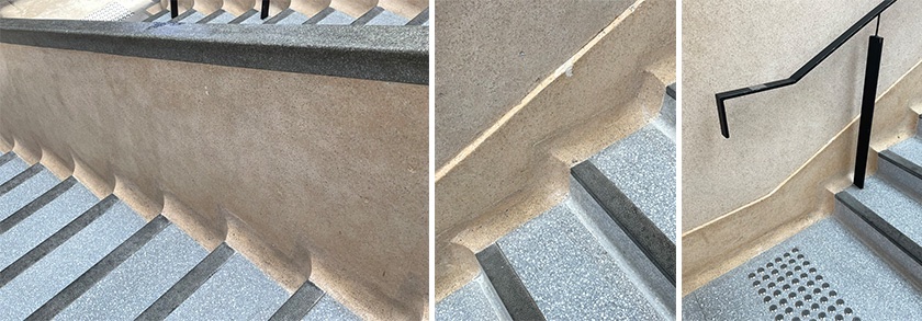
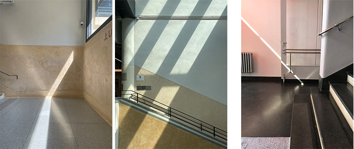
The second detail of interest was in the curved edge at the juncture of each stair riser, tread, and stringer. I immediately noticed them as the warmth of the afternoon light shimmered on the surface. I found the treatment between tread and riser to be attentive in its detailing and the overall Bauhaus concept of space planning.
As a side note, treating the corner intersection between riser and tread emerges during the Victorian era. The purpose was simply to prevent clumps of dust from accumulating in the corners of the stair, thus facilitating easier sweeping—and eventually vacuuming. Because of the exuberant styles of the 19th century, dust corners were often decorative and available in multiple finishes. A concave triangle-shape piece of brass or nickel was placed in the corner, providing a functional and aesthetic (read fashionable in patrician homes) purpose. Ironically, I am the proud owner of an 1893 Victorian/Queen Ann home in a historic district and, with two Jack Russels, these dust corners come in handy!
Interior balusters

While the corners were remarkable in their simplicity, I was also enamored by the treatment of the interior baluster where it meets the last step prior to engaging the floor landing. Whether it is how a gentle and graceful curve—which is the handrail—bows to the landing; or the stringer baluster makes a half circle or a full cylinder on the ground floor, each detail shows a tectonic expression of materials, form, and is elegantly resolved. And this, despite how each detail required craftsmanship of the highest standards (Image 12, above).
Looking closer at these details, I marveled in front of the variations of treatment of several staircase corners that revealed the hand of the craftsman and, perhaps, their signature in giving diversity while maintaining the corner’s functional and aesthetic purpose (Image 11, above middle). I should note that the metal railing throughout the Central Market staircase was an additional feature added during the renovation to meet contemporary safety regulations.
Handrail
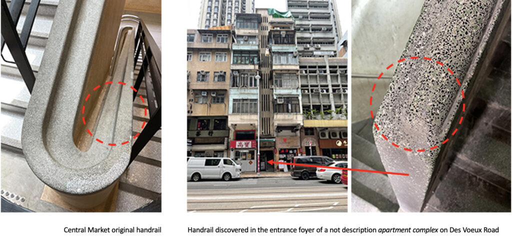
The original handrail (unique in that is was apiece with its stringer) was generous and proportioned more to the scale of the stair. It reminded me of one that I found earlier in the day in a housing complex in a nearby neighborhood. That handrail seemed more refined than the one at Central Market. Also made of Shanghai Plaster, the handrails’ proportions were perfect when the hand glided while ascending or descending. The thumb could easily grip the small groove, while the palm rested on the curve with the other fingers holding tight onto the larger surface (Image 13, below right).
I bring this up as the Bauhaus favored functionalism, but here I would argue that the monumental aesthetic of the Central Market stair eclipsed the touch of the human hand in this one detail!
Conclusion
The treatment of Central Market’s Bauhaus stair remains for me remarkable in terms of its interpretation of the staircase at the Bauhaus in Dessau. Yet, in the hands of Hong Kong craftsmen, there is a specific signature to this staircase, which makes it part of the Bauhaus’s history, yet integral to its own identity that will always be part of my discovery in Hong Kong.
For students who are interested in looking at precedence and understanding subtle distinctions, I hope they don’t shy away from observing the built world (e.g, staircase) even as they add to it.
Blogs of interest of Hong Kong
Between Coffee at Tai Kwun, Hong Kong
Murals at Hong Kong Central station
Hong Kong trams, a way to travel
Hong Kong Shopping Mall
Hong Kong: Bauhaus style Central Market
Hong Kong: the history of Central Market
Hong Kong: a lesson in stairs (Central Market). Part 1
Bathroom at the Novotel in Hong Kong
Hong Kong: a metropolis of contradictions
Blue Bottle Coffee: Hong Kong
Additional blogs of interest regarding stairs
Latvian National Museum of Art (ProcessOffice), Part 1
Latvian national Museum of Art, Part 2
The Whitney Museum: stair by Marcel Breuer
Vittorio Gasteiz: a lessons in stairs (Francisco Mangado)
Hong Kong: a lesson in stairs (Bille Tsien and Tod Williams)
Porto: a lesson in stairs (Alvaro Siza)
Firminy: a lesson in stairs (Le Corbusier)
Lexington: a lesson in stairs (Jose Oubrerie)
Vienna: a lesson in stairs (Jože Plečnik), Part 1
Vienna: a lesson in stairs (Jože Plečnik), Part 2
Geneva: a lesson in stairs (Le Corbusier)
How to design a stair