
Latvian National Museum of Art (Processoffice), Part 1. Hands down, the stair that I am about to share with you is conceptually one of the most subtle tectonic statements that I have seen in recent years. Not simply because it is both simple and utterly sophisticated in its execution, but it takes its place so eloquently and effortless within the entrance foyer of an existing building, namely the Latvian National Museum of Art in Riga, Latvia (LNMM).
The original museum was designed between 1903-1905 by Baltic German architect Wilhelm Neumann (who in 1905 also became director of the museum), and reflects for me a Scandinavian neo-classical style, one that may, at the outset, not be sympathetic to a contemporary intervention. Despite the classical style of the building, the architects responsible for the latest intervention have been extremely attentive to the building’s character without mimicking it; and were successful in their interpretation of certain features in a contemporary manner.
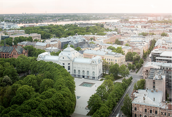
Following a design competition in 2010, the project for the renovation, reconstruction, and extension (the latter extends below ground with two levels into and under the adjacent public park), was won by Lithuanian office Processoffice (Vytautas Bieksa, Andrius Skiezgelas, Marius Kanevicius, Rokas Kilciauskas, and Jezi Stankevic). The work took place between 2012-2015. In 2017 the office received the prestigious EUmiesaward (European Union Prize for Contemporary Architecture) for the project.
As the architects shared with me: “vertical connections are the key part of the design in the old building aiming to provide access and guide visitors to newly accessible existing spaces in the old building (ground floor, attic, and cupola spaces) and the new extension. Therefore, we have made several stair designs for the project each with specific architectural and structural references within the building.”
Although bold and carefully calibrated moves can be found in their projects throughout the museum, one stair in particular, the “gold” stair, is the subject of this blog and is nothing less than exceptional. For the architects: “the ‘gold’ stair in the main lobby was created as part of the representative space of the building referencing the existing gold leaf architectural decor and polished brass details to show its importance as the main connection to the 3 lower levels of the building.” Adding to this description, let me share my thoughts after having visited the museum. But let me first mention something about the collection.

The art collection at the LNMM
The Latvian National Museum of Art holds the largest collection of national art from Latvia, and includes a robust collection of Baltic artists from Estonia and Lithuania. The art spans from the 18th century to today, with many paintings from the modernist era of the 1920s, in particular pieces by Latvian expats residing in Russia. During my visit, I quickly realized that while far too many world-renowned collections are simply too recognizable, often resulting in a visit with few genuine surprises, this visit would prove the opposite.
As a side note, happily, the number of museums that have what I call unforeseen collections (as I found at the LNMM) are growing in number. These are places that amaze me with the richness and distinctiveness of their collections. I invite readers of this blog to visit some of these museums either virtually or in person.
For example, the North Carolina Museum of Art in Raleigh (original building designed by Edward Durell Stone with addition by architect Thomas Phifer and Partners; the Nasher Museum of Art is the art museum of Duke University, Durham, North Carolina; the Virginia Museum of Fine Arts (VMFA) with expansion and transformation by London-based architect Rick Mather in partnership with SMBW, a Richmond architecture firm who designed the beautiful Sherwood Memorial Park in Salem, VA. Farther away, I love the Barnes Foundation Collection in Philadelphia (architects Billie Tsien and Tod Williams); and Museum of the History of Riga and Navigation in Riga, Latvia.
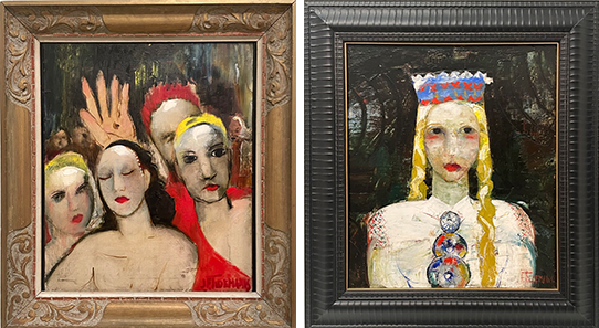
My appreciation for the uniqueness of certain collections doesn’t diminish my admiration for well-known museum holdings belonging to the pantheon of humanity’s art history. But, at my age, I will admit that I yearn to wonder; to discover artists with new stylistic sensitivities, with uncommon philosophical stands, and unexpected and imaginative approaches. I equally seek to be touched by explorative paths in the art of painting and other art forms; even if the artifacts are part of a proven line of subject matter or chronologically accepted cultural movements drawn from neighboring countries. As with architecture, I believe in re-invention rather than invention.
![Image 4: Latvian National Museum of Art -Sketches for a poster “Let’s storm the third year of the Five-Yes Plan! [Higher the flag of socialism!]” (1930); and Sketches for the posters “All to the re-elections!” and “Facing our tasks!” (1930) by Gustavs Klucis. Photographs (author’s collection)](https://atelierdehahn.com/wp-content/uploads/1painting10.png)
My infatuation with many of the artists exhibited at the LNMM, stem from my naivety in front of Baltic artists—although my father was from Riga! To my delight, much of the art that I encountered during my visit revealed a depth and character of what I came to understand as a Latvian and Baltic identity.
From portraiture to landscape and still-life, from modernist abstraction to the formation of an indigenous and national school of painting, the output of many artists provoked me to appreciate anew a number of cultural changes dating from the 1800s and Latvia prior to its independence in 1918 as well as outside influences over centuries (Image 3 and 4 above, and 5 below).
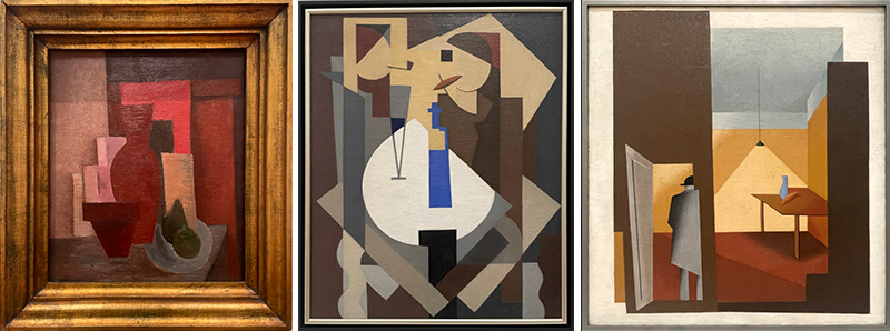
From the Teutonic, Swedish, and Polish-Lithuanian rule, to 1918 independence, the German occupation during World War II, and the 1991 regained independence from the forcible incorporation by the Soviet Union in1944, room after room of the museum exhorts art that was nothing less than seductive, challenging, and culturally inspirational.
The entrance sequence of the museum
The multi-ethnic and multi-cultural complexity exhibited in many of the paintings seems to have been remarkably distilled and then sensitively reinterpreted by the architects when working on the “gold” stair. Added to this is a genuine reverence, yet authoritative position, about how to thrive innovatively within the particular historical style of the museum itself.
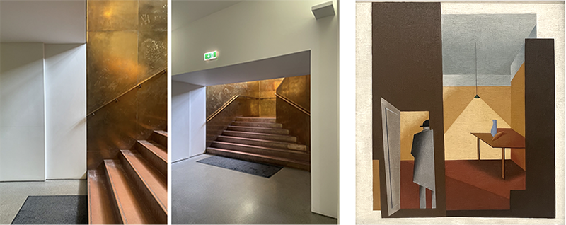
Case in point, I am inclined to argue that particular pieces of art such as the Constructivist and Cubist influenced pictorial language become metaphorically relatable and eventually extracted into the architecture, the technology, and the formal compositional principles of the “gold” stair. This is particularly interesting as those art movements were intended to refer to a new reality that carried significance through the painting’s self-referential qualities, and not simply one based on the representational character of the subject matter. As we will see, I believe that the “gold” stair builds on this antecedent. The stair IS a three-dimensional artifact (a usable stair) with the ability to radically change the perception of itself and its adjacent space through its materiality (Image 19, below).
The main staircase
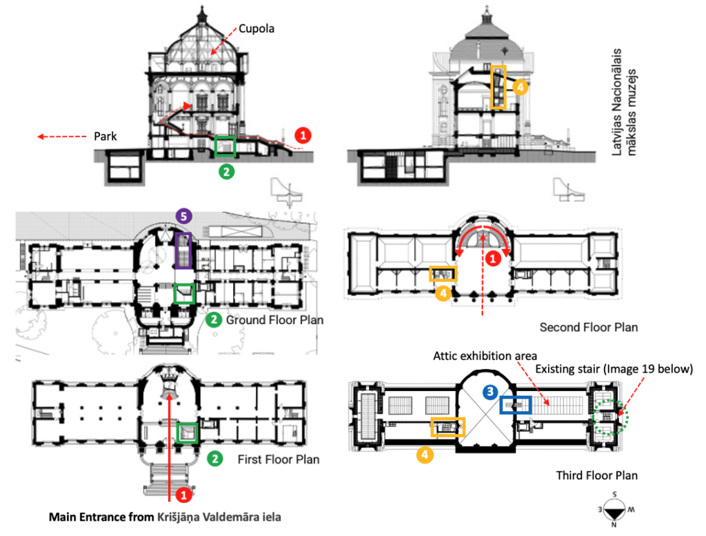
At the top of the outside entrance stair, one enters the museum foyer through a beautifully ornate entry lock to be confronted by a grand symmetrical staircase leading to the second floor with its hallway and opulent ballroom (and museum galleries). Due to its language and style, the grand stair seems to date to the original design of the building (Image 7, below).
Despite having seen many grand staircases (e.g., the Paris Opera staircase designed by Tony Garnier)—they always seem imposing and ostentatious within a stifling symmetrical floor plan, often displaying the ambitions of a rising bourgeoisie as key players in a post-revolutionary society—I was impressed by how the LNMM main staircase shows restraint within a Scandinavian/Germanic neo-classical language (Image 7 and 8 (Number 1 in red) below).

The “gold” staircase
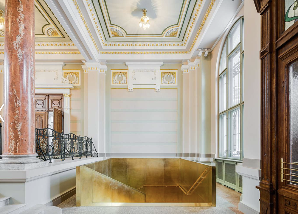
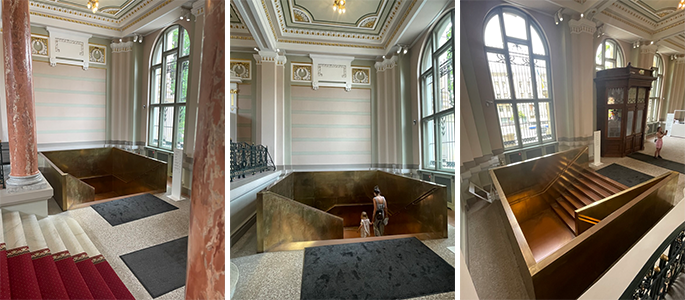
Returning to my focus to the “gold” stair, it is located immediately to the right upon entrance to the museum. To me, it is unavoidable. It is formally stunning; acting almost like an elegant contemporary piece of furniture inhabiting a classical space (Image 9, above).
I could not avoid admiring it for how: (1) its materiality reflects light; (2) its minimalist sculptural qualities reminded me of American artist Donald Judd; (3) it has a quasi autonomy as an object, all the while re-constructing the existing space (the decorative language of the foyer). Additionally, the more mundane, yet important, quality that the staircase has for its (4) functional role leading visitors to the ground floor and two basement floors that hold galleries, new open storage, coat room, and bathrooms. Let me further elaborate on these four points.
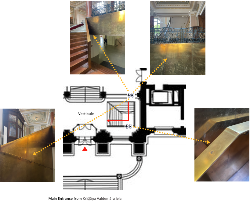
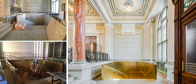
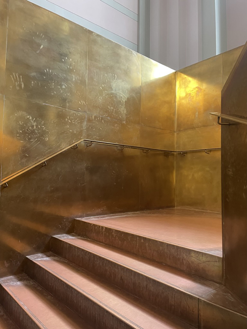
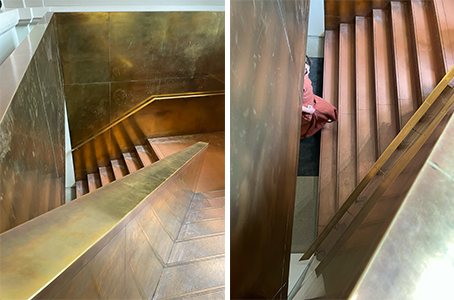
Let me start by mentioning the materiality of the staircase, which first drew me to it. It is entirely made from brass. And I mean it. Wall enclosures, steps, landing, handrails, and occasional screws. The architect’s strategy for the user’s haptic experience is accomplished with the use of a single material that gives to this almost cube-like space a richness comparable to a sumptuous jewelry box.
The splendor and spatial ephemerality of the staircase exists between form and dissolution and owes much to the brightness and luster of the materiality, which benefits from the soft north light coming through the large arched stained-glass window to reflect off the brass surfaces.
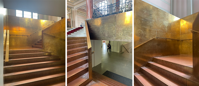
As one moves up and down the staircase, the golden-yellow brass seems to shift between opaqueness and transparency, at times mirroring adjacent surfaces and spaces. This illusion is due to the craftmanship of its finishes, as nothing is left to chance. The stair is visually clear in its form, and lacking ornamentation. Its artisanal beauty resides predominantly in its materiality, its formality, and the expert hand of craftsmen; it merges skill, dedication, and commitment to creating a work of art.
In an email exchange, the architect mentioned that “The ‘gold’ stair in the main lobby was created as part of the representative space of the building referencing the existing gold leaf architectural decor and polished brass details to show its importance as the main connection to the 3 lower levels of the building. . . . This allowed us to make a clear and contemporary accent in the highly decorated lobby and also to create a ‘gold tooth’ in the lower ground level which also helps visitors’ orientation.”
Secondly, the rather deceptive simplicity of the staircase suggests—at least for an educated eye—that both the formal and technical complexity of its making represents an incredible talent and know-how in craftsmanship, resulting in its seamless appearance.
Perhaps the wish for such a uniform and luxurious surface treatment stems from the architect’s choice of brass, as it is known “for its excellent workability, and machinability.” All in all, the stair demonstrates the architect’s design rigor and ingenuity, as well as a demonstration of how those in the Baltic States pride themselves on championing craftsmanship within a deep tradition based on ancestral gestures.
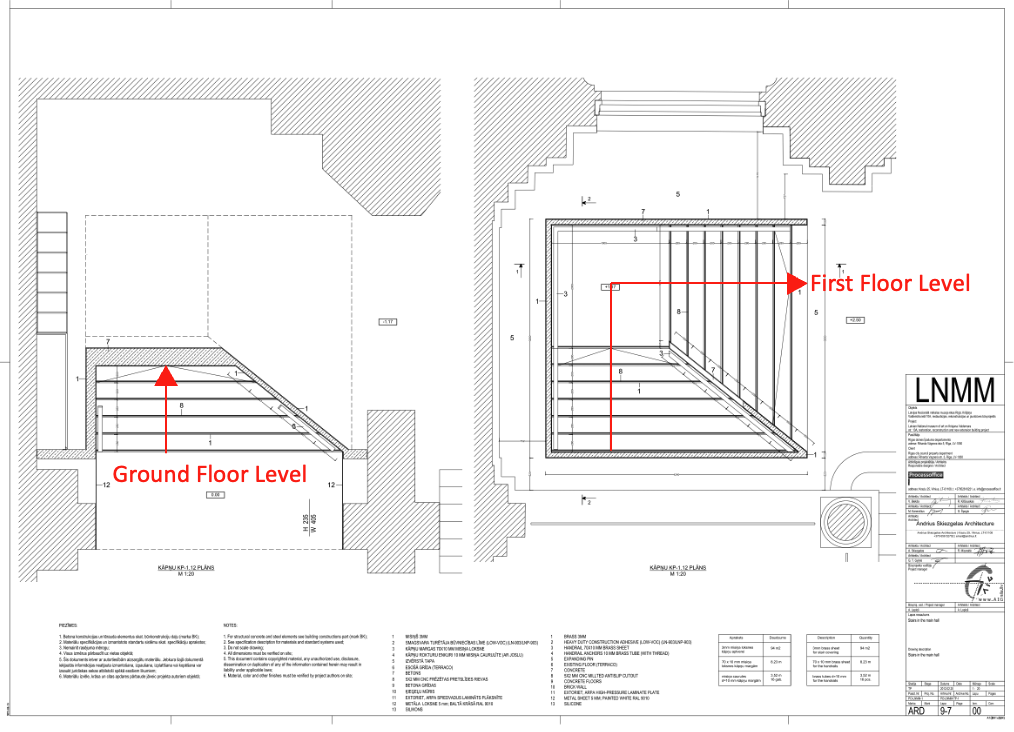
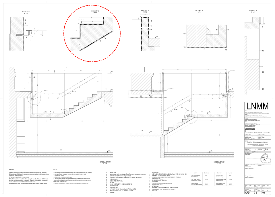
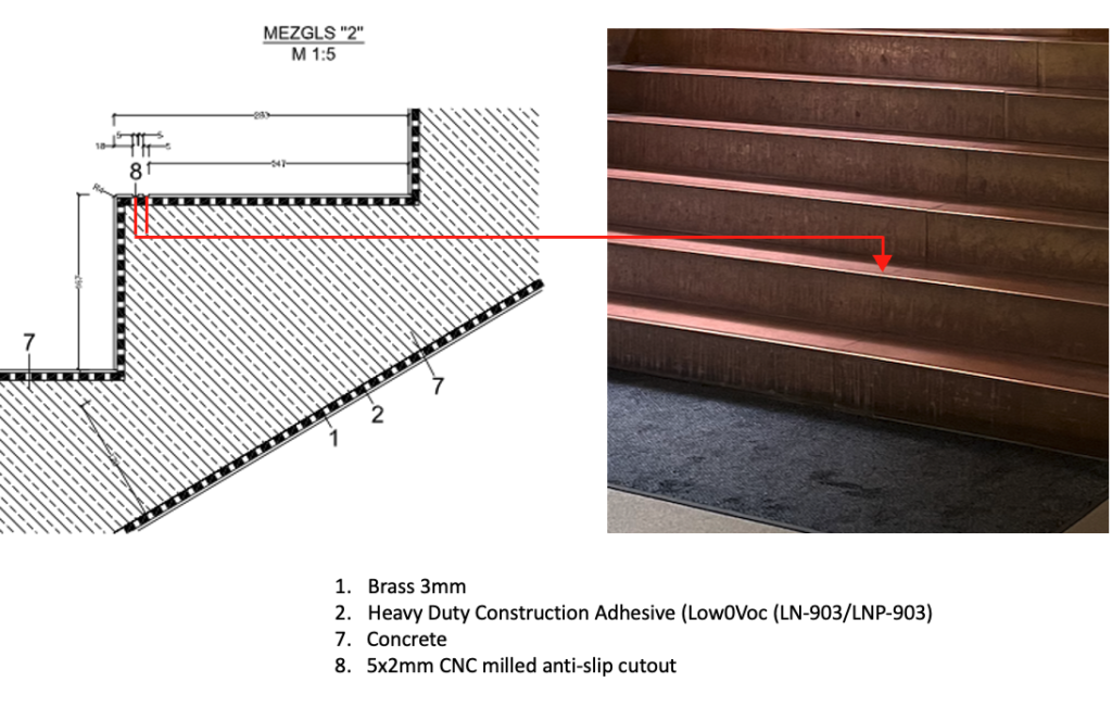
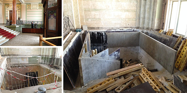
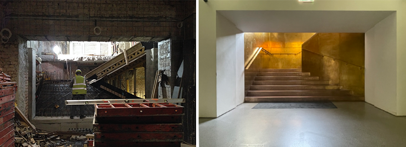
The architects explained to me that the stair “is made by replacing the existing concrete slab section [on which was previously located the cloakroom, Image 12, top left)] with a new concrete slab and stair element with brass sheets (3mm) [0,12inches] finish glued to the concrete stair and railings.” The end result is one of great beauty, and owes as much to the absence of screws, bolts, or other hardware (to the exception of the handrail fasteners), as it does to the skill in creating seamless and continuous surfaces.
Within this visual uniformity, the stairwell is subdivided into two tiers of seven and eight steps. Its overarching formal concept introduces a diagonal within the almost perfect square, obliging one to move in an oblique way. The resulting spatial condition in that the stair’s width narrows towards the landing, lending an impression of acceleration when one uses the staircase.
This geometric strategy maintains the simplicity of the stair, and, as mentioned previously, I believe that it echoes some of the turn of the century tectonics used in particular paintings in the LNMM collection. The stair’s overall form is the result of the architect’s meticulous approach; where minimalism results from a process of reduction, a gradual stripping away of extraneous elements, leaving only the essentials to emphasize proportion, scale, material, detail, and texture. It is these attributes that give true meaning to this intervention, making the “gold” stair exceptionally simple, yet sophisticatedly complex.

Thirdly, I believe that the overall design philosophy when creating this stair could not have been done without an astute reading of the foyer’s original style. The architect’s interpretation of the existing classical space, with its decorative molding, light pink marble columns, stucco, and punctuated gilding, offers a balance; perhaps a raison d’être for the new stair to exist. In fact, the architects confirmed my intuition by writing “… allowed us [for the stair] to make a clear and contemporary accent in the highly decorated lobby and also to create a ‘gold tooth’ in the lower ground level which also helps visitors’ orientation.” (Image 17 above, and 18, 19 below)
The opulence of the stair is self-referential while being a clever re-interpretation of the character of the existing foyer. Here, the past and the present anchor each other in space and time, all connected through materiality. For the architects, there is an obvious understanding of tradition and innovation that is brought to the interpretation ofexisting architectural languages.
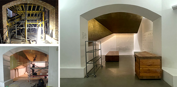
Finally, and maybe of lesser importance for those who favor Architecture as solely about the above three points, I like to point out that the overall functional distribution of the three floors below the original entrance first floor—including the two new basement extensions under the park—could have only been achieved through the judicious positioning of the “gold” stair.
Occupying what typically would be considered as a space of transition (foyer), the architects punctured the existing slab between the entry level (first floor) and ground floor to create the stairwell, relocating the previous cloakroom. (Image 20, above). After experiencing the space, the location of the “gold” stair is obvious given that the shortest height difference between foyer (first floor) and ground floor is at that particular point.
To have positioned this new stair slightly higher at the hallway level would have disrupted the integrity of the existing space, competed unnecessarily with the grand staircase, hindered the natural symmetry of both gallery entrances, and disrupted the natural flow between a new stair and the connection of the old building to the new underground facilities. (Image 8, above, stair 2 and 5).
Perhaps a small detail, but I have always favored that when creating a meaningful architecture based on poetry, functional interpretation is important in the overall design strategy. This is what makes architecture so appealing for me!
Conclusion
My delight and admiration for the “gold” stair can be summed up by what Le Corbusier calls just and not simply new for any of his interventions. As much as one can admire this particular stair, at the end of the day, any new circulation system needs a purpose. Perhaps this is what I would call a sophisticated functional simplicity where everything is judiciously placed where context, materiality, technology, aesthetics, craftsmanship AND functionality work seamlessly.
Whatever came first in the design process is secondary for me, as long as the end purpose serves what is appropriate (just) for the space; and not merely a selfish desire to create something that is fashionably new, easily understood, and which offers an immediate sense of gratification.
After my visits to LNMM, the elegance of the “gold” stair, as with the other interventions there by the architects (topic for another blog) reminded me of a quote by Montesquieu: “The distinguishing feature of great beauty is that first it should surprise to an indifferent degree, which, continuing and then augmenting, is finally changed to wonder and admiration.” To achieve such subtlety, seasoned professionals know how much design consideration must be developed through endless iterations on a same idea until ‘perfection’ is achieved.
Additional blogs of interest regarding stairs
Latvian National Museum of Art, Part 2
Vittorio Gasteiz: a lessons in stairs (Francisco Mangado)
Hong Kong: a lesson in stairs (Bille Tsien and Tod Williams)
Porto: a lesson in stairs (Alvaro Siza)
Firminy: a lesson in stairs (Le Corbusier)
Lexington: a lesson in stairs (Jose Oubrerie)
Vienna: a lesson in stairs (Jože Plečnik), Part 1
Vienna: a lesson in stairs (Jože Plečnik), Part 2
Geneva: a lesson in stairs (Le Corbusier)
How to design a stair
Additional blogs on the Baltic States
Public fountain in Kaunas, Lithuania
Vilhelms Kuze cafe in Riga
Pharmacy in Riga (Office: Substance)
Latvian National Museum of Art (Processoffice), Part 1
Latvian National Museum of Art (Processoffice), Part 2
Dubulti train station at Jurmala, Latvia, Part 1
Dubulti train station at Jurmala, Latvia, Part 2