Final architecture presentation drawings. In past blogs, I have emphasized the importance of sketching as integrative design process. While these learned skills never fail to assist a student’s ability to investigative their project, this blog emphasizes the other end of the spectrum; namely the need to create a successful final presentation.
Some time ago, I visited the final presentation of a colleague’s studio and to my disappointment, most students’ drawings showed no hierarchy of design process; were collaged over each other in a haphazard manner; lacked precision and refinement in various rendering techniques; and, to my dismay, conveyed an absence of pride in their final work. (Yes, I believe that final semester presentations should carry a sense of gravitas.)
I recognize that I am more formal in my approach to final presentations, or let me be honest, in my approach to education in general. But in today’s world where most visuals and graphics are so curated and are designed to an extreme in terms of layout, composition, image selection, and typographic choices to name but a few, I have difficulty understanding why there is such a laissez-faire attitude when it comes to requesting students produce a set of deliverables for a final review, especially a review that concludes a year of learning!
This is not simply about making a beautiful presentation, but is part of creating an identity—the student’s distinctiveness in how they responded to the project brief—and to a large degree, how they establish key relationships with the audience who view, discuss, and appreciate the visual and verbal efforts. I will admit that this lack of final presentation among many studios is not so much the students’ decision—especially in second year—but poor judgment by faculty in preparing our students to present their work.
Since early in my teaching career, I have had students present their projects holistically—meaning that contrary to pinning up drawings haphazardly, and thus failing to showcase multiple aspects of their design thinking, I request that they consider how to represent their final product, their process, and, most importantly, how they developed the project over the assigned time.
The following blog addresses my interest in having students craft final presentations and includes select drawings that were presented during the final reviews.
Stage 1: understanding the deliverables
To engage students in this endeavor, two weeks prior to their final presentation, I share a list of required deliverables that hopefully by then come as no surprise due to the familiarity of basic presentation requirements. These parameters are formed by analog and digital drawings as well as models that give insight into the projects; they are often accompanied by additional precedence materials that support ideas and process, and bring a personal touch to the presentation. These deliverables encompass plans, sections, elevations, sketches, process drawings, precedence, axonometrics, and perspectives, walk throughs, collages and montages, narrative texts, etc.
The initial conversations cover how to create a successful architectural presentation. As a class, we discuss possible layouts, visual hierarchy, formal structure of composition (proportion, balance, symmetry, rhythm, sequence, scale, movement, cropping, and repetition), and color versus black and white; all components defining how each student wishes to have their project read. At this time, I often share past presentation boards to inspire them, as I have seen that students need some visual clues to understand the task, yet they always draw on their own creative and experimental desires, enabling them to produce their own marvels. They are encouraged to underpin their creatively with an underlying structure or grid in order to give the necessary coherence and “visually persuasive” content needed for any successful final presentation.
I also recommend to students that their overall presentation showcase the excellence of their work in addition to conveying the process through which they arrived at their final design. In fact, we often discuss how final presentations are a mini thesis in their own right; one that communicates with elegance a narrative (story telling) and reflects a holistic design process. Of course, it is equally important that the layout be accompanied by a verbal presentation that omits the typical evasive words including kind of, perhaps, maybe, you know . . .
In addition to having students work with visual languages and aesthetic strategies, I give them constraints in order to compare and contrast between presentations—and this regardless of the program brief. I typically require a layout on three to five landscape-oriented side-by-side 24 x 36-inch panels; with the caveat that the overall presentation needs unity across all boards, while being easily read thematically as individual panels.
Stage 2: composition layout of the panels
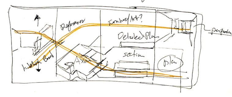
At this point, and with some basic instruction, students begin composing a graphic language through ideas in sketch form (Image 2, above). Some use place holders to locate specific drawings, while others write down the name of each drawing to be included. Either way, what is important at this early stage is to develop an idea about the sequential movement and dynamic rhythm of the overall composition, accompanied by a narrative that will assist them, and the reviewer, to understand the nature of their innovative design proposal.
What I mean by this, is that to simply draw a rectangle or bubble indicating the position of a drawing does not allow students to understand that each drawing has a basic scale, size, and orientation. For example, the inclusion of a plan appears typically flat in any presentation, while an axonometric is more dynamic due to the angles (e.g., 30/60 degrees), and thus will begin to “point” in various directions, begging to be tied to a previous or subsequent drawing, which in turn will give sense to the overall layout.
Students rapidly learn that creating a dynamic composition is essential, thus they begin to play with cropping and overlapping drawings—often at different scales—that give depth to the presentation, while allowing specific drawings to “pop out” and draw the attention of the reviewers.
Version 1: first formal layout
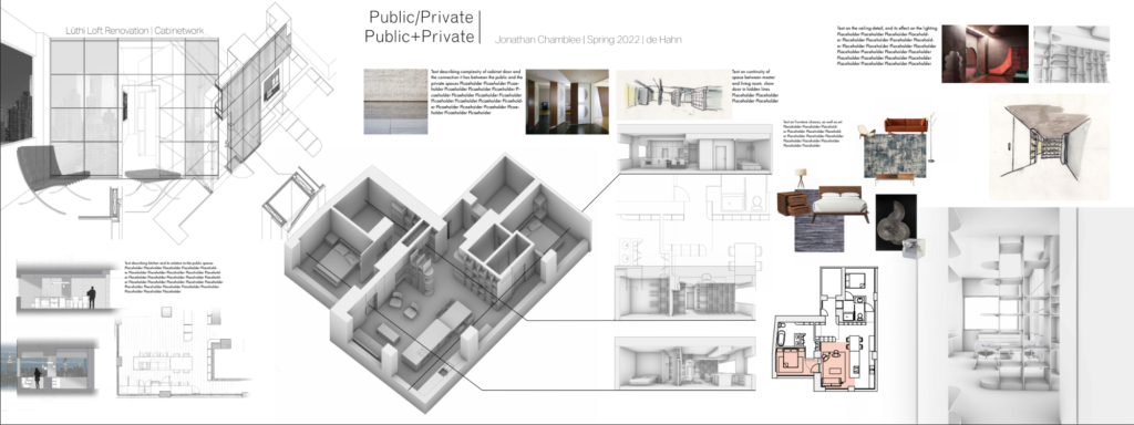
At this stage, it is critical that students rapidly move from conceptual thinking to actual presentation drawings at scale 1:1. To do this they must replace their conceptual note/drawing with the actual drawing. The reason is simple. If they don’t, it often leads to misinterpretation of the actual scale of each drawing, thus creating a presentation that is unreadable and does not make sense compositionally. Some students express a lack of interest in this step, and it is unfortunate, as they are avoiding replacing their placeholders (i.e., bubble diagrams) with actual scaled drawings which give a whole new perspective to the scale of the layout. Students who rely on an imaginary composition are often disappointed in the overall composition.
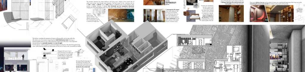
Prior to moving to a 1:1 scale, I encourage students to print out their presentation panels on 11 x 17 inch sheets of paper (Image 3, above). This allows them to assess if what they see on their computer screen makes sense when printed (Image 3 below). For students, it is always a revelation to see how drawings are perceived on screen versus when printed at a small scale, and this is even more true when see they them full scale, as jurors will during the final review. Self-critique and feedback are typically done on these xerox copies.

In the above two images (4 and 5 above), changes are done to improve the readability of the large axonometric (middle left); perspectival sections are modified to basic sections (right of the axonometric); and both top and bottom right corners are adjusted for clarity and order. In this example, a parti based on organizing select areas of the loft (e.g., bookshelves) is highlighted, while bringing into focus past charettes conducted during the project.
Note that a site plan is finally introduced (Image 5 above, middle right showing part of the island of Manhattan), which will become the subject of subsequent iterations until it acts as a background for all plans and sections (Images 6, 7, and 8 below) followed by the introduction of an axonometric of the skyscraper (Image 9 below).
Version 2: the 1:1 printing
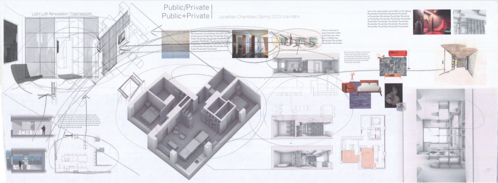
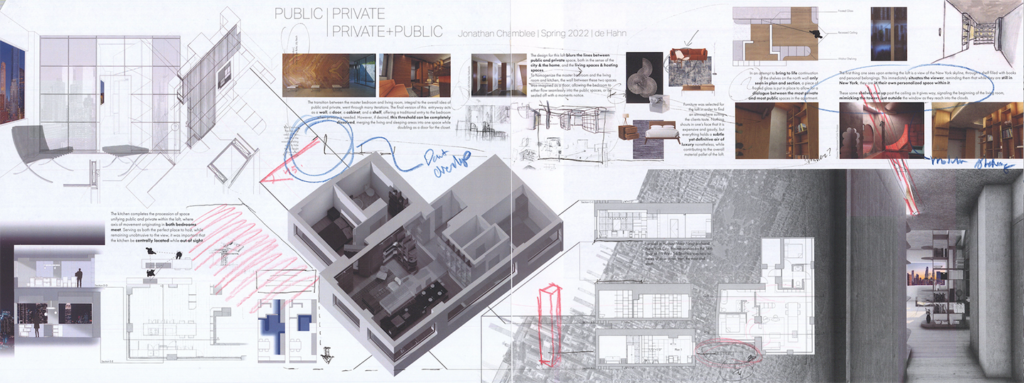
At this juncture, a class review of the presentation panels is conducted at scale 1:1. As peers, a critique is conducted to assess the content of each composition and the students are invited to scribble their thoughts on the presentation panels, thus suggesting to their colleagues either the need for major changes or slight adjustments. Often critiques point toward the lack of overall readability of the compositions, probing the drawings in term of their position, proximity, scale, and color, in addition to the length, size and character/font of text with its obvious and unfortunate misspellings, etc.
Version 3: final adjustments
At this stage, each student finetunes their presentation, making digital refinement after refinement. Images find a common scale, and ordering systems bring coherence to the layout, often interjected with process sketches and all necessary nomenclatures as sectional cuts, titles, north arrow AND graphic scale.
Note how in this example (Image 7 above), the site plan has migrated to become the background of the plan and sections while suggesting it is part of the perspective on the right. A very nice move that adds a dynamic to the right side of the presentation. Small refinements are calibrated, including the extension of the light in the middle right image into the drawing above (Image 8 below).
Version 4 (final presentation)
Conclusion:
The day of the public review, it is always impressive to see for the first time the collective display of all the students’ work. Pride, hard work, and confidence infuses the space, and it is encouraging, and most rewarding to see the personality of each student represented in their final compositions. Not only are their design strategies different from each other, but each presentation carries a personal interpretation of the identical required deliverables. Perhaps the most important aspect in developing a final presentation, is to consider the task as a design project in its own right; one that starts with a brief (required deliverables), then the first conceptual sketches, next, the testing of the layout at a small scale, and then, at full scale, the day’s final presentation.
Post scriptum
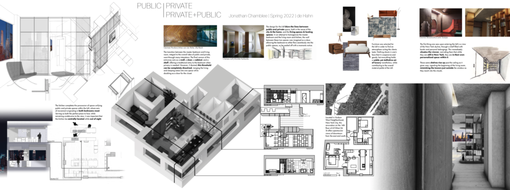
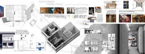
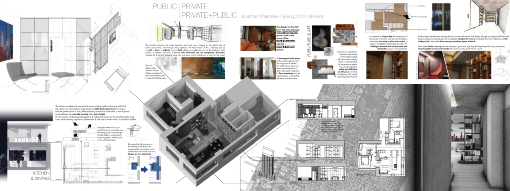
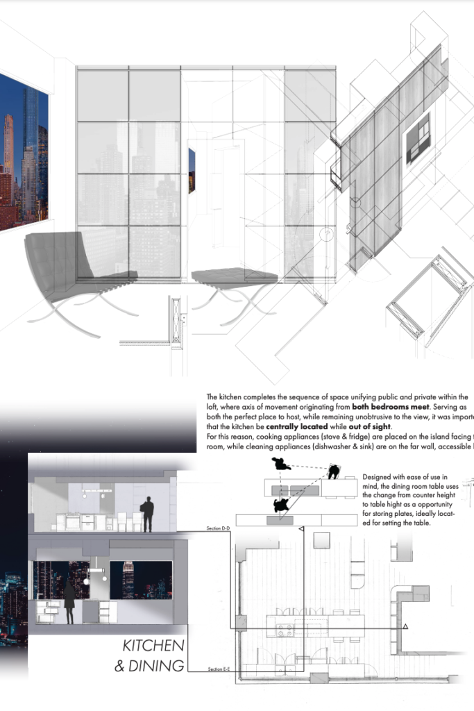
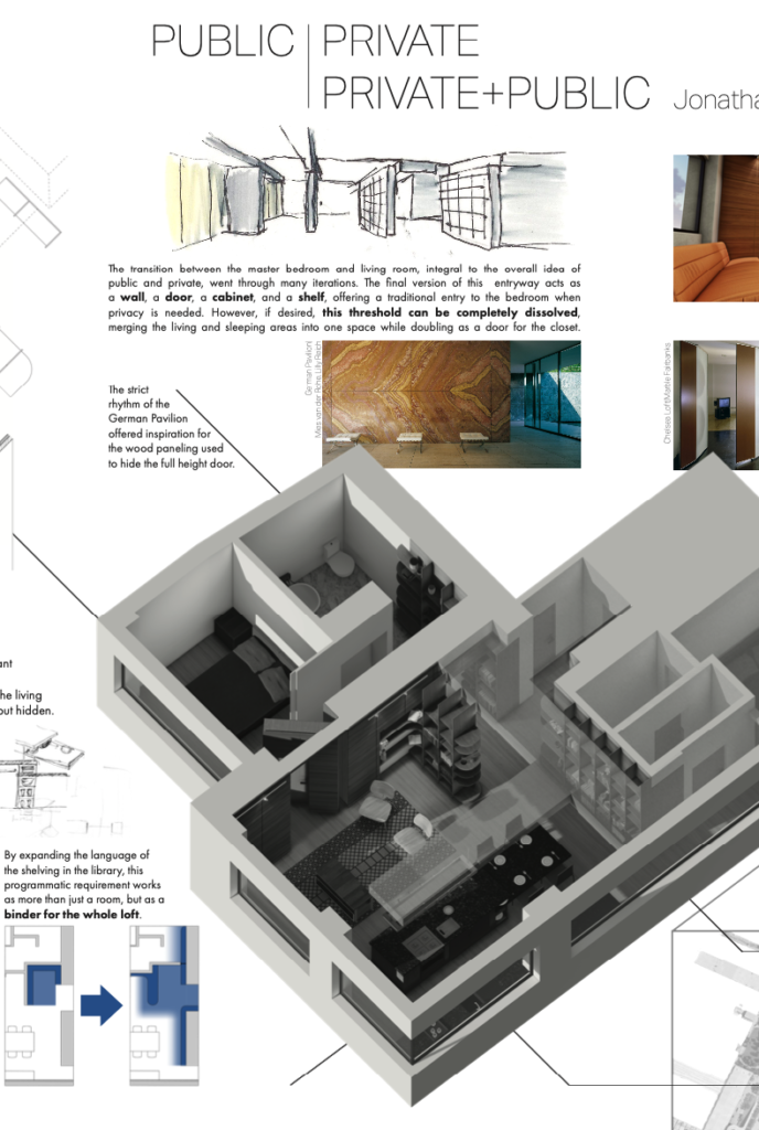
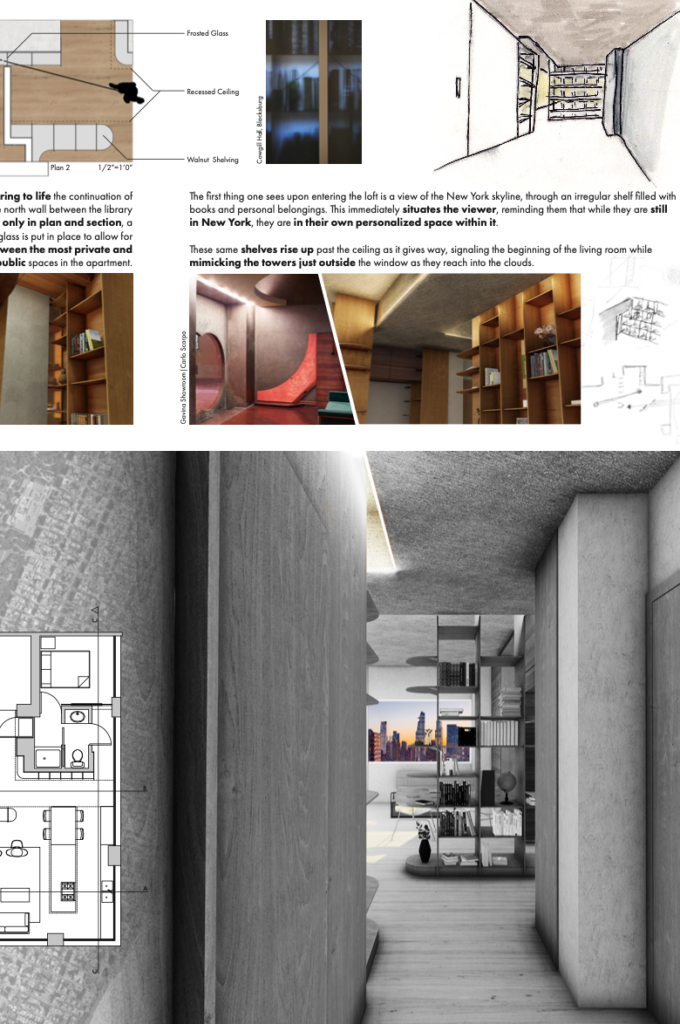
Following is the close up of four panels (from left to right) of the above final presentation. Per the initial directive, each layout was created separately but conceived, foremost, as a single presentation.

Related blogs
The need for disciplinary integration. Part 1
The need for disciplinary integration. Part 2