
Firminy: a lesson in stairs (Le Corbusier). There are times in academia when one is confronted by fundamental design questions that change our understanding of architecture. For me, this occurred when I encountered the promenade architecturale in Le Corbusier’s oeuvre. Hands down, and even retrospectively, this remains for me one of the most important spatial ideas I learned as a young student.
Central to Le Corbusier’s concept of creating movement through space, the architectural promenade is intrinsically linked with his dom-ino modular structural system (1915); manifesto of five points of architecture (1927); four compositional strategies (1929); and the anthropometric scale of proportion called The Modulor (1948). These five design principles—including the architectural promenade—seemed for me so revolutionary as they characterized how modernism postulated a just way of creating space. (Here, the French word juste –where all things are exact and appropriate– is important.) From then on, moving through space took another dimension, especially when considering the architectural promenade as an expression of how one bridges floors through stairs or ramps (Image 1 below).

The architectural promenade
When I first encountered this during my studies, I had seen my fair share of historic places that offered paths of circulation often expressed by stairs that were visually elegant and tectonically charged. When it came to ramps, I found them mostly present in exterior situations, including Mughal, English picturesque, and Renaissance gardens; ramps between ornamental parterres—or in more familiar iconographic images of long-gone marvels (e.g., the painting of the tower of Babel by Breughel the Elder). Yet, experiencing a modern celebration of internal movement developed around a ramp was something new.
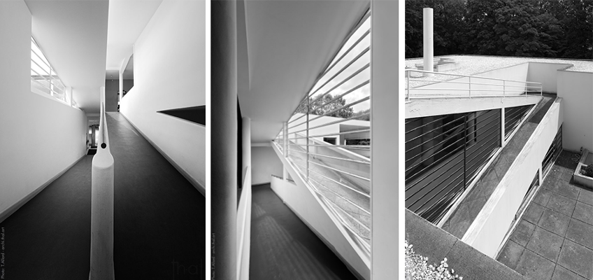
The particular preoccupation of the architectural promenade is about experiencing the fourth dimension; the result of movement in space which produces a richness of visual and physical experiences. In the specific case of Villa Savoye (1931), designed by Le Corbusier, the observer’s perception throughout the built space was no longer celebrated simply by stairs—modest or elaborately executed as shown throughout the history of architecture—but through the diagonal experienced when walking up the ramp.
The scenographic qualities of the interior circulation redefined the edges of the path of movement, all the while accentuating a perspectival appreciation of space, often teasing the relationship between constructed views and cubist spatial ambiguities, while blurring the inside and outside spaces.
Ramps
When referring to Le Corbusier’s work, we typically associate the term promenade architecturale to include a directed vertical ascension: a deliberately organized movement accompanied by a rich experience of space in all of its dramatic three dimensionality. While stairs remained a common mode of circulation, in Le Corbusier’s oeuvre, the ramp is treated as a hierarchical ‘machine’ of perception par excellence; one that allows movement through the building while shaping our cinematic experiences of space in a very particular manner.
Often, the architecture promenade is not restricted to the interior; habitually starting outside the building, and ending at a roof garden as part of his five points (Image 2, above).
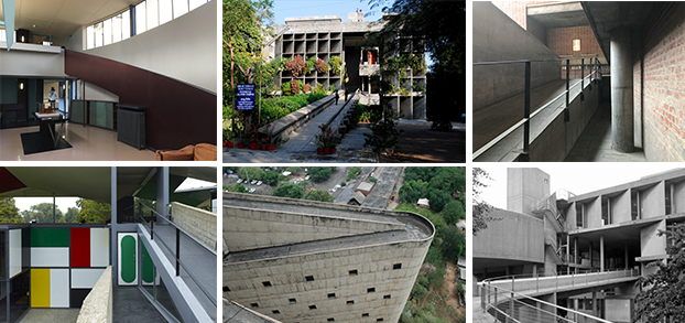
If the 1931 Villa Savoye (Poissy, France) remains an oft-cited example for understanding the notion of promenade architecturale, there are other noteworthy examples of ramps that can be found in Le Corbusier’s oeuvre; starting with the 1925 La Roche Jeanneret house (Paris, France), 1954 Mill Owners’ Association Building and 1954 Sanskar Kendra Museum (both in Ahmedabad, India), 1960 Heidi Weber pavilion (Zürich, Switzerland), and in 1963 the Palace of the Assembly (Chandigarh, India) and the Carpenter Center (Cambridge, USA), to name a few that I know and have visited, to the exception of the project in Chandigarh. (Image 3, above from left to right.)
Student Center at Firminy

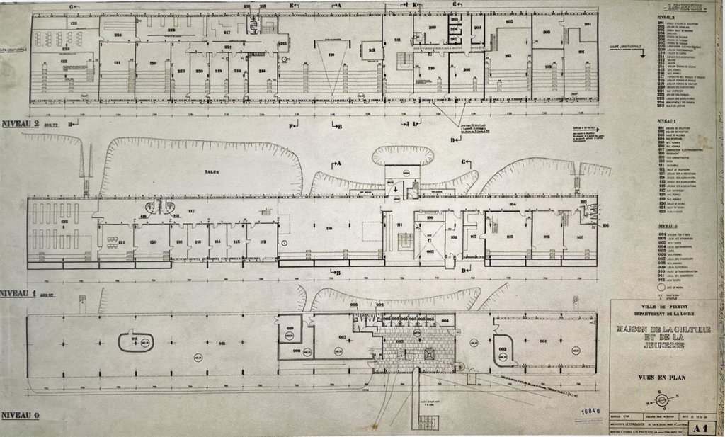
Despite the many virtuosic ramps found in Le Corbusier work, during a visit to the 1965 Maison de la Culture (Youth and Cultural Center), in Firminy, France, I discovered a set of stairs that drew my attention (Images 4 and 5 above). The Center is the “only building designed by the architect in Firminy that is not a posthumous achievement.” The other three projects are the Church of Saint-Pierre, completed by José Oubrerie, the adjacent stadium, and a Unité d’Habitation (other Unités are in, Berlin, Briey-en-Forêt, Nantes-Rezé, and Marseilles).
Interior amphitheater stairs
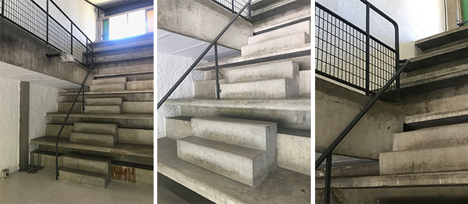
I mention stairs, but due to the sectional quality of the building, the overall circulation serves both as seating for separate auditoriums as well as steps for easy access to each of the bleacher-like rows (Image 6 above). There is a sculptural quality to the tectonics of the design as it emphasizes thick and thin surfaces that reflect light while creating depth between every third step. The extruded third step serves a simple functional aspect, namely to hold belongings while seated.
But beyond this mundane ‘storage’ the line and the shadow created immediately below the seating area is tectonically exaggerated, and reminds me of the tapered stone seating in Greek theatres, where we find a defining shadow similar to that in Le Corbusier’s theatre (Image 7, below).

When studying Greek amphitheaters, arenas, and circuses as types, they were segmented in wedge-shaped seating sections punctuated by vertical circulation which created the proportional systems of seating. While Vitruvius, the Roman architect and engineer, offers ample information about theatre design in his book De Architetura, contemporary surveys of these building types confirm that formulas and stereometric measurements gave precise rules as to the proportional system employed in setting the distance and height between rows.
Question of dimensioning
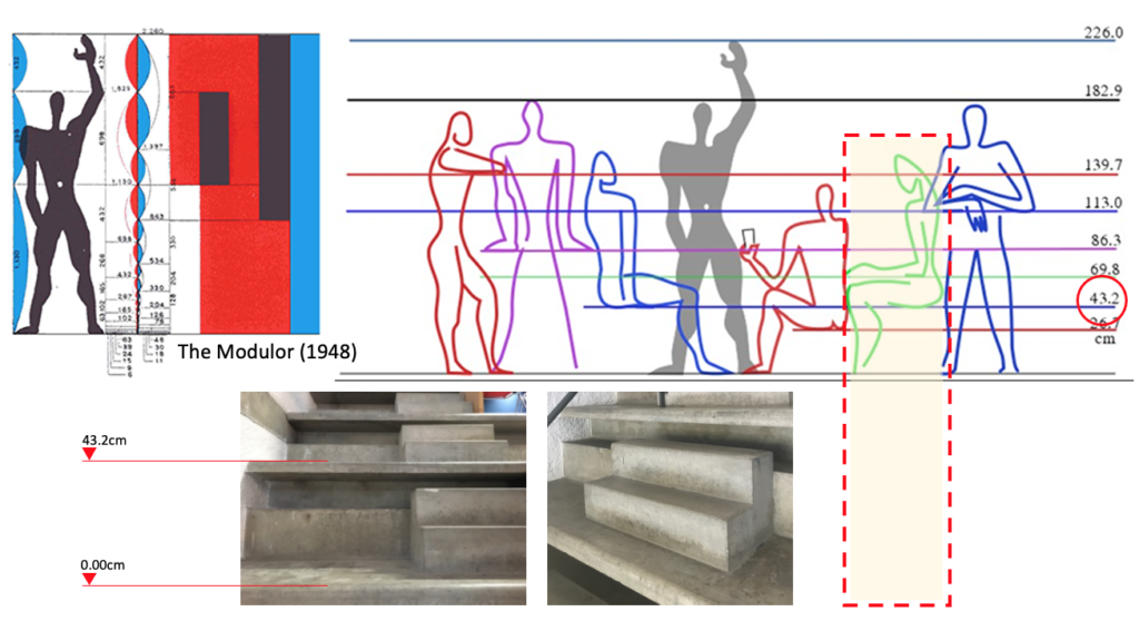
While the notion of type does not presuppose exact replication of design form and proportion for each public building, I discovered an article about ancient theatre capacity that mentions that a typical configuration of Roman theatre seating had a distance of 44cm (17.32 inches) in height between rows. Looking back at Le Corbusier’s Modular, the number 43.3cm (17.04 inches) is very close to the Roman measurement. Auspicious coincidence, or divine proportion of the modern man, this height corresponds to a person seated with their feet firmly on the floor and their knees bent at a ninety-degree angle (Image 8 below).
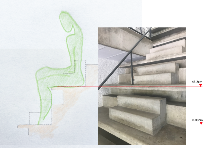
Standard modern seating height typically ranges between 17-19 inches, thus Le Corbusier’s proportions for the Firminy amphitheater and steps is aimed at creating the utmost comfort for both seating and vertical ascension. Since I did not measure the steps during my visit (yes, one of those regrettable moments where the camera took over), I can only speculate on the accuracy of my findings which I have rendered in a sketch (Image 9 below).
Additional spatial functions
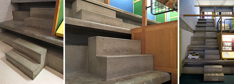
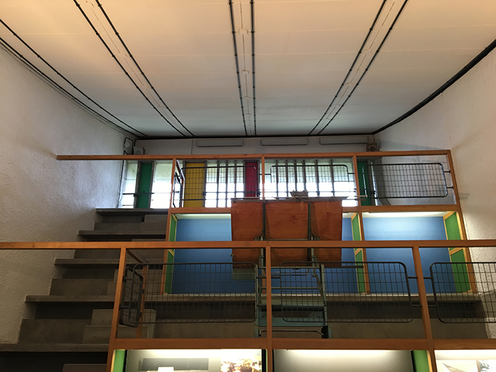
In some amphitheater spaces, Le Corbusier subsumes the stadium seating to accommodate exhibition space by incorporating furniture-like panels of various colors. The existing steps allow access while providing a new function (Image 10 above and 11 below).
Conclusion
Re-invention is at the center of this amphitheater with a particular tectonic expression of the seating and steps that builds on Greek precedence, all the while allying it with Le Corbusier’s Modulor. Functional exceptions are built into the rule to offer variety in future use of Firminy’s Youth and Cultural Center. I have always marveled in front of interventions that are flexible without breaking the rule underlying the exception.
When writing this blog, I was reminded of the treatment of steps in the work of Balkrishna V. Doshi and José Oubrerie, two of the last living apprentices of Le Corbusier (Image 12 and 13 below). Similar treatment, but in their own right, very different.


Postscript
Although the work of Ticino architect Aurelio Galfetti (1936-2021) was integral to my education, when comparing the steps at the municipal ice-skating rink designed by him, with those at Firminy designed by Le Corbusier, I wonder why they are inelegant and almost brutalist in their expression compared to the beautiful reinvented Greek theatre of Le Corbusier.
And this in particular as many of the leading founding architects of the Ticino Tendenza Movement were heavily influenced by the work of Le Corbusier prior to implementing Aldo Rossi’s interest in the city at a territorial scale. Finally, I want to make note of similarities in the roof structure of the same building with those employed decades earlier at Firminy (Image 14, below). Once hidden, structure with Galfetti is now expressed and celebrated.

Additional blogs related to Le Corbusier
Le Corbusier, Sanskar Museum in Ahmedabad
Le Corbusier, Immeuble Clarte
Le Corbusier, Heidi Weber
Le Corbusier and the horizon
La Petite Maison by Le Corbusier
La Tourette by Le Corbusier
Additional blogs pertaining to stairs
Latvian National Museum of Art (ProcessOffice), Part 1
Latvian national Museum of Art, Part 2
The Whitney Museum: stair by Marcel Breuer
Vittorio Gasteiz: a lessons in stairs (Francisco Mangado)
Hong Kong: a lesson in stairs (Bille Tsien and Tod Williams)
Porto: a lesson in stairs (Alvaro Siza)
Firminy: a lesson in stairs (Le Corbusier)
Lexington: a lesson in stairs (Jose Oubrerie)
Vienna: a lesson in stairs (Jože Plečnik), Part 1
Vienna: a lesson in stairs (Jože Plečnik), Part 2
Geneva: a lesson in stairs (Le Corbusier)
How to design a stair
Thank you for quoting me for the use of my images!
I’d like to take this opportunity to add a link for your readers who might be interested in the complete architectural tour of the Villa Savoye .
Cher Thierry,
Absolument, laisses moi savoir ou tu voudrais voir the link dans mon blog. Je t’ai également laisse un message sur ton courriel.
Amities,
Henri