
Architectural sketching and how do I sketch. This second blog of the series Architectural sketching is a compendium and illustration of conceptual thoughts offered in the previous blog of a similar title. The examples for this blog are taken from my own sketchbooks that span over several decades. Each example illustrates a particular architectural preoccupation through sketching.
Example 1: Sketching an architectural project
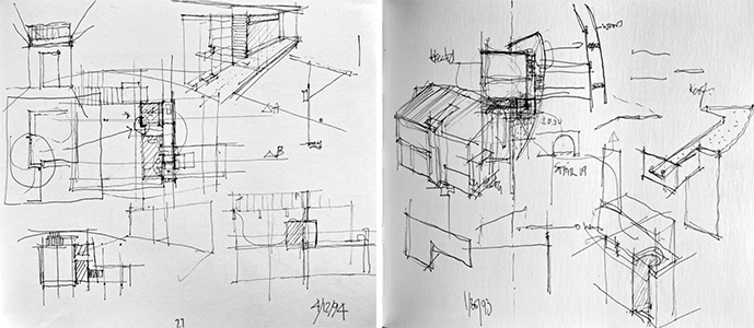
In the above example and following images (Image 1 above and 2 – 4 below), sketches might start:
- With a plan while emphasizing a proportional system, then include a section, followed by diagrams that conceptualize a parti.
- At another scale, sketches might highlight a detail by studying them adjacent to the area under consideration; they often include an isometric (seeing the object) or perspectival (appreciating the space) drawing that give depth to the space through a chiaroscuro technique.
- I often like to add symbols such as arrows to denote the procession through space or to simply connect thoughts, in addition to jotting down notes that enrich the drawing. This happens all on the same page, which shows how the thinking process unfolded, often emphasizing redundancy. At times, I need to regroup my thoughts and draw a concept summarizing my research and findings (Image 2, right in red, below).

In sketching, juxtaposing and overlapping drawings is essential for me, as I have a tendency when I sketch to move from one idea to another using the empty real estate of the page to populate a maximum of ideas. This technique avoids creating an “art piece” where a single sketch is isolated and becomes static in its expression and claims to be beautiful in its own right.
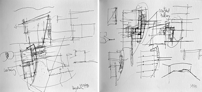
I often venture into detailing an aspect of construction in order to measure the project from concept to finish. Reviewing the sketches above and below, each of them includes a plan of the house (Haydon project 1993) and the proposed addition, yet each new drawing sketches out various research options (e.g., emphasizing the staircase between new and old; bathroom zoning; wooden barn-like screen; revising and clarifying the structure). Each of the six images showcase past research topics that build on previous sketches and ideas, all-the-while adding new thoughts about how various spaces can be rearranged and improved.
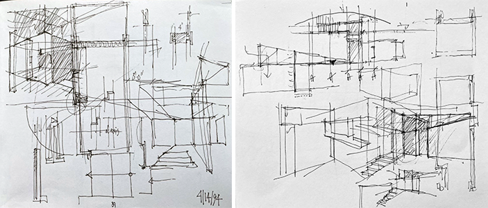
Once again, as described previous blogs, I am not concerned about the aesthetics of the sketches, although, those who know me recognize my style of sketching.
Example 2: Sketching to understand a room

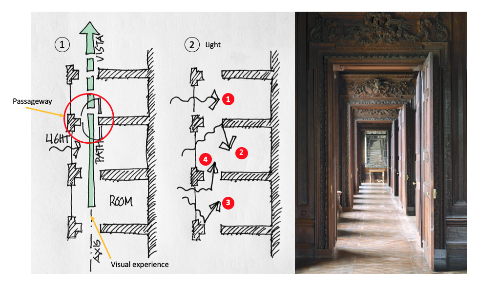
In this second example, one day while I enjoyed sipping a cappuccino at our local Barnes and Noble, I was perusing a book on Florentine villas. Focusing on one of the patrician houses, I was curious what made the corridor-space so appealing. I made a series of conceptual sketches about what I thought were its key components (Image 4, above, No. 1 to 3 (red), including a. and b. (green)): proportion of the room; ceiling height; and symmetrical position of the doorway at the end of the corridor.
While sketching, I added window openings, which I suspect were French doors; furniture layout; and most importantly, the quality of the light (including the curtains). Though sketching, I came to appreciate how these observations qualified the five surfaces that defined the space (at least as framed in the photograph). Looking back at the original image, I manipulated, first conceptually then for the purpose of this blog, the interior wall from the window side along the axis of the door (dividing the photograph in two), thus creating interesting attributes that qualified the wall (darker side of the room) and the window surfaces that illuminated the other side of the room, which contained the opening (Image 4 left, above bottom).
Beginning with the plan (1) I added all of the above attributes followed by a quick perspectival rendering (2)—initiated from my own plan with the corrected asymmetrical door position. Skimming through additional photographs of the villa, I came to realize that there were different ways of framing the window openings for specific rooms, thus my suggestion in plan of an a. solution (90-degree corner) or a b. solution (tapered corner). Both solutions are now drawn in the plan as well as the tapered alternatives in the layout of the furniture between windows (3) making the sketch now a research component rather than simply understanding what is in front of me.
This three minute sketching technique (on a 4×6 inch piece of paper) obliged a more in-depth observation than simply flipping from page to page as one is accustomed to. When the space was sketched out, it included errors that could be altered as the initial preconceptions were questioned. I believe this to be true during any sketching activity, as I always try to find the big idea prior to honing in on the details.
Case in point, while I drew the longitudinal space in plan, I implicitly drew the door on axis; an incorrect gesture that was perhaps a result that the door was situated in the middle of the two page layout. In fact, I realized that the enfilade situated the door closer to the interior wall, leaving more wall surface near the exterior wall for the light to bounce back on. I could have made a second sketch to redraw the space correctly, but decided to simply note the error and move on (see red frame in Image 4).
Again, this sketch contains various observational concepts that are roughly sketched out with no fear of having the drawings overlap as I move rapidly from one idea to another. The purpose is not to create a beautiful drawing but to record the process of observing.
I mentioned the word enfilade, which reminds me of another sketch that I created in a previous blog on this classical notion. In that instance I was curious to understand how light could qualify various surfaces, thus creating a spatial corridor of great beauty.
Example 3: Understanding a series of spaces: a loft in China

While researching miniature loft spaces for an assignment prepared for my second-year architecture students, I stumbled on this loft built in Hangzhou, China designed by Continuation Studio. I was enamored by its loft’s elegance, simplicity, and, above all, the superbly calibrated spaces where functions overlapped and were not preassigned as most spaces are in the West, especially in the United States, where space seems rather in abundance.

As I wanted to understand how everything was packed so efficiently and tightly together in what I assumed was a small, elongated space. I embarked to sketch out plans and sections based on the photographic survey that I found on the web. The sketches (Images 8 and 9, below) show my trials and errors in figuring out how everything was organized volumetrically. Note that the first plan focuses on the main space and the proportional system that is expressed in the floor which contains an ingenious storage solution.
Obsessed with the raised living room floor storage, something I have rarely seen outside of Asia, I did not immediately focus on understanding the right-hand side of the plan. However, I did attempt to visualize the main floor plan and the bedroom above, which is placed on top of the kitchen (Image 9, below).
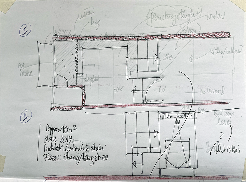
After having gained a better grasp of the overall distribution of spaces in volume, I redrew the plan, followed by a section through the stairs leading from the lower level (entrance, kitchen and bathroom) to the main level (living room and loft bedroom). In this process, I discovered the window above the kitchen storage located under the large steps leading to the bedroom. Such an ingenious way to visually connect the kitchen with the rest of the loft (Image 7 middle left and middle right, above).
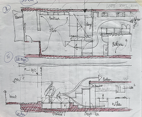
The sketches did not take more than 20 minutes and allowed me to achieve my goal; to understand the spatial, functional, and storage principles behind the organization of the loft. A persistent approach to understanding the photographs transcribed the space in plan and section.
This particular process has always been invaluable for me, and I owe it to my first-year professors who instilled sketching as a research tool to understand space in order to create my own designs. In this instance, sketching is not to project an imagined space, but to understand (e.g., deconstruct) the spatiality of a project by cross referencing a number of photographs. This is an exercise that can be done on a daily basis and students can easily hone their sketching techniques while developing an eye to understand underlying principles behind photographs. Your hand becomes an improved new iPhone!
Of note, it is only after my sketching that I ventured to find more information about this loft. Needless to say that I was pleased with the pages that illustrated the loft that confirmed many of my observations and assumptions! This is an important comment as I could have immediately searched for the plans, but acting like Sherlock Holmes, It was a nice 20 minutes of honing my investigative skills all while sketching them out.
Example 4: Understanding a series of spaces: a loft in Hong Kong

This sketch is very similar to example 3 in China. It accompanies a blog written on a café that is at the bottom of an apartment tower in Hong Kong. Fascinated by the simplicity of the Blue Bottle Coffee shop, I naturally became curious to understand the tower’s façade and consequently the one floor apartment distribution. There is never any limit on what one can research and find delight in observing through sketching.
Example 5: Designing a writing desk and drawer handle

During a fall travel program in Europe, my colleague and I devised a number of charettes where students were asked to sketch and design a number of spaces and artifacts. In this example, students had twenty-four hours to design a desk that was to be used to write letters (yes an old fashion concept that could only make students think what writing a letter might mean!).

As students often challenge you to respond to a design brief, the above illustration (Image 11) is my attempt to define a desk through two materials (chrome for the structure and wood for the desktop). I must admit that my scheme was in direct response to the previous day’s visit to Mies van der Rohe’s Villa Tugendhat in Brno, Slovenia. There, like many students, I admired many of the innovative pieces of furniture that were created for the villa (Image 12).
I proposed a number of support variations for the table’s structure using continuous tubular chrome that would unfold in space to accommodate a wooden surface, all-the-while providing flexibility to accommodate chairs at least on two sides of the desk (inspired by the asymmetrical table by Mies in Image 12, far right).
While sketching, I also toyed with the idea of including a drawer (with the understanding that I will ask students as a next charette to design a handle for their table drawer), as well as a slanted back lip to hold books or stationery. This brought me to version H where the desktop became a structure in itself and, by folding a plate a metal, I could elegantly accommodate both the work surface and the groove to hold pens, notecards, and even a book.
The use of a double page (I favor large real estate) allowed me to develop a number of sketches (A to G), until I ended up disregarding the initial idea of using wood, in favor of a work surface that could be made by folding a sheet of metal. At this moment, the sketch moves from the macro scale to the micro scale with the suggestion of sa fastening system between structure and desktop.
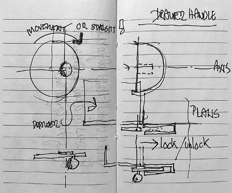
As I like to reinvent, I have over the years kept ample examples of door handles. Here, to respond to the brief of designing a drawer handle, I had a vague recollection of a door handle seen at the Bauhaus in Dessau, which became the inspiration for this asymetrical drawer knob.
Example 6: A film: Parasite by Bong Joon-ho

In this example, I became obsessed by the spatial qualities of the villa featured in the South Korean film Parasite. I found the sequence of interior spaces of such contemporary elegance that I needed to understand how the plan worked at the particular juncture between living room, staircase to bedroom floor, dining room, and kitchen. Thus, I decided to transcribe them into an architectural system of notations.
Viewing the film several times, I transcribed via multiple sketches and views, an approximation of the spaces of interest. To give more meaning to the overall sketch, I pasted in a number of photographs found on the web. Beyond the errors in my attempt to get a grip on the sequence of spaces, sketching in this instance was used to understand a particular condition that demanded answers on: how does the cinematographic space look in plan?
Example 7: study of three paintings
In these three final examples (Image 15-18), I return to one of my early passions, namely painting. To understand one of the seminal paintings by Edward Hopper titled Cape Cod Morning (1950) I was particularly interested in the gaze of the key protagonist from the bow window. I have summarized my findings in an earlier blog but used a variety of sketching techniques to achieve the goal of my research.
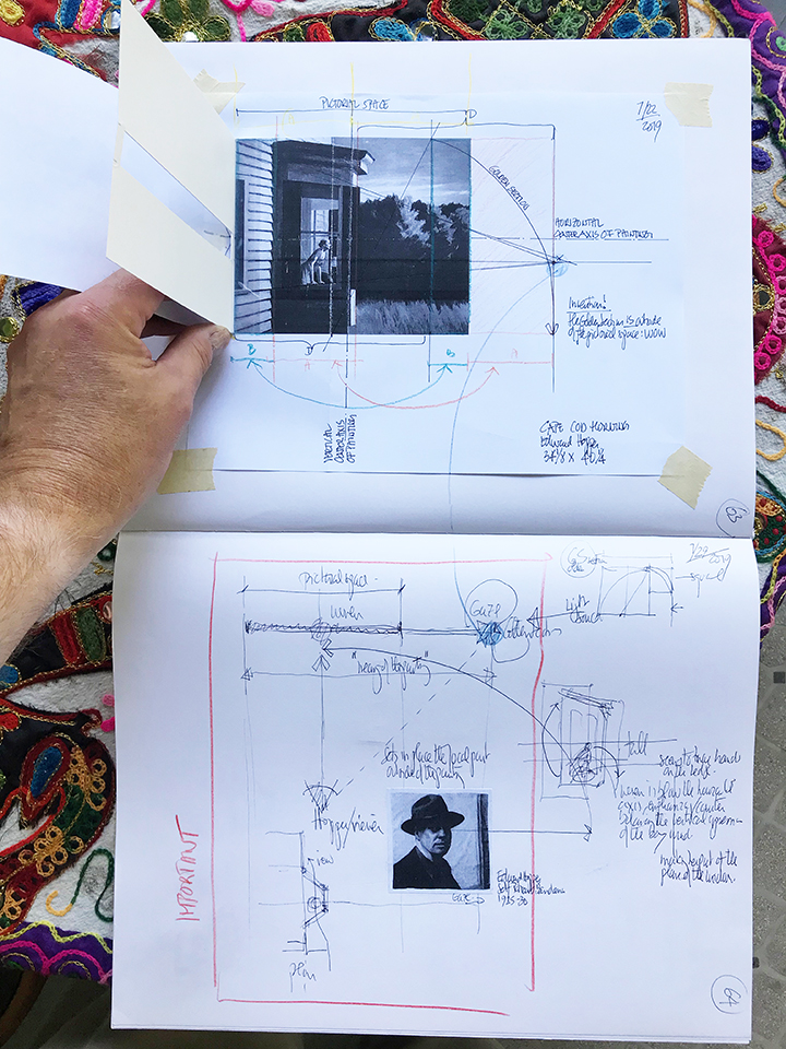
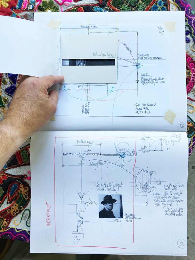
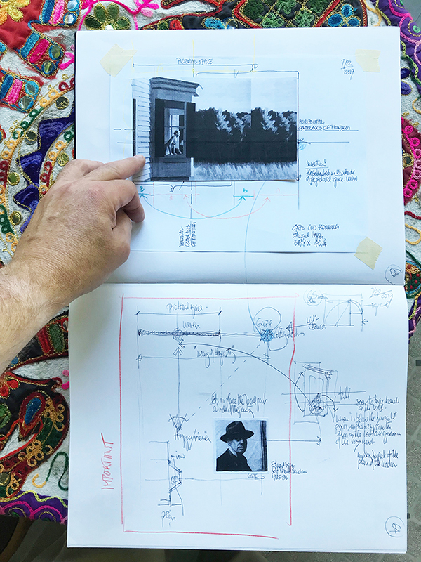
Similarly, study sketches of Juan Gris (Fruit Dish, Glass and Newspaper, 1916) and Giorgio Morandi (still life, 1959) inched me closer to understanding the magic of their work, compositions, and overall cubist poetry (Image 18-19).


Conclusion
Hopefully these examples show not only the variety of sketching techniques, but that sketching can be a tool for an infinite variety of research.
Additional blogs of interest
Sketching as a reflection-in-action
Architectural sketching and how do I sketch
The importance of sketching for architects, Part 1
Some thoughts on sketching by hand
Sketching on a field trip, Part 1
Sketching on a field trip, Part 2
Issues about sketching, Part 1
Sketching -an iterative process, Part 2
Sketching -an iterative process, Part 1
Architectural Education: What issues does one encounter when sketching?
Why Model Sketching? Part 5
Why Model Sketching? Part 4
Why Model Sketching? Part 3
Why Model Sketching? Part 2
Why Model Sketching? Part 1