
Blind sketching. If you’ve read some of my past blogs, you may be familiar with my belief that sections are key to any successful design. Two of the blogs (blogs 1 and 2) presented basic concepts about the importance of architecture students working in section, especially since they typically do not think this way—at least in their early years when plans seem to predominate their design. As students gain confidence in the investigation of space through sections, little marvels unfold. Projects become architectural, as they successfully develop spatial experiences that anticipate how users will encounter them in a haptic way.
Background
After my second-year students completed a renovation project, I had a couple of weeks left until the end of the semester. While I considered having them work on a typical end-of-the year portfolio assignment, I decided to have them tackle one last design exercise, one in which they could showcase their understanding of space in a very particular manner. What I mean by this is that to achieve a simple, yet complex task, they would return to basic architectural tectonics voided of two fundamental attributes: site and function.
I will be honest. This approach derived from concerns I had after seeing the final deliverable of their loft project, a project which successfully touched on so many design issues—from the integration of concepts to construction detailing—yet the simple act of sketching had been forgotten at the expense of digital thinking. In the final weeks of the project, I saw little hand sketching and much finetuning for the final presentation, thus my end of the semester commitment to conduct a final sketching exercise.
Additionally, I wanted to challenge the students to work with as much spontaneity as possible ‘one last time’, without the need to resolve functional requirements, or make things ‘look good’, something which I hope was no longer a primary concern for my students—as it was for most of them when entering second year after formalistic first year training.

Thus, my interest in having them investigate two fundamental issues: the design of a section and the creation of space without any functional requirements. Here, the program—because I make a distinction between program (thesis) and function (program brief)—was to develop a promenade architecturale. The only requirement in this charette was to include a ramp, stair, and elevator, components which required them to imagine a spatial path from ground to roof (Image 1, above)
In the past I had conducted similar charettes with other groups of students, but this time I decided to run the exercise with two minor, yet important, twists. First, to have them sketch blindfolded, and second, to duplicate their blindfolded section without seeing the results of their initial sketch.
Blind sketching
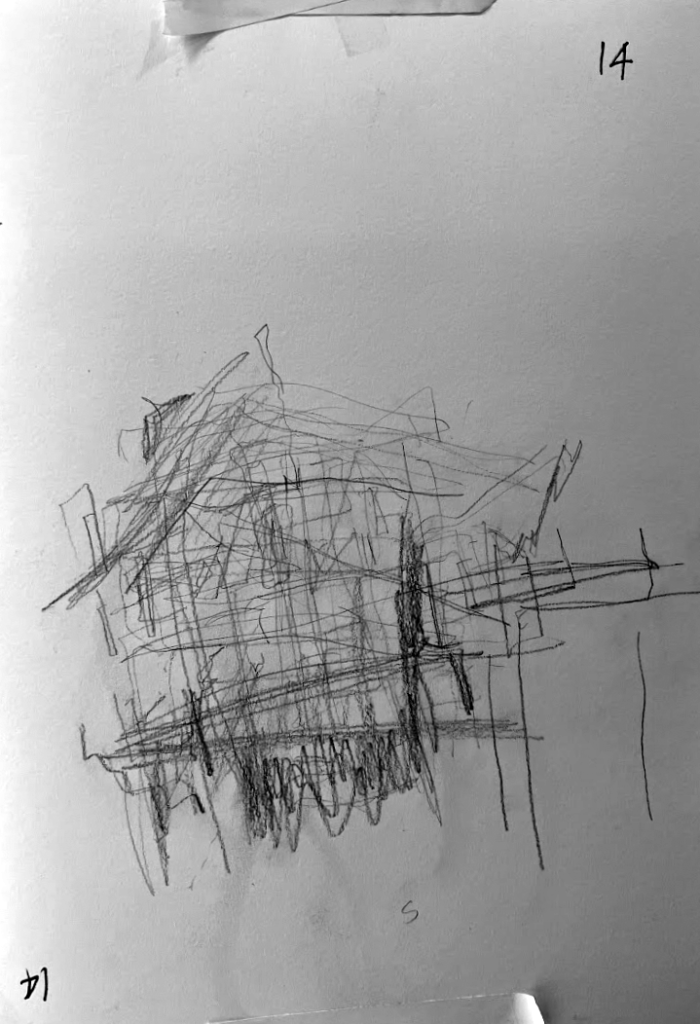
I will be honest. Asking students to sketch blindfolded was not to conduct a weird, trendy exercise. It was brought about after attending a guest lecture by an architect who was blind. Until listening to him speak and demonstrate how he worked, I had never realized that such a spatial art such as architecture could be accomplished with such ease and elegance by someone who was denied sight. I was so moved by the presentation that I wanted to see how students would translate their ideas to paper without ever seeing the drawing being built in front of them (Images 1 and 2 above, 3 below).
To provide structure and an environment for success, I made available to each student two blank 11 x 17-inch sheets of paper and a blindfold. After having them fix their paper to their desk and choose a pencil of their liking, I asked them to blindfold themselves. While agreeing to not break the rules by looking at their drawing through or under the blindfold, I asked the students to use their fingers and mind to familiarize themselves with their canvas; exploring the limit of their sheet of paper, understanding its edges, and the distance their hand might need to draw a line from top to bottom, left to right.
Seeing this familiarization happen in front of my eyes, I witnessed how each student approached this first task. Most were strategic with their new environment—I presume that none of them had ever measured a sheet of paper with their mind—and at least one meticulously positioned a hand at the middle edge of the sheet of paper, marking a datum from which everything would unfold.
Phase 1

Over the brief span of a half hour, I gave them a different idea for the creation of the section every three to four minutes. We started with an imaginary space composed of familiar elements of building design; next, where is your ground entrance; next, what about vertical movement (ramp, stair, and elevator); what about roof and ceiling; structure; façade; openings; and finally, light (mage 3 above).
Each of these prompts were known components that formed a building; thus, each student could rely on some set of references as each new element was introduced. Over the span of the exercise, I remember explicitly avoiding using the term floor, as I was interested in seeing if students would think outside of the box by creating different ceiling heights between levels. This might seem insignificant for a seasoned student and architect, but too often with younger students, levels are drawn as continuous horizontal lines without much spatial interaction between floors.
As the brief unfolded verbally in a diachronic manner (in the sense that information was given over a period of thirty minutes), students were tasked to focus on specific elements (i.e., façade, window) while remembering where their pencil was on the piece of paper when tasked with a new element (i.e., moving from entrance to roof). The difficulty certainly increased when trying to sketch a section that made sense between each element. Being blindfolded created an obvious source of frustration which in the end contrasted with the authenticity of each of the sketches!
Phase 2
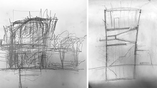
At the end of this first phase, I asked students to turn over their drawing before removing their blindfold. I collected the drawings and asked the now unblindfolded students to, using their second sheet of paper, reproduce their first sketch without ever seeing what they had drawn before. The challenge of this task was triple: 1. mentally replicate the verbal instructions given in phase 1 to construct the second drawing; 2. represent from memory the sketch that they produced blindfolded; and 3. represent the ‘idea’ of their first sketch, which for me, might be the most challenging aspect of this second phase. Of course, to be successful, all three challenges need to work in tandem! (Image 4 above).
Assessment
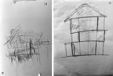
Typically, sketching is a dual process of translating AND investigating ideas on paper, transforming mental images into form through geometric figures. Subsequently, and if done correctly, sketching is an iterative process of layer upon layer, as students explore alternative solutions that refine their understanding, not only of discipline of their art, but more importantly, the anticipated experience of space. This is accomplished through form, scale, and the disposition of shapes -all calibrated by looking at the drawing and responding to its visual clues based on graphic traditions of communication.

In the first phase of this charette, students drew ideas while unable to respond to their produced sketches as they could not see them. Thus, the students’ dilemma in creating their second sketch was: 1. would they want to recapture the drawing by remembering the images triggered by the faculty prompts or would they replicate the imagine they believed they had created initially in their first sketch or a third possibility, or 2. would they sketch a new idea of what the section ‘should’ look like? I stress the word should as for most students the second sketch illustrated a certain degree of unspontaneous drawing which made them appear clumsy and contrived (Images 4-8).
Conclusion
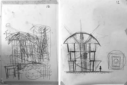
While the blindfolded sketches may seem crude and inelegant, they revealed, through an unsophisticated representation, ideas in a most authentic way. Repeated lines intersected one another, reinforcing intentions, and drawing attention to the intensity of the gesture that conveyed a particular moment of the section. There was no inhibition about how things looked, thus the true character of the section was revealed. The ill-defined and truly sketchy aspect of their drawings was so refreshing and full of ideas.
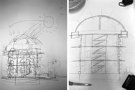
It was a magic moment when students were asked to pin their second sketch next to their first one. For some, a moment of hesitation revealed that they could not identify their own first sketch, thus showing two very different approaches between phase 1 and phase 2.
I hope what they took from the exercise is that spontaneity is the gift of sketching. Don’t overthink, adjust but don’t focus on achieving a sense of beauty. Let the sketch speak and become what it wants to be. In the spontaneity of not looking, they captured ideas that might have been missed, or overlooked, when seeing.
Postscript
I was reminded of the impact of starting in the middle of the page of my sketchbook—the freedom this gives me to develop the idea in ANY direction—rather than from top left across and down, when conducting a drawing exercise where the students were blindfolded.
Additional blogs of interest
Sketching as reflection-in-action
Architectural sketching and how do I sketch
The importance of sketching for architects, Part 1
Some thoughts on sketching by hand
Sketching on a field trip, Part 1
Sketching on a field trip, Part 2
Issues about sketching, Part 1
Sketching -an iterative process, Part 2
Sketching -an iterative process, Part 1
Architectural Education: What issues does one encounter when sketching?
Why Model Sketching? Part 5
Why Model Sketching? Part 4
Why Model Sketching? Part 3
Why Model Sketching? Part 2
Why Model Sketching? Part 1