
National Museum in Singapore, Part 2. Following my thoughts on the nature of the growth of museums, during a recent trip to Singapore, and, in particular, the National Museum of Singapore (NMS)—a place that I remembered for both its extensive galleries showcasing the history of Singapore and the temporary exhibitions on topics relevant to a more in-depth analysis of specific cultural dimensions—I was interested in the development of museum additions using this museum as an example.
As an architect, I was interested in the NMS and the British influence on its heritage buildings (1887-1926); as well as in the superb and elegant addition that almost doubled the real-estate of its holdings. The last museum expansion—completed almost two decades ago in 2006—provided additional space for the collection to grow; this as the city-state continued to feature its history pre-and-post 1965 independence.
In addition, the 2006 building offers a number of permanent galleries, temporary exhibition spaces, a children’s discovery gallery, and an auditorium. Office space, restaurant, gift shop, and thematic galleries are relegated to the previous two interventions (Image 3, below).

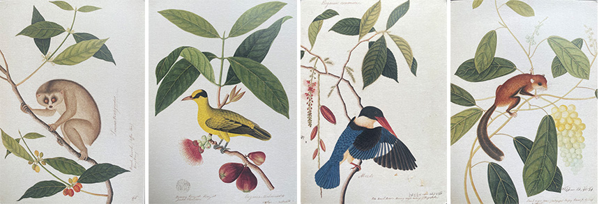
Beyond the educational galleries on the history of Singapore, my interest during my first visit some years ago was also focused on the collection of early 19th century botanical drawings found in the William Farquhar Collection of Natural History (Image 1, above). The museum’s collection holds 477 watercolors of the Malay Peninsula’s flora and fauna.
The artistic delicacy and scientific detailed renderings of these plates are nothing less than remarkable and they alone require a visit to the NMS. On a side note, this collection reminds me of art plates by the American artist John James Audubon whose naturalist drawings (Image 2, above) are on display in many key US museums (e.g., North Carolina Museum of Art).
The National Museum’s location and three stages of growths
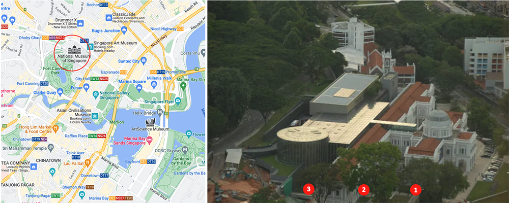
The NMS is situated in Singapore on the north west edge of Central near Istana Park and Dhoby Ghaut Green, two major green spaces in the city. To its south lies the historic Fort Canning Green with the beautiful Farquhar Garden. The existing heritage building was designed by Colonel Sir H.E. McCallum, and completed in 1887—although the origin of the museum dates to 1849 and is considered “the nation’s oldest museum that seeks to inspire with stories of Singapore and the world.”
Upon the completion of the first building, the edifice became known as the Raffles Library and Museum, in honor of Sir Thomas Stamford Bingley Raffles, who was one of the British Governors of the Dutch East Indies (Image 3, above).

The formal attributes of the original building are neoclassical; more precisely, Neo-Palladian in style. They feature a typical symmetrical organization of spaces in plan that is reflected in the facades; a central rotunda crowned with a dome (like the Villa Capra of Andrea Palladio); and a central stair that seems to be added along with the second addition (I cannot figure out where the original staircase was located in the main building to access the rotunda).
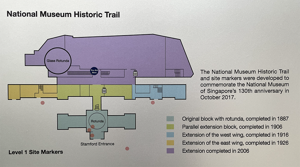
The original central building was bookmarked by rectangular pavilions to the east and west. These wings were detailed with appropriate western classical vocabulary of columns, pilasters, large window openings (for natural ventilation due to the tropical climate), cornices and pediments (Image 4, above).
Later additions occurred during three intervals, each spanning ten years (Image 3, above), and follow the linear block type of the heritage building. The 1906 extension mimicked the heritage building (without a central rotunda), and was followed by a west wing in 1916, and an east wing in 1926. The resulting organization created a set of three parallel buildings doubling the capacity of the original building.
Come 2006—eighty years after the last extension—a fourth addition took place that respected the previous extension strategies, but introduced a bold formal gesture that used contemporary materials (glass and steel), and modern structural principles (columns). This addition once again doubled the footprint, this time from the 1926 layout (Image 5, above).
The new building
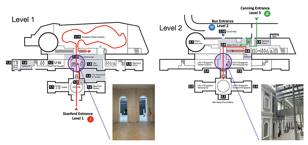
W Architects was in charge of this most recent addition. They built on the classical symmetry of the previous interventions, emphasizing the existing central axis of the spatial organization. This was accomplished through the creation of a skylight atrium with a large concourse and vertical circulation which included escalators, stair, and a bridge connecting (on axis) the original corridor to the rotunda. The rear of the new building was defined by a more contemporary geometry facing Fort Canning Park (see image 6, above).
This attention to, and respect for, the classical organization is evident in the re-invention of a connection between the old and the new. The treatment is a void; this time internalized from the bottom canyon to the glass atrium on the second level. The moment of joining the existing with the new is accomplished through a glass-covered atrium/concourse with the strategy that “did not want old and new to simply stand next to each other… We wanted physical engagement,” as stated by Mok Wei Wei, principle of W Architects.
The architect’s strategy reminds me of the Italian architect Carlo Scarpa, in particular his intervention at the Gipsoteca in Possagno, Italy. There, Scarpa created a transition between new and old using a magnificent spatial play of two circulatory paths and a structural system that shows how they belong within the joint linking the buildings. Scarpa’s joint is more modest and subtle in scale than that at the NMS, where the monumentality of the interstitial space is magnified and developed through a large enclosed atrium.
The verticality of this canyon-like space—emphasized by the striations in the wall made out of multiple shades of local granite—carves away from the upper-level rear entrance to the underground lower-level history gallery. Despite the dramatic vertical scale of these spaces, it is my understanding that the skylight roof was located at the current height because restrictions prevented the architects from going higher than the spring of the existing dome of the original heritage building.
The atrium’s concourse
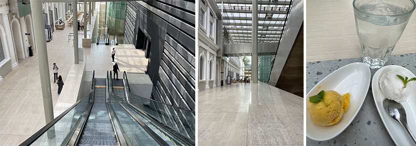
The atrium—which is designed as part of the formal entrance path from the existing heritage building leading to the new addition—is a large rectangular glass-covered hall that is subdivided into two distinct spaces: concourse and escalators. The overall ambiance of the space acts as a generous inside courtyard, yet one feels outdoors because of the abundance of light through the skylight.

While the west side of the concourse is open and has no specific functions, the east side provides a café where, between gallery visits, I lounged while enjoying the day’s special Mango and Lychee sorbet. What a delectable treat, especially as I could see that there was a rain shower outside; one that added more humidity to the already taxing tropical climate. In the middle of the space separating concourse and vertical movement is a parapet on which slender free-standing columns emerge to support the skylight roof. (Image 7, above).
While the contrast between old and new becomes evident after entering the atrium, the entrance sequence to the atrium/concourse is, at first glance, almost understated. After experiencing the entrance hall of the heritage building with its stately dome, and then passing the formal connecting stair, I faced two arched doorways that are one of two entrances that link the old and the new museum. The second entrance at located directly above the first level and is a bridge from the glass atrium (Image 8, above).
Circulating through the archways on level 1 feels abrupt. The transition is defined by opposing colors (white and grey-black) and material textures (plaster and stone). The elongated verticality of the arches frame the new wall opposite—with an integrated A/C system—constructed with dark stone striations spanning the length of the concourse. Rather than signifying a grand entrance, the effect of the transition is at first disconcerting, but upon reflection is subtle and classically handled (Image 6, above, middle).
The escalators

As previously stated, the courtyard concourse is subdivided into two spaces. Behind the parapet that defines the edge of the concourse and the gallery wall of the new building are two pairs of escalators that direct visitors to the upper and lower levels. While I am not fond of escalators in museums as they suggest a shopping mall rather than a place of contemplation and intellectual satisfaction, the pairs of escalators here are elegantly designed despite their imposing scale.
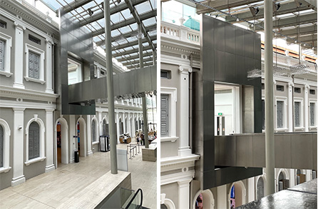
Each escalator is lined by modular square stone panels of a light color that face the walkway and enter into a sympathetic dialogue with the existing highly ornate ‘back’ façade of the 1906 extension that originally faced Farquhar Garden. The two-story façade is composed of arched window openings that are decorated with tropical shutters, and Ionic and Corinthian pilasters reminiscent of British colonial style of architecture found in many South-Asian countries (Image 9, above)
This classical treatment of the heritage façade is in direct contrast to the new extension that appears monolithic and abstract given its striations of concrete-and-granite panels. The wall is treated as layers of different heights with large empty joints suggesting the sedimentation of stones in the earth—with no windows opening, and only punctual access to galleries (Image 10, below).

The escalator uses materiality to mediate between old and new, and, while ever present in the space, they are elegant and discrete. Finally, behind the striated wall is the large Singapore History Gallery, located below the glass atrium.
The skylight and roof juncture

The open-air atmosphere of the atrium/concourse is defined by an overarching structure that covers the entirety of the space. The skylight is supported by a post and beam structure that spans from the heritage building over the atrium and terminates at the edge of the glass atrium wall facing Farquhar Garden.
The modularity and effect of lightness of the structure lends a degree of effacement to the roof, while contributing to the uniqueness of the entire space. The treatment of the joint with the heritage building is designed to be in the recess of that building’s roof parapet, thus rendering almost effortless any design complexity (Image 11, above).
Bridge entrance
The bridge entrance remains the spatial highlight for me. I previously mentioned how the architects worked skillfully to create the entrance sequence at the first level. A second access strategy was created on the second floor, and was amplified by the connecting bridge between the glass atrium and the heritage building (Image 6, above). My admiration was not solely for the bridge itself—although it is elegantly detailed in a minimalist and contemporary way—but for the way the architects treated the second level entrance portico to the heritage building; a reverse spatial sequence from that found on level 1 (Image 12, above).
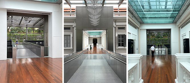
To create a contemporary doorway, two windows were removed from the existing second floor façade. After stabilizing the opening, a frame was inserted to demarcate a formal entrance connecting the glass atrium to a vestibule-like space in the heritage building. Treated as a gateway, the passage is magnified through an over-scaled vertical rectangle that reminded me of a picture frame in which the art is seen as the spatial gangway.
For me, the handling of this picture frame is remarkable given that the overall illusion also suggests a mask, thus the space of entrance has been inserted within the façade with its thicknesses recessed from the edges of the mask. All in all, a very well-designed way to insert a modern intervention within a heritage façade (Image 13, above, and 14, below).

Conclusion
Practicing architecture within a historic context (e.g., the addition to the National Museum in Singapore), has shown W Architects’ reverence to the existing, all the while being unabashedly contemporary in their overall intervention. Reading the plans, experiencing the space, and describing the various spatial strategies above, the addition seems almost self-evident.
After my visits to NMS, the obviousness of the addition reminded me of a quote by Montesquieu: “The distinguishing feature of great beauty is that first it should surprise to an indifferent degree, which, continuing and then augmenting, is finally changed to wonder and admiration.” To achieve such subtlety, seasoned professionals and talented students know how much design consideration must be developed through endless iterations on the same idea.
Trust in the concept, passion, and perseverance is what make the architecture of any addition successful. Thus, for me, the richness of the overall intervention at NMS balances the simplicity of an idea with the complex follow up accompanied by strong conceptual gestures at every level of the project.
The beautiful simple detailing clearly demarcates the new and old, while finding the necessary complicity between both. Compared to Scarpa’s exuberance and cultural expression of a lost art of Venetian craftsmanship, W Architects’ spatial expression is undoubtedly more minimalist in its overall formal approach, yet that does not lessen in any way the reading of their intentions and a guest’s spatial appreciation during their visit.
In spite of my remarks about the singularity of this building, there is nothing atypical in the strategy, as many architects favor the use of a joint to take appropriate distance from an existing building when creating an addition. Yet, the solution at the NMS is ingenious as is turns the back façade into a front space that allows a new connection between old and new. I mention this because during my first visit ten years ago, I entered through the main entrance and discovered the primary spatial sequence.

During my recent visit, after meandering through Farquhar Garden, I arrived at the top rear level entrance—the one situated above the vehicular drop off—to discover the glass atrium along with the full volumetric expression of the concourse with its elongated promenade. I will admit that it is not the typical entrance sequence (Stamford entrance) as most arrive by car or bus at the Canning entrance. Nevertheless, the entrance sequence that I encountered on this latest visit was impressive, and enabled me to view the atrium differently than I had before (Image 12, above).
Additional blogs pertaining the city of Singapore
National Museum in Singapore, Part 1
Hotel Park Royal Collection Pickering, Singapore
People’s Park Complex in Singapore, Part 1
People’s Park Complex in Singapore, Part 2
People’s Park Complex in Singapore, Part 3
Additional blogs pertaining to issues of preservation
Addition to the National Museum in Singapore. Part 1
A question of Preservation
Hong Kong: the history of Central Market
Ballenberg: a vernacular architecture museum
Speicherstadt in Hamburg. Part 1
Speicherstadt in Hamburg. Part 2
Carlo Scarpa Gavina Showroom in Bologna, Italy. Part 1
Carlo Scarpa Gavina Showroom in Bologna, Italy. Part 2
Carlo Scarpa Gipsoteca in Possagno, Italy
Carlo Scarpa and detailing
Lesson from vernacular architecture -inventing versus re-invention
Street pavement: Wittenberg, Germany
Church façade in Ticino, Switzerland: Part 1
Church façade in Ticino, Switzerland: Part 2