 What does built-in cabinetry have to do with architecture?.There is always a practical answer to the program of a room so that “one’s sense of well-being takes priority over any theoretical concerns.” One way to investigate this is to learn how to design furniture and built-in cabinetwork to enhance the program. For many students, this exercise is eye opening, especially in the early years of their architecture studies.
Set within a pedagogical context, the study of furnishings establishes a context to organize flexible interior functional arrangements, all the while emphasizing aesthetic pursuits through well thought out proportions, textures, finishes, and material size choices. But above all, for a project to be successful, casework should be an expression of its construction through well crafted detailing. From common sense (detailing) to physiological sensation (aesthetic), students learn to appreciate two opposite attitudes and have them work in tandem.
Le Corbusier
Students are not alone in this pursuit. I have always been struck by Le Corbusier’s versatility in designing from the scale of the city (i.e., Chandigarh, India, 1951-65) to the standardization of furniture (i.e., Pavilion de L’Esprit Nouveau, Paris, 1925). In his 1930 book titled Precisions on the present state of architecture and city planning [Précisions sur un état présent de l’architecture et de l’urbanisme] Le Corbusier’s lectures are gathered—delivered during his South American trip between Rio de Janeiro, Sao Paolo, Montevideo, and Buenos Aires—and transcribe a vision bridging political representation and the domestic intimacy of the machine age.
In his last lecture in Buenos Aires, Argentina, titled “The Undertaking of Furniture,” Le Corbusier expands on his interest about man and his environment, and focuses on the importance of furniture. The exhortation that “The renewal of the plan of the modern house cannot be undertaken efficiently without laying bare the question of furniture,” is accompanied by a number of diagrams illustrating his interest in a new and modular approach to built-in cabinetwork. Here, today, I wish to highlight three of his sketches.
Cabinet 1
In image 1 (below), Le Corbusier compares and contrasts an existing room layout with the design of a space he imagines for the future. The two top pencil sketches (Image 1: images 1 and 2) illustrate a typical bourgeois 19th century room, or parlor, with a large period wardrobe against the wall with caricatured and stylistic details such as cabriolet legs, carved wooden doors and decorative entablature (Image 1: sketch 2), all representing the taste and status of the inhabitants.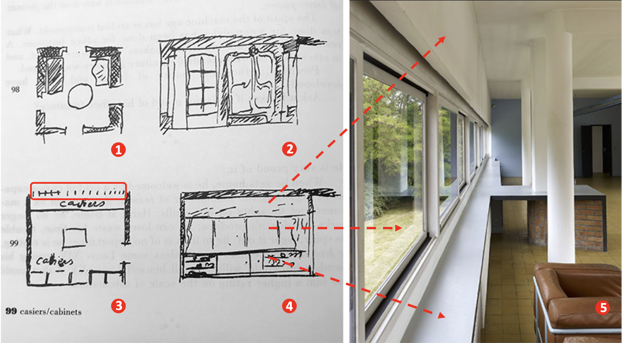
Image 1: sketches from Precisions and interior photograph of the living room wall at the Villa Savoye (1929) by Le Corbusier
In the same image, sketches (Image 1: sketches 3 and 4) show a radical arrangement tailored to a modern space. Le Corbusier proposes a single non-descript unit of built-in-storage, thus saving space for the room. A machine age home with appropriate utilitarian cabinetwork where “one can move around easily; gestures are rapid and exact; storage automatic. These are minutes gained, every day; precious minutes.” It may be interesting to note that in the latter sketches (Image 1: sketches 3 and 4), there seems to no longer be a window—an opening in the traditional sense.
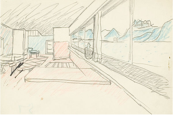
The few squiggles to the left and right above the lower cabinet (4), may suggest hanging clothes, given those drawn in sketch 10 (image 4 below). Nonsense, Le Corbusier would retort, Nonsense! They are not curtains and the expression of a ribbon window is drawn in plan through short repetitive vertical dashes (Image 1: sketch 3, and Image 2: sketch 6 below), which are translated in the adjacent photograph (5 in image 1) of Villa Savoye (1929). We find this to be equally true in La Petite Maison (image 2, parts 6 – 8) designed for his mother on Lac Léman (often incorrectly called Lake Geneva) in Corseaux, Switzerland (1923-24).
In both examples, the wall incorporates a horizontal window while offering a modern utilitarian use for storage. Needless to say, the screen wall—named a free facade (fenêtre en longeur) by Le Corbusier— allows light to generously bathe the room and offers a panoramic view onto the landscape (Image 2, photograph 8).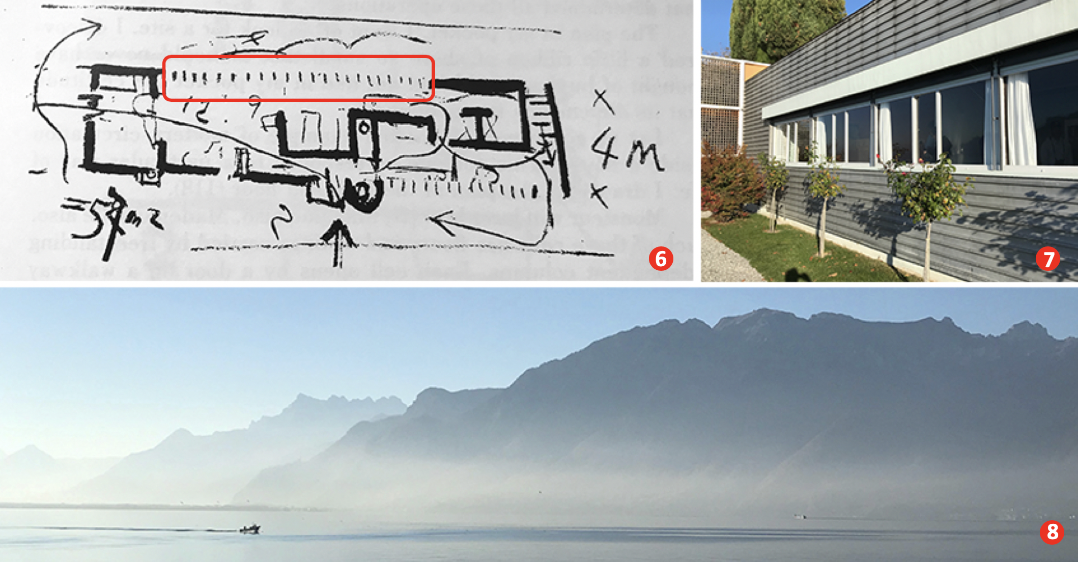 Image 2: La Petite Maison, Corseaux, Switzerland (Photographs of author’s collection)
Cabinet 2
In images 9 and 10 (Image 4 below), Le Corbusier draws a set of shelves that hold everyday utilitarian objects and garments expressive of the couples’ social status. A hybrid storage unit—an interesting combination to store clothes with dishes—that is modular with precise dimensions “showing in an unanswerable manner the principle of the ‘equipment of the modern dwelling’ with standard cabinets.”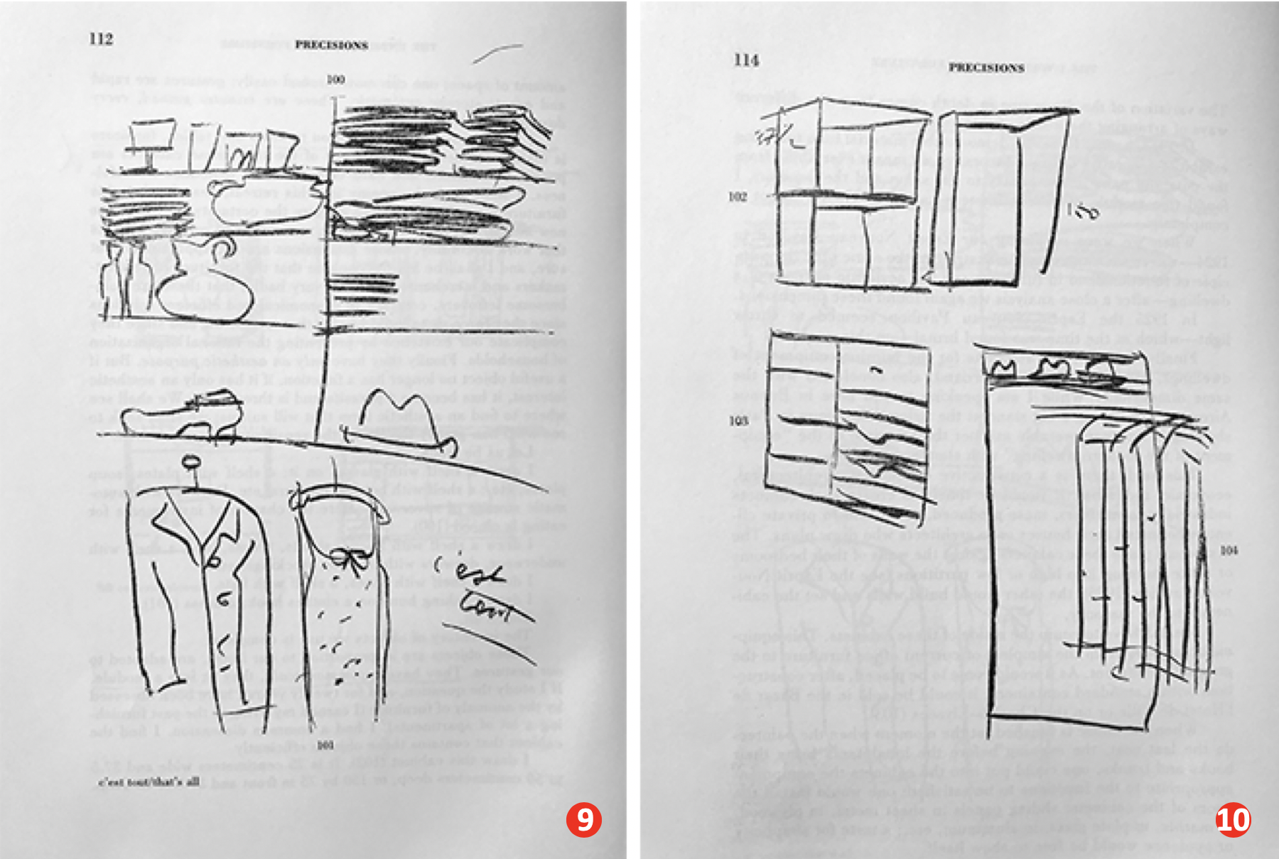 Image 4: sketches from Précisions
Built-in cabinets as a studio project
The initial second-year studio project prompt was to design a loft, followed by two charettes to furnish two major rooms or spaces (images below)—and to select art based on the owner’s interests.
Image 5: Student furniture proposal based on day and night activities (author’s collection)
Following this, I decided to introduce students to the design and detailing of built-in cabinets. While this endeavor tends to be developed in interior design programs, architecture students welcomed this attention to think of their projects at a micro scale. The minimum requirements for this exercise were for students to design and detail a built-in storage unit and a door, and represent them in plan, section and elevation.
A student’s example
While students responded to the brief with many innovative solutions, a particular scheme stood out due to the overall conceptual organization of the loft. The project promoted a free plan concept with a series of rooms designed as free-standing habitable furniture; all including built-in cabinetwork.
From early on, the concept of furniture as a spatial idea was investigated through a series of conceptual diagrams (Image 6: images 1-3 below), leading to the first iteration of a drafted sketch (image 6: image 4), ending up with a final plan exhibiting the consistency of the semester’s process (Image 6: image 5). The poetic intervention of transforming spaces into furniture was one of many ways to extend the issue of scale of the human body to bring a balance between comfort and optimization of space.
 Image 6 -Images 1 – 5 of student work
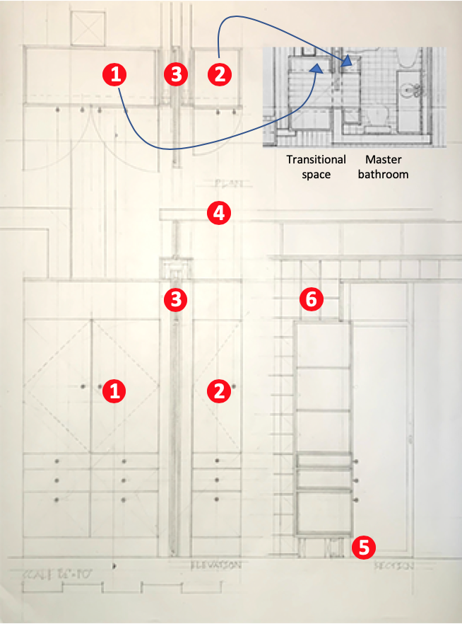
When it came to the deliverables of detailing the cabinetwork, the student opted to develop a transitional space that emerged between plans 4 and 5 (highlighted in a red rectangle). Similar to architect Herman Hertzberger’s praise of “the habitable spaces between things,”—spaces such as doorsteps, stoops, landings, balconies, and porches, typical Dutch social urban spaces of interaction—here the student ultimately located cabinets between the master bedroom and the master bathroom (image 5, above).
Shouldering on the idea of a typical cabinet unit formed by a set of drawers at the bottom and removable shelving tucked behind enclosing doors (image 6 below, 1 and 2), the student duplicated the cabinet throughout the space, thus creating an elegant walk-through area (essentially a walk-in closet) that extended into the bathroom. This was accomplished through the introduction of:
- A sliding door (3) between cabinets
- The lowering of the bathroom ceiling to hermetically seal the space for climate and sound control (4)
- Lighting built into a translucent baseboard to give the impression that the cabinets are levitating and for accent lighting at night (5)
- And finally, a re-visitation of modernist issues towards hygiene by covering both the inside and outside of the bathroom with tiles (6).
In this example, rethinking cabinetwork through the creation of a utilitarian transitional space demonstrates the student’s equal ability to think conceptually at various scales. For me it is never too early to have students learn that architecture remains an adventure that must also reflect a culture of construction; a tangibility that gives space its profound nature.
The importance of sketching for architects, Part 1
Some thoughts on sketching by hand
Sketching on a field trip, Part 1
Sketching on a field trip, Part 2
Issues about sketching, Part 1
Sketching -an iterative process, Part 2
Sketching -an iterative process, Part 1
Architectural Education: What issues does one encounter when sketching?
Why Model Sketching? Part 5
Why Model Sketching? Part 4
Why Model Sketching? Part 3
Why Model Sketching? Part 2
Why Model Sketching? Part 1
